I spent twelve years visiting the workshops of Europe's leading photographers and illustrators, negotiating the acquisition of rare prints, and advising demanding collectors on how to hang their works. And do you know what question consistently arises during my private consultations? "How to create a gallery wall that exudes elegance without looking like a chaotic jumble?" This anxiety about empty space facing a white wall, this fear of missing harmony, I understand intimately. A successful gallery wall instantly transforms an ordinary space into a place of character, tells your visual story with subtlety, and showcases your works much better than an isolated and timid arrangement. Yet, too many framed walls fail due to a lack of understanding of three fundamental principles: the logic of composition, the balance of spacing, and narrative coherence. I am going to share with you today the exact method that I apply for my clients, the one that guarantees a result worthy of a contemporary art gallery, even with a modest budget and frames collected over time.
Why so many framed walls fail (and how to avoid it)
The majority of attempts at gallery walls end in an impression of disorder that visually pollutes the space instead of magnifying it. The first trap? Buying frames randomly, without a global vision, hoping that "it will eventually harmonize." I have seen dozens of clients accumulate frames for months, only to finally give up before the glaring inconsistency of styles, formats and tones. A successful framed wall is conceived as a global composition, not as a progressive addition of isolated elements.
The second pitfall concerns spacing: too tight, your gallery wall becomes stifling and unreadable; too loose, it loses its visual strength and floats in the void. In my hanging projects for private collectors, I apply a golden rule that I learned from an artistic director at MoMA: the space between frames must create breathing room, never a break. Specifically, this means maintaining a metric consistency that naturally guides the eye from one work to another.
Finally, the third invisible saboteur remains the lack of focal point. Your gaze must know where to settle first, then circulate according to an intuitive path. Without this visual hierarchy, even the most beautiful works neutralize each other in a silent cacophony. This is the difference between a professional gallery and an overloaded wall that fatigues the eye in thirty seconds.
The three composition architectures that always work
Having orchestrated over a hundred installations for residential and commercial spaces, I have identified three compositional structures that guarantee visual harmony, regardless of the nature of your artworks. Symmetrical composition is the safest approach for beginners: you arrange your frames according to a central vertical axis, in perfect mirror or with a logic of balance of masses. Ideal for formal spaces like a dining room or office, it exudes a reassuring authority.
The regular grid: rigor and modernity
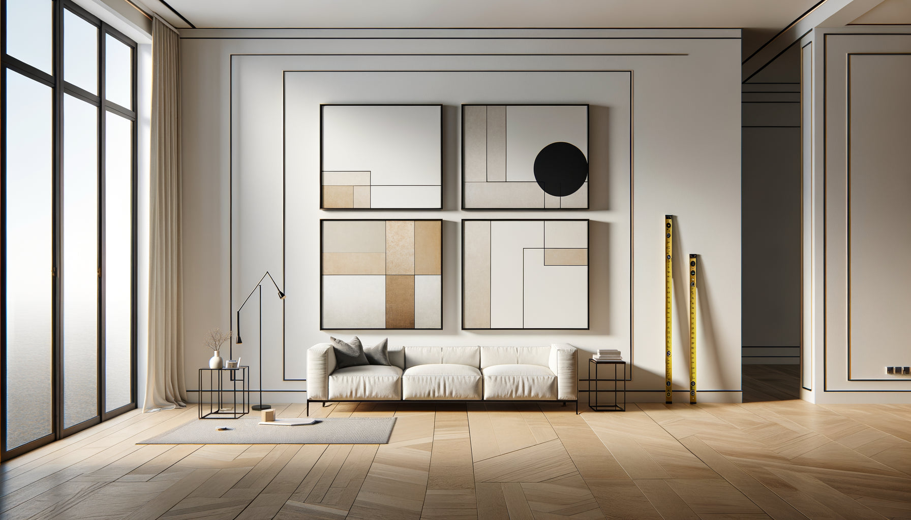
The grid composition naturally imposes itself for homogeneous collections: photographic series, botanical engravings, illustrations by the same artist. You align your frames according to a strict orthogonal mesh, with identical vertical and horizontal spacing. This architecture is perfectly suited to contemporary and minimalist interiors, where repetition creates a soothing visual rhythm. I recommend a spacing of 5 to 8 centimeters between each frame for this configuration, no more under penalty of losing the series effect.
The organic arrangement: mastered freedom
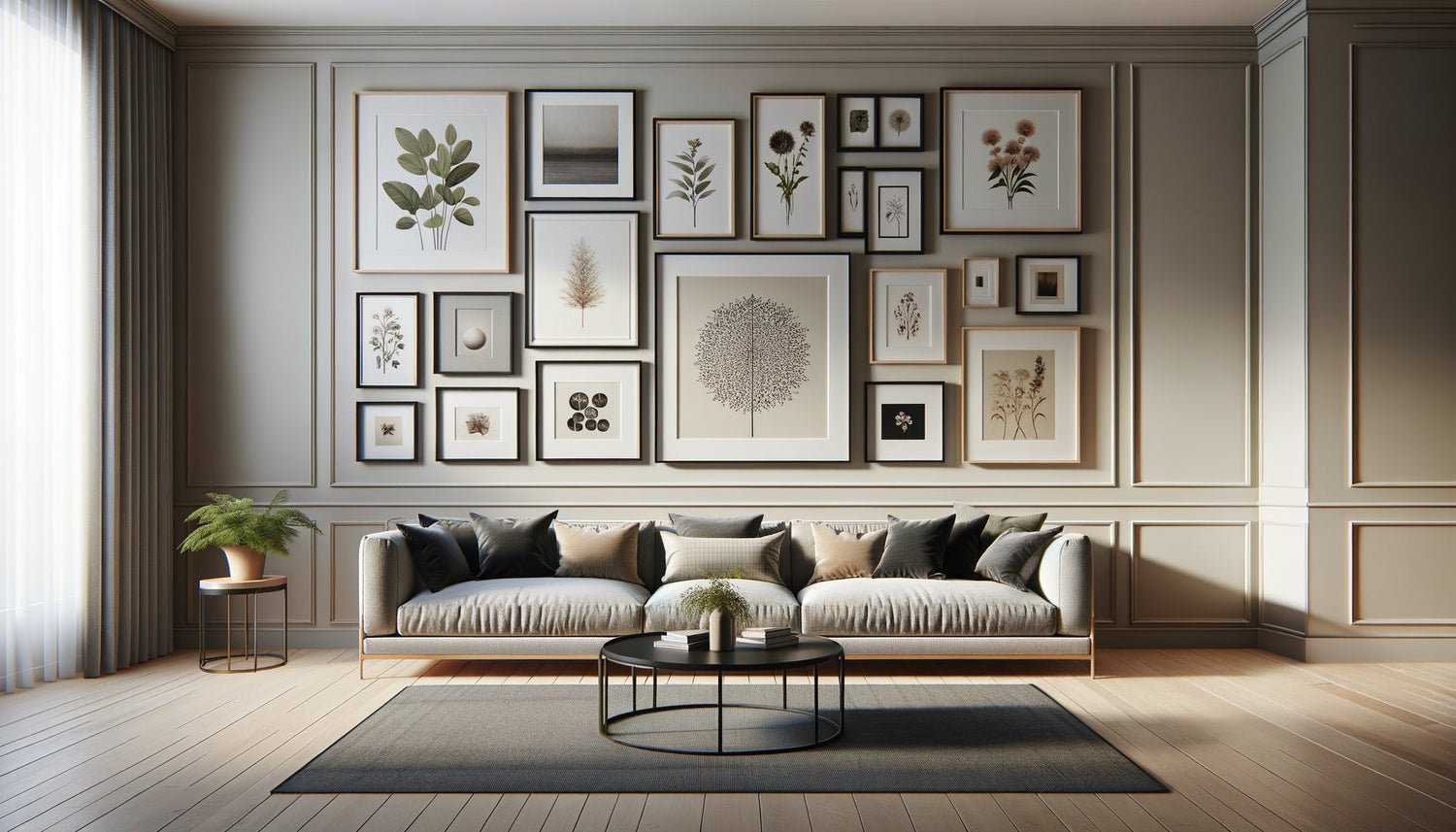
The approach that fascinates me the most remains organic composition, which allows for variations in formats while maintaining an invisible coherence. The secret? Mentally draw an imaginary geometric perimeter – rectangle, square or L shape – then fill this space scrupulously respecting its outer limits. Inside, you play freely with sizes and orientations, but the outer edges of your gallery wall form sharp lines. This invisible discipline creates the paradoxical impression of a totally mastered freedom.
To succeed in an organic composition, I always place first the largest frame or the most visually striking artwork, slightly off-center to create dynamic tension. Then I build around by alternating horizontal and vertical formats, ensuring that visual masses are distributed evenly in the four quadrants of my composition. A trained eye should never feel gravitational imbalance.

Discover this inspiring artwork
The ideal number of frames according to your space
The question of quantity consistently arises during my consultations, and my response always surprises: there's no magic number, only an optimal density. For a wall 2 meters wide, a composition of 5 to 9 frames generally finds its balance depending on the average size of your artworks. Below 5 elements, you create more of a grouping than a true gallery wall; beyond 15, you enter a risky territory that requires professional mastery to avoid saturation.
I personally apply the rule of thirds: your frame ensemble should occupy approximately 60 to 75% of the available wall surface, leaving room for lateral and vertical margins. Specifically, if your wall measures 3 meters wide by 2 meters high (a total of 6 m²), your gallery wall should cover around 3.6 to 4.5 m². This proportion guarantees a striking presence without overwhelming the space.
For narrow hallways, I prefer a linear vertical composition of 3 to 5 aligned frames, which accompanies movement without interrupting it. Above a sofa or bed, a horizontal arrangement of 7 to 11 elements creates a generous band that powerfully structures the space. Never forget this placement rule: the optical center of your composition should be 145-150 cm from the floor, the natural height of an adult's standing gaze.
Precise spacing: the invisible key to harmony
If I had to isolate THE parameter that separates an amateur hanging from a professional installation, it would be spacing. In my projects for galleries and collectors, I consistently apply a uniform spacing of 5 to 7 centimeters between all frames, regardless of their size. This constant metric creates a subliminal visual rhythm that unifies the whole without the viewer being aware.
Some contemporary hangers play with more generous spacings of 10 to 15 centimeters for Scandinavian minimalist interiors, where each artwork must breathe individually. Conversely, very dense compositions, in the spirit of Parisian salons from the 19th century, can reduce the interval to as little as 3 centimeters to create a luxurious saturation effect. The fatal mistake is to randomly vary these distances: 4 cm here, 12 cm there, 7 cm elsewhere. This inconsistency instantly sabotages any attempt at harmony.
The template technique for millimeter-perfect placement
Before hammering in a single nail, I systematically cut out templates from kraft paper to the exact dimensions of each frame. I fix them to the wall with repositionable adhesive tape, then spend hours adjusting the composition until complete satisfaction. This full-size preview phase saves dozens of unnecessary holes and allows for an outside perspective to validate the balance. Once the templates are in place, I mark the location of the fasteners directly on the paper, then drill precisely before removing the patterns. This template method remains the best-kept secret of professional hangers.

Discover this inspiring artwork
Visual coherence: unify without uniformize
A captivating gallery wall plays on a delicate paradox: enough consistency to create a visual family, enough variation to maintain interest. In my residential projects, I always identify two or three guiding threads that weave unity without imposing monotony. These invisible links can be chromatic (a dominant black and white palette with touches of sepia), material (raw wood or matte black metal frames), thematic (natural landscapes, portraits, geometric abstractions), or stylistic (documentary photography, botanical illustrations).
The common mistake is to seek total uniformity: identical frames, works by the same artist, repetitive formats. This approach certainly produces an easy harmony, but it sacrifices the narrative richness that brings an authentic gallery wall to life. I personally prefer to mix 60% consistent elements with 40% assumed variations: a colorful large format among monochrome prints, an antique gold frame in the middle of minimalist black structures, a contemporary illustration dialoguing with an 18th-century engraving.
Coherence is also built by the quality of framing: it's better to have simple but well-finished frames than heterogeneous decorative structures that compete for attention. Invest in museum-quality mats, impeccably cut at 45°, which create this precious breathing space between the artwork and its frame. These invisible details to the untrained eye make all the difference to the practiced eye.
Ready to transform your blank wall into a personal gallery?
Discover our exclusive collection of landscape paintings that perfectly integrate into a sophisticated wall composition and tell your visual sensibility.
Take action: your first gallery wall in three steps
Planning always trumps improvisation when it comes to composing a memorable gallery wall. First step: physically gather all your frames in the room concerned, lay them out on the floor and start experimenting with arrangements before any commitment to the wall. This playful phase immediately reveals happy associations and glaring incompatibilities. Photograph each attempt with your phone to objectively compare options.
Second step: create your hanging plan on templates as explained previously, scrupulously respecting your chosen spacing. Step back regularly from 3 meters to assess the overall impact, because millimeter adjustments are lost in the overview. Have your composition validated by an outside eye – spouse, friend, neighbor – before drilling, as we all develop a progressive blindness towards our own creations.
Third step: hang methodically from the center outwards, checking the level after each fixing. I personally use a laser level for complex compositions, but a classic spirit level is quite sufficient to start with. Take your time on this installation phase: a frame off by 2° is immediately noticeable and sabotages the harmony of the whole ensemble. Once all frames are hung, step back at a distance and observe your creation with pride: you have just raised your interior by a tangible aesthetic level.
Your wall now tells your story
A successful gallery wall transcends simple decoration to become the visual narrative of your sensitivity, your travels, your artistic crushes. Each visitor will naturally be drawn to this magnetic wall, seek to decode your choices, linger on a detail that resonates with their own story. You now have the keys to compose with the confidence of a professional: mastered composition architecture, rigorous spacing, assumed narrative coherence. No longer let your bare walls tell silence; offer them the voice of your visual universe. Start modestly if necessary, with five carefully chosen frames, then gradually enrich your composition as you make discoveries. The essential thing remains this first decisive step: dare to transform intention into action, the mental project into a tangible reality that will magnify your daily life for years to come.