That day, my client called me in a panic. She had just received the painting of her dreams – a magnificent abstract canvas with ocean tones – but once hung above her sofa, something was terribly wrong. "It floats in emptiness," she said, distraught. The problem? She had chosen with her heart without consulting her measuring tape. A mistake I practically see every week in my staging projects.
Here's what a painting of the right proportions brings to your interior: it creates an instant visual harmony, it structures the space without cluttering it, and it transforms a bland wall into a captivating focal point. The difference between a work that enhances your room and one that throws it off balance? Often just a few centimeters.
You may have experienced that frustrating moment yourself: that impulsive purchase of a painting you love that seems lost on your large wall, or conversely, an imposing canvas that completely overwhelms your space. You wonder if there are reliable rules to avoid these costly disappointments. Rest assured: choosing the perfect size for a painting is not an exact science reserved for decorators, it's an art accessible with a few simple guidelines.
In this guide, I reveal the proportions that always work, the concrete measurements adapted to each situation, and above all, the tips I use daily to transform anonymous walls into true personal galleries.
The rule of thirds: your best decorating ally
After hanging over 300 paintings in Parisian apartments, I've noticed that one rule is universally accepted: the rule of thirds. It’s simple, effective, and works in 90% of cases.
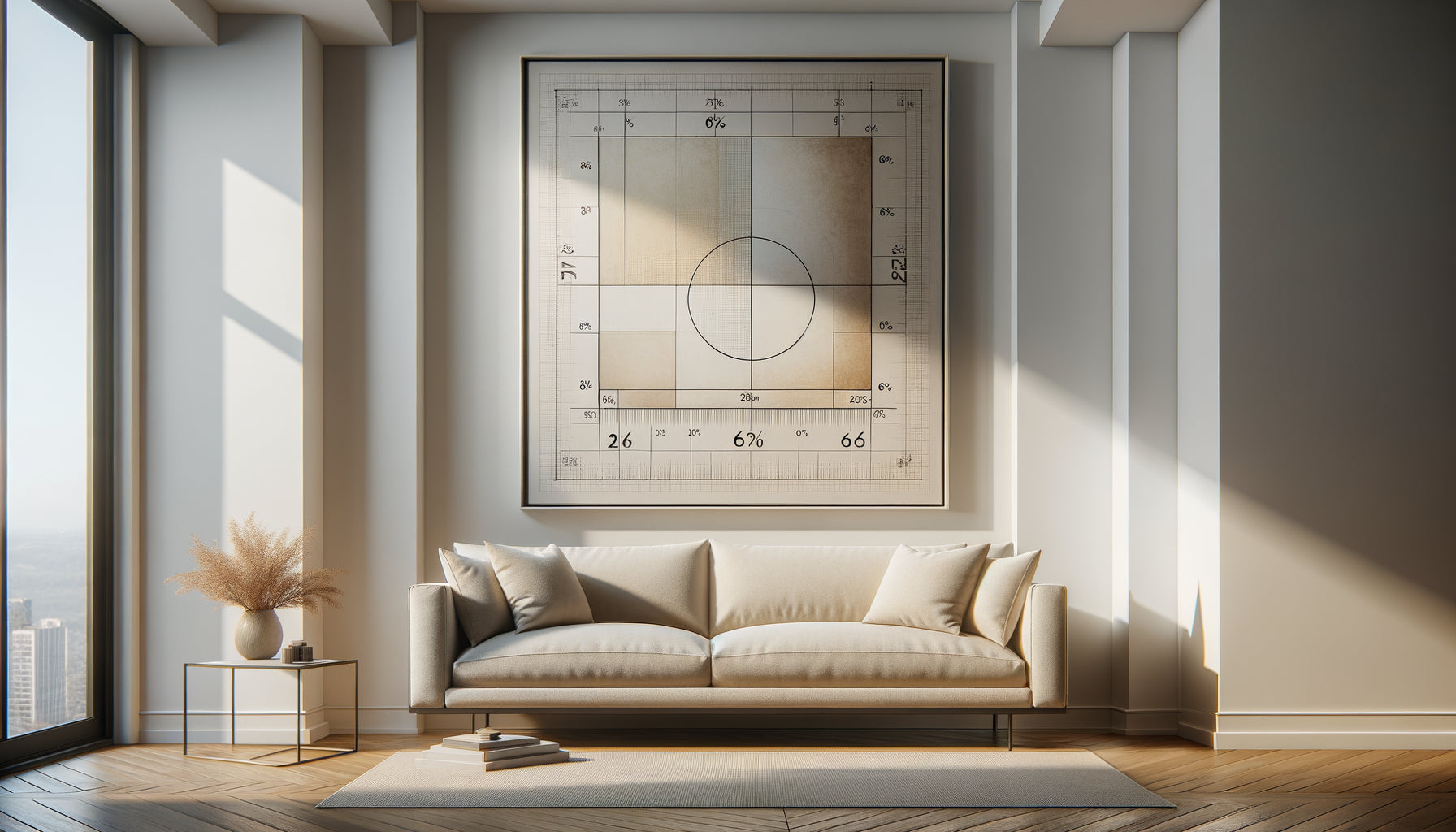
Here's how to apply it: measure the width of the furniture located under your future painting – sofa, console, buffet, bed. Your painting should occupy between 50% and 75% of this width. The ideal is around 65-70%. Why this proportion? It creates a perfect visual balance: the painting is imposing enough to have character, but leaves space to breathe around it.
Concrete example: you have a sofa 200 cm wide? Aim for a painting (or composition) 130 to 150 cm wide. This proportion creates what I call “the anchoring effect”: the painting and the furniture form a coherent ensemble rather than two disconnected elements.
For height, keep in mind that a painting should ideally leave between 15 and 25 cm of space between the top of the furniture and the bottom of the frame. Too close, it looks like it's been placed there. Too far, it floats without connection to the rest. This distance allows you to place some decorative objects in front without creating visual clutter.
When your wall is bare: the wall proportions that change everything
Empty walls – those large, unfurnished spaces – can be the most intimidating. I’ve seen clients abandon the idea of decorating them altogether out of fear of making a mistake. Yet, with the right approach, they become your most beautiful creative opportunities.
The key? Reasoning in terms of overall volume rather than centimeters. Your artwork should occupy approximately 25% to 35% of the visible wall surface. A wall measuring 3 meters wide by 2.5 meters high (a standard living room size)? A piece of art 100 to 120 cm wide will work beautifully.
For large walls – those imposing surfaces that seem to swallow small formats – dare to go big. A piece of art 150 cm or larger is not excessive, on the contrary. I transformed a cathedral wall measuring 4 meters with a single canvas of 180 cm: the effect was spectacular without being oppressive. A large format creates an architectural presence that structures the space.
Conversely, in a hallway or reduced space, prioritize vertical formats of 40 to 60 cm which accompany the movement without visually shrinking the passage.
The template trick
Before investing, cut the intended size from kraft paper and temporarily attach it with masking tape. Live with it for 48 hours. You will instantly see if the proportions of the artwork correspond to your feeling. This technique has saved me countless returns and disappointments.

Discover this inspiring work
Deciphering standard sizes: from 30x40 to 120x180
Let's talk specifics. Here are the formats I recommend according to your spaces, based on my years of experience in the field.
30x40 and 40x50 cm formats: perfect for creating gallery-style wall compositions. On their own, they suit small spaces – entrance, bathroom, stairwell wall. I often use them in triptychs above a desk or in a deconstructed accumulation in a hallway.
50x70 and 60x80 cm formats: the quintessential all-rounders. Ideal above an entryway console, a bedroom dresser, or a reading chair. These intermediate dimensions adapt to most configurations without risk.
80x120 and 100x150 cm: my favorites for standard sofas (180-220 cm). They have a striking presence that instantly transforms the atmosphere of a living room. A 100x150 cm artwork above a two-seater sofa creates a magnetic focal point.
120x180 cm and larger: reserved for large spaces and bold souls. An XXL format requires distance – count at least 3 meters of viewing distance. In a loft or cathedral living room, these monumental dimensions create a striking gallery effect.
Above the sofa: the most strategic location
This is THE question all my clients ask me: what size artwork should I choose for that famous wall behind the sofa? This location concentrates all eyes and deserves special attention.
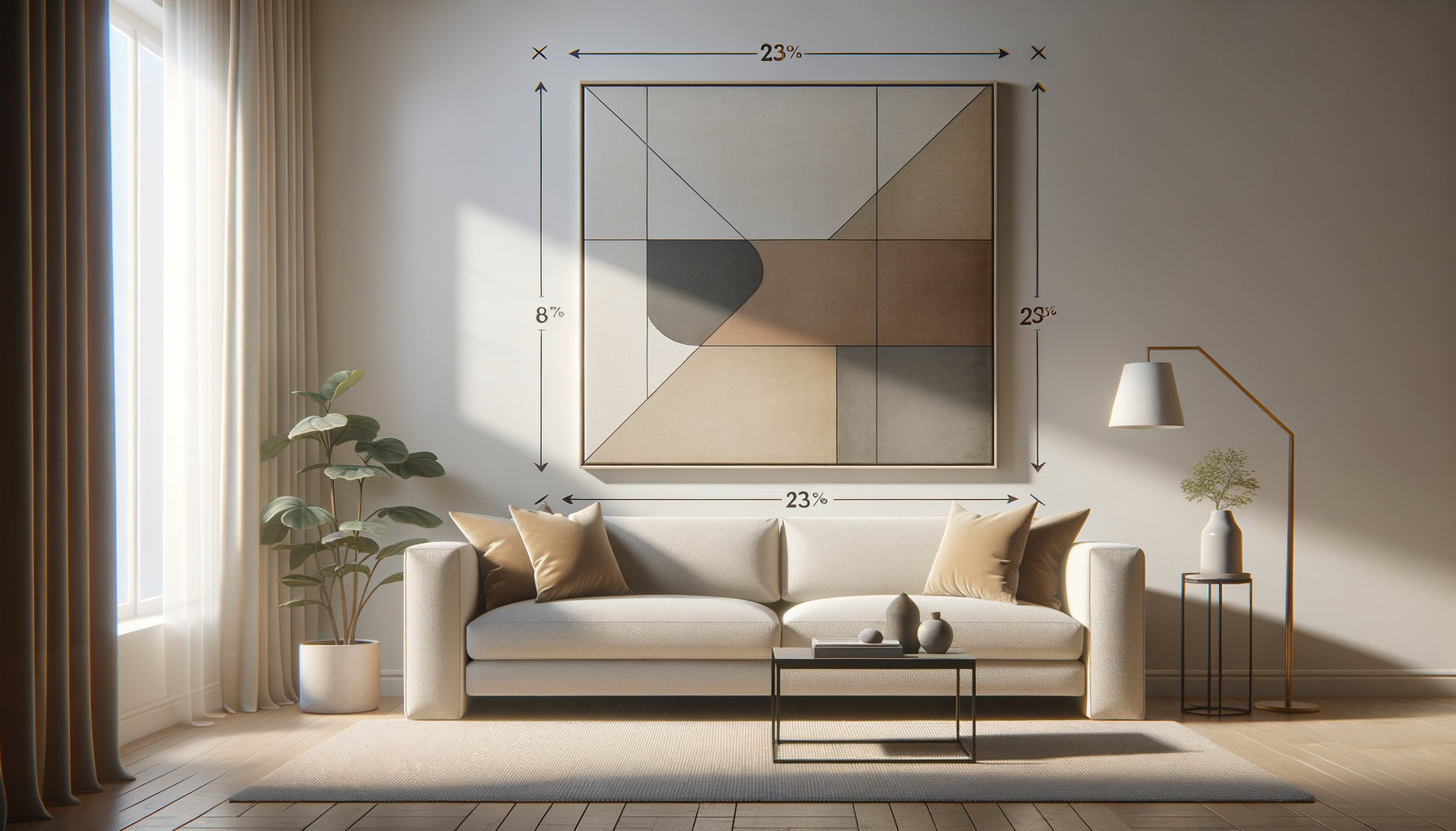
First reflex: measure your sofa precisely, including armrests. For a two-seater sofa (150-180 cm), aim for a painting 100 to 120 cm wide. For a three-seater sofa (200-240 cm), opt for 130 to 180 cm in width. The goal? To have the artwork cover about two thirds of the length of the sofa.
If your favorite is too small, don't give up. Instead, create a multi-artwork composition that respects this overall proportion. Three 50 cm artworks arranged horizontally with 10 cm spacing will give a total width of 170 cm – perfect for a large sofa.
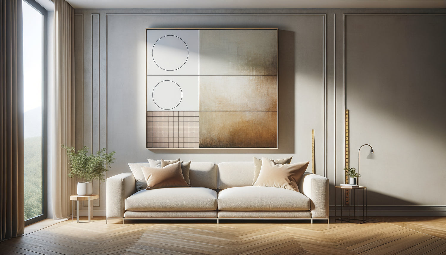
As for the hanging height, respect these 15-25 cm between the backrest and the bottom of the frame. This is the ideal distance so that seated people can fully enjoy the artwork without having to crane their necks. The center of the artwork should be approximately 145-150 cm from the floor – the famous museum height which facilitates contemplation.
The mistake to absolutely avoid
Never choose an artwork wider than your sofa. I have seen this error create a heavy visual imbalance: the work overflows, the sofa seems crushed, the whole lacks harmony. The furniture must always visually anchor the artwork, never the other way around.

Discover this inspiring artwork
Multiple compositions: when several artworks are better than one
Sometimes, the solution isn't a single large format piece, but a composition of several artworks. This approach offers exceptional creative flexibility and adapts to all budgets.
For a classic horizontal layout (perfect above a sofa), space your artworks 5 to 10 cm apart. Three 40x60 cm pieces with 8 cm between each give a total width of 136 cm – ideal for a 200 cm sofa. Keep the bottom alignment identical to create a stable guideline.
The famous gallery wall requires more boldness but offers a spectacular result. My tip: start with the central artwork (the largest), then build around it while respecting regular spacing of 5 to 8 cm. The overall composition should form an imaginary rectangle always adhering to the rule of thirds in relation to the furniture.
For vertical spaces like stairwells, overlap 3 to 5 artworks while maintaining a constant spacing. This vertical arrangement naturally accompanies the upward movement and energizes often-neglected areas.
Adapt proportions to your lifestyle
Beyond mathematical rules, your ideal proportions also depend on your daily life. A detail that many forget, but which radically changes the perception.
Do you often entertain? Prioritize medium to large formats (80-150 cm) placed at eye level when seated. Your guests will appreciate these artworks comfortably installed in your sofa. In my practice, I've noticed that artworks between 100 and 130 cm generate the most conversations – imposing enough to attract the eye, accessible enough not to intimidate.
Do you live alone in a small space? Paradoxically dare a large format. A 120 cm artwork in a 25 m² studio may seem counterintuitive, but it creates visual depth that perceptually expands the space. This is what I call “the window effect”: the eye travels through the artwork rather than hitting the wall.
For bedrooms, I systematically recommend soothing proportions: horizontal (landscape) formats of 80 to 120 cm above the bed. Avoid overly imposing compositions that create visual tension not conducive to relaxation.
Ready to transform your walls into true galleries of emotions?
Discover our exclusive collection of landscape artworks that adapts to all your proportions, from the intimate format to the spectacular large format.
Your wall transformed: visualize the final result
Imagine yourself in three weeks. You return home after a long day, and your gaze immediately falls on that wall which has frustrated you so much. Now, a painting of perfect proportions reigns there with a just presence – neither shy nor overwhelming. It harmonizes with your sofa, structures the space, captures natural light.
Your guests will be sure to notice it. Not because it shouts for attention, but because it creates that visual coherence that the eye instinctively seeks. You have transformed a simple wall into a memorable focal point.
This transformation begins with a simple decision: take your measurements right now. A measuring tape, a notebook, five minutes. Note the width of your sofa, the available height on your wall, the distance from which you view it. With these figures and the proportions you have just discovered, you now possess all the tools to choose without hesitation.
The perfect painting exists somewhere. The only question that remains: which one will make your heart beat while respecting the harmony of your space? With the right proportions in hand, you can finally let your emotions speak with confidence.
Frequently Asked Questions About Painting Proportions
Can you put a small painting on a large wall?
Absolutely, but strategically. A small painting alone on an immense wall will indeed create a feeling of being « lost in the void ». The solution? Integrate it into a larger composition with other decorative elements – mirrors, shelves, hanging plants. Or create a gallery wall where this small format becomes a piece of a larger puzzle. Otherwise, prioritize more intimate spaces (niche, narrow wall panel, above a door) where a 30x40 cm format will shine fully. I recently placed a 40x50 cm painting in the corner of a large living room, next to an armchair – the cozy effect was perfect because the scale corresponded to the function of that specific corner.
How do I know if my painting is too big before buying it?
The foolproof technique: the paper template that I mentioned earlier. Cut out the exact dimensions from kraft paper, hang it on the wall with masking tape, then step back. Photograph the result with your smartphone – the camera often reveals disproportion that the accustomed eye no longer sees. If the template touches other elements (ceiling, adjacent furniture, door frames), it is too big. If you have to squint to distinguish the details from your sofa, it is probably too small. The right size is recognized by this feeling of obviousness: the painting occupies the space naturally, without forcing attention or disappearing.
Do you need the same proportions for a horizontal and vertical painting?
No, and that's an important subtlety. Horizontal formats (landscapes) follow the two-thirds rule in width that we detailed. But vertical formats (portraits) obey a different logic: they draw the eye upwards and create a feeling of elevation. For a vertical format above a piece of furniture, you can afford to be slightly narrower – about 40 to 50% of the furniture's width is enough. On the other hand, play with the height: a vertical artwork 120 cm high brings dynamism without unbalancing the whole. I often use vertical formats in spaces with low ceilings to create an illusion of height, and horizontal formats in rooms with high ceilings to visually lower the ceiling and create conviviality.