I spent ten years touring artists' studios and museum reserves, handling thousands of artworks, from miniature Persian pieces to monumental canvases. Yet, the question I hear most often isn't “Which artwork should I choose?” but “Is it the right size?”. This anxiety about wall proportions reveals something profound: we instinctively know that a tableaux too small gets lost like a whisper in a cathedral, while a tableaux too large crushes the space like an intrusive guest.
Here's what a perfectly chosen picture size brings to your interior: a visual balance that soothes the eye, an authentic enhancement of the artwork that reveals its soul, and architectural harmony that transforms each wall into a private gallery. The right proportion is never chance; it’s a silent conversation between art and space.
You may have already experienced this frustration: you fall for a magnificent work, you return home full of enthusiasm, you hang it... and something feels off. The painting floats on the wall like a lost postage stamp, or conversely saturates the room with its presence. You move it, adjust it, step back three meters, squint. Nothing works. It's not the artwork that’s at fault; it’s simply a matter of wall proportions.
Good news: there are simple rules, proven by decades of hanging in the most beautiful homes. Formulas that exhibition designers and curators use daily. I will pass them on to you, piece by piece, with the clarity that comes from experience. After reading this guide, you will know exactly what size picture to choose for each space in your home.
The golden rule of two-thirds: your universal compass
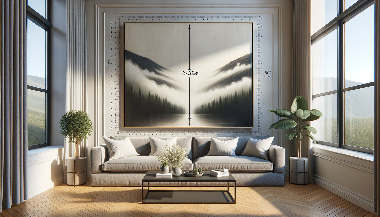
In the museum reserves where I worked for a long time, seasoned hangers passed on an immutable rule to me: a picture should occupy between 50 and 75% of the width of the furniture or wall section it dominates. This range is not arbitrary; it corresponds to what our brains perceive as harmonious.
Specifically, if you want to hang a work above your 200 cm sofa, aim for a picture size between 100 and 150 cm wide. This proportion creates a visual anchor without stifling the space. I’ve seen too many living rooms where a tiny 40x50 cm got lost above an immense sofa – the effect is that of a button on a coat, decorative but insignificant.
For a queen size bed (160 cm), a canvas of 80 to 120 cm works perfectly. Above a 120 cm console in the entrance hall, a format of 60 to 90 cm brings that welcoming presence without dominating. These numbers are not constraints but guardrails that have proven their worth in thousands of interiors.
Living room: the art of large formats and wall compositions
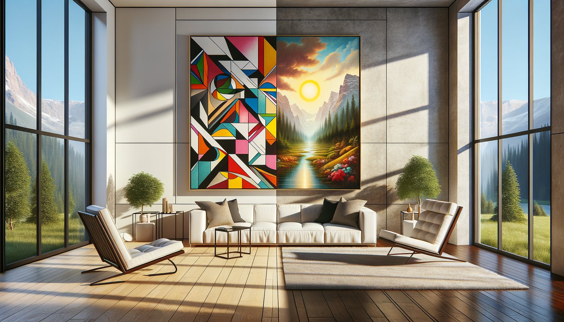
The living room is the theater of your home, the space where volumes breathe and where art can unleash its full power. This is where I encourage my clients to dare the large formats – those canvases of 120x160 cm or more that transform a wall into an aesthetic manifesto.
For a main living room wall (typically between 3 and 4 meters wide), a single piece of art measuring 140 to 180 cm creates a masterful focal point. I remember an apartment in the Haussmann style where we hung an abstract landscape of 160x200 cm: the work finally breathed, its nuances were revealed from afar, and the entire room gained character.
If your ceiling is 2.80 m or higher, don't hesitate on the height. A vertical format of 100x150 cm enhances volumes and guides the eye upwards, creating a sense of space. For standard ceilings (2.50 m), prioritize horizontal or square formats that visually widen the room.
The gallery wall alternative
If you have several works of medium size, the wall composition is your ally. The trick: consider the whole as a single large painting. For a 220 cm sofa, your total composition (including the spaces between frames) should measure 130 to 165 cm wide. Keep 5 to 8 cm of spacing between each frame – no more or less. Too tight, it's stifling; too spaced out, the coherence dissolves.

Discover this inspiring artwork
Bedroom: the intimacy of medium formats
The bedroom calls for a completely different approach. It is a sanctuary where art should soothe rather than impress. After years of advising collectors, I have found that medium formats (60x80 cm to 100x120 cm) work miraculously in these intimate spaces.
Above the bed, respect this visual safety rule: leave 15 to 25 cm of space between the top of the mattress and the bottom of the frame. This "buffer zone" avoids a feeling of being crushed when you are lying down. For a standard double bed (140 cm), a painting measuring 80x100 cm positioned 20 cm above creates this perfect balance between presence and softness.
I particularly like square formats (70x70 cm or 90x90 cm) in contemporary bedrooms. Their stable geometry brings a almost meditative serenity. And if you opt for a diptych, two canvases of 50x70 cm spaced 10 cm apart create a perfect total width for a queen size bed.
Hallway and entrance: maximizing impact in reduced space
The hallway is the neglected stepchild of wall decor, and that's a crime. These circulation spaces deserve special attention as they shape the first impression. In a standard hallway (1 meter wide), vertical formats of 40x60 cm or 50x70 cm create an elegant visual rhythm without shrinking the space.
The trick I consistently apply: in hallways, alignment is key. A series of three to five identical artworks in size (30x40 cm for example), hung at the same height with a regular spacing of 15 cm, transforms a mundane corridor into a personal gallery. This repetition creates movement that naturally guides towards the main rooms.
For the entrance, if you have a welcome wall facing the door, dare to use a medium format (80x100 cm) that immediately affirms the aesthetic identity of your home. It's your visual calling card – it should have character without overwhelming the visitor as they cross the threshold.

Discover this inspiring artwork
Kitchen and bathroom: small formats emancipated
For a long time, these technical rooms were condemned to bare walls. What a mistake! The modern kitchen, open and convivial, wonderfully welcomes art – provided its functional constraints are respected.
In a kitchen, compact formats (30x40 cm to 50x60 cm) find their place above the coffee corner, on a side wall away from splashes, or in a dining area. Absolutely avoid the cooking zone, but don't hesitate to dress that bare wall between the upper cabinets and the countertop with a small series of 20x30 cm under glass (easy to clean).
The contemporary bathroom is beautifully suited to small artworks (20x30 cm to 40x50 cm) – provided they are protected from direct humidity. A trio of framed photographs measuring 30x40 cm above the bathtub transforms the daily bath into an aesthetic experience. Opt for aluminum or plastic frames, which are more resistant than wood in these humid environments.
The fatal mistakes that kill your wall proportions
Let me tell you about the disasters I've seen – and corrected – over the years. The most common? Hanging too high. The center of the artwork should be between 145 and 155 cm from the floor, which is at eye level for a person of average height. Not at 180 cm as I still see it too often, transforming the work into a ceiling decorative element.
Second mistake: ignoring the room's scale. A 200x150 cm format in a 25 m² studio isn't bold, it's stifling. Conversely, scattering a 80 m² loft with small 30x40 cm formats creates a confetti effect that dilutes any decorative intention. Always adapt the canvas size to the overall volume.
Third pitfall: neglecting the chromatic environment. A 60x80 cm canvas with vibrant colors on an over-patterned wall will appear more imposing than a 100x120 cm canvas with neutral tones on a plain wall. Perceived size isn't just physical, it's also psychological.
Ready to transform your walls into a harmonious gallery?
Discover our exclusive collection of wall art with carefully considered proportions that perfectly adapts to each space in your home.
Visualize before hanging: the kraft paper technique
Before hammering in a single nail, use this method that I consistently apply during my consultations: cut out the exact dimensions of the canvas you're considering from kraft paper or newspaper. Fix this template to the wall with masking tape and live with it for 48 hours.
You will be surprised by what this simple simulation reveals. That format which seemed perfect on the online store can suddenly seem disproportionate once confronted with your actual furniture. Or conversely, that size you considered bold ultimately proves to be ideal. This technique has saved countless euros in unsuitable purchases and unnecessary screw holes.
Photograph your wall with the template, send the image to a trusted friend. An outside perspective is valuable for validating your wall proportions before making a final commitment.
The art of evolving your hanging over time
Your relationship with art isn't fixed, and neither are your walls. I always encourage my clients to design their hanging as a living composition. That perfect canvas for your current living room can migrate to the bedroom after a rearrangement. These three medium formats can be separated to dress the hallway and office.
The canvas size ideal doesn't exist in absolute terms – it exists in relation to a given space, at a given time. That's why I recommend investing in modular hanging systems (rails with cables or adjustable hooks) that allow you to evolve your personal gallery without multiplying holes in the walls.
Imagine: in six months, you return from a trip with a new work of art you love. Rather than anxiously wondering “Where am I going to put it?”, you can rearrange your hanging smoothly, applying these proportion rules that you now master. Your interior becomes an evolving gallery, an authentic reflection of your aesthetic journey.
The right format is never a constraint – it's the key that unlocks the full emotional potential of a work. Now that you know the rules, take your measuring tape, observe your walls with a new eye, and finally give your favorite artistic pieces the spatial setting they deserve. The perfect harmony awaits you, just a few measurements away.
Frequently Asked Questions
Can I mix different sizes of paintings on the same wall?
Absolutely, and it's even one of the most dynamic approaches! The key lies in creating an overall visual balance. Use the "invisible frame" technique: imagine a rectangle that would encompass your entire composition – this virtual rectangle must respect the rule of thirds with respect to your furniture or wall section. Start by positioning the largest piece, then build around it by varying the formats. Keep a constant spacing (5-8 cm) between all frames to maintain cohesion. I have created spectacular compositions mixing a large 80x100 cm with three medium 40x50 cm and two small 20x30 cm – a personal gallery effect is guaranteed. The final trick: always align at least one side (top, bottom, or side) of several frames to create an invisible guideline that structures the whole.
What size should I choose for a very tall wall in an old apartment?
High Haussmannian ceilings (3 meters and more) are often intimidating blessings. You have two winning strategies. First option: dare the monumental single format (150x200 cm or more) that dialogues with the architecture and celebrates these generous volumes – it's spectacular in a living room. Second option: create a vertical tiered composition on two or three levels, with medium-sized paintings (60x80 cm) spaced 25-30 cm apart. This "tiered" approach guides the eye upwards while harmoniously fragmenting the height. Absolutely avoid this mistake: an isolated small format that would accentuate the wall void. Think proportion: a 3x4 meter wall represents 12 m² – a 1.5 m² painting (approximately 120x130 cm) only occupies 12% of this surface, which remains reasonable. Trust generous volumes, they are made to welcome art with grandeur.
How do I adapt the size of a painting in a small apartment without overloading?
A small space doesn’t condemn you to timid formats – on the contrary! A well-chosen medium-sized artwork (70x90 cm or 80x100 cm) in a 25 m² studio creates a focal point that visually structures the space, much better than a multitude of scattered small formats. The golden rule for small interiors: one to two artworks with a beautiful presence are worth five small frames that fragment the gaze. Favor light tones and airy compositions that visually expand the space. Strategic placement: place your medium format on the main wall visible from the entrance – it becomes the architectural element that gives character without cluttering. In a studio, I recommend a large format on the sofa wall (100x120 cm), a medium in the sleeping area (60x80 cm), and that’s enough. Quantitative sobriety with assumed sizes creates an impression of mastered space, almost luxurious. Remember: it's not the size of your apartment that determines the size of your artworks, but the quality of the overall composition.