How to coordinate a turquoise wall art with your furniture?
How to coordinate a turquoise wall art with your furniture?
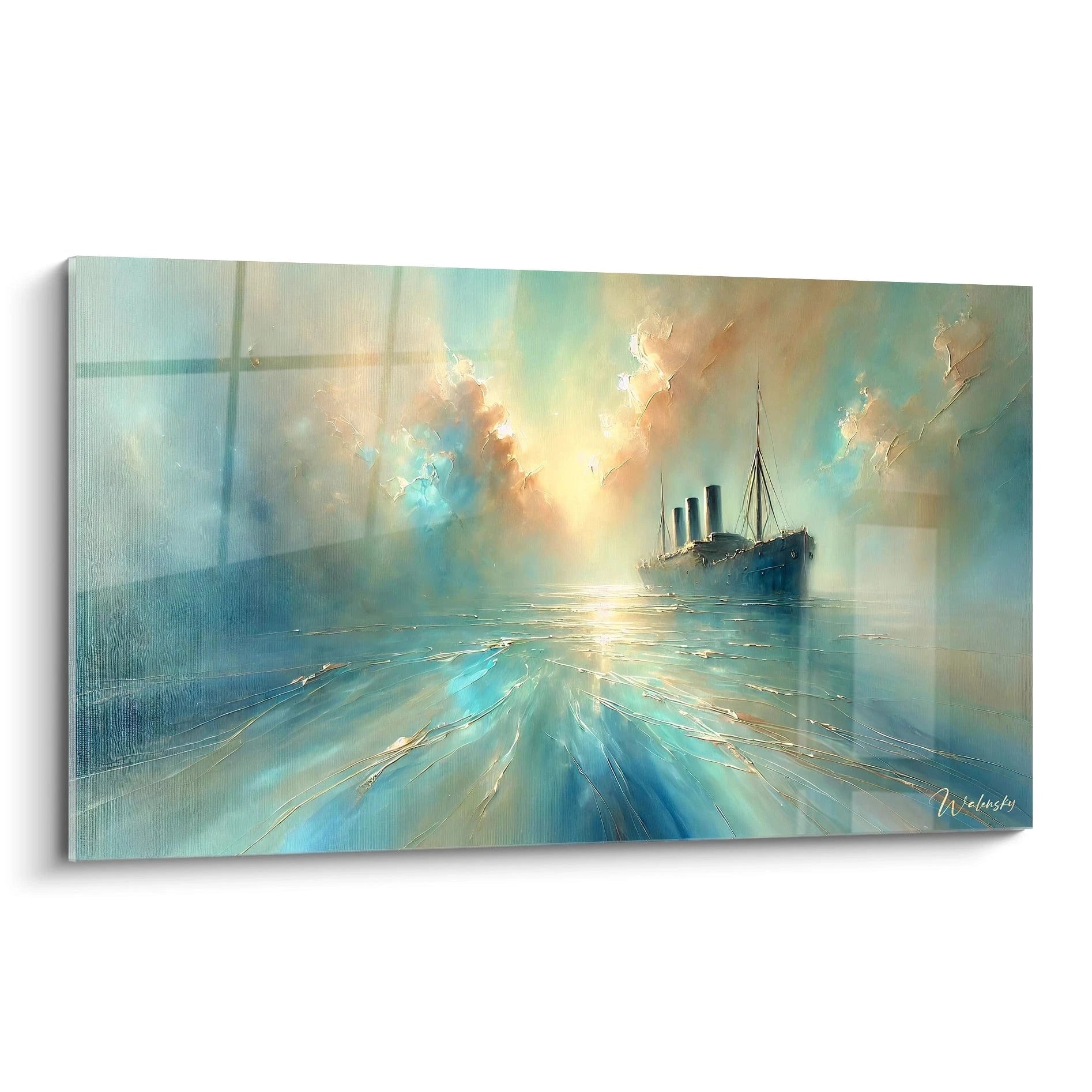
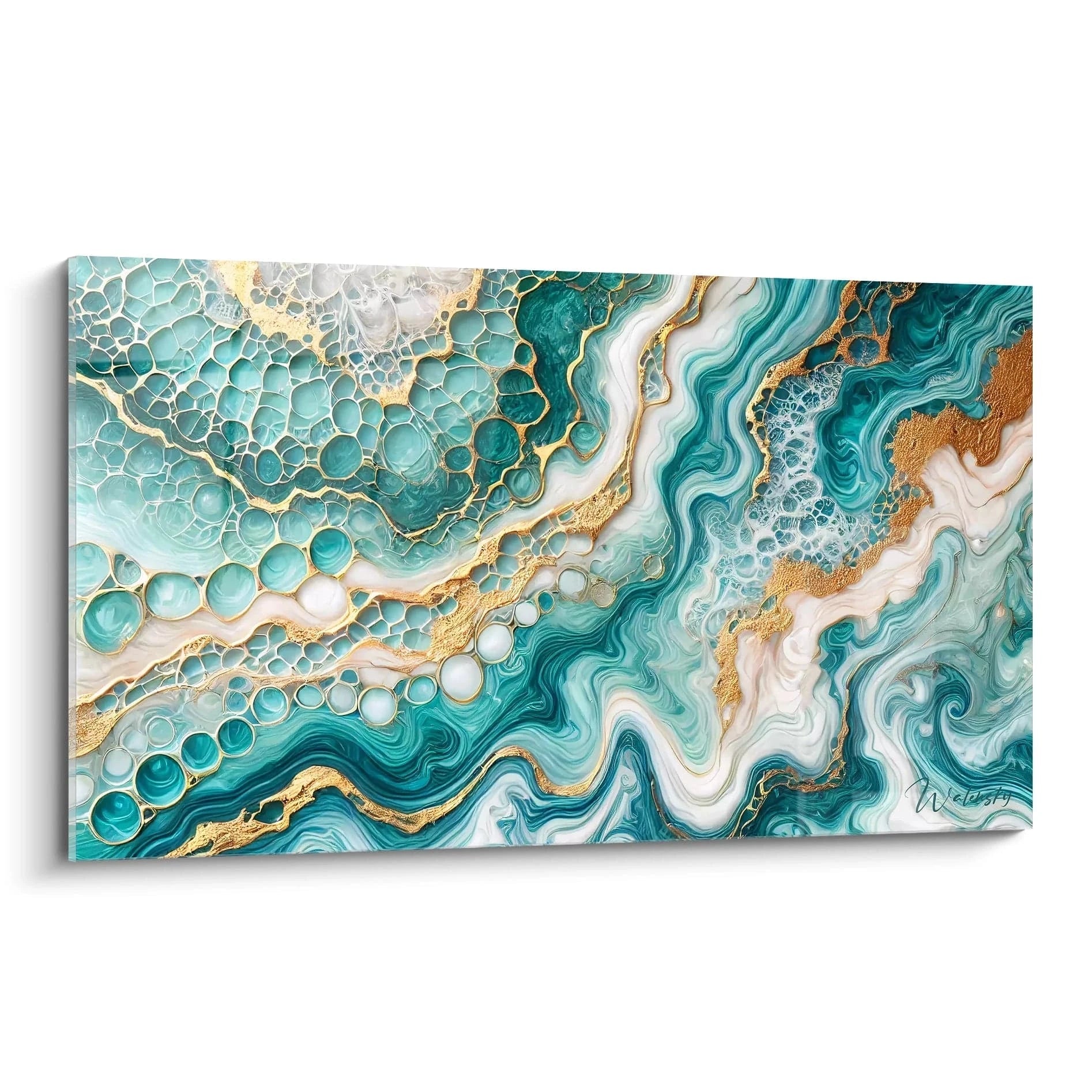
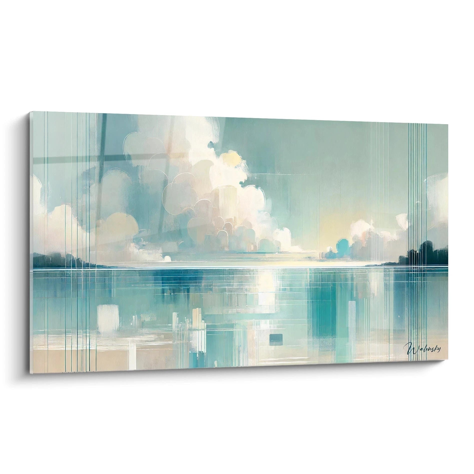
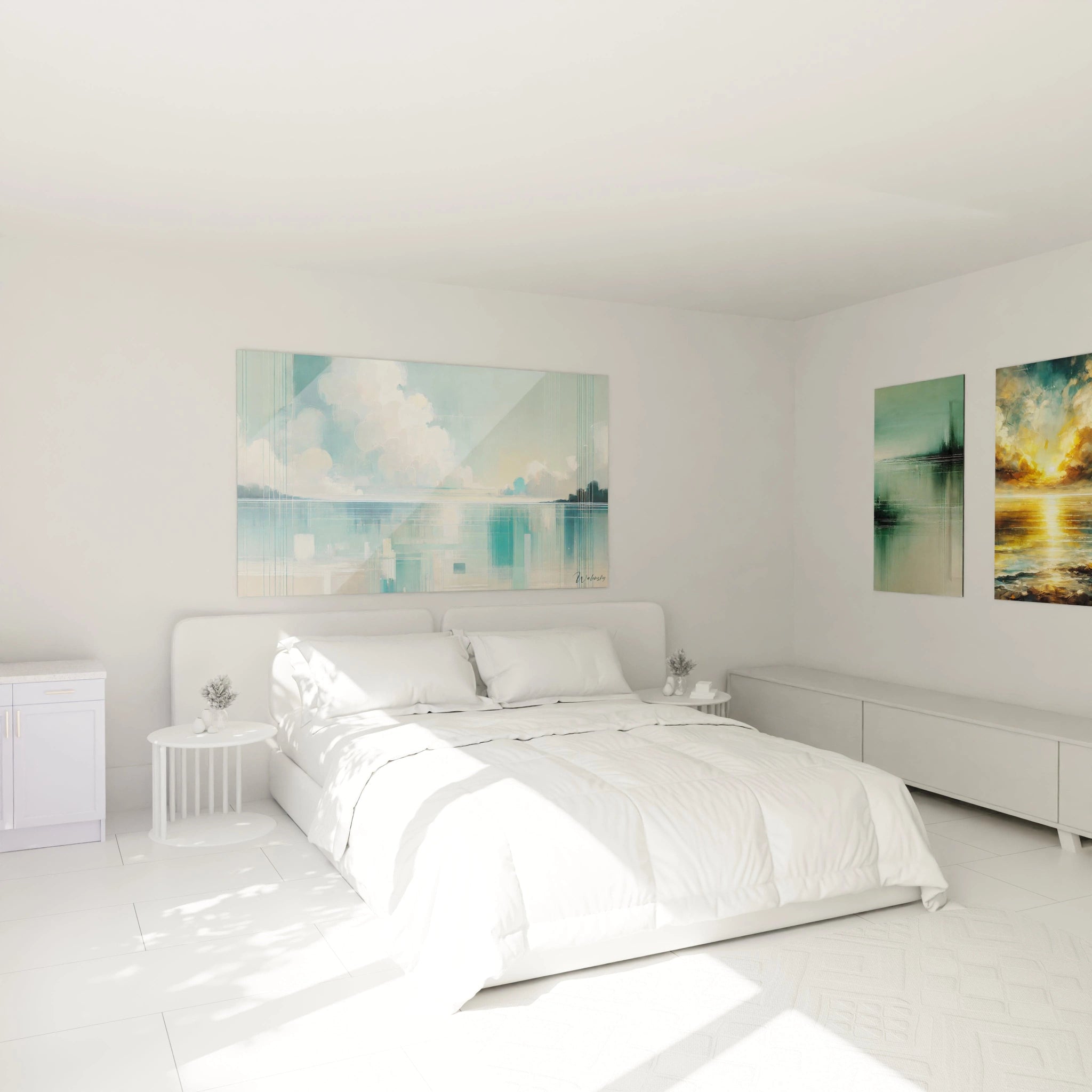
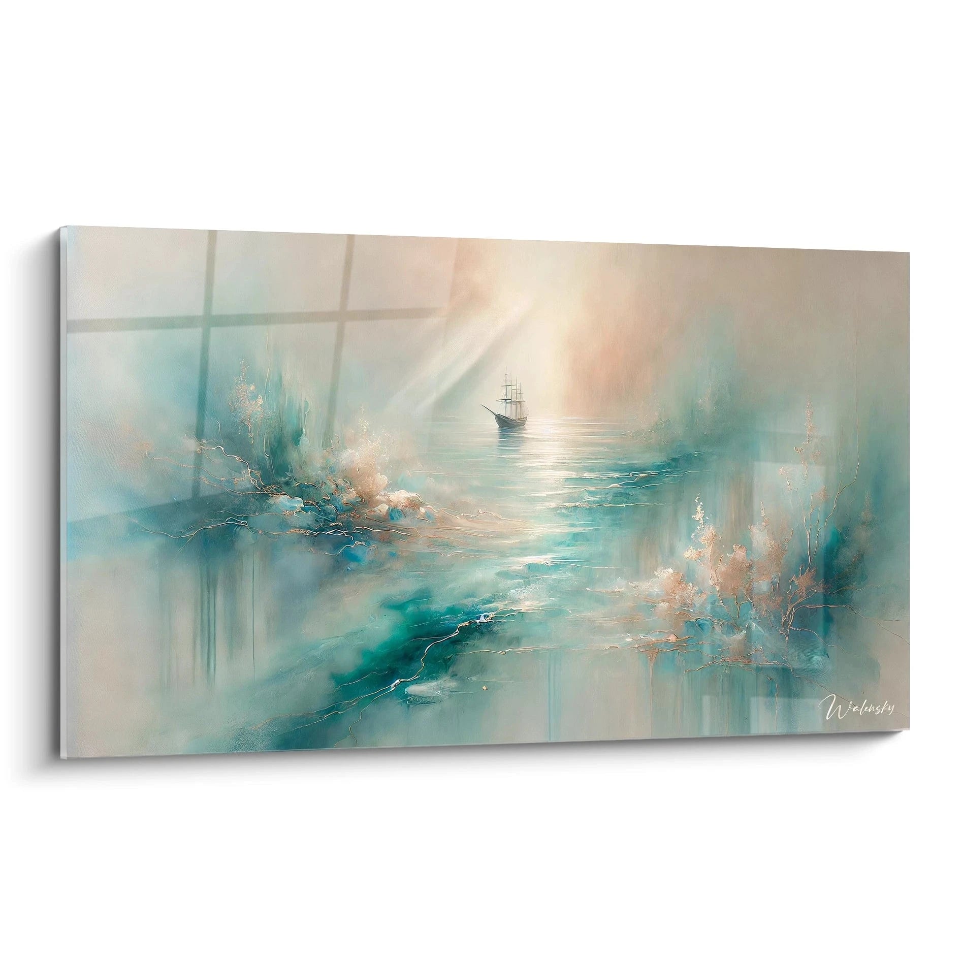
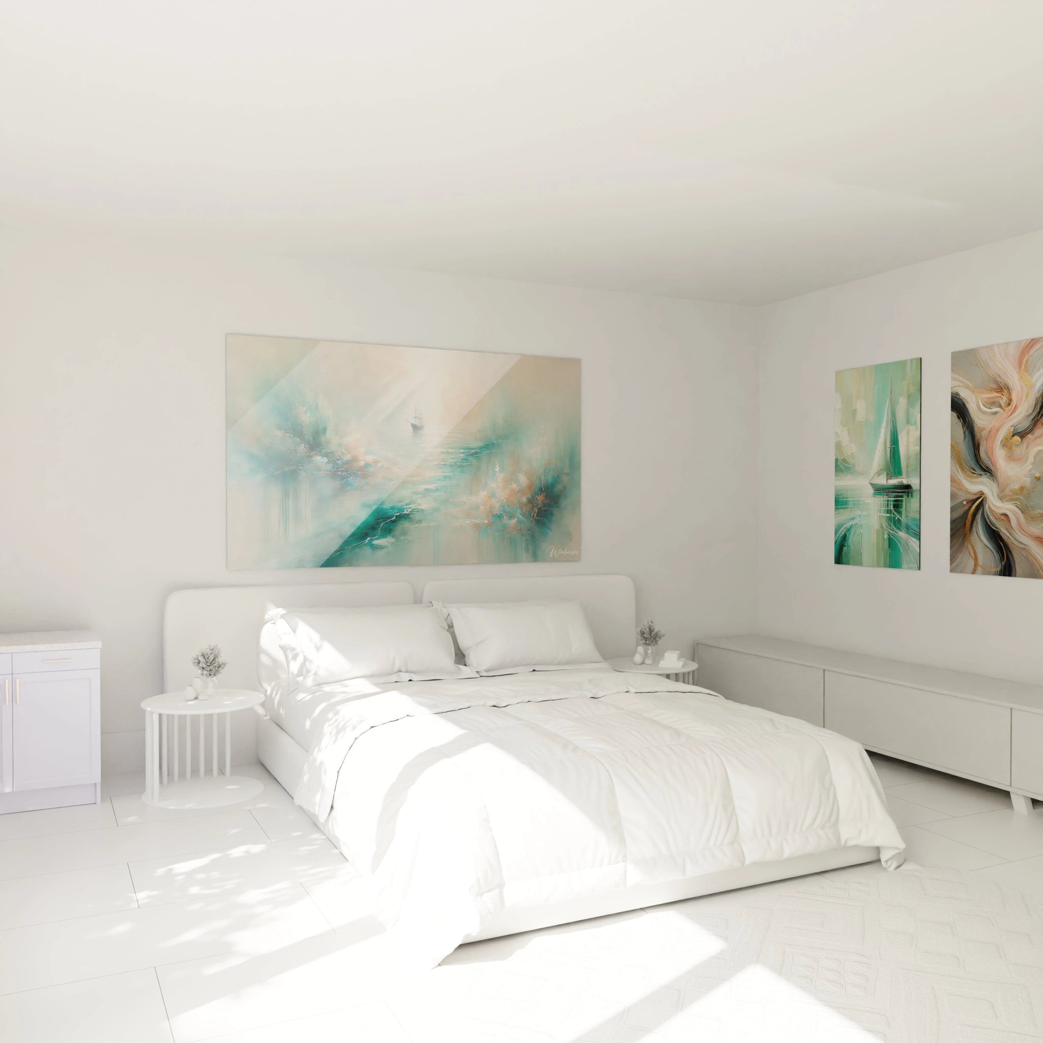
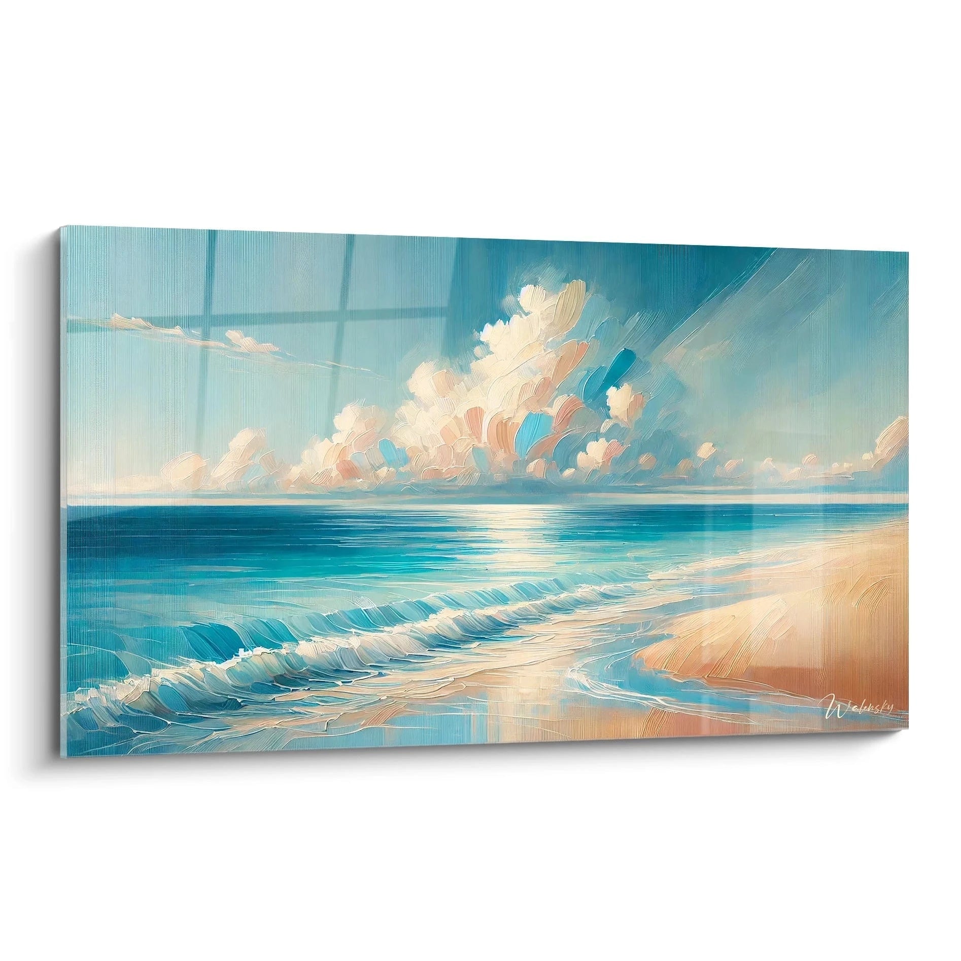
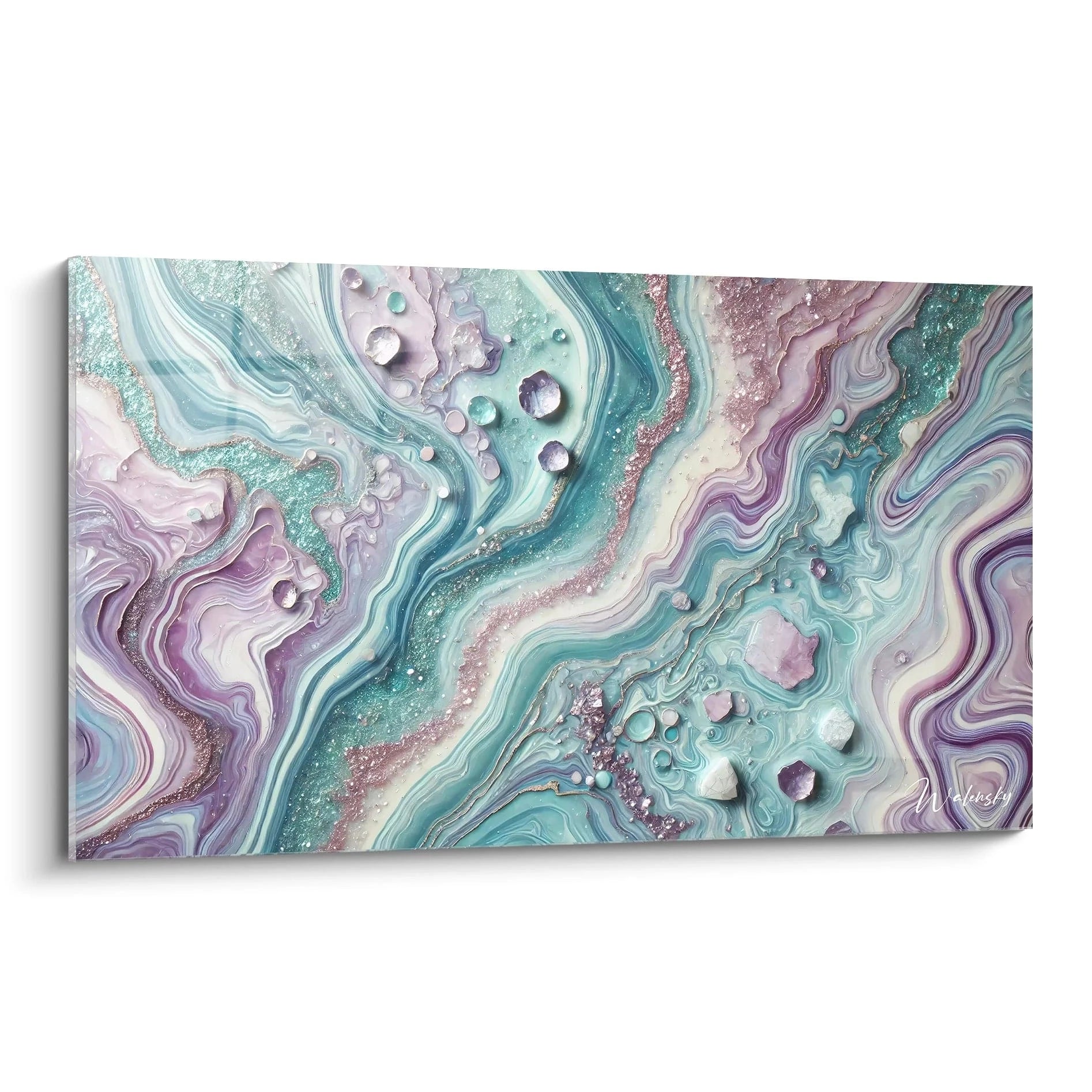
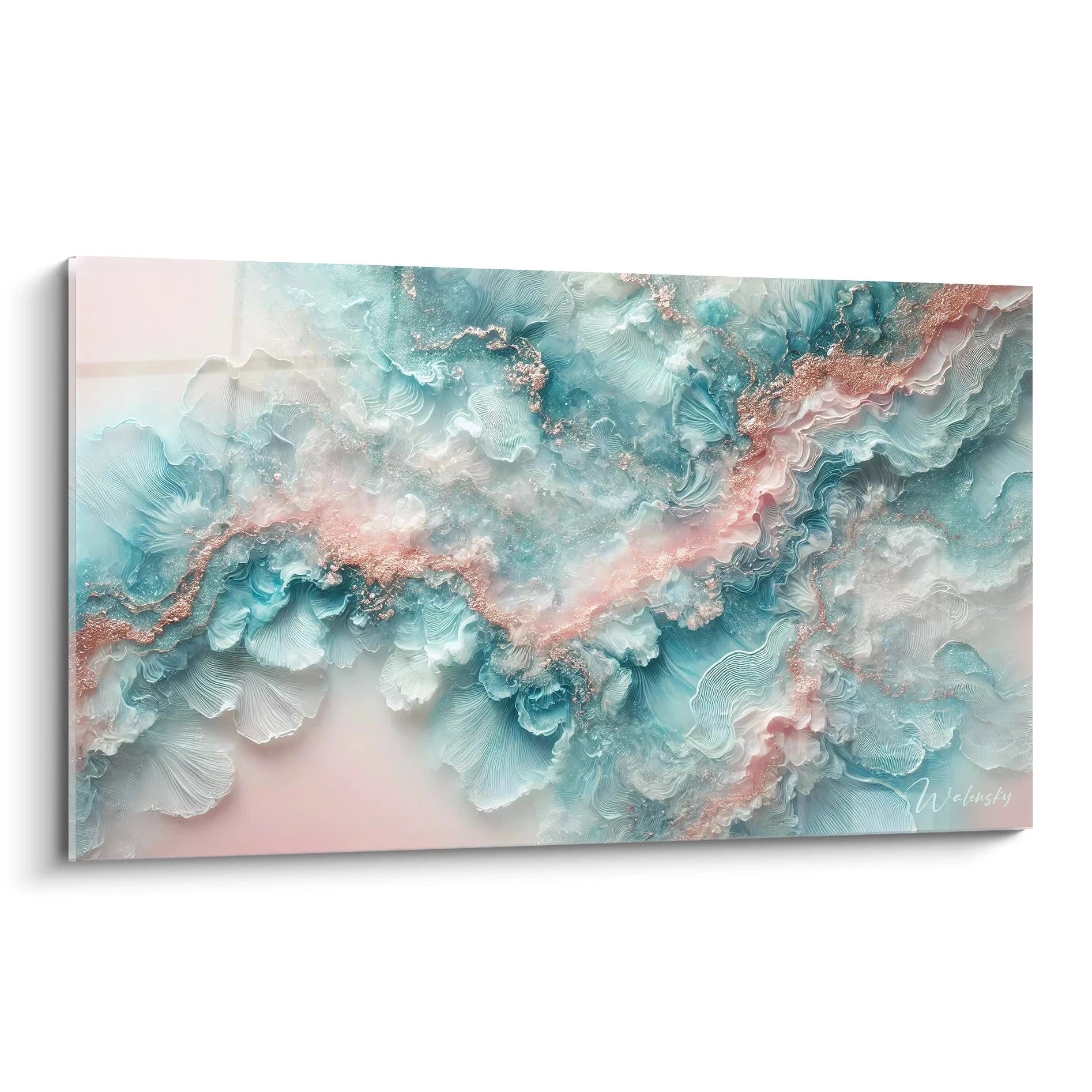
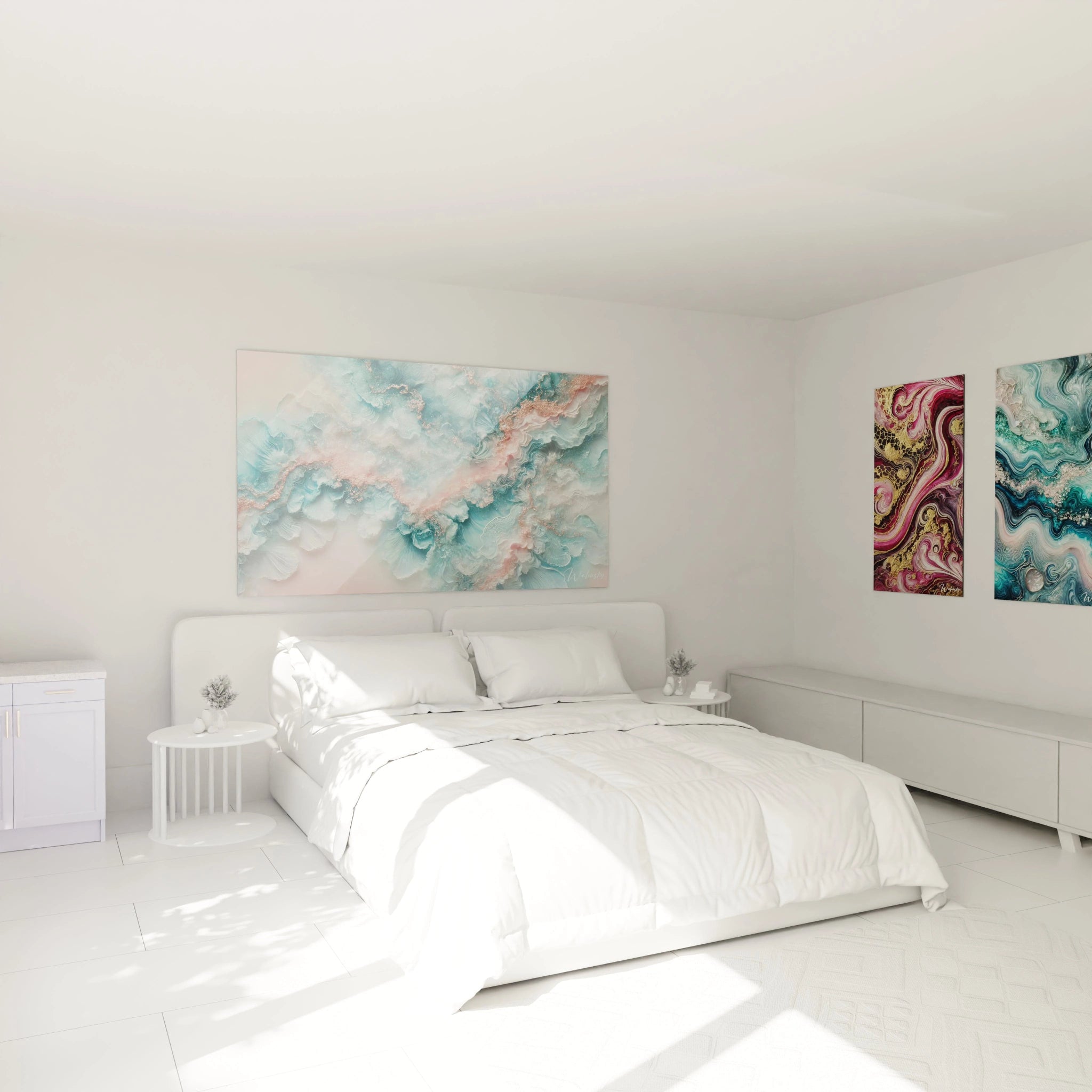
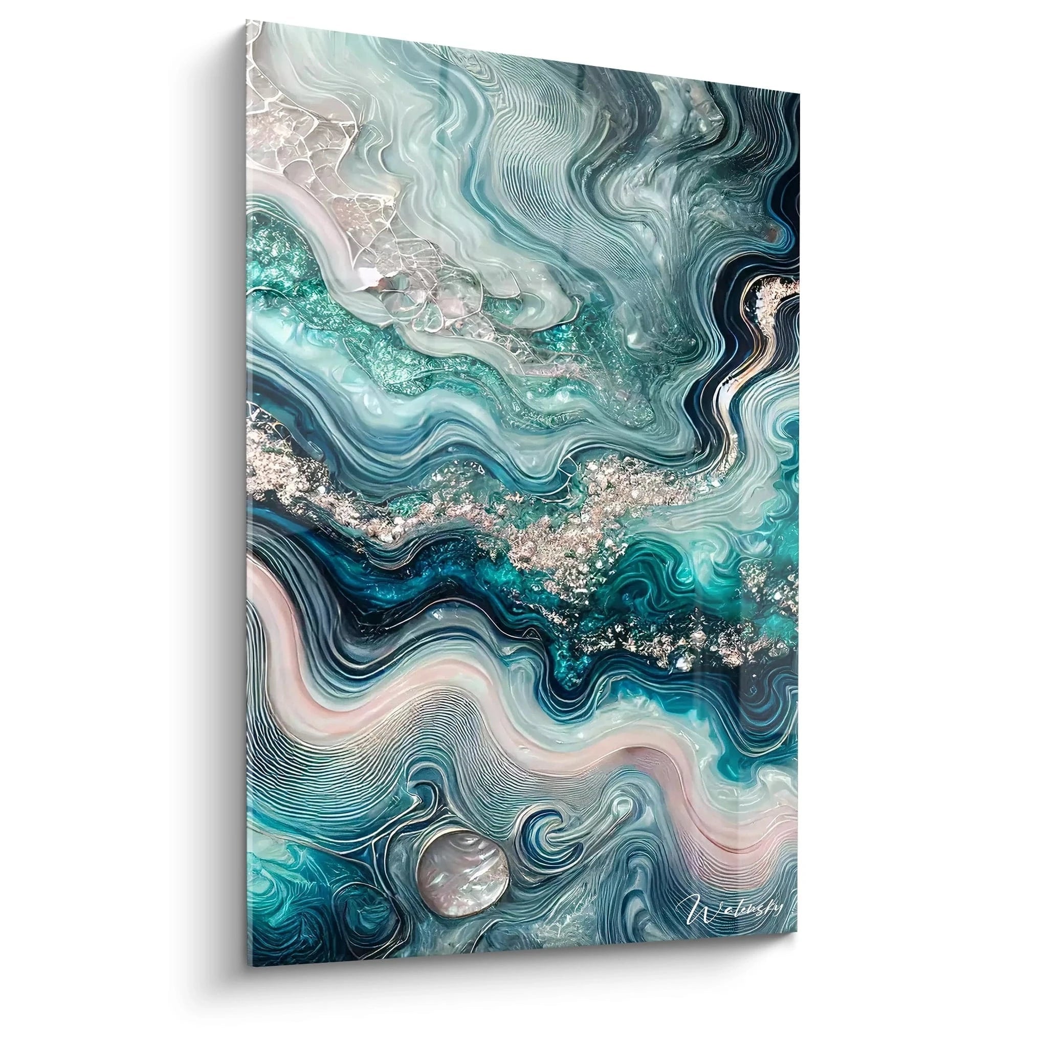
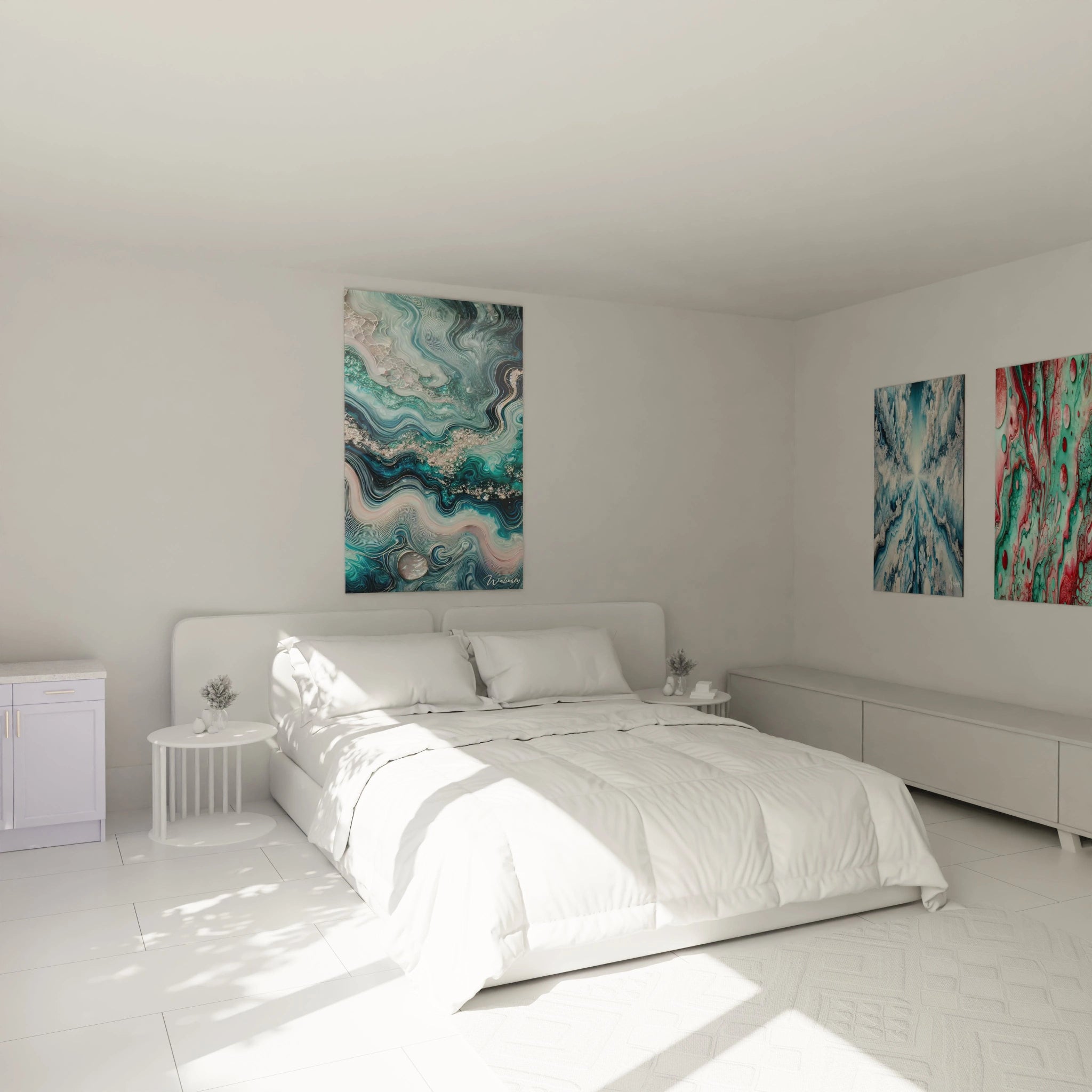
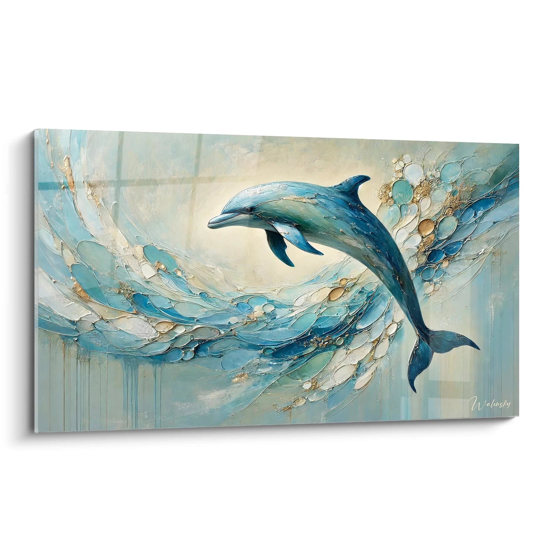
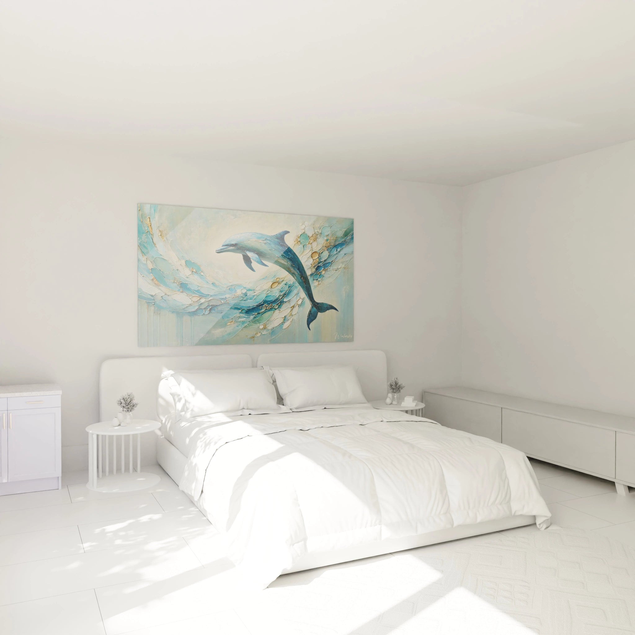
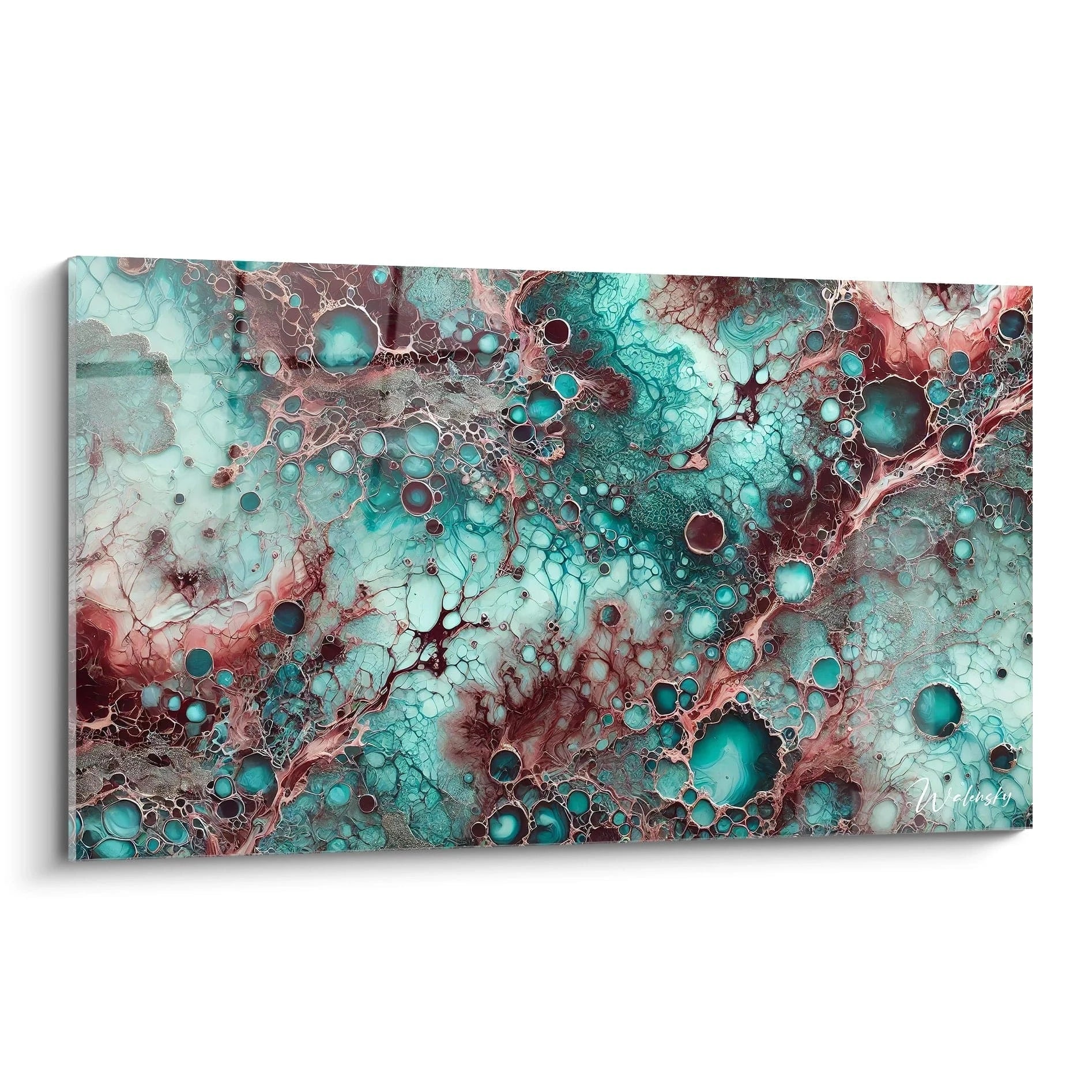
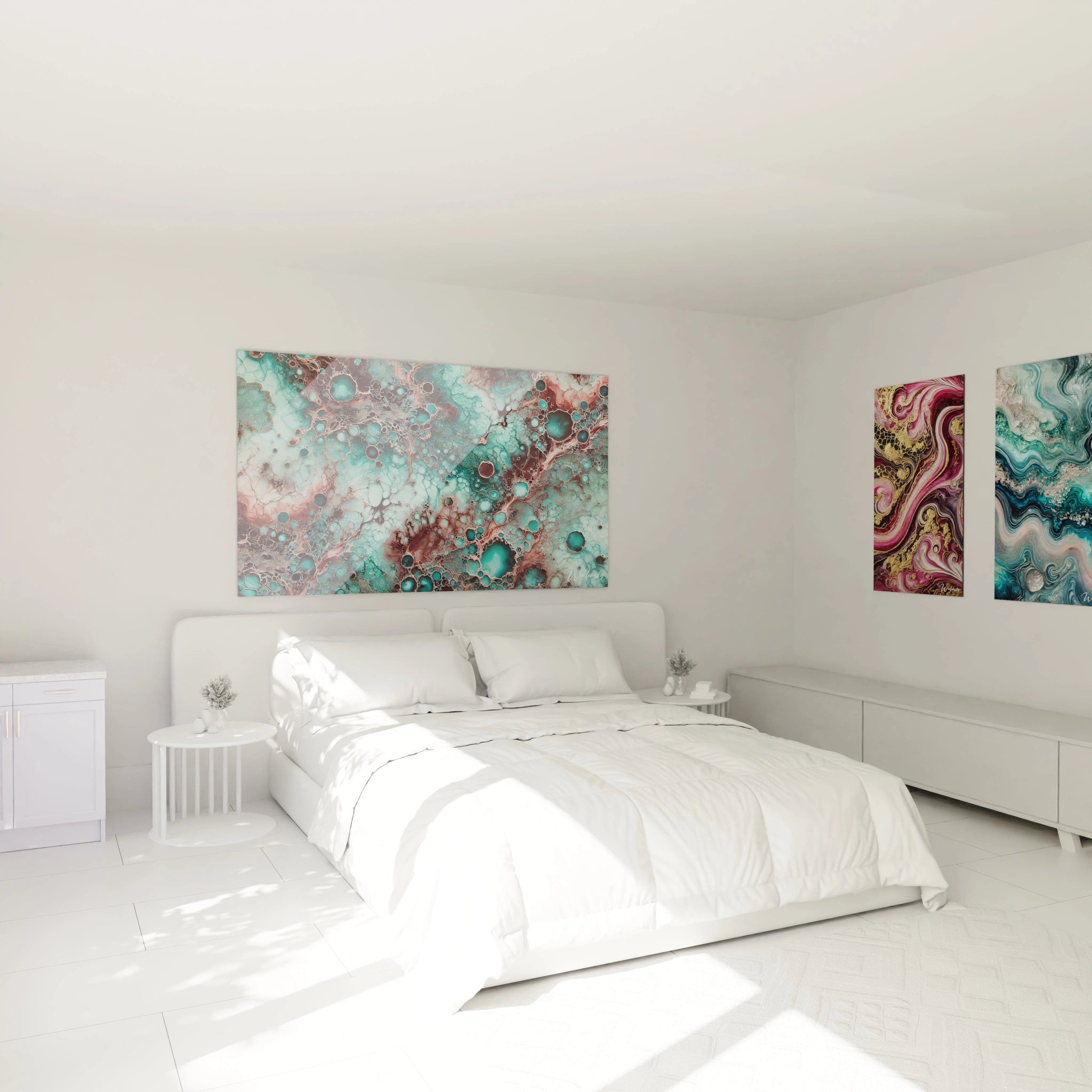
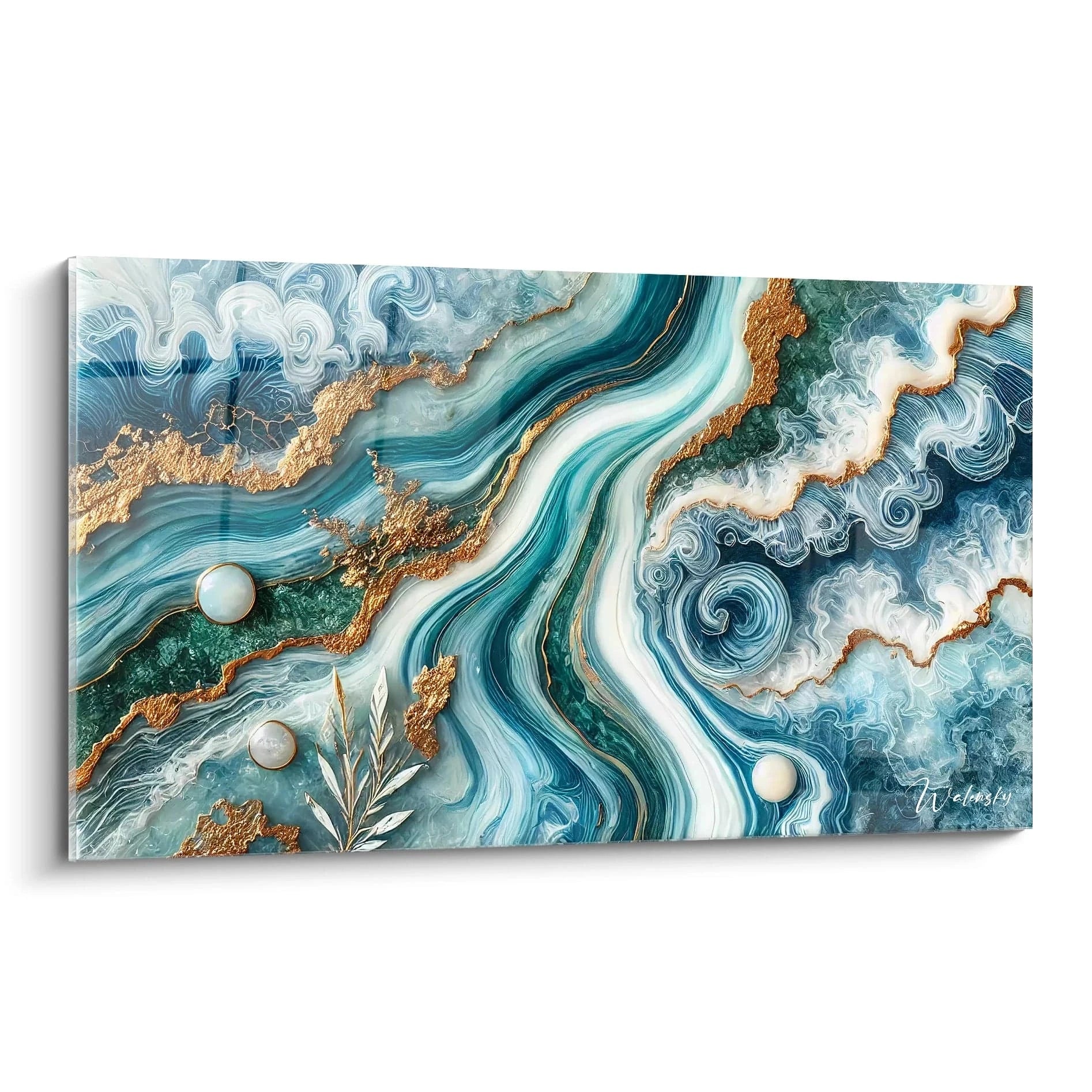
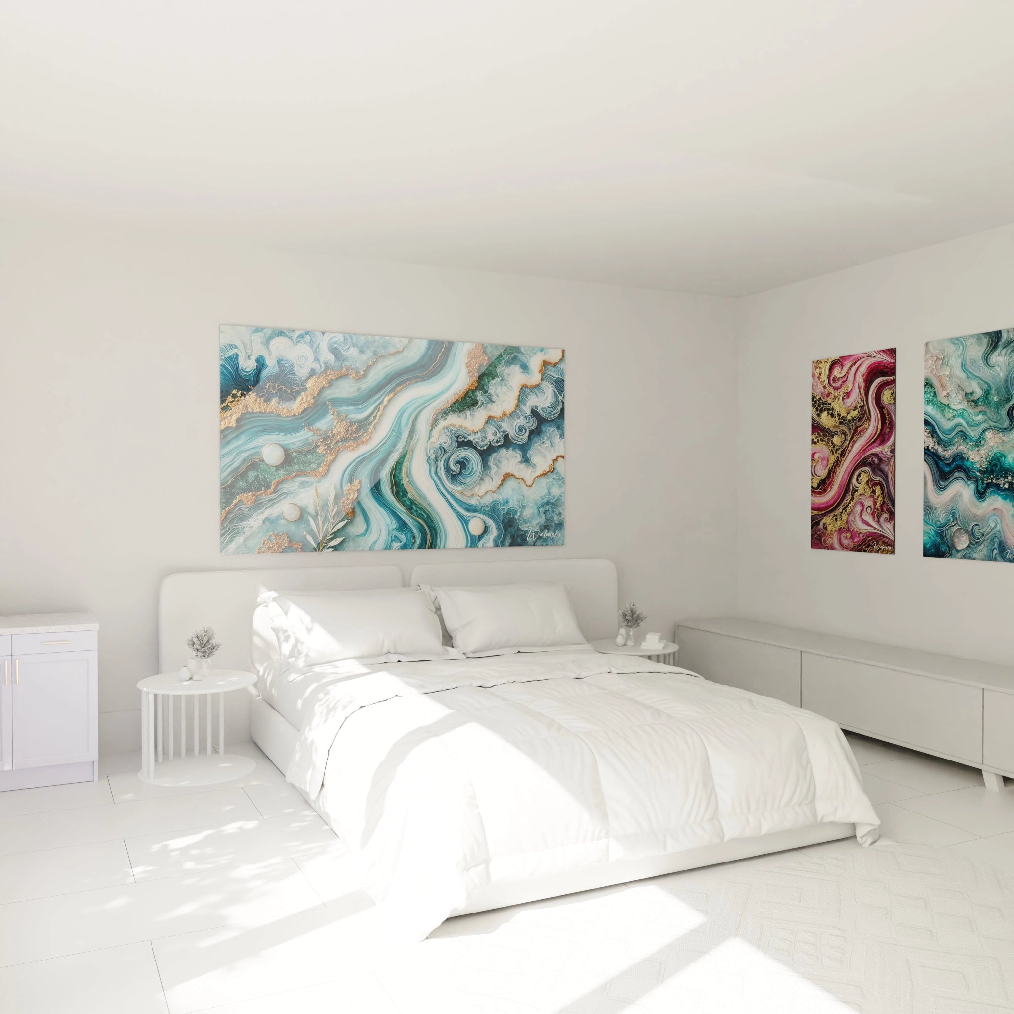
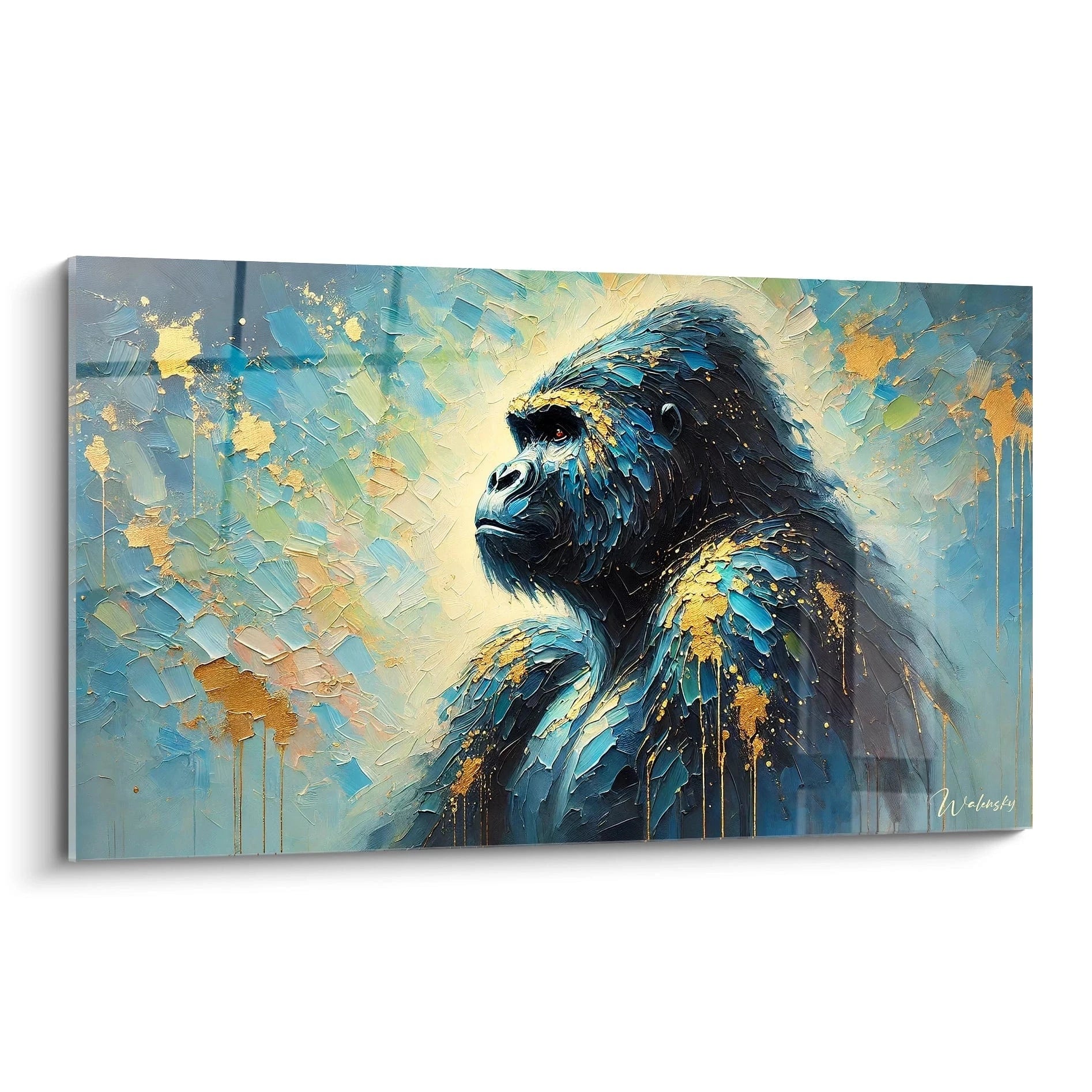
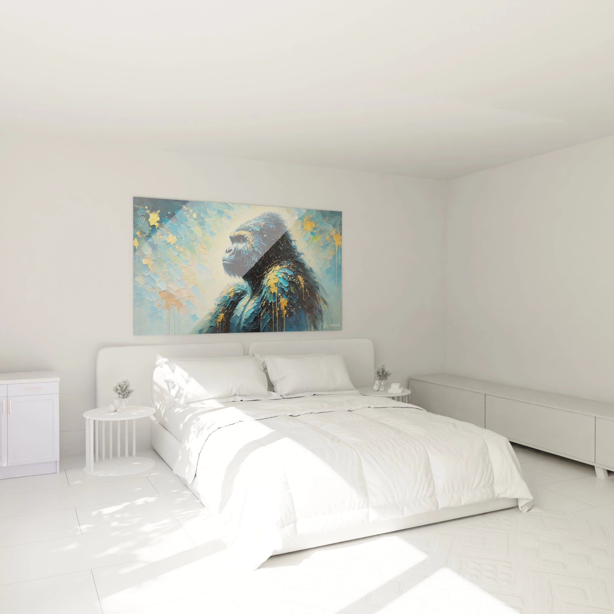
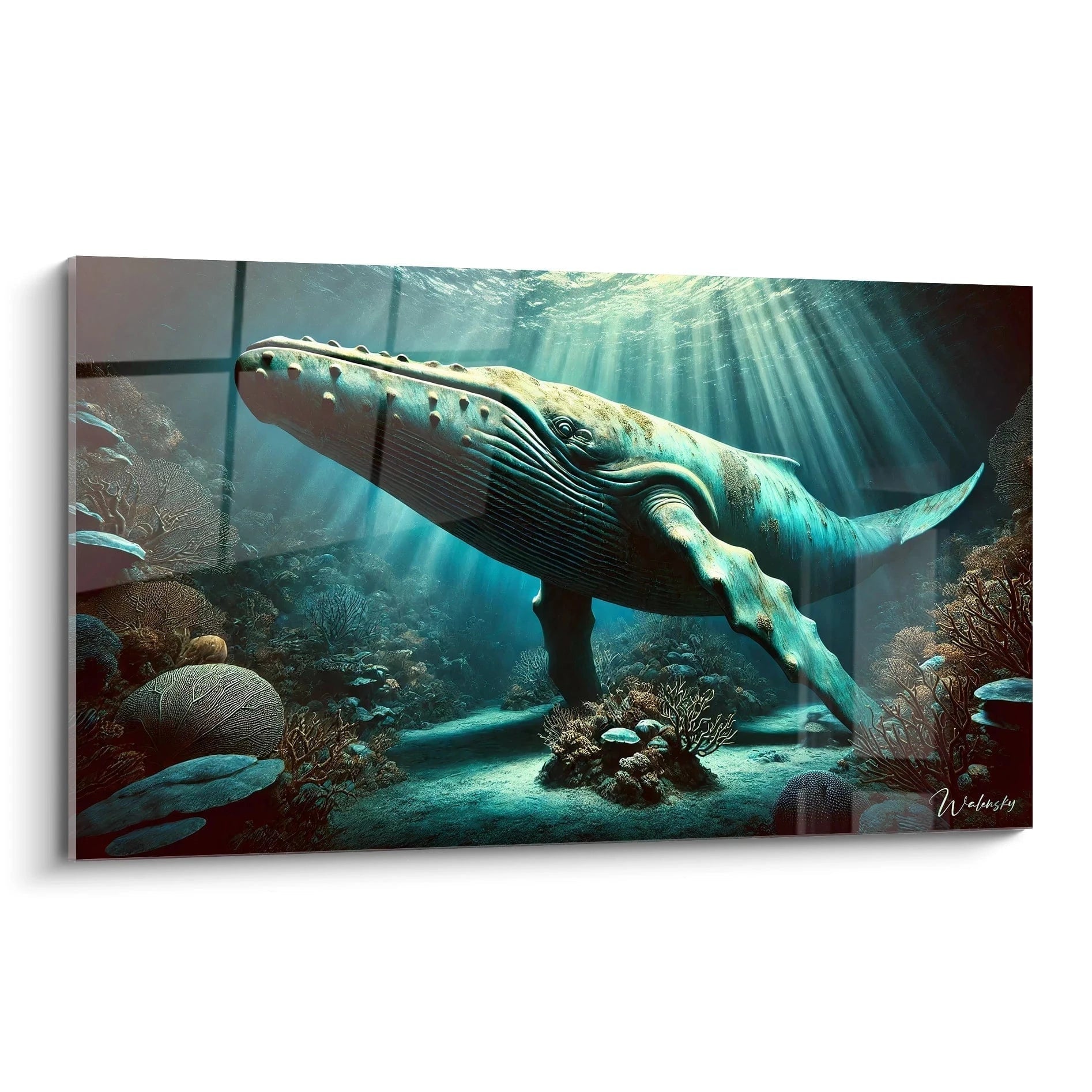
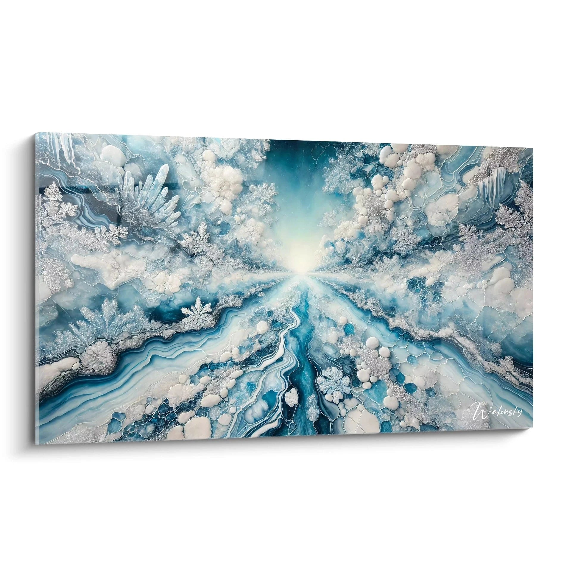
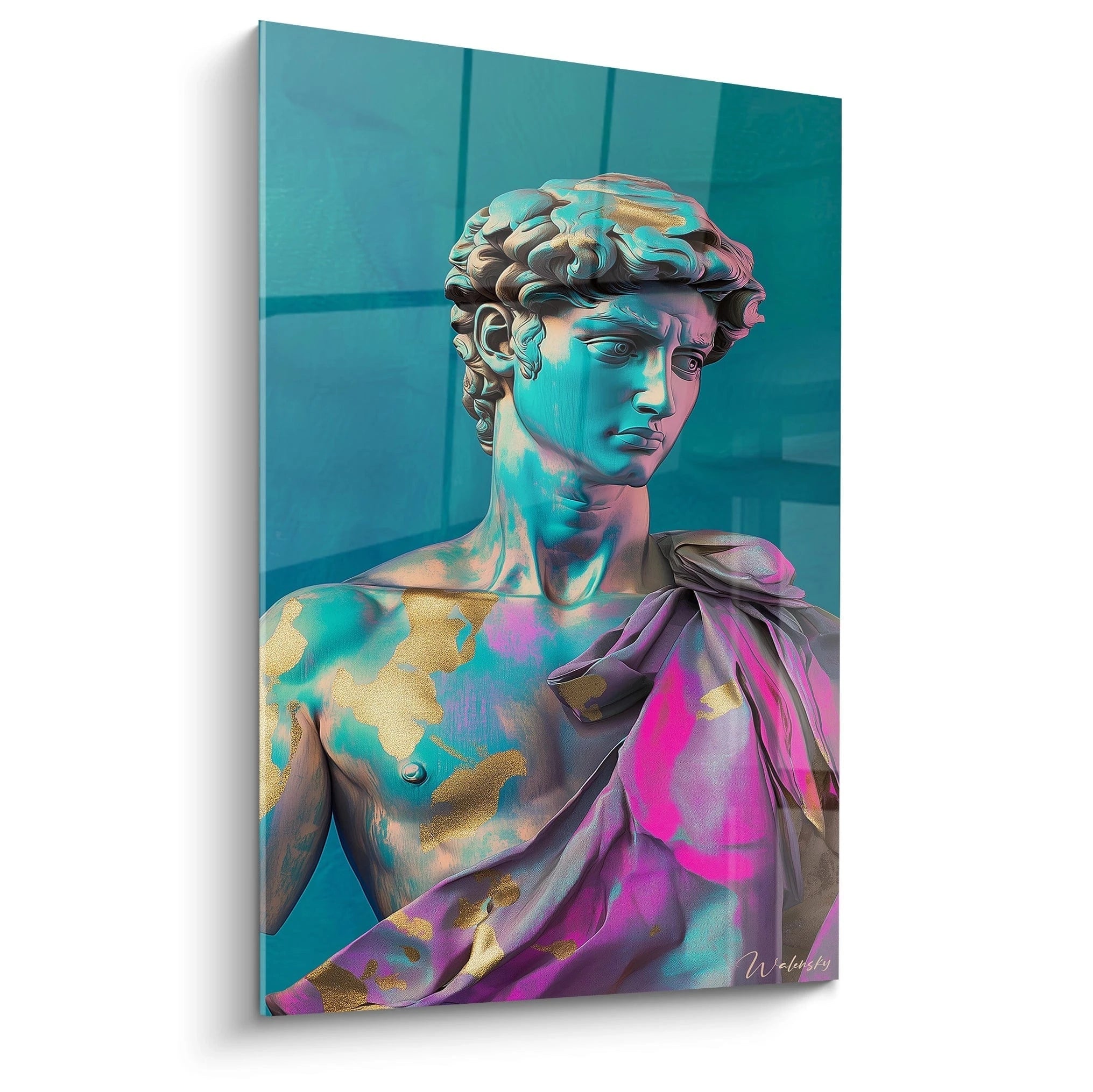
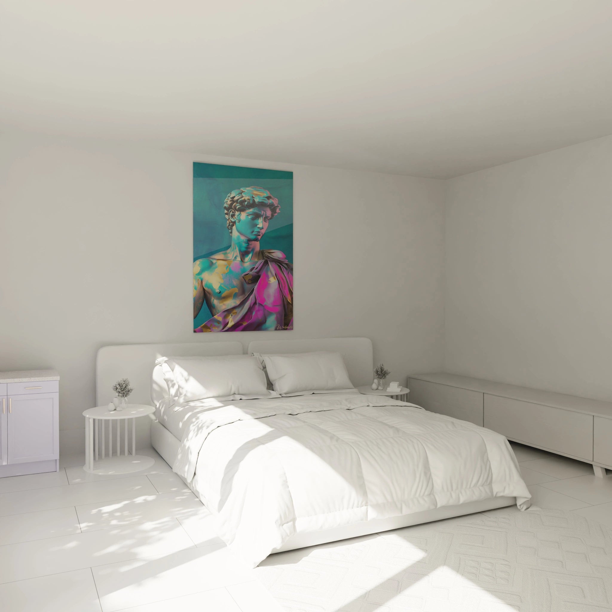
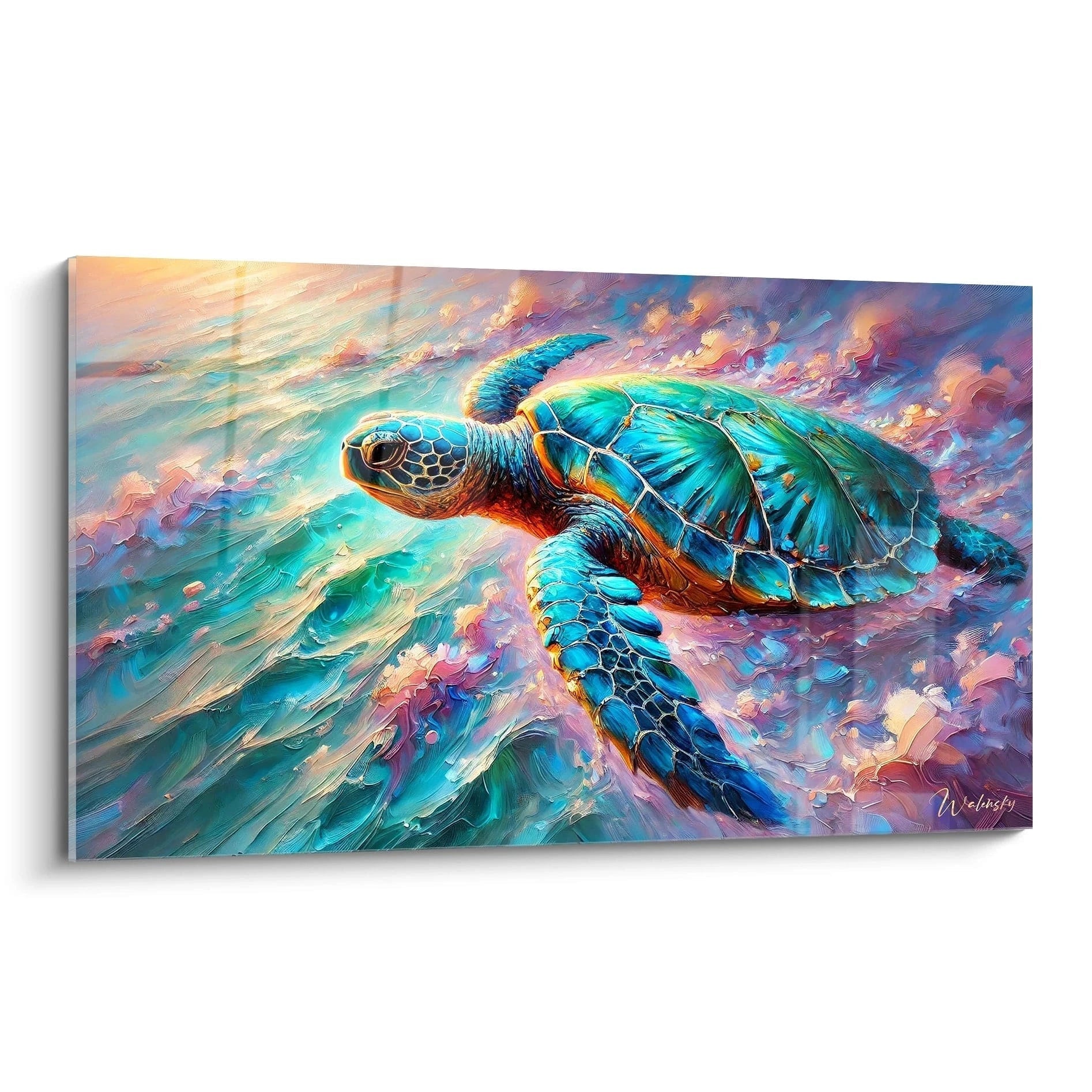
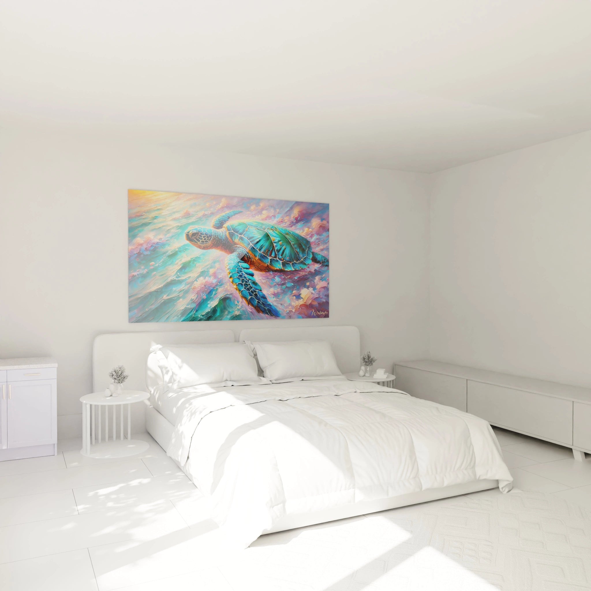
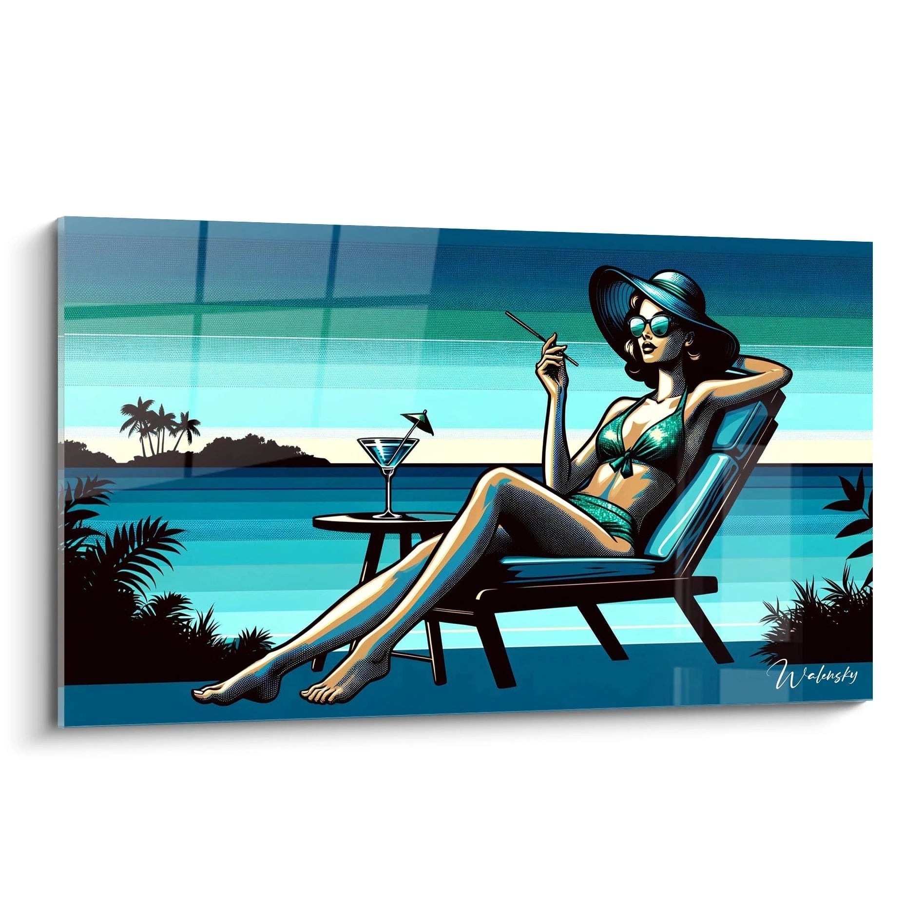
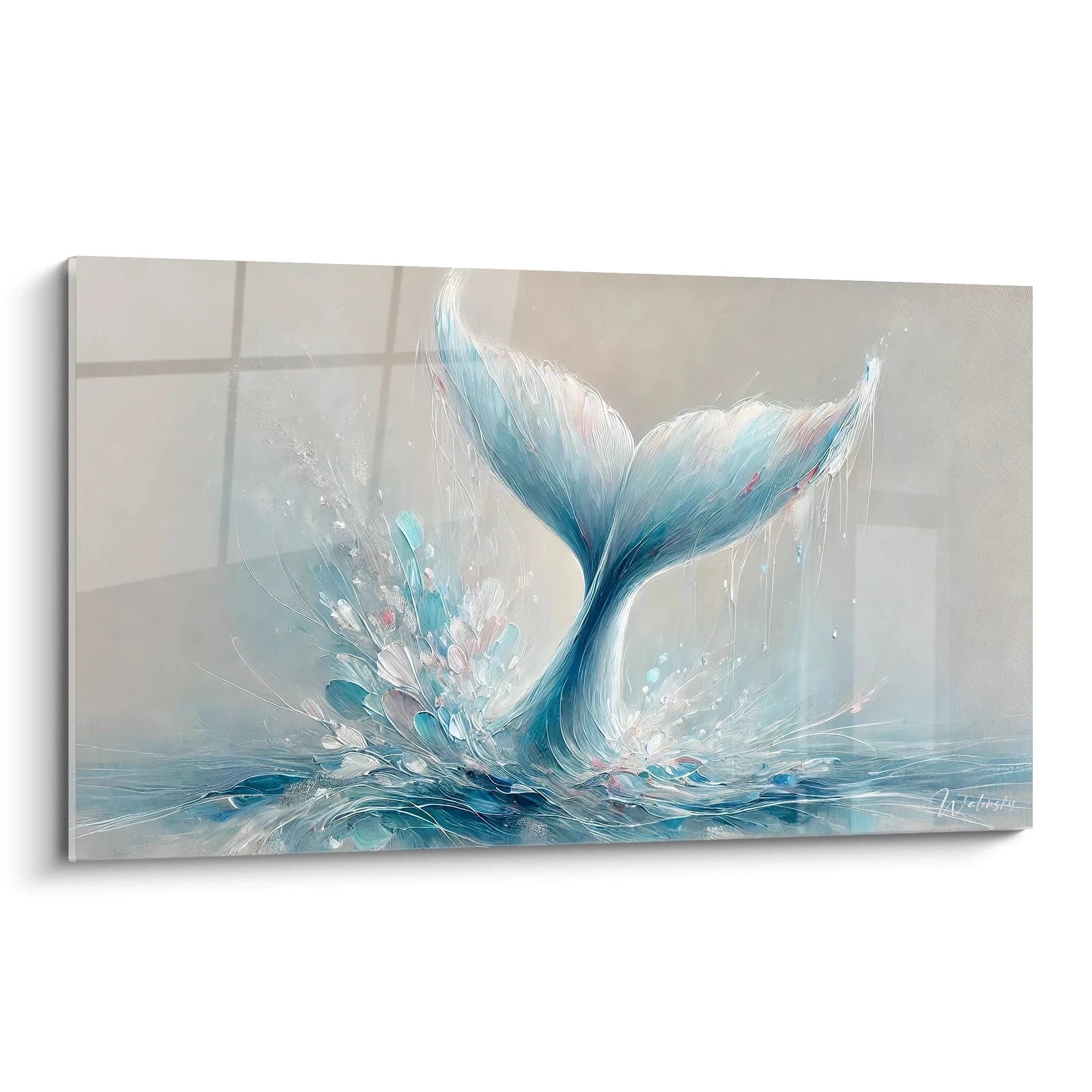
Turquoise wall art is a centerpiece that can transform an interior by infusing it with a touch of freshness and elegance. Whether it's a turquoise painting, a turquoise canvas or a turquoise illustration, this decorative element immediately captures attention and energizes the space. However, to avoid any false note, it is essential to pair it intelligently with your furniture and other interior decoration elements. Discover how to harmonize colors, choose suitable materials and integrate this wall art into different decorative styles for a result that is both aesthetic and balanced.
Ideal color associations for harmonious results
The choice of colors plays a key role in showcasing a
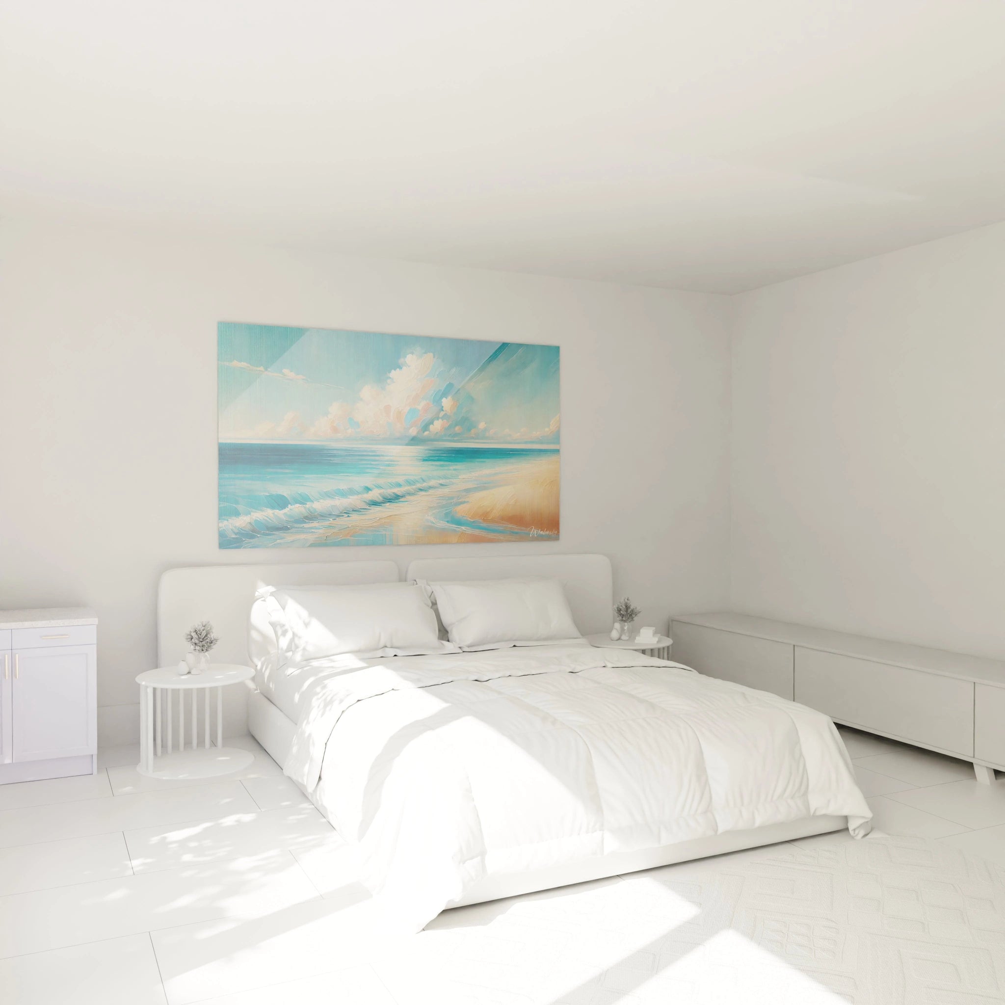
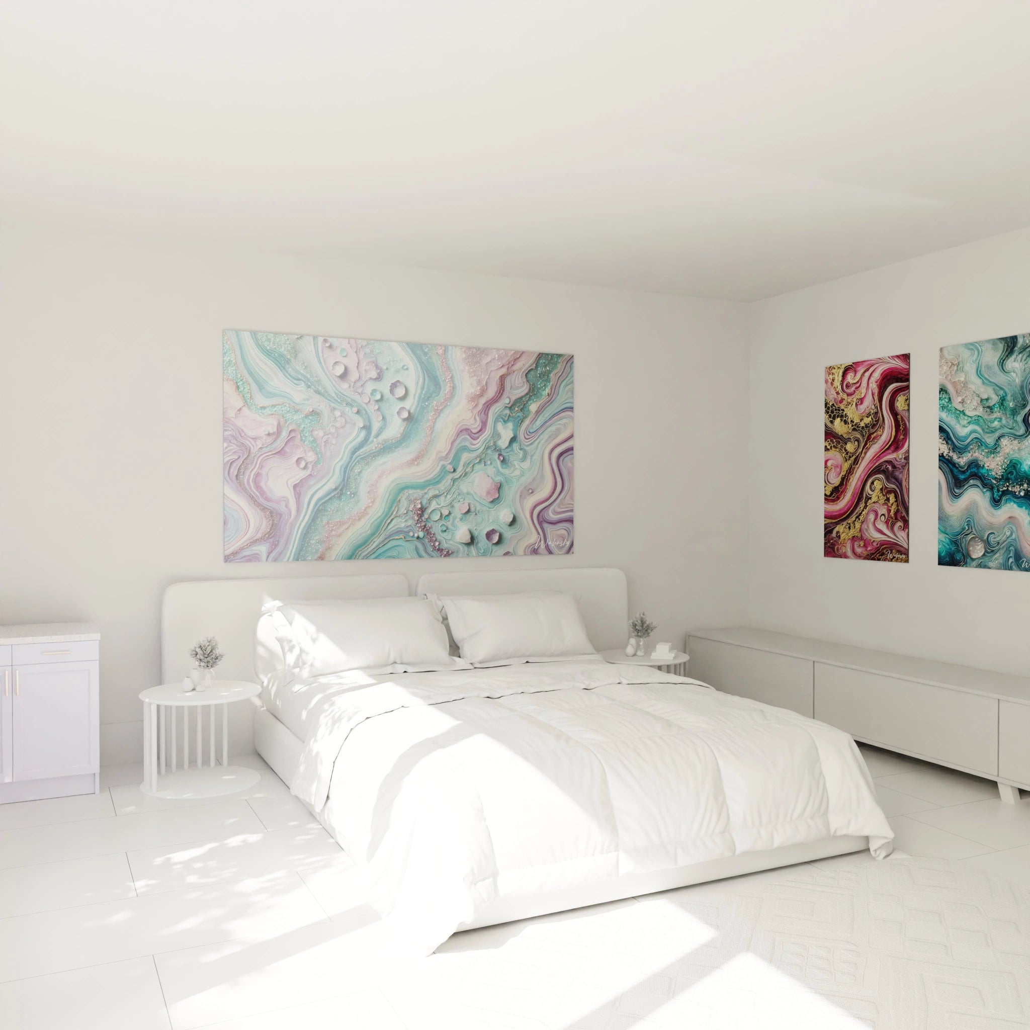
turquoise wall art . For a soft and soothing ambiance, opt for natural hues like beige, ivory or off-white. These colors allow you to highlight the wall art without cluttering the space.
If you seek sophisticated contrast, pair your modern turquoise painting with deep tones like anthracite gray, black or midnight blue. This play of opposites imparts timeless elegance to your interior. For a warmer effect, favor earthy shades like terracotta, ochre or mustard, which will add depth and a cozy aspect to your decoration.
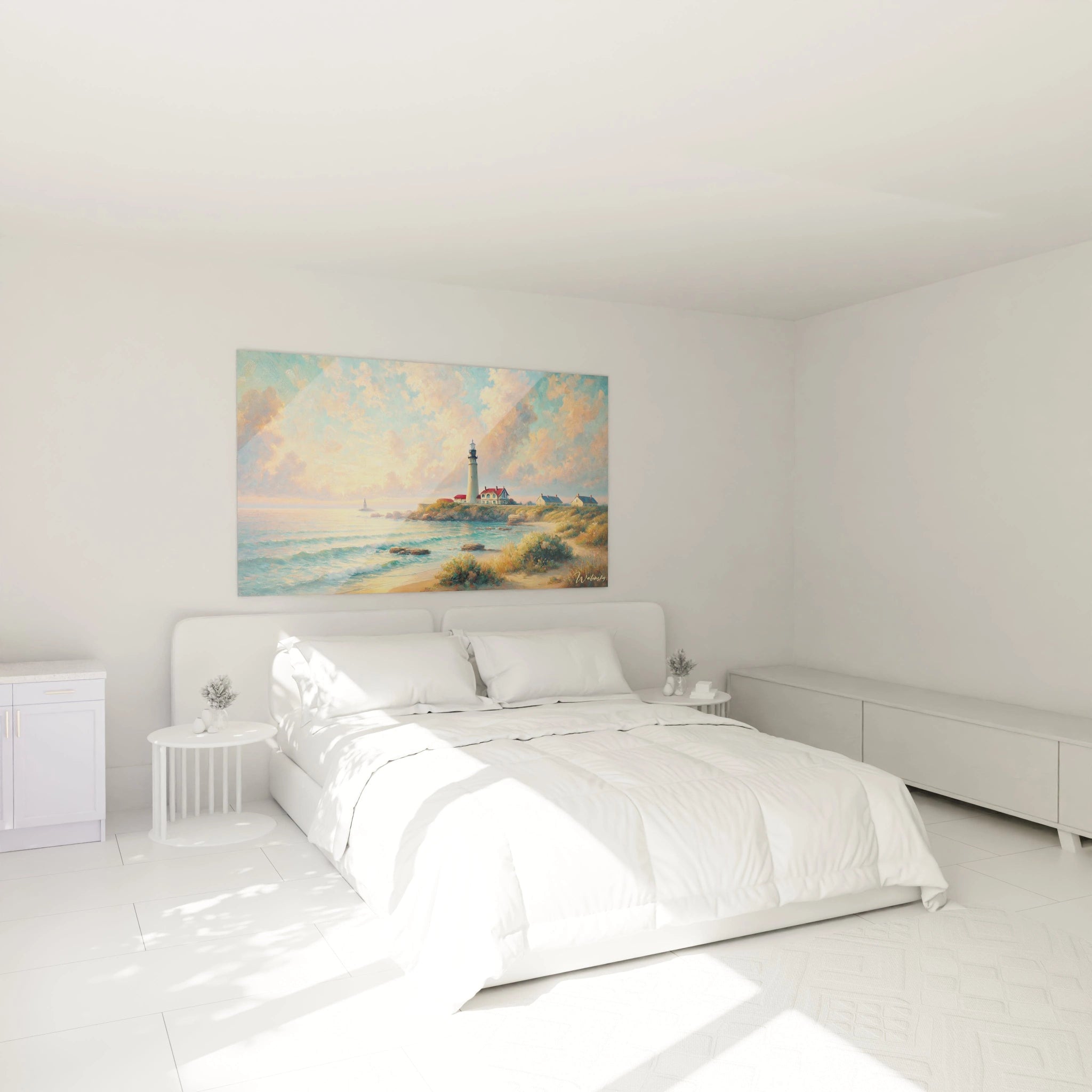
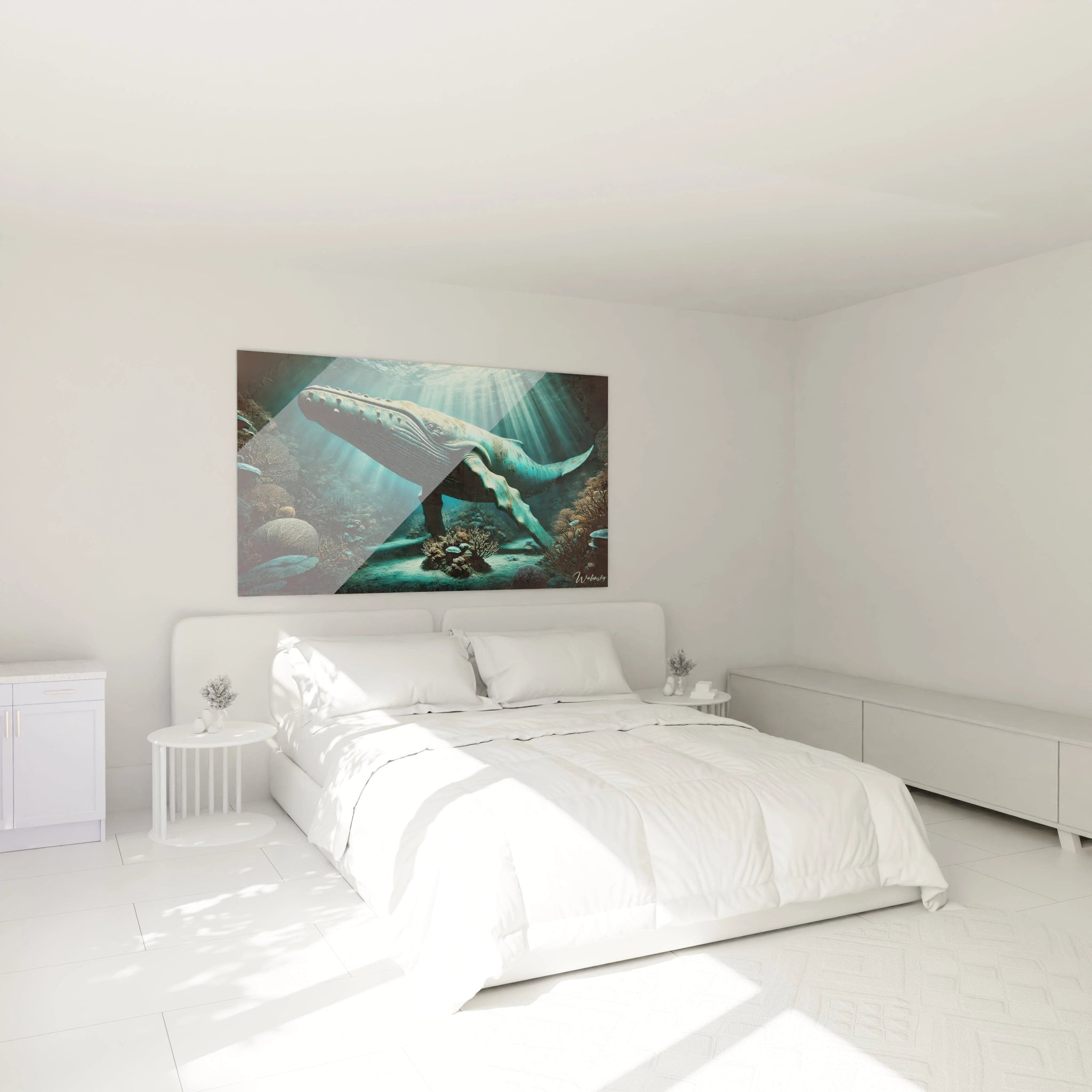
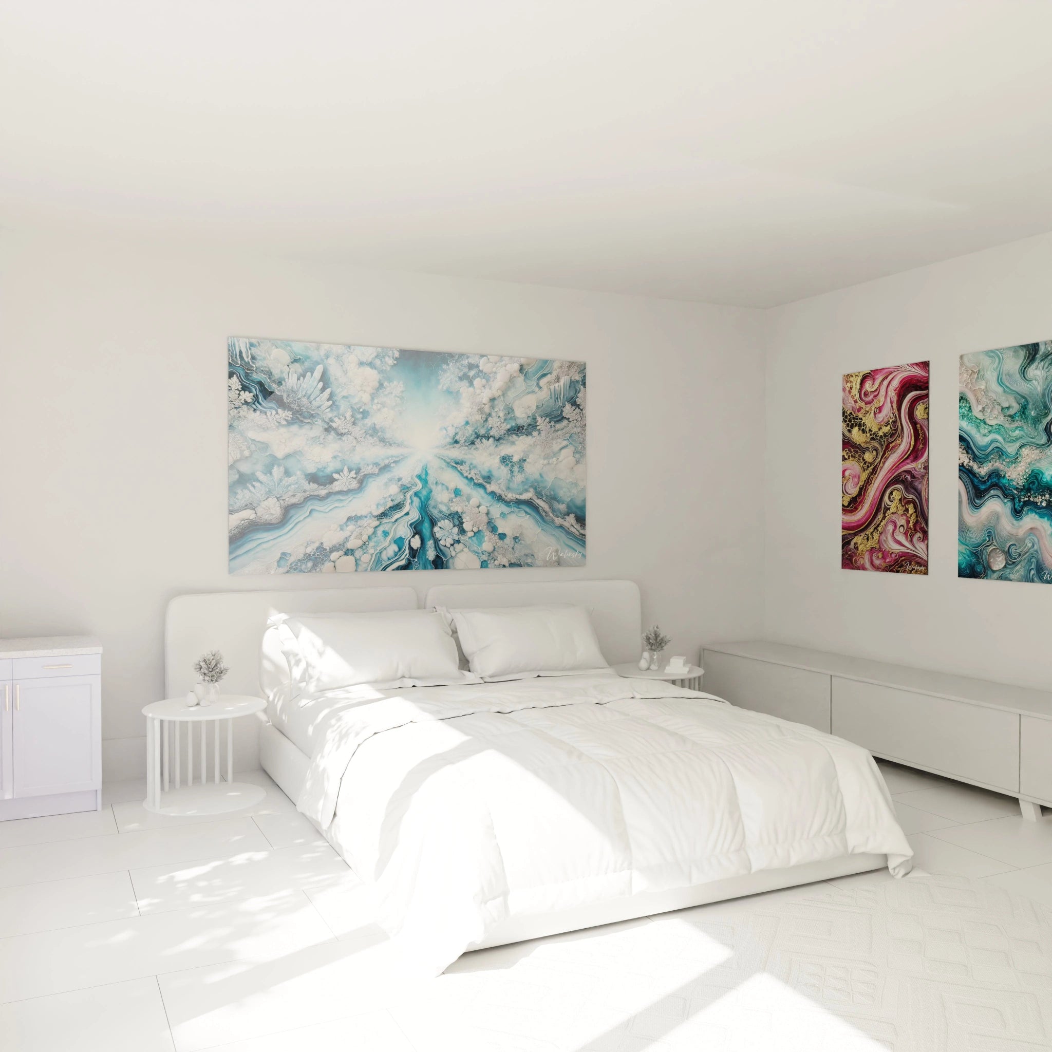
In a Mediterranean or seaside spirit, combine the turquoise painting with white and touches of sky blue. This association evokes seascapes and establishes a luminous and refreshing atmosphere.
Materials that enhance turquoise wall art
The choice of materials is essential to enhance your turquoise wall decoration and give it unique character. Certain materials allow you to exalt the beauty and luminosity of your turquoise abstract painting:
• Light wood: With its natural and soft nuances, it creates a warm and timeless effect. A table or shelves in light oak help enhance the brilliance of the turquoise artwork's blue pigments.
• Black or golden metal: Ideal for industrial or contemporary decoration, it accentuates the modern side of the turquoise design wall art. Opt for lighting fixtures or a metal frame to visually structure your space.
• Glass and reflective surfaces: A glass coffee table or mirror strategically placed around your turquoise wall painting allows you to play with light and emphasize the depth effect.
Integration into Scandinavian, bohemian or industrial palettes
Turquoise wall art adapts to different decorative styles depending on the associations you create:
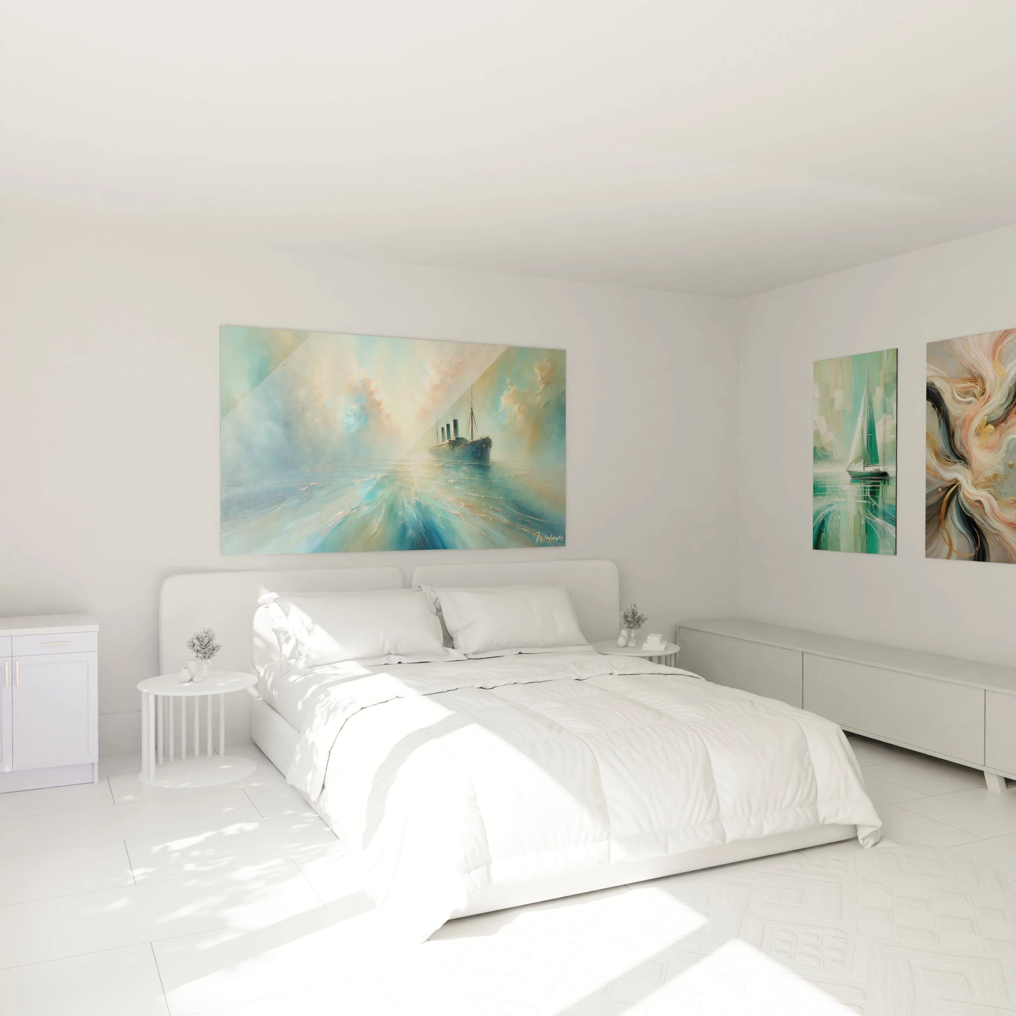
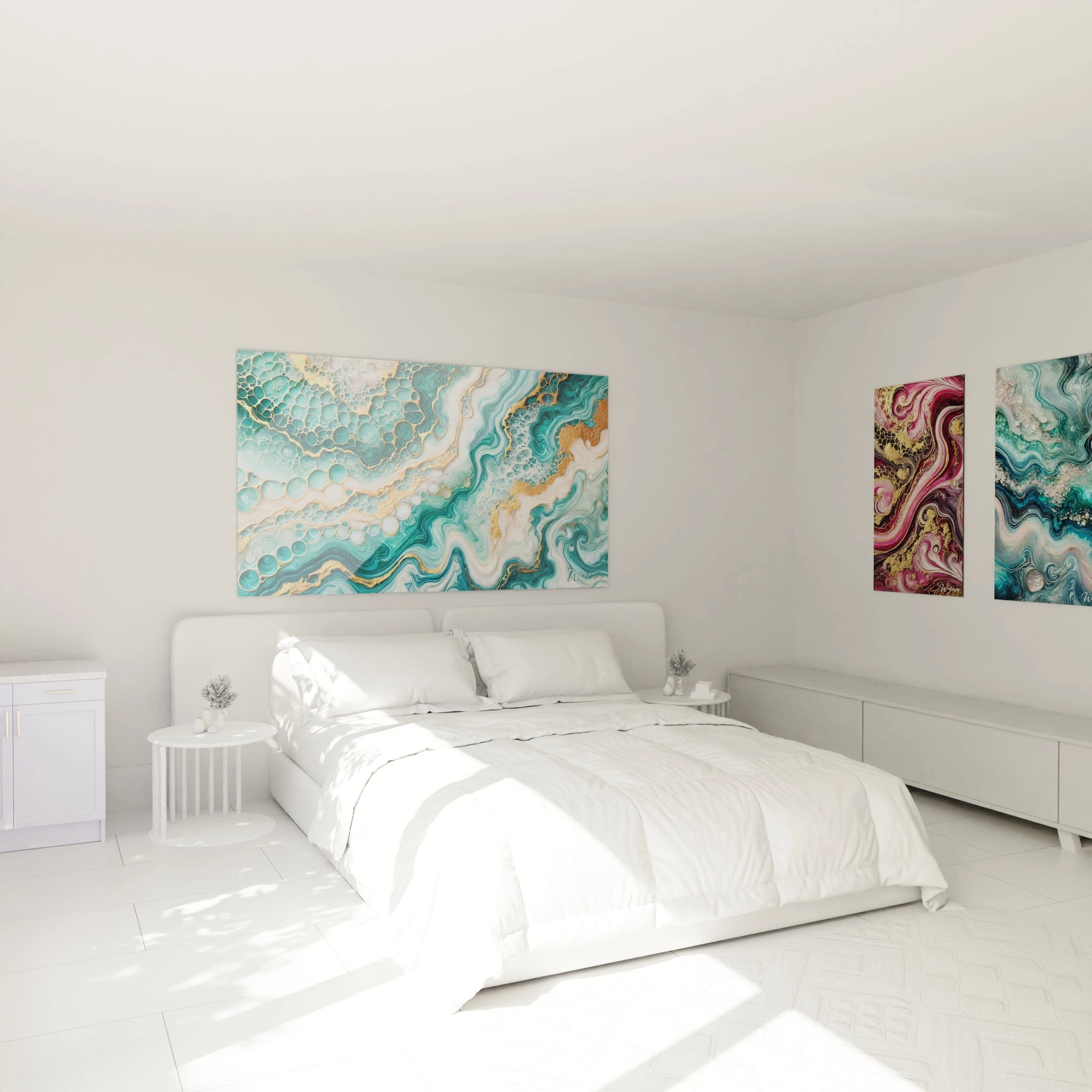
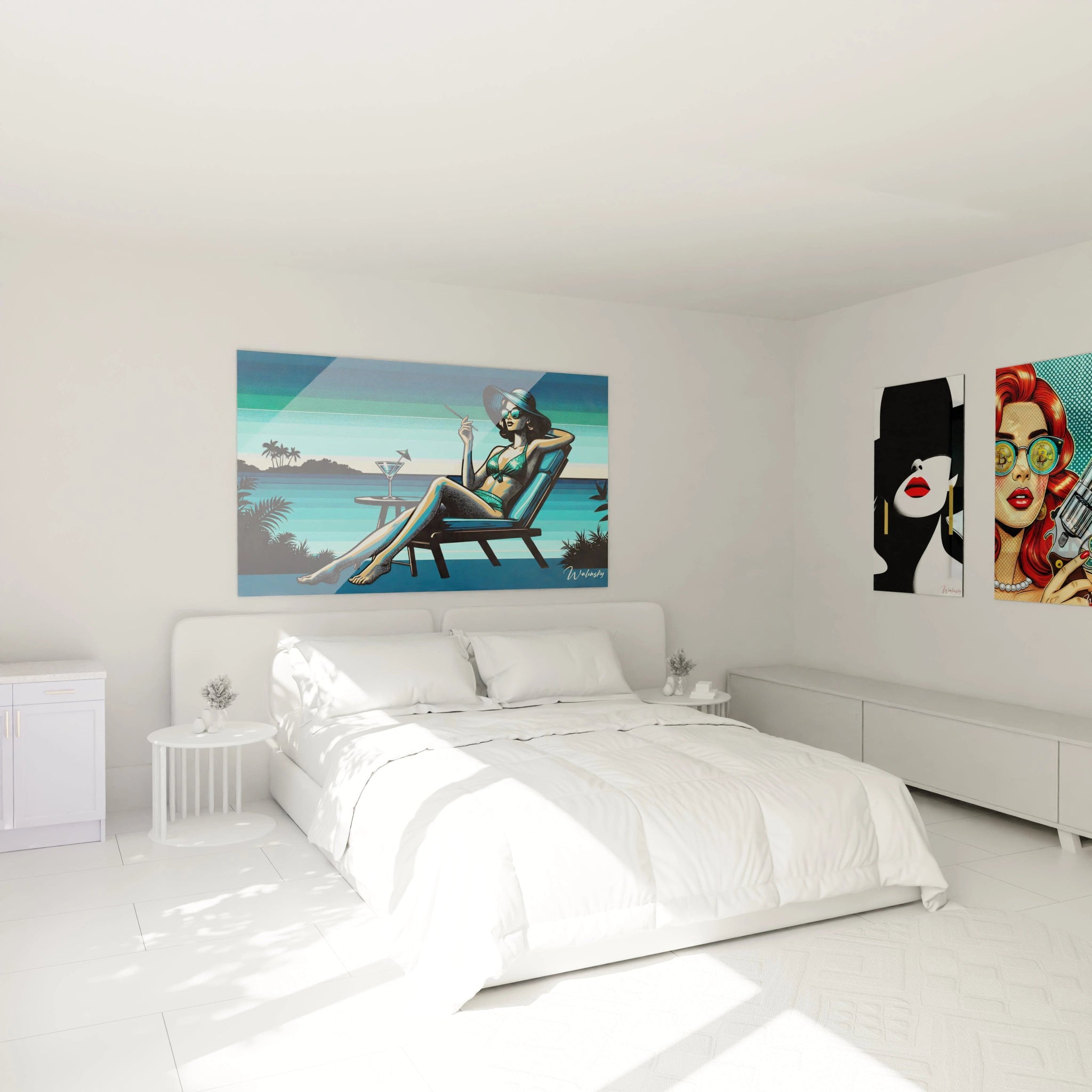
• Scandinavian style: Pair your turquoise canvas with white walls, a linen sofa and light wood furniture. The minimalism and simplicity of this style allow the turquoise color to stand out while maintaining a soothing ambiance.
• Bohemian style: Focus on natural materials like rattan, jute or wool and add cushions and rugs with ethnic patterns. The contemporary turquoise painting brings a vibrant and dynamic touch to this warm and relaxed universe.
• Industrial style: Here, contrast is key. Pair your turquoise illustration with concrete surfaces, steel furniture and aged leather. This mix of raw textures reinforces the modern and sophisticated character of your interior.
The importance of contrast with walls and textiles
The color harmony between your turquoise wall art and your furniture relies greatly on well-balanced contrasts. If your wall is already painted in a strong tone, favor a sober frame or a location where natural light can accentuate the reflections of your turquoise painting.
Textiles also play a key role:
• Opt for natural linen curtains, which will bring a light and airy touch without visually overwhelming your turquoise artistic canvas.
• Add mustard or terracotta velvet cushions to balance the freshness of turquoise with warm touches.
• A Berber rug with subtle patterns can complete the set by bringing an enveloping texture and subtle contrast.
Mistakes to avoid in choosing complementary hues
Integrating turquoise wall art into decoration requires some reflection to avoid design mistakes. Here are some common errors to avoid:
• Too much blue or green: If your interior is already dominated by these hues, the turquoise design wall art risks blending into the décor without really standing out. Introduce contrasts with warmer colors.
• Overly saturated colors: Overly vibrant hues like scarlet red or hot pink can create visual dissonance and harm color harmony. Prefer more muted and natural tones.
• Poor placement: A turquoise abstract painting should not be lost among too many decorative elements. Let it breathe on a clean wall so it fully captures attention.
• Inadequate lighting: If the light is too dim or poorly directed, the brilliance of your turquoise canvas will be diminished. Use LED spotlights or wall sconces to enhance its blue pigments.
Successful integration of turquoise wall art relies on a subtle balance between colors, materials and the arrangement of elements. Whether your interior is refined, warm or industrial, this artistic frame can become a central piece and structure your decoration with elegance. By playing with shades, textures and artistic expression, you'll create a space that is both aesthetic and harmonious, where every detail contributes to a coherent and refined decorative trend.