- View all
- Abstract
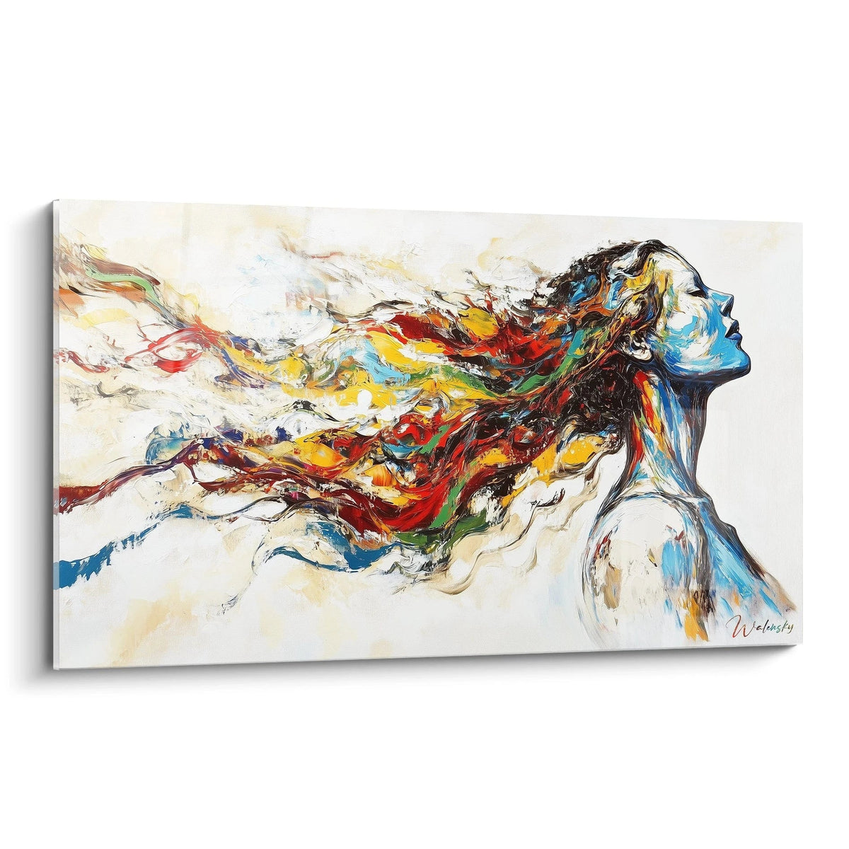
- Colorful Abstract
- Blue marble abstract
- Black and Gold Abstract
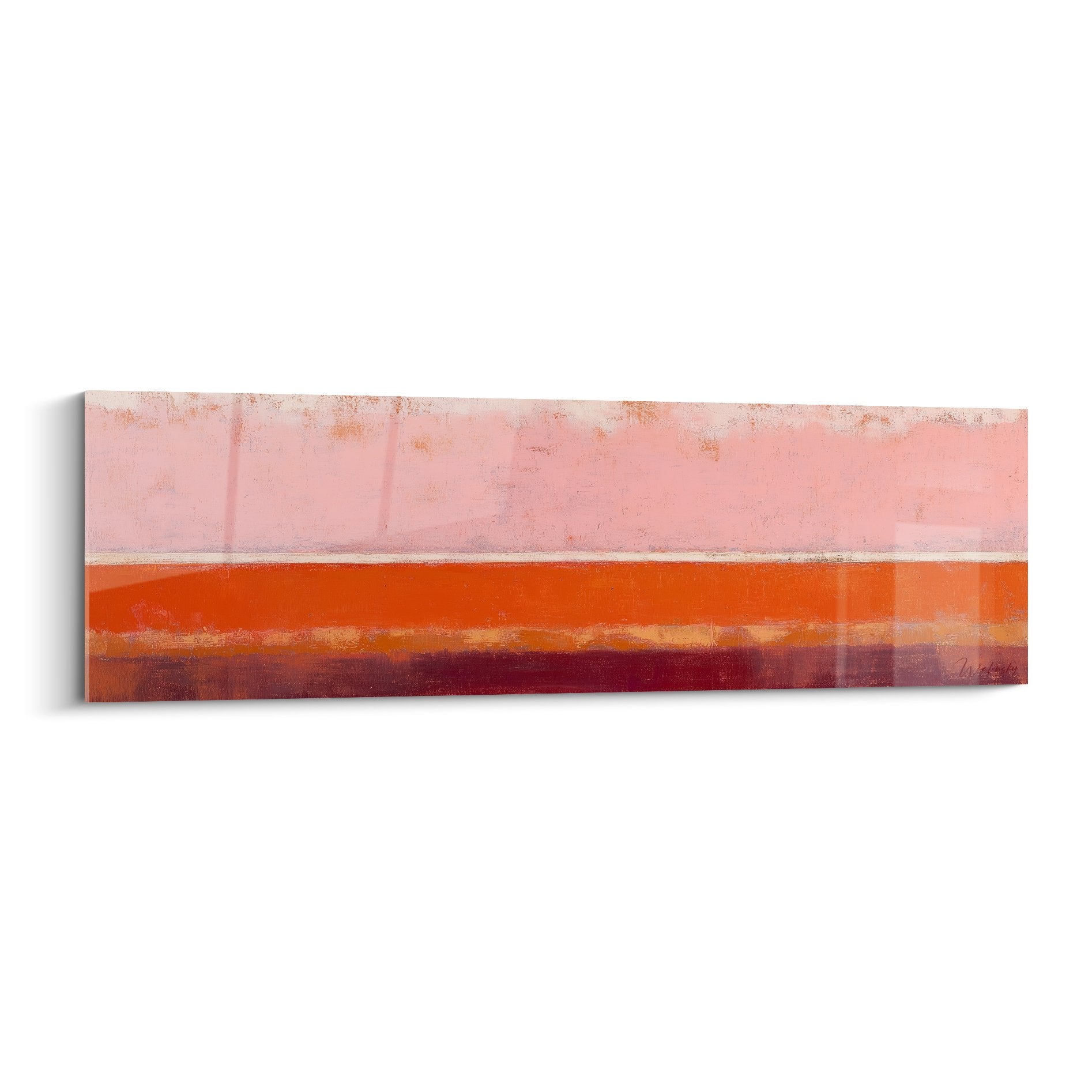
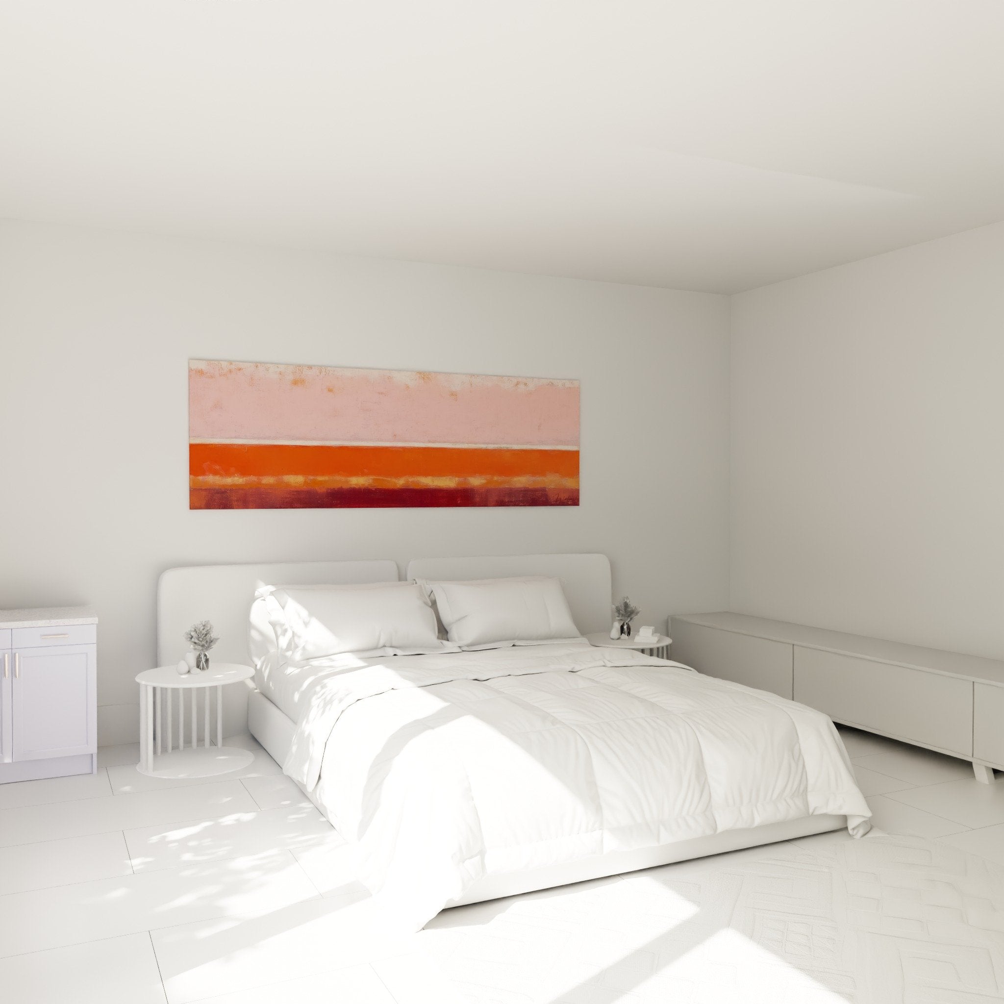
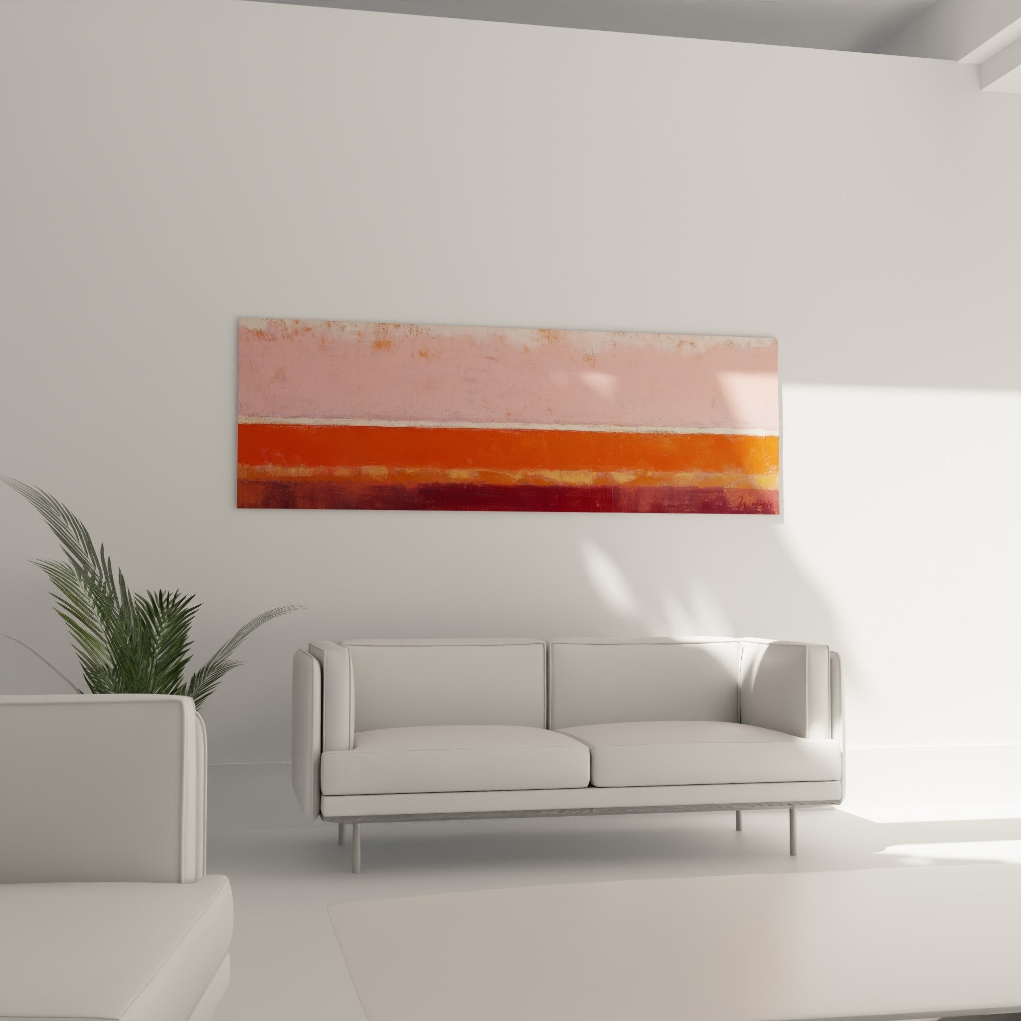
- Abstract Scraped Style
- Abstract Artistic
- Boat
- Abstract Seaside
- Abstract Body
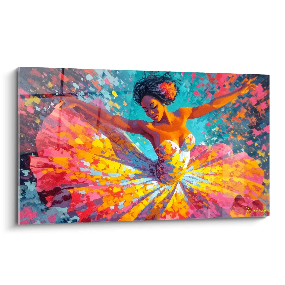
- Abstract Dancer
- Abstract Figurative
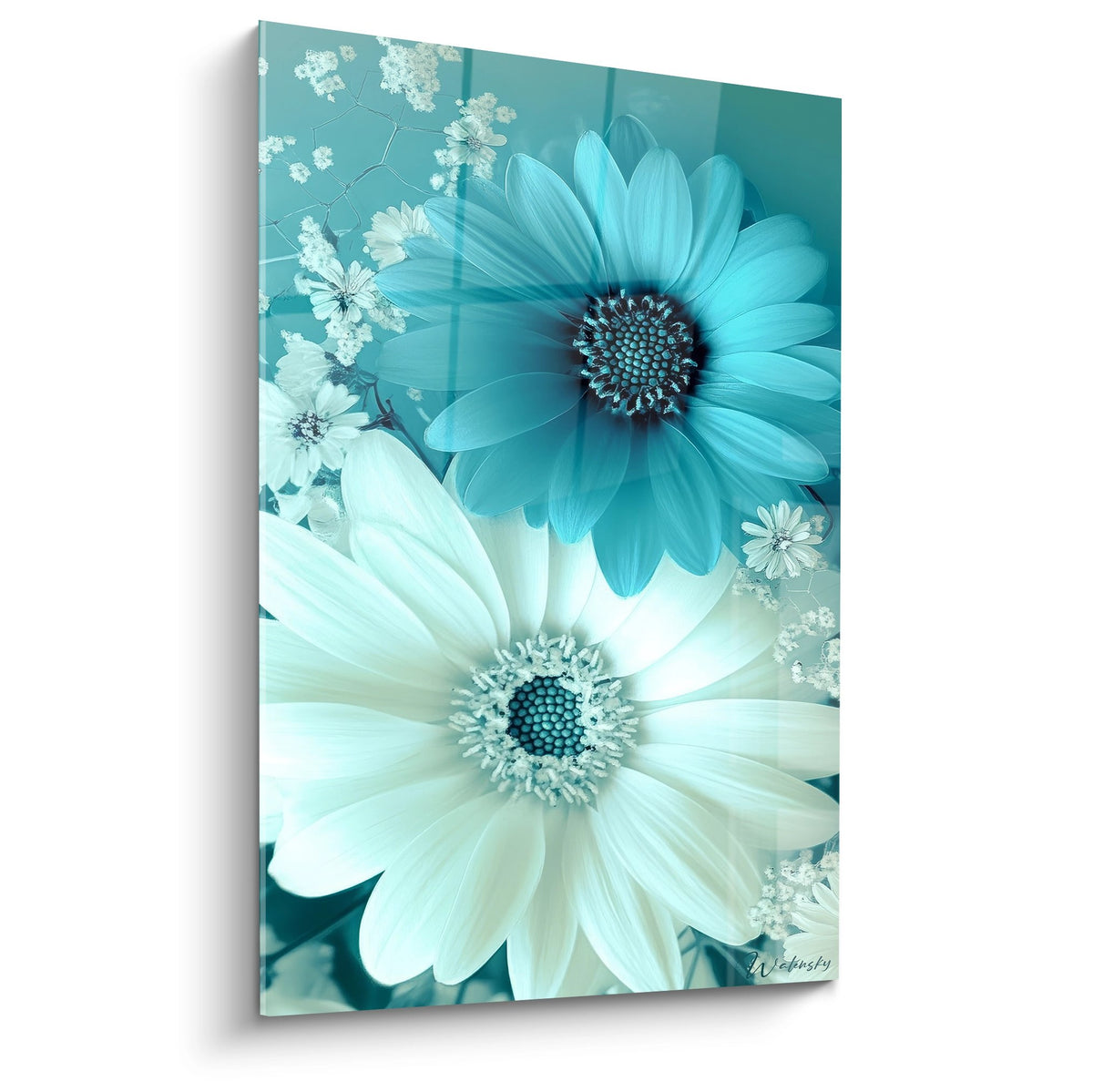
- Abstract Flower
- Geometric
- Abstract Marble
- Modern
- Contemporary Multicolour
- Multicolored
- Abstract Still Life
- Painting (style)
- Pop Art Abstrait
- Sensual Abstract
- Abstract Spirals
- Textured Abstract
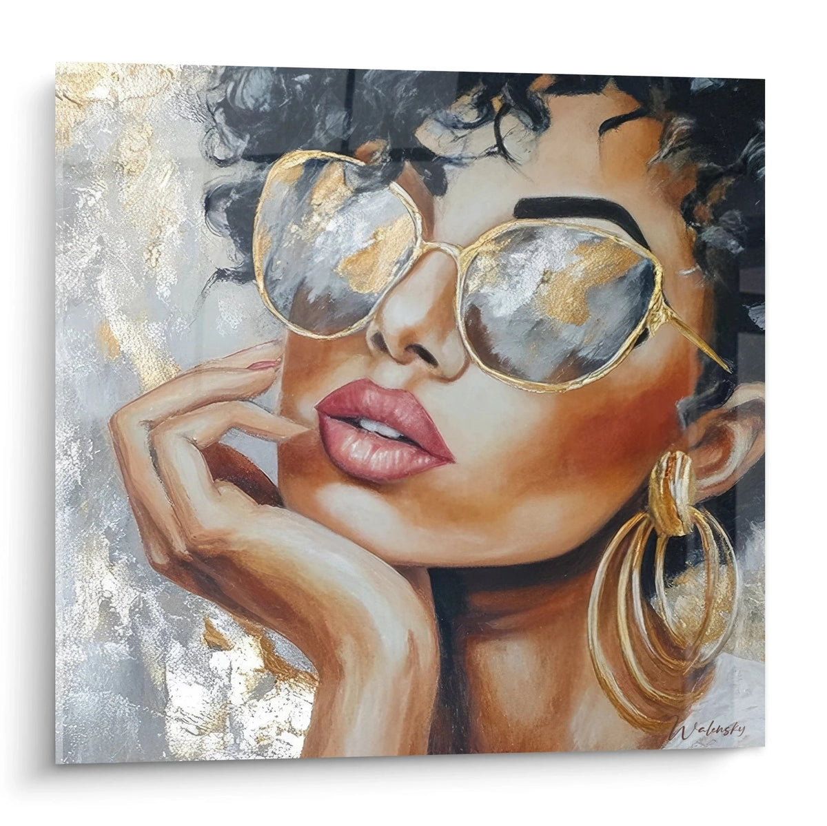
- Face
- View all
- Bee
- Eagle
- Donkey
- Savannah Wildlife
- Antelope
- Spider
- Other Animals
- Ostrich
- Axolotl
- Whale
- Hermit-Crab
- Doe
- Bison
- Buffalo
- Sperm Whale
- Giant Squid
- Chameleon
- Duck
- Capybara
- Caracal
- Caribou
- Koi Carp
- Beaver
- Deer
- Camel
- Cat
- Bat
- Horse
- Mountain Goat
- Dog
- Chimpanzee
- Owl
- Stork
- Ladybug
- Pig
- Guinea Pig
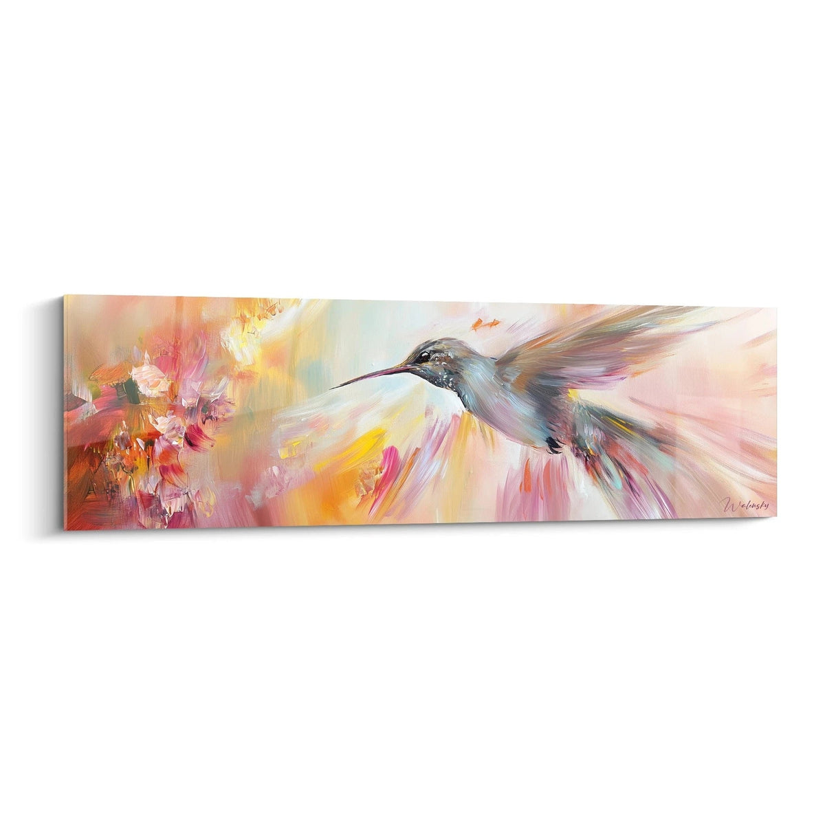
- Hummingbird
- Rooster
- Seashell
- Raven
- Crab
- Toad
- Shrimp
- Crocodile
- Swan
- Dolphin
- Dromedary
- Squirrel
- Elan
- Elephant
- Snail
- Swordfish
- Wild Essence
- Starfish
- Falcon
- Pink Flamingo
- Ant
- Ferret
- Gazelle
- Giraffe
- Wildebeest
- Gorilla
- Frog
- Grizzly
- Crane
- Cheetah
- Hamster
- Hedgehog
- Heron
- Owl
- Seahorse
- Hippopotamus
- Lobster
- Hyena
- Iguana
- Animal Eye
- Insect
- Jaguar
- Kangaroo
- Koala
- Llama
- Rabbit
- Lemur
- Dragonfly
- Unicorn
- Lion
- Lion Cub
- Lioness
- Wolf
- Otter
- Lynx
- Puffin
- Penguin
- Jellyfish
- Morse
- Seagull
- Mold
- Sheep
- Ocelot
- Birds
- Orangutan
- Orca
- Brown Bear
- Polar Bear
- Sea Urchin
- Giant Panda
- Red Panda
- Panther
- Snow Leopard
- Black Panther
- Peacock
- Butterfly
- Lazy Sloth
- Pelican
- Parrot
- Parakeet
- Seal
- Pigeon
- Penguin
- Feather
- Fish
- Betta Fish
- Octopus
- Puma
- Manta Ray
- Raccoon
- Fox
- Shark
- Rhinoceros
- Salamander
- Wild Boar
- Scarab
- Scorpion
- Serpent
- Monkey
- Meerkat
- Armadillo
- Bull
- Tiger
- Sea Turtle
- Terrestrial Turtle
- Toucan
- Polar Crossing
- Jungle Trek
- Cow
- Vulture
- Zebra
- View all
- Alfred Sisley
- Amedeo Modigliani
- Camille Pissarro
- Caspar David Friedrich
- Claude Joseph Vernet
- Claude Monet
- Edgar Degas
- Edvard Munch
- Edward Hopper
- Frida Kahlo
- George Braque
- Giuseppe Arcimboldo
- Goya
- Gustav Klimt
- Gustave Courbet
- Henri Matisse
- Hieronymus Bosch
- Jean Baptiste Camille Corot
- Jean François Millet
- Jean-Auguste-Dominique Ingres
- JMW Turner
- Johannes Vermeer
- Leonardo da Vinci
- Michelangelo
- Paul Gauguin
- Peter Paul Rubens
- Pierre-Auguste Renoir
- Piet Mondrian
- Pieter Bruegel the Elder
- Rembrandt van Rijn
- Sandro Botticelli
- Sonia Delaunay
- Théodore Géricault
- Vincent Van Gogh
- Wassily Kandinsky
- View all
- Acrylic (style)
- Art Deco
- Islamic Art
- Art Nouveau
- Comic Strip
- Baroque
- Bauhaus
- Billiards
- Classicism
- Collage
- Constructivism
- Cubism
- Dadaism
- Drawing
- Expressionist
- Abstract Fauvism
- Abstract Futurism
- Gothic
- Hyperrealism
- Impressionism
- Japandi
- Light painting
- Minimalist
- Neo-classical
- Op Art
- Abstract Contemporary Painting
- Pointillism
- Abstract Pop Art
- Post-Impressionism
- Pre-Raphaelitism
- Realism
- Renaissance
- Italian Renaissance
- Rococo
- Romantic
- Romanticism
- Hook style
- Stained Glass Style
- Abstract Surrealism
- Symbolist
- Vanity
- View all
- Rainbow
- Architecture
- Northern Lights
- Other Landscapes
- Campaign
- Cascade
- Waterfalls
- Lavender Fields
- Sky
- Starry Sky
- Sunset
- Desert
- Underwater Depths
- Forest
- Gorges and Canyons
- Natural Caves
- Islands and Archipelagos
- Jungle
- Lakes
- The World of the Sea
- Marine
- Sea
- Mountain
- Hot Air Balloon
- Ocean
- Abstract Landscape
- Lighthouses
- Beach
- Ports
- Savanna
- Tropics
- Volcanoes
- Aerial View
- View all
- Athletics
- Rowing
- Foosball
- Baseball
- Basketball
- Bowling
- Boxing
- Breakdance
- Hunt
- Cheerleading
- Circus
- Jump Rope
- Running
- Cricket
- Crossfit
- Dance
- Acrobatic Dance
- Chess
- Equestrian
- Climbing
- Fencing
- Football
- Formula 1
- Golf
- Gymnastics
- Jetski
- Karate
- Karting
- Kayak
- Kite surf
- MMA
- Motorcycle
- Bodybuilding
- Swimming
- Paddle
- Parachute
- Paralympic
- Paragliding
- River Fishing
- Ping Pong
- Underwater Diving
- Polo
- Whitewater Rafting
- Hiking
- Rugby
- Skateboard
- Skiing
- Water Skiing
- Snowboard
- Surf
- Tennis
- Shot
- Archery
- Mountain Bike
- Wingsuit