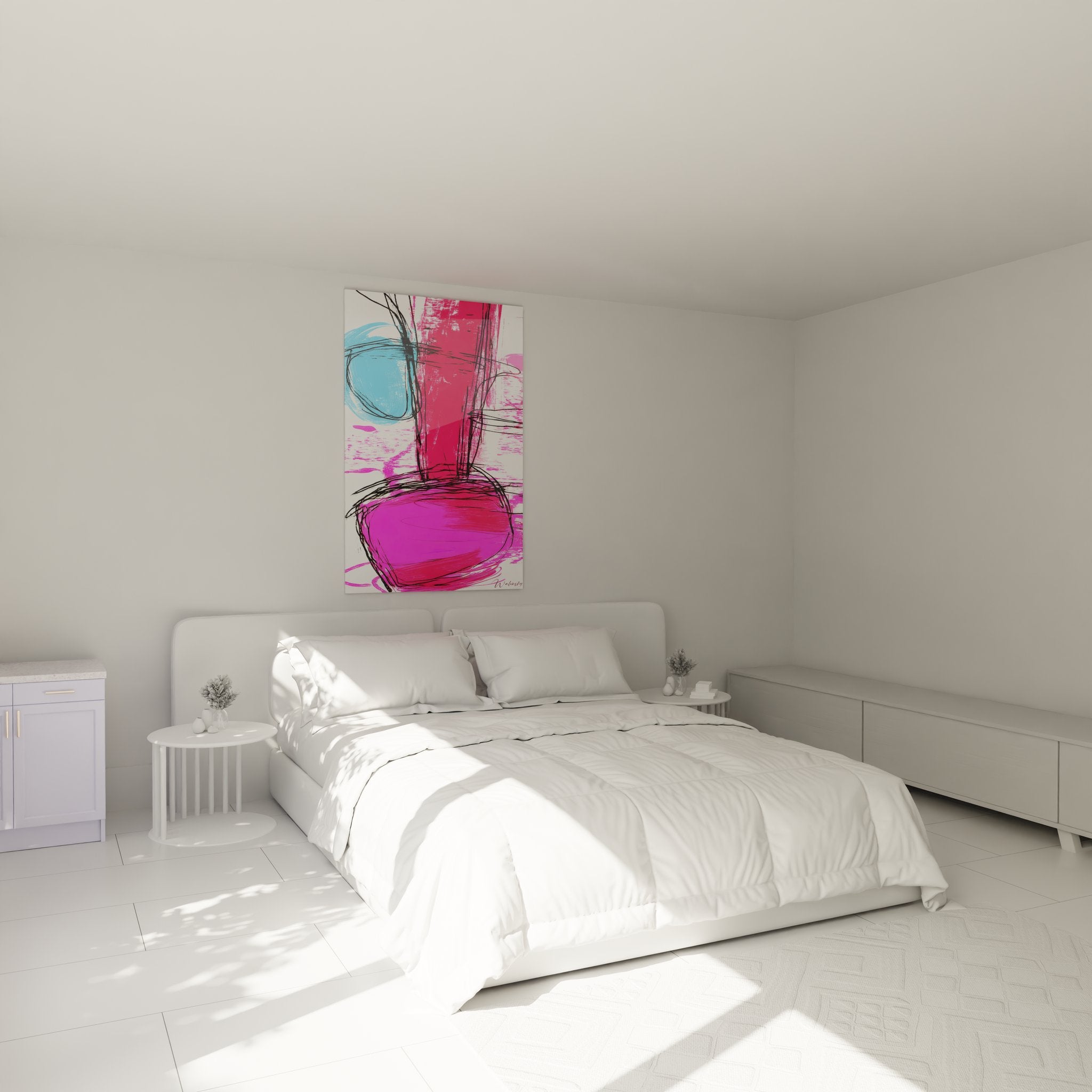
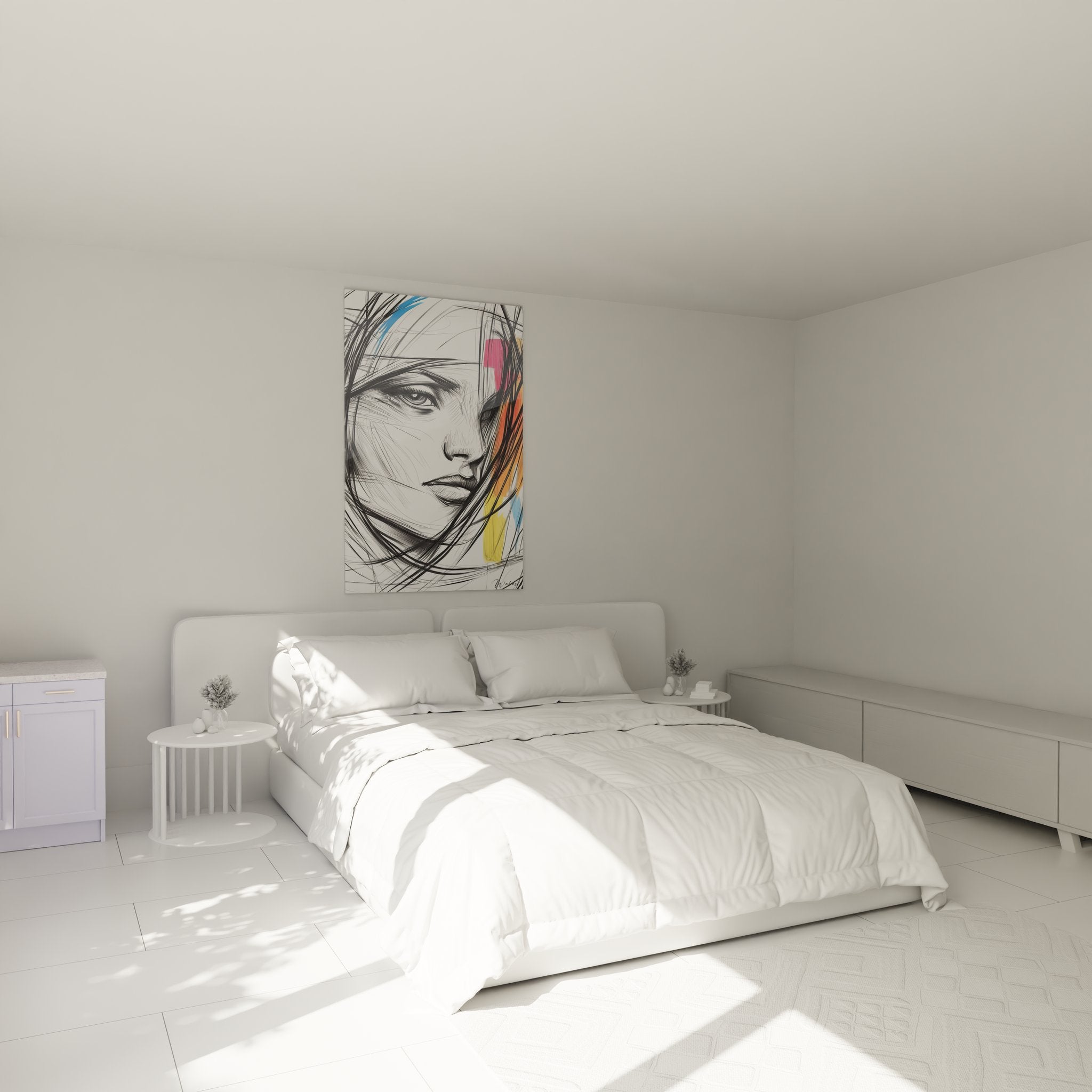
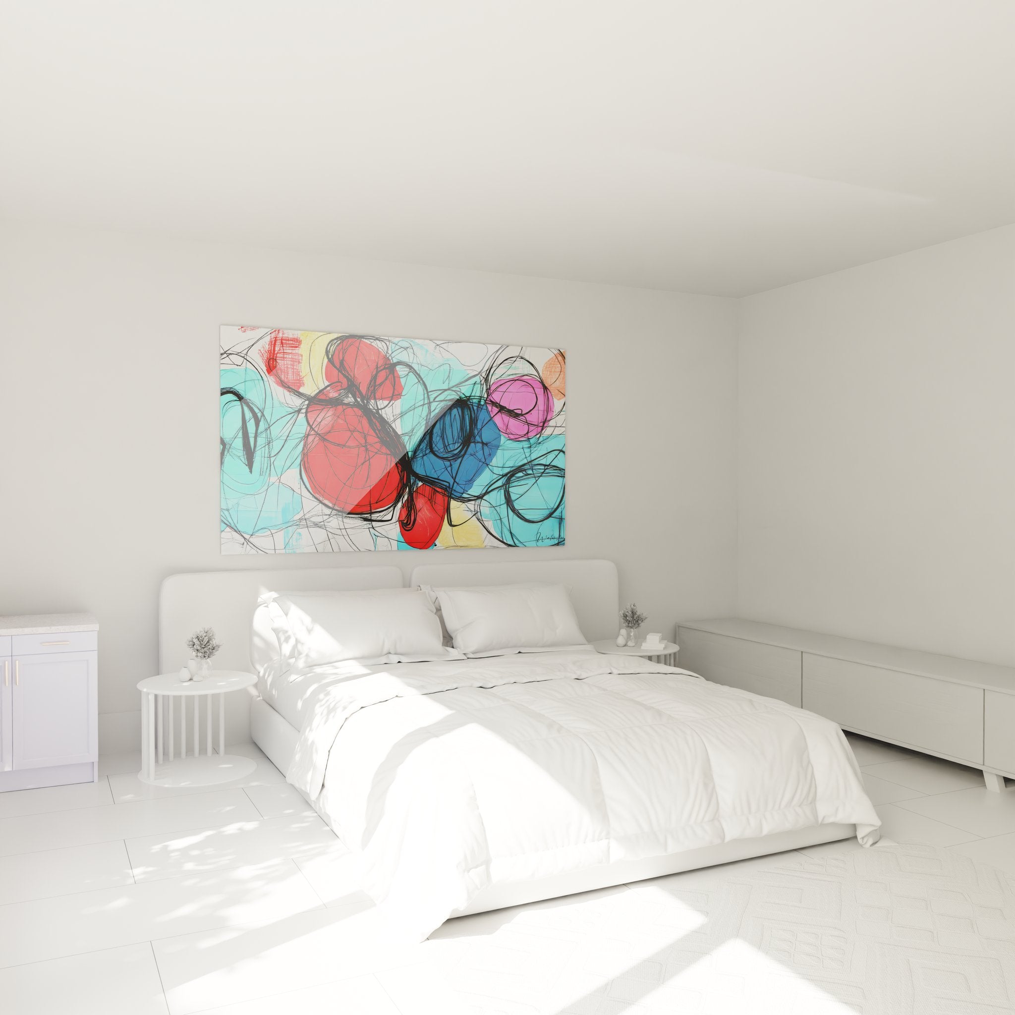
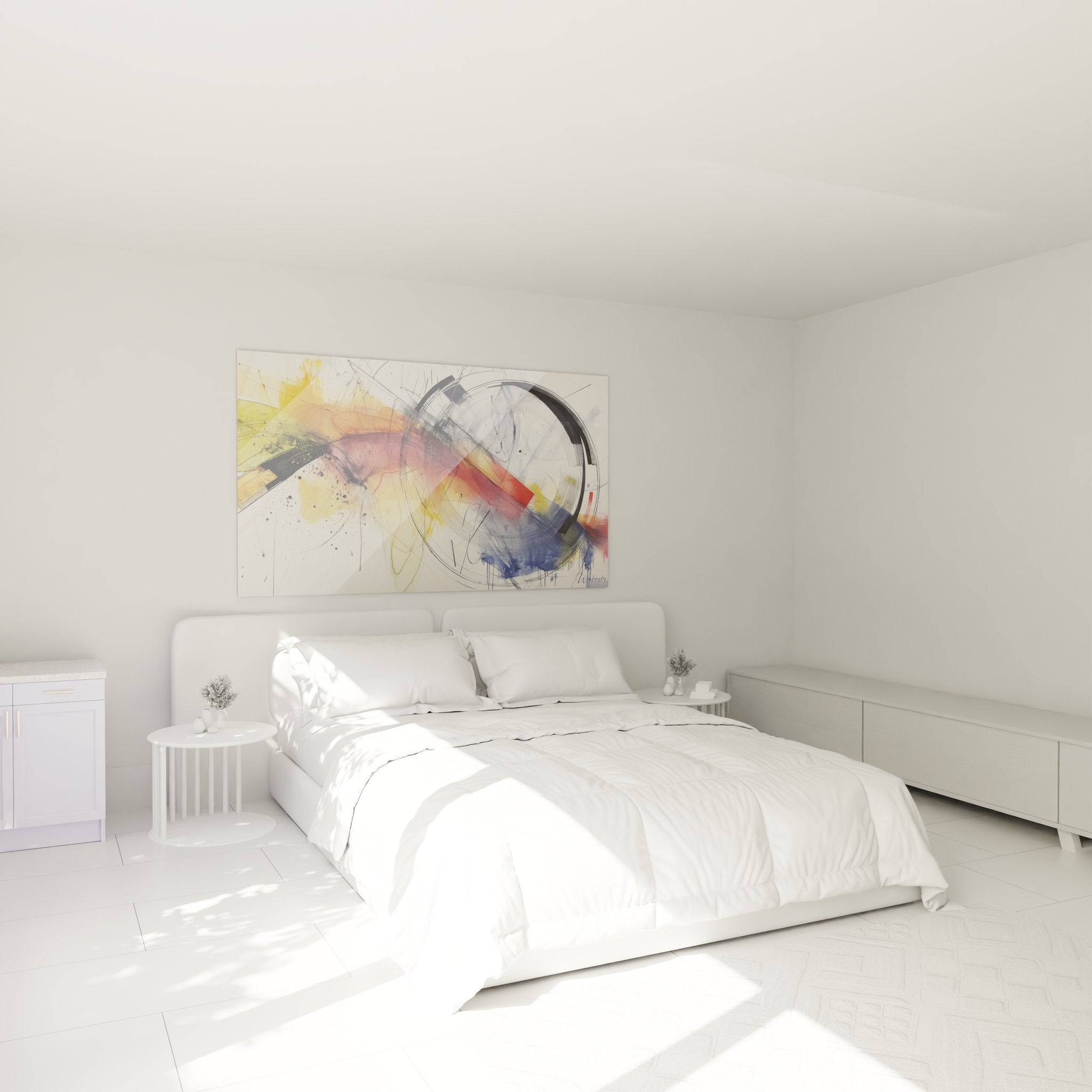
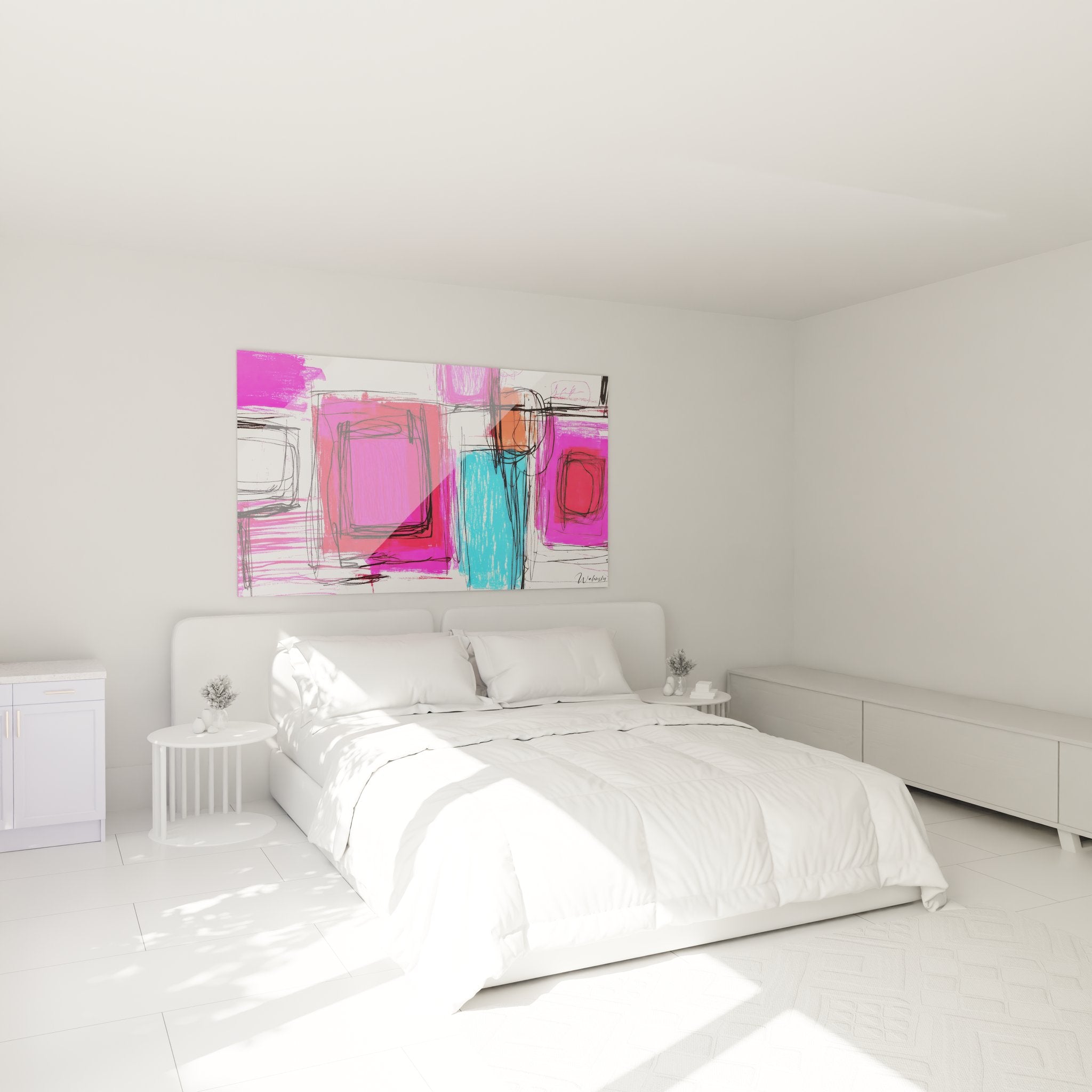
A colorful drawing wall art piece dramatically transforms the ambiance of a living space through the visual intensity of its vibrant and contrasting hues. These large-scale wall creations instantly capture attention with their exceptional chromatic saturation, creating focal points that completely redefine spatial perception within a room. The use of saturated pigments in graphic compositions infuses immediate positive energy, stimulating creativity and fostering a dynamic atmosphere particularly sought after in contemporary interiors. These artworks distinguish themselves through their capacity to generate powerful emotions while visually structuring large architectural volumes.
The Art of Chromatic Saturation in Large-Scale Wall Compositions
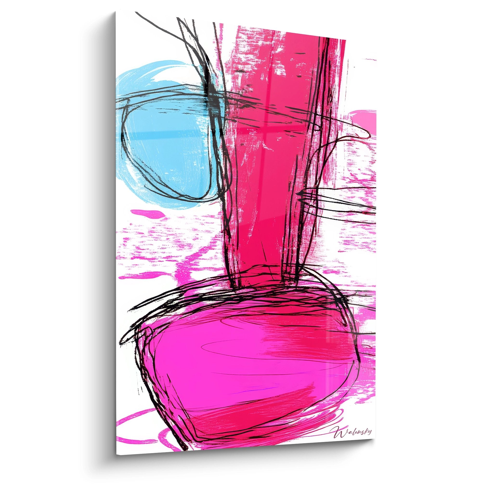
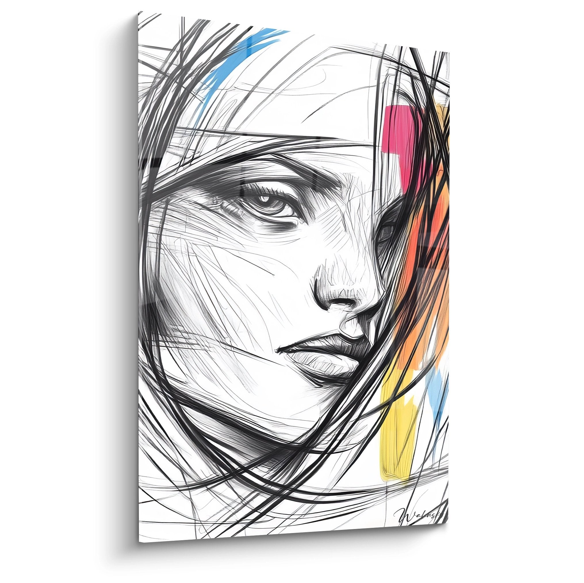
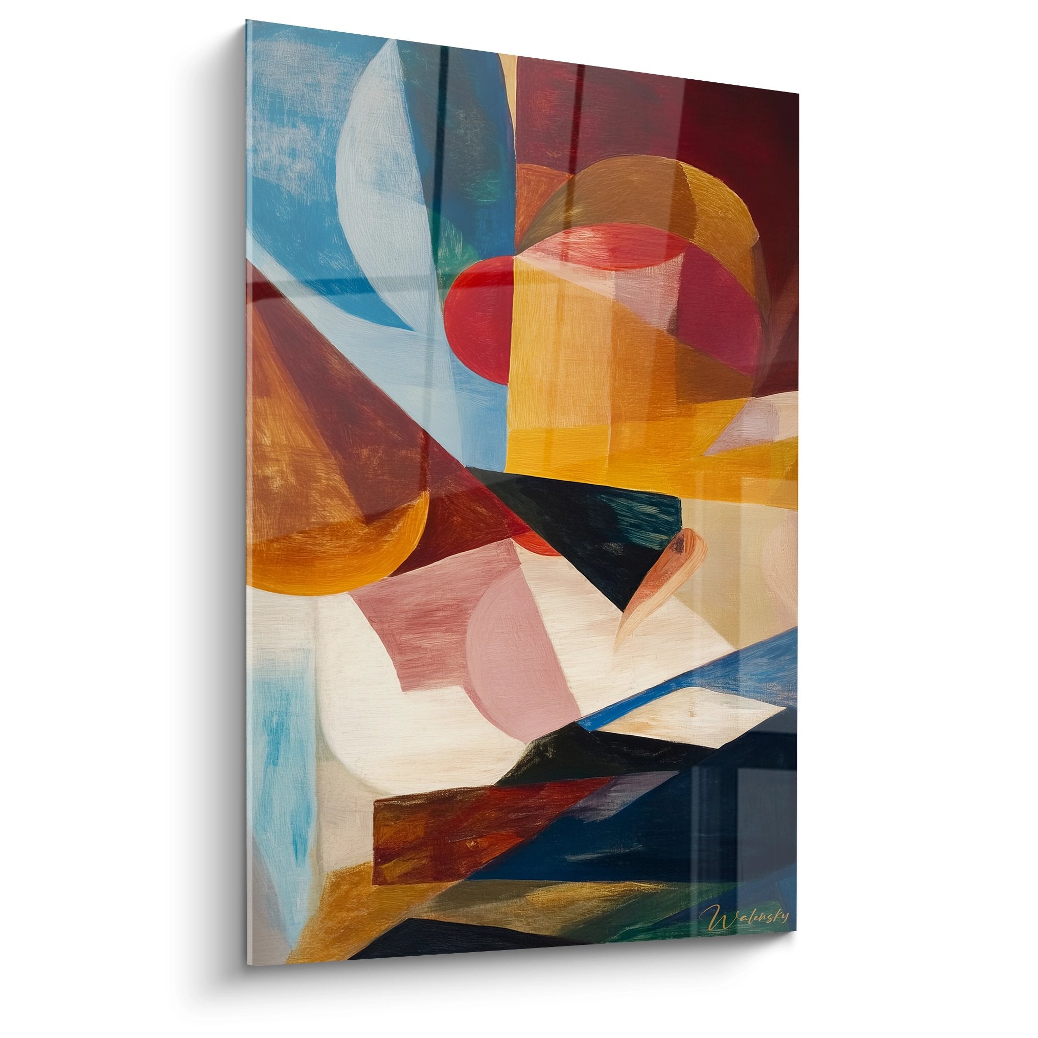
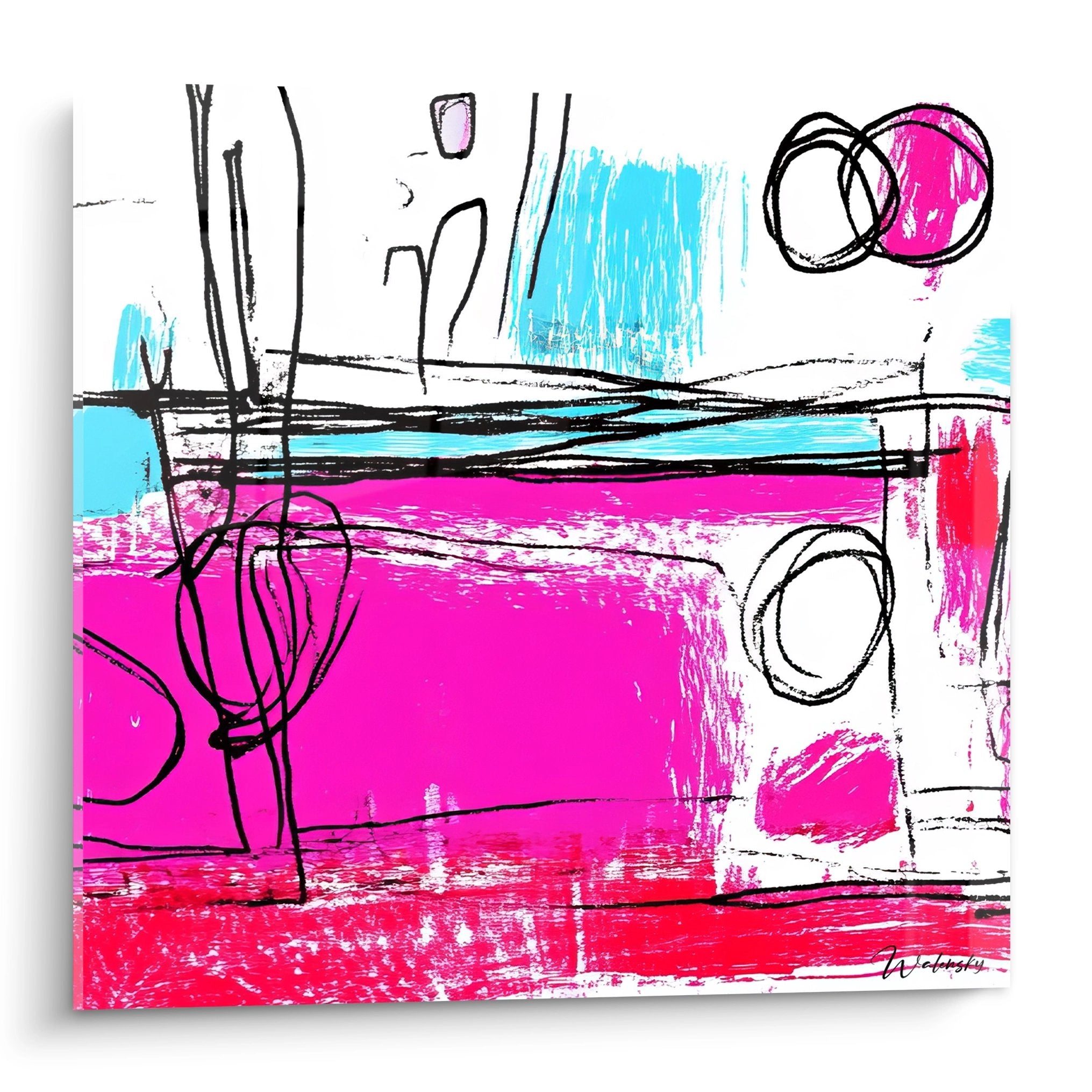
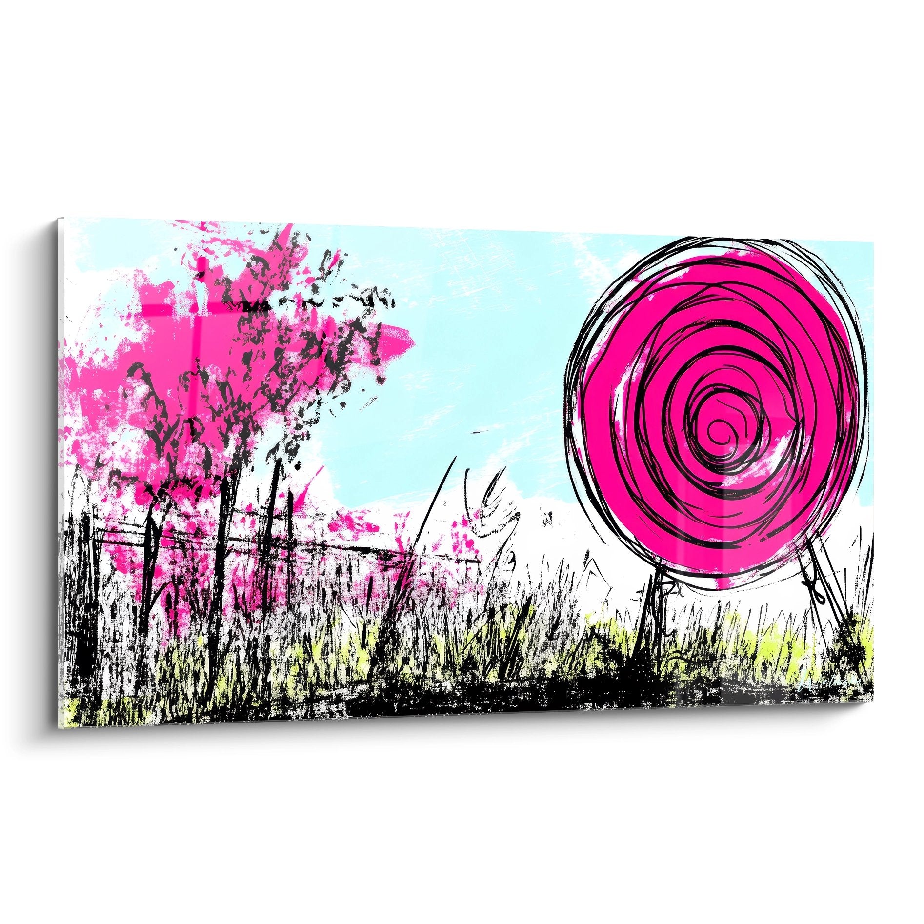
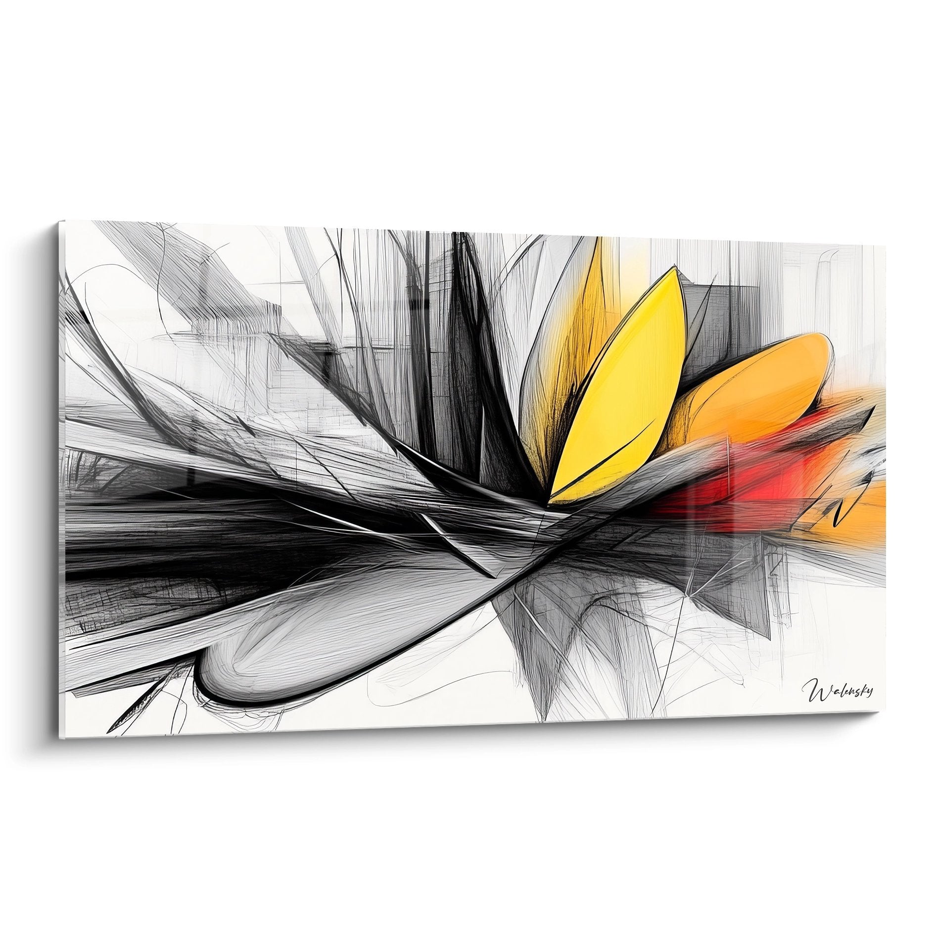
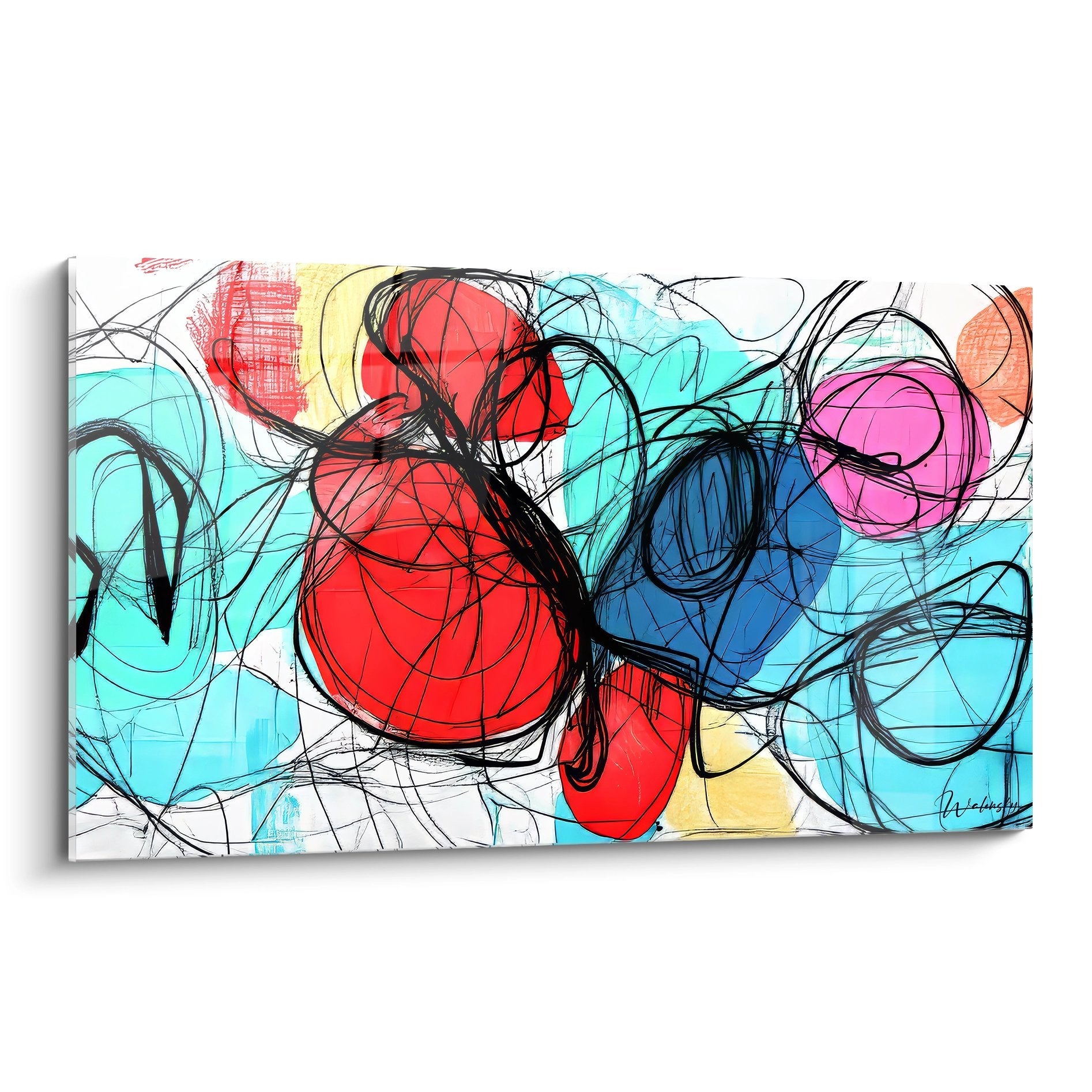
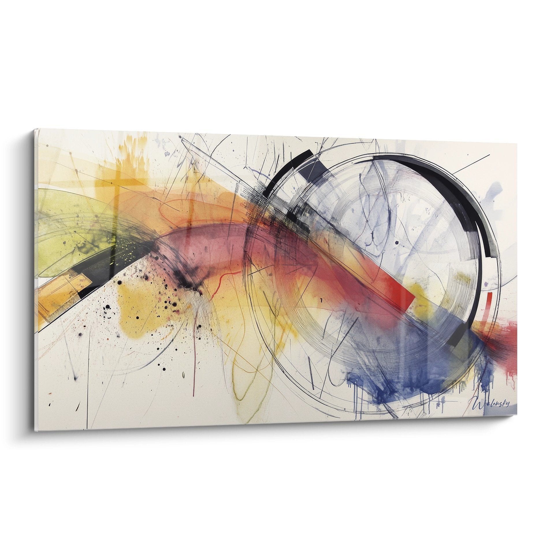
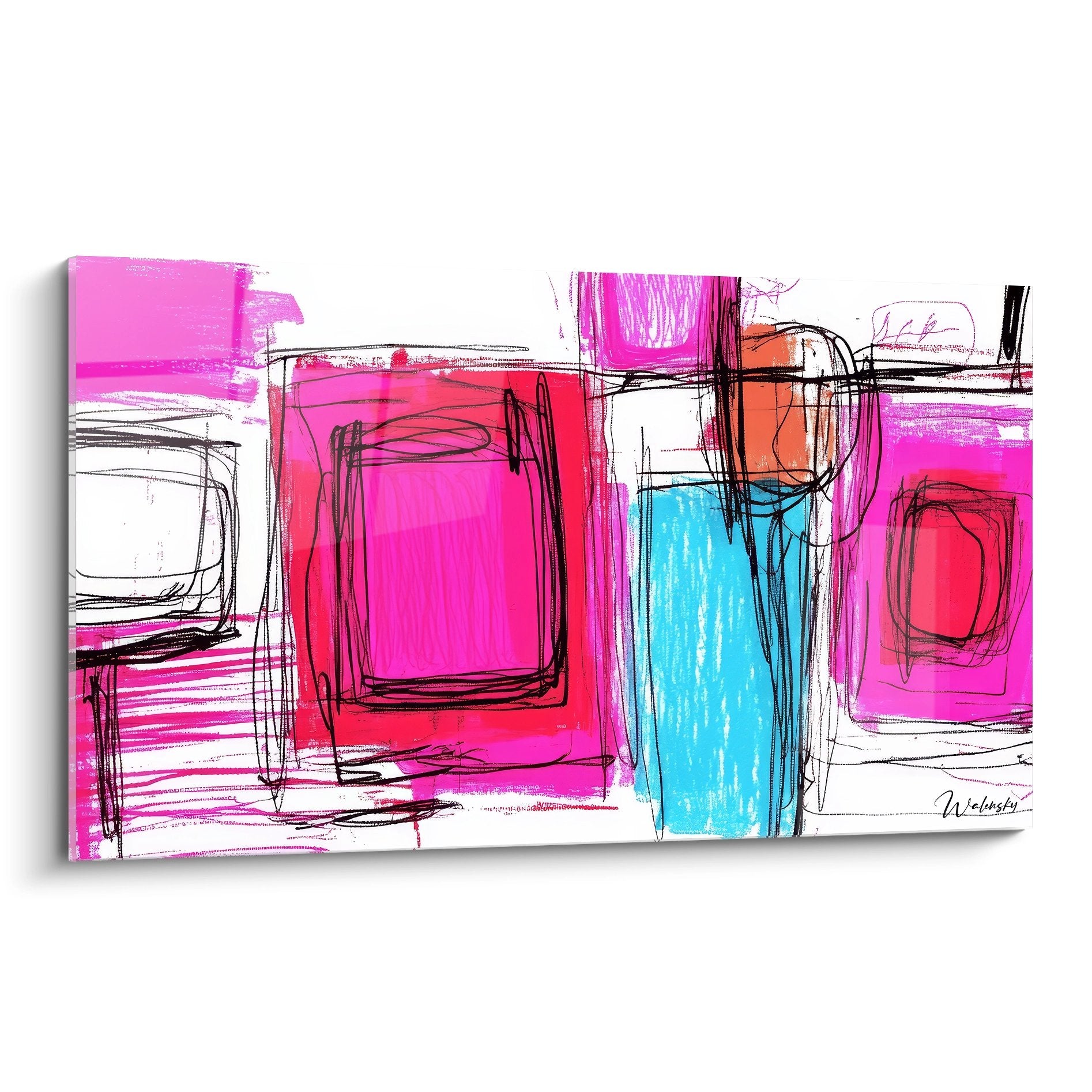
The colorful drawing wall art is characterized primarily by its exceptional pigment intensity that creates striking contrasts on significant wall surfaces. This maximum chromatic saturation enables the generation of complex visual gradients that capture natural light differently throughout the day, offering an ever-evolving decorative experience. Saturated hues in electric red, yellow, electric blue, or magenta create optical vibrations that energize neutral spaces while serving as a powerful visual anchor in spacious living areas.
Which color combinations maximize the visual impact of colorful drawing wall art?
The association of complementary colors such as turquoise and orange or violet and lemon creates particularly effective visual tension in large-format compositions. These combinations produce remarkable perceptual depth effects, where certain zones appear to advance while others recede, literally sculpting the wall space. For creative professional environments or industrial lofts, the use of balanced color triads brings contemporary sophistication while maintaining constant stimulating energy.
The influence of pigmented surface on spatial perception
A large-scale colorful drawing wall art acts as a space modulator by visually redistributing architectural volumes. Expansive multicolor compositions can perceptually enlarge a room when light hues dominate, or create warm intimacy with deep and saturated pigments. This visual manipulation proves particularly valuable in modern open spaces where defining functional zones requires powerful visual references without physical partitioning. Colorful graphic lines establish directional guides that naturally orient the gaze and structure spatial experience.
Decorative synergies with bold contemporary styles
The integration of a work with intense pigments naturally harmonizes with maximalist decorative approaches that celebrate visual abundance and chromatic exuberance. These artworks dialogue effectively with minimalist design furniture, creating balanced contrast between structural minimalism and visual richness. In modernized Scandinavian interiors, injecting a vibrant multicolor composition breaks neutral palette monotony while respecting Nordic functional spirit. For those exploring more conceptual expressive dimensions, an abstract drawing wall art can complement this approach by bringing additional intellectual dimension.
Energetic Dynamics of Polychrome Large-Format Compositions
The imposing formats of a colorful drawing wall art generate energetic presence that directly influences the psychological atmosphere of an environment. This chromatic monumentality creates immersive visual fields where viewers experience a genuine sensory envelope rather than simple decorative observation. Dynamic lines combined with extended pigment ranges produce constant perceptual movement that maintains visual interest and prevents aesthetic fatigue, a frequent phenomenon with monochromatic or limited-contrast compositions.
How does polychromy transform creative workspaces?
In studios, creative agencies, or collaborative spaces, installing a large-scale multicolor composition directly stimulates cognitive processes associated with innovation and lateral thinking. Neuroscience demonstrates that exposure to chromatic diversity simultaneously activates multiple brain areas, fostering unusual neural connections underlying creativity. A work with saturated pigments becomes thus a functional tool as much as a decorative element, particularly valued in professional environments focused on design, visual communication, or interior architecture.
Integration strategies in minimalist architectures
The apparent paradox between architectural minimalism and chromatic exuberance brilliantly resolves when a unique colorful drawing wall art becomes the exclusive focal element of a refined space. This "maximum accent on minimal background" approach creates sophisticated aesthetic tension characterizing contemporary high-end interiors. The large white or gray volumes of modern lofts perfectly welcome these pigment explosions which, through contrast, acquire multiplied intensity. The absence of visual competition allows each nuance to fully express itself, creating pure chromatic experience rarely accessible in visually saturated environments.
Perceptual evolution according to lighting conditions
The richness of a polychrome composition progressively reveals itself through daily natural lighting variations. Warm hues intensify during direct solar exposure while cool tones emerge in diffuse or twilight lighting, offering a constantly metamorphosing decorative experience. This perceptual variability transforms a single decorative investment into a virtual collection of distinct ambiances, maximizing functional value of the acquisition. Owners of west-facing spaces particularly appreciate how sunset's golden lights exalt orange and red pigments, creating spectacular warm atmospheres.
Chromatic Psychology and Environmental Well-Being
The psychological impact of a colorful drawing wall art extends far beyond its decorative function to directly influence emotional states and energy levels of occupants. Environmental chromotherapy recognizes that prolonged exposure to balanced multicolor compositions regulates circadian rhythms and stimulates production of neurotransmitters associated with well-being. Saturated pigments act as visual activators effectively combating sensory monotony of standardized urban environments, bringing stimulating diversity particularly valuable in confined residential spaces.
What emotional benefits does a large-format multicolor composition offer?
Environmental psychology research demonstrates that spaces visually enriched by polychrome compositions significantly reduce stress markers compared to monochrome environments. A work with multiple vibrant hues creates moderate cognitive stimulation maintaining mental engagement without causing sensory overload, a delicate balance particularly beneficial in multifunctional domestic spaces. Families with children observe that these artworks foster visual awakening and exploratory curiosity, indirectly contributing to perceptual development while positively structuring daily environment.
Sectoral optimization according to spatial functions
The choice of dominant chromatic values in a colorful drawing wall art should strategically align with the primary function of the concerned space. Energizing hues such as vermillion red or cadmium yellow ideally suit social or creative activity zones, stimulating communication and interaction. Conversely, compositions where deep blues and emerald greens dominate naturally calm, proving pertinent in master bedrooms or meditation spaces. This functional personalization transforms acquiring a wall artwork into strategic ambiance architecture decision rather than superficial aesthetic choice.
Real estate valorization through aesthetic differentiation
High-end real estate professionals recognize that interiors characterized by bold and coherent decorative choices memorably distinguish themselves during viewings, significantly accelerating sales or rental processes. A work with exceptional pigments immediately positions the property in an aspirational segment, signaling particular attention to detail and developed aesthetic sensitivity. This visual differentiation justifies superior valuations by creating unique spatial identity difficult to reproduce with standard furniture or conventional architectural finishes.
Is colorful drawing wall art suitable for formal professional spaces?
Absolutely, when chromatic balance prioritizes sophistication over raw exuberance. Law offices, executive offices, and high-end reception spaces progressively adopt these compositions as markers of modernity and cultural openness, effectively counterbalancing the austerity traditionally associated with corporate environments.
What maintenance does large-format colorful drawing wall art require?
Quality wall compositions simply require periodic gentle dusting and protection against prolonged direct solar exposure that could gradually alter certain sensitive pigments. The use of invisible UV protection preserves original chromatic intensity durably without modifying the artwork's visual appearance.
How can multiple colorful drawing wall artworks be integrated without creating visual chaos?
The optimal strategy consists in establishing clear hierarchy with a dominant masterpiece complemented by secondary compositions with harmonized but non-identical palettes. Respecting sufficient visual distances between artworks allows each to breathe perceptually while creating coherent chromatic dialogue across overall space.