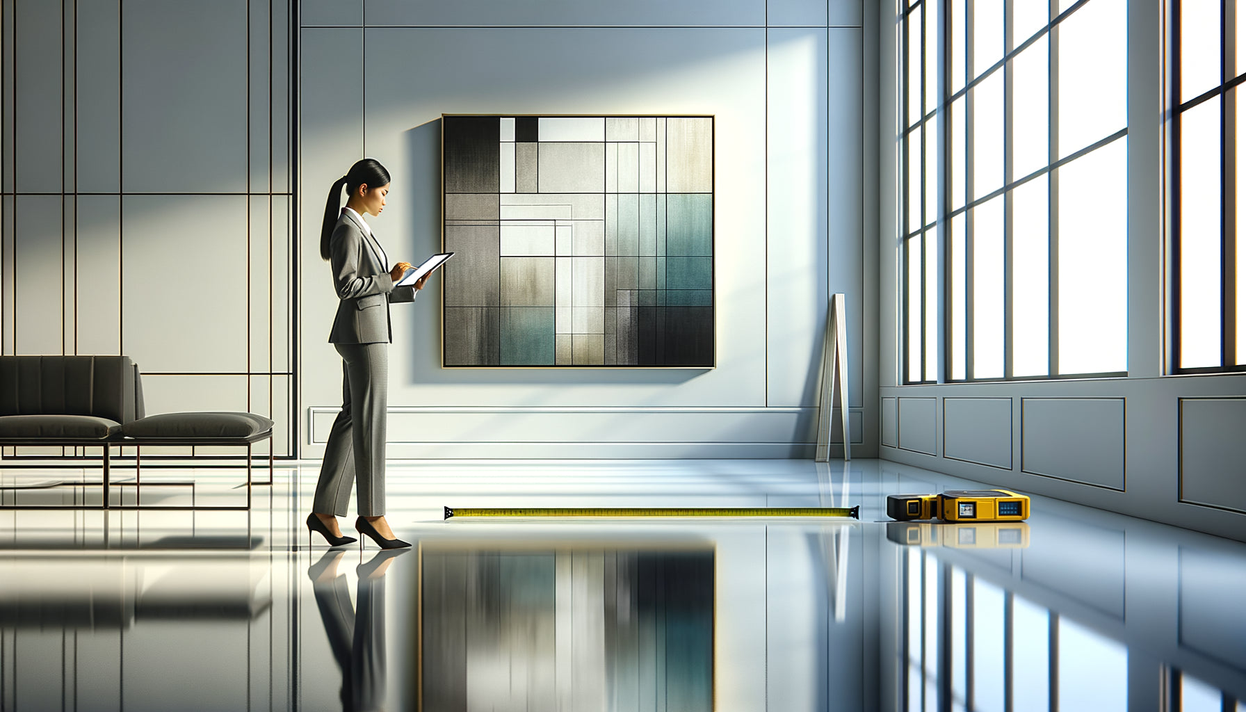
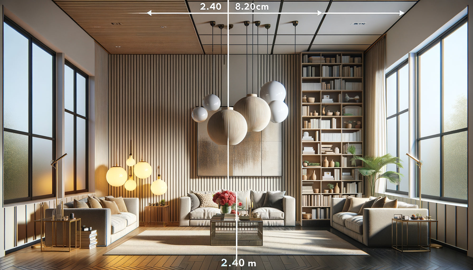
In my contemporary Pilates studio, which opened seven years ago, I've observed a fascinating transformation: the addition of a large abstract painting with flowing lines changed the intensity of the sessions. Students naturally synchronized their movements with the visual curves, as if the canvas was breathing with them. This discovery led me to completely rethink my design for a dynamic training space.
Here’s what a painting with visual movement brings to dynamic Pilates: an amplification of bodily fluidity, an attentional anchor that avoids mental dispersion, and an energetic stimulation that supports the intensity of effort. These three dimensions radically transform the quality of practice.
Many dynamic Pilates practitioners find themselves in functional but visually neutral spaces, sometimes even cold. White or gray walls create a clinical atmosphere that contrasts with the vibrant energy required for fast sequences. This visual dissonance can hinder bodily engagement, creating a feeling of emptiness that disperses attention rather than channeling it.
Yet, the solution exists and is more accessible than you might think. Dynamic visual art isn't reserved for high-end professional studios. With a clear understanding of the principles linking body movement and visual stimulation, you can transform your practice space into a true performance catalyst. I’m going to reveal the specific criteria that make a painting truly support your dynamic Pilates.
Why visual movement responds to the essence of dynamic Pilates
Dynamic Pilates is distinguished by its cardiovascular intensity and fluid transitions. Unlike classical Pilates with slow, controlled movements, this modern approach integrates fast sequences, jumps, constant level changes. The eye instinctively seeks a visual reference point to accompany this kinetic energy.
I noticed that my students unconsciously fixed their gaze on certain points in the studio during complex sequences. A spotlight on the ceiling, an intersection of walls, any stable landmark. But these static points created a contradiction: the body demanded fluidity while the eye clung to immobility. This subtle tension limited full bodily expression.
A painting with visual movement resolves this fundamental contradiction. Curved lines, shapes that seem to circulate, asymmetrical compositions create a sense of continuous flow that resonates with the nature of dynamic Pilates. The eye can rest without freezing, follow a visual path that mimics the trajectory of the body in space.
The three types of visual movement that amplify practice
Circular movement: for fluid sequences
Spirals, concentric circles and organic shapes create a natural invitation to rotation. In dynamic Pilates, twists, leg circles, roll-ups immediately benefit from this visual suggestion. The brain interprets these curves as paths to follow, facilitating the complex coordination of sequences.
I installed an abstract canvas with ocean blue and gold spirals in the area dedicated to standing exercises. Students performing standing roll-downs followed by twists spontaneously gained amplitude, as if the painting gave them permission to fully explore the three-dimensional space.
The upward movement: for jumps and elevations
Vertical compositions with ascending lines, gradients that lighten towards the top, or shapes that seem to defy gravity psychologically support the effort of elevation. When you prepare a jumping jack on the reformer or a squat jump on the floor, your gaze captures this upward suggestion.
This visual directionality is not anecdotal. It activates the same brain areas as motor planning. Your nervous system reads the visual movement as preparation for physical action, optimizing muscle recruitment even before execution.
The undulating movement: for spinal fluidity
Waves, sinuous lines and irregular visual rhythms perfectly reflect the successive vertebral articulations at the heart of Pilates. The spine wave, dynamic cat-cow, swan dives find their visual echo in these fluid compositions.
An architect client confided to me that since installing a large painting with undulating lines in her home studio, she finally felt the famous 'vertebral segmentation' that I had been describing to her for months. The visual movement had created a comprehensible metaphor for her body.

Color and energy: the chromatic equation of dynamic Pilates
The color palette directly influences your physiological activation level. It's not a matter of personal taste but of measurable neuronal response. For dynamic Pilates which requires sustained energy and simultaneous concentration, certain combinations prove particularly effective.
Energizing warm tones - orange, coral red, golden yellow - naturally increase heart rate and perceived body temperature. Perfect for intense sessions where you're looking to maintain a high cardio. However, be careful: in excess, they can create mental agitation. It is ideal to combine them with neutral or cool elements.
Energizing cool tones - electric blue, bright turquoise, emerald green - stimulate mental clarity and precision. They are particularly suitable for technical sessions with complex sequences requiring fine coordination. These colors maintain energy without sensory overheating.
In my practice, I have adopted a painting combining deep turquoise and touches of copper. This alliance creates an contained and powerful energy, exactly what dynamic Pilates seeks: controlled intensity, fluid strength, elegant power. The feedback is unanimous on the feeling of being both stimulated and centered.
Strategic placement: where to position your painting to maximize impact
The location of the painting determines whether it becomes an ally or a distraction. The golden rule: place it within your natural field of vision during key positions in your practice. Analyze your usual sequences and identify dominant orientations.
For floor exercises (roll-ups, hundred, crisscross), you are mostly facing the ceiling or sitting looking straight ahead. A painting on the main wall, at mid-height (between 120 and 160 cm from the floor), will be visible during transitions and seated positions.
For standing exercises (lunges, squats, standing balance), the gaze naturally projects towards the horizon or slightly above. The same wall works, but the painting should be large enough to remain present in your peripheral vision during movements.
Absolutely avoid placing the painting in an area requiring cervical rotation to see it. If you have to turn your head more than 45 degrees, you create tension that contradicts the alignment principles of Pilates. The painting must naturally integrate into the visual path of your practice.

Format and scale: size really matters
A small decorative painting of 40x40 cm will never have the impact of a substantial piece of 100x150 cm. To create a real visual presence that dialogues with the dynamic movement of your body, you need significant visual mass.
In a standard domestic practice space (12-20 m²), aim for a minimum size of 80x120 cm. This dimension allows the artwork to occupy enough visual field to create an environment, not just a decorative accent. Your peripheral vision captures visual movements even when you are not directly looking at the canvas.
For professional studios or dedicated large rooms, don't hesitate to invest in 150x200 cm formats or diptychs. I equipped my main space with a triptych 400 cm wide: the immersive effect literally transforms the energy of the room. Students enter and immediately feel they are entering an intentional movement space.
Beyond aesthetics: the psychological effect of visual movement
What fascinates me after seven years of observation is the measurable psychological impact. On days when I temporarily cover the main artwork (for photos or adjustments), I consistently notice a decrease in intensity during sessions. Students perform the same exercises, but with less conviction, less amplitude.
Visual movement acts as a silent witness to your commitment. It creates a presence that observes you without judgment, encouraging you to maintain quality even when fatigue sets in. It is a visual partner who remains dynamic when your energy weakens.
This psychological dimension explains why so many practitioners report more consistent at-home sessions after installing an appropriate artwork. Personal discipline benefits from environmental cues. Your practice space is no longer just a corner of the living room, it becomes a territory dedicated to body transformation.
Transform your practice space into a true catalyst for movement
Discover our exclusive collection of wall art for yoga rooms that naturally amplify your energy and concentration during each session.
Visualize your next session with a visual ally
Imagine your next dynamic Pilates sequence. You start with an energetic hundred, legs in tabletop then extension, arms pulsing rhythmically. Your gaze naturally rises and meets flowing lines that seem to undulate with your breath. This visual-body synchronization instantly anchors you in the present moment.
You transition to a rolling like a ball, then explosion into a standing roll-down. During the spinal descent, your eyes follow a descending curve on the canvas. During the ascent, an ascending form guides your spinal reconstruction. Visual movement becomes a silent choreography that supports your body expression.
This experience is not reserved for professional studios. It begins with a conscious decision to treat your practice space as an intentional environment, not just a functional location. The moving visual artwork isn't a decorative luxury; it’s a performance tool that deserves its place alongside your mat or reformer.
Start by observing your current practice. Identify moments when your concentration falters, when your energy stagnates. Then imagine a dynamic visual element that could support exactly those moments. This awareness is the first step towards a truly transformed practice.
Frequently Asked Questions about Dynamic Pilates Artwork
Can a moving visual artwork be distracting during Pilates exercises?
It's a legitimate concern I regularly hear. The key lies in the type of visual complexity. A figurative artwork with narrative scenes or multiple details can indeed scatter attention, your brain attempting to decode the elements represented. Conversely, an abstract artwork with movement visual functions differently: it stimulates without requiring cognitive interpretation. Your eyes capture shapes, curves and colors as a global ambiance rather than content to analyze. That’s exactly what dynamic Pilates seeks: stimulation that supports movement without monopolizing mental resources. In my practice, I've observed the opposite of distraction: better concentration because the eye naturally finds where to rest without wandering mentally. Start with simple compositions with obvious movements (waves, spirals, flowing lines) rather than dense geometric abstractions.
What is the minimum size for an artwork to have a real impact on my practice?
The critical dimension is around 80x100 cm for a standard domestic space. Below that, the artwork becomes a decorative accent without true environmental presence. Think of it this way: during a roll-up or hundred, your field of vision covers several square meters of the wall in front of you. If the artwork occupies only a tiny fraction of that space, your brain categorizes it as peripheral detail, not as a structuring element. I’ve tested different scales in my studio: a 60x80 cm piece went completely unnoticed during effort, while a 120x150 cm piece immediately created a dialoguing presence with movement. For smaller budgets or restricted spaces, prioritize one large artwork rather than several small ones. The impact comes from the coherent visual mass, not from multiplying points of attention. A vertical format (80x120 cm) works particularly well for standing exercises, while a horizontal format (120x80 cm) is better suited to practices mostly on the ground.
Do the vibrant colors of the artwork risk overstimulating and fatiguing?
This question reveals an excellent intuition about energy balance. Indeed, excessive chromatic saturation can create visual fatigue, particularly problematic when you practice daily in the same space. The solution is not to avoid bright colors, but to master their proportion and context. An effective artwork for dynamic Pilates generally combines a soothing dominant (deep blues, emerald greens, colored grays) with energizing accents (touches of orange, golden yellow, coral red). This color strategy gives you the necessary stimulation without sensory aggression. I personally use an artwork dominated by turquoise with copper filaments: the base remains contemplative while the metallic accents capture the light and create dynamism. Also observe the lighting in your space: a vibrant-colored artwork under intense direct light will indeed be overstimulating, while the same artwork under diffused natural light or indirect lighting reveals its richness without aggression. Test your personal reaction: some people thrive with bold palettes, others prefer subtle harmonies.