I've spent fifteen years transforming Parisian maids’ rooms into radiant havens of light. From 9m², 12m² under the roofs, to narrow studios that seemed destined for cramped spaces. And each time, the same revelation: a single wall art piece, well-chosen, can push walls back. Not by magic, but through a subtle manipulation of our spatial perception.
Here's what a strategically positioned wall art piece brings to a small studio: it creates an illusory visual depth that pushes perceived limits, it directs the gaze towards focal points that reorganize space mentally, and it introduces a vertical or horizontal dimension that restructures our spatial references.
The frustration of inhabitants of small spaces is universal: this feeling of oppression, these walls that seem to draw closer every day, this inability to visually breathe. We accumulate mirrors, we paint white, we frantically declutter, but the effect remains limited. Yet, the solution exists, elegant and accessible.
Rest assured: there's no need to knock down a partition or invest thousands of euros. A judiciously selected wall art piece can transform your perception of space in just a few hours. I am going to reveal the techniques that I systematically apply in my spatial optimization projects, these principles that transform a cramped studio into an airy refuge.
Perspective: Your best ally against walls closing in
The first time I installed a wall art piece depicting a forest path in an 11m² with a slope, my client literally stepped back in surprise. “It's like the wall has disappeared”, she whispered. It wasn’t a fanciful optical illusion, but the exploitation of a precise neurological mechanism.
Our brain automatically interprets vanishing lines as indicators of depth. A wall art piece with pronounced perspective – whether it's a winding path, an urban street, an architectural corridor or a pier extending over the ocean – literally forces our eye to travel beyond the surface of the wall.
In a 15m² studio in Montmartre, I positioned a monumental figurative wall art piece depicting Greek columns in perspective on the back wall, just above the sofa. The effect was immediate: the space suddenly seemed to contain three additional meters of perceptual depth. Guests naturally settled further into the room, proof that their spatial perception had been reorganized.
What perspectives to prioritize according to your layout?
For a long studio, opt for a horizontal wall art piece depicting a scene with lateral vanishing lines – a beach as far as the eye can see, a suspension bridge, tram tracks. This visually accentuates the missing width.
If your studio is square and has low ceilings, choose a vertical wall art piece with upward perspective: a sequoia forest, a Haussmann facade photographed from a low angle, monumental staircases. The eye rises, and mentally, the ceiling seems to rise by thirty centimeters.
Cool colors: push the walls back with chromatic temperature
I always have a chromatic chart in my bag during consultations. When I explain to clients that colors possess a “spatial temperature,” they look at me skeptically. Until the demonstration.
Cool shades – deep blues, aquatic greens, nuanced purples – have this fascinating property of seeming to recede visually. A wall art piece dominated by these tones creates a perceptual window in the wall, as if it opened onto a distant elsewhere.
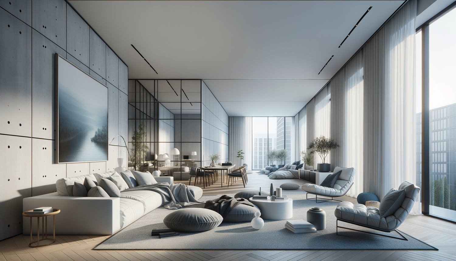
In a Parisian studio facing north, naturally dark, I installed an abstract wall art piece with ocean blue gradations. Not only did the space seem larger, but the perceived brightness paradoxically increased, because our brains associate these blues with the celestial and maritime infinity.
However, be careful: a completely cool wall art piece can make the atmosphere clinical. I like to introduce subtle warm touches – a golden sunset on a blue marine landscape, copper reflections on a turquoise abstract composition. This combination maintains visual depth while preserving emotional warmth.

The XXL format: dare monumentality in constraint
It's the advice that systematically provokes resistance: “You want to put a LARGE wall art piece in my SMALL studio? Isn’t that counterintuitive?” Absolutely not. It is even the opposite that happens.
A large-format wall art piece – I'm talking about a minimum of 120x80cm, or even 150x100cm – acts as an architectural window. It does not visually overload the space; it restructures it by creating a powerful focal point that reorganizes the entire perception of the room.
I equipped a 13m² studio in Lyon with a panoramic wall art piece measuring 180x90cm depicting a minimalist desert in sand and pale ochre tones. Result? Visitors consistently estimated the surface area at 18-20m². The imposing wall art piece had created a deceptive visual scale, suggesting that such a small space could not accommodate such a monumental work.
The "small space = small decorations" mistake
Many people multiply scattered small frames, thinking they are respecting proportions. Spatial disaster! This visual fragmentation breaks up the space, making it nervous, small and cluttered. A single large format wall art on the other hand brings a soothing visual coherence that unifies and expands perception.
In my optimized studio projects, I systematically replace compositions of 6-8 small frames with a single statement wall art. The breathing effect is immediate and spectacular.
Playing with horizons: the line that changes everything
Here's a technique I have perfected after studying the principles of composition of landscape masters: the horizon line in a wall art determines where your eye naturally rests, and therefore how you perceive the height and width of the space.
A wall art with a low horizon – a beach where the sky occupies 70% of the composition, a field of lavender under a vast firmament – draws the gaze upwards and gives an impression of high ceilings. Ideal for studios with low or sloping ceilings.
Conversely, a wall art with a high horizon – an aerial view, a mountain landscape seen from a summit – creates a feeling of horizontal expanse. Perfect for visually widening a narrow studio.
I recently transformed a 14m² attic studio with a wall art depicting clouds viewed from an airplane – essentially sky, with a thin strip of earth at the bottom horizon. The owner, who complained about the oppression of the sloping ceiling, immediately felt a liberating vertical opening.

Aerial motifs: when emptiness becomes volume
Counterintuitively, a wall art with a clean motif often expands more effectively than a complex composition. I call it “the breathing effect”: our brain interprets the negative spaces in the work as extensions of the real space.
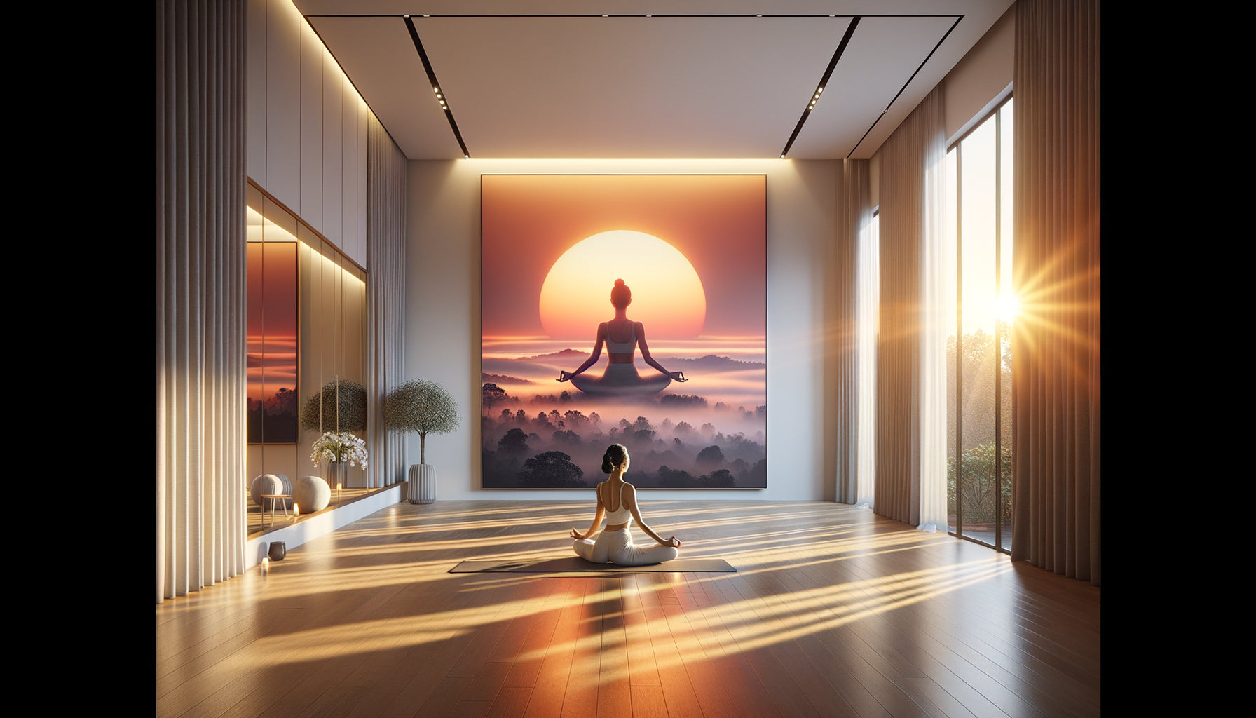
A minimalist wall art – three circles on a neutral background, a Japanese cherry branch on off-white, clean geometric lines – does not visually saturate the space. On the contrary, it introduces organized emptiness that echoes the spatial void you are sorely lacking.
In a 12m² attic studio, I installed a wall art depicting birds in flight against a white sky. Clients were initially looking for something 'rich' and 'full' to 'compensate' for the smallness. I convinced them to try the opposite. The result: the space suddenly seemed to breathe, open up, rise.
The balance between emptiness and presence
Be careful, a wall art that is too empty can seem cold or unfinished. The trick is to create a subtle point of interest – a golden detail on a white background, a minimalist silhouette – that captures the eye without saturating it. This focal point guides the eye towards perceptual expansion rather than concentration.
Strategic positioning: transforming dead zones into assets
I have developed what I call the 'invisible wall rule': in a studio, the back wall – the one you see when entering – determines your first impression of depth. This is where your wall art produces its maximum effect.
Position your main wall art facing the entrance, on the furthest wall. As soon as the threshold is crossed, the gaze travels through the space and projects into the depth of the work. You instantly create an increased perceptual depth.
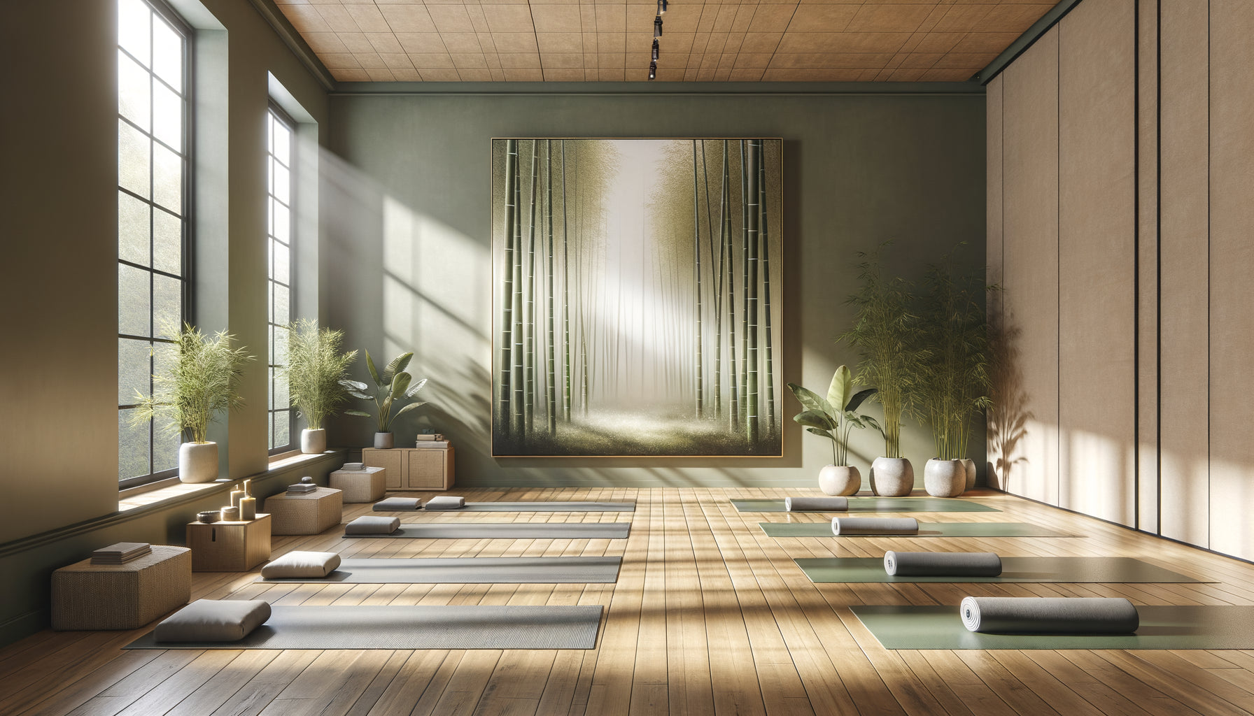
In a 16m² hallway studio, I placed a monumental wall art at the end of the natural perspective – a misty forest in green-grey tones. The hallway, initially oppressive, turned into a tunnel of depth, giving the impression of traversing space rather than being confined to it.
For difficult angles – those corners that make a studio feel awkward – a well-chosen wall art transforms the flaw into an asset. A dark corner becomes a contemplation nook around a luminous work; an awkward recess turns into an intimate gallery.
Your studio deserves the illusion of space that only art can offer
Discover our exclusive collection of carefully selected wall art that will transform your spatial perception and create that precious feeling of spaciousness.
Visualize your transformed studio
Imagine: you return home after a busy day. The door opens. Your gaze no longer immediately hits the back wall. It travels through this deep blue seascape, this elongated urban perspective, this soothing minimalist composition. Shoulders relax. The space breathes.
Your studio hasn’t gained a single physical square foot, but it has conquered cubic meters of visual breathing space. Your guests exclaim about the feeling of spaciousness. You rediscover your interior every day, surprised by this rediscovered amplitude.
The wall art you choose today will not just be decoration. It will be your perceptual window, your spatial extension, your daily breath. Start by identifying your strategic wall – the one that commands perceived depth. Then let yourself be guided by the principles I have passed on to you: perspective, cool colors, generous format, strategic horizon, airy patterns.
Your small studio already contains the space you dream of. It is simply waiting for the right wall art to reveal it.
Frequently Asked Questions
Won't a large wall art overwhelm the visual space of my small studio?
This is the most common fear, and it is totally understandable. Yet, experience consistently proves the opposite. A large format wall art acts like an architectural opening – think window rather than decoration. It creates a unique focal point that visually unifies the space, where several small elements fragment and shrink it. The key lies in choosing the pattern: prioritize clean compositions or deep perspectives over scenes overloaded with details. A minimalist landscape of 150x100cm will enlarge your studio much more effectively than five small frames of 30x40cm scattered around. Test mentally: imagine your main wall with a large window versus several small openings – which gives the feeling of space?
What colors of wall art should I choose if my studio is already dark?
In a naturally dark studio – north orientation, reduced windows, close vis-à-vis – your wall art becomes your perceptual source of light. Prioritize light and cool tones: sky blues, pale aquatic greens, bright grays. These shades mentally reflect light and create a feeling of openness outwards. Paradoxically avoid intense warm colors (oranges, deep reds) which, although welcoming, tend to “advance” visually and therefore shrink the space. A particularly effective strategy is to choose a wall art depicting a luminous natural scene – a sunny beach with light tones, a bright cloudy sky, pristine snow. Your brain will interpret this painted light as an extension of the actual brightness, creating a feeling of spaciousness bathed in clarity even in objectively dark studio.
At what height should I hang my wall art to maximize the enlarging effect?
The hanging height of your wall art directly influences the spatial perception of your studio. The academic rule – center of the artwork at 1.60m from the floor – works for galleries, but not necessarily for spatial optimization. In a low-ceilinged studio, hang your wall art slightly higher than standard, leaving only 20-30cm between the upper frame and the ceiling. This draws the eye upwards and creates an impression of increased height. If your studio is narrow but has high ceilings, position your wall art at natural seated eye level (approximately 1.40m in the center) to visually anchor the space and make it more proportionate. A tip: if your artwork depicts a landscape with a horizon line, align that horizon with your own standing eye level – this creates a perceptual continuity between your real space and the represented space, maximizing the depth effect.