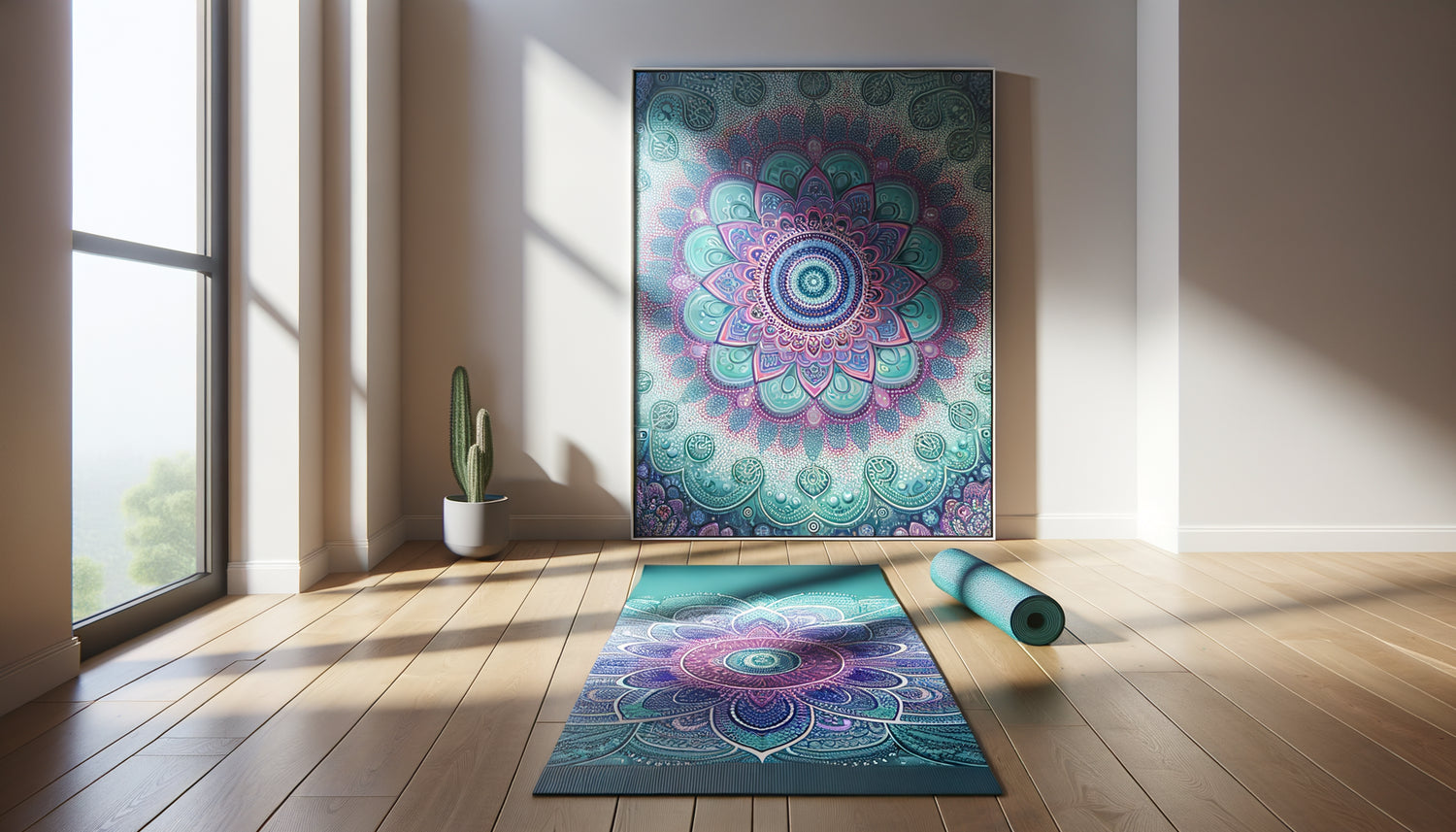
The first time I arranged a practice space for a yogini client, her emerald green mat vibrated so much that it seemed to absorb all the attention in the room. The white walls appeared cold, almost hostile against this explosion of color. That's when I realized: a colorful yoga mat is not just an accessory, it's the emotional heart of a personal sanctuary.
Here's what harmonized artworks with your yoga mats bring: a visual consistency that soothes the mind before even starting to breathe, an amplification of chromatic energy that supports your intention, and an aesthetic anchor that transforms your practice corner into a true refuge.
Many practitioners invest in beautiful mats with complex patterns and vibrant hues, then find themselves overwhelmed by their walls. How not to create visual chaos? How to make a purple mandala dialogue with wall art without the whole thing looking like a confetti explosion? The temptation is great to leave everything neutral for fear of making a mistake.
Yet, the solution exists, and it's more intuitive than you might think. Choosing artworks that converse with your yoga mat simply requires understanding a few principles of chromatic and energetic harmony. After designing dozens of practice spaces where art and movement coexist, I will share a sensitive and accessible approach.
Decoding the color language of your mat
Before choosing the slightest artwork, spend ten minutes really observing your yoga mat. Unroll it, sit facing it as you would face a painting in a museum. What are its dominant colors? A turquoise mat often hides deep blue nuances and touches of green. A burgundy mat may reveal plum or terracotta undertones.
This attentive reading becomes your color map. Mentally note or photograph these shades. If your mat displays a geometric pattern, also identify the proportions: is there 70% blush pink and 30% gold? Or vice versa? These proportions will guide you in choosing your artworks.
I have a client whose mat presented a gradient from coral to peach. She absolutely wanted abstract cobalt blue paintings, thinking of creating a dynamic contrast. But in practice, this opposition created tension rather than synergy. We opted for works with softened coral touches with sandy beige tones, and the space immediately became soothing.
The art of complementary or analogous harmony
Two philosophies are available to you to harmonize paintings and yoga mats. Analogous harmony uses colors close on the color wheel: if your mat is emerald green, opt for artworks in shades of blue-green, olive green or yellow-green. This approach creates a soothing, almost meditative continuity.
Complementary harmony, on the other hand, plays on controlled opposites. A vibrant orange rug can beautifully converse with paintings in deep blues or muted blues. But be careful: this approach requires subtlety. Favor desaturated versions of complementary colors to avoid visual overload.
The power of neutral tones with accents
A strategy I particularly like: choosing predominantly neutral paintings that subtly pick up a color from your rug. Imagine a multicolored mandala-type rug with purple, fuchsia and gold. A beige linen painting with a delicate touch of watercolor purple will create a visual bridge without rivaling the intensity of the rug.
This approach works particularly well in small spaces where a colorful rug already occupies an important part of the field of vision. Paintings then become visual breaths that balance chromatic energy rather than amplify it.

When pattern meets movement
If your yoga mat features mandalas, geometric patterns or florals, the question of pattern in your paintings becomes crucial. The golden rule: vary the scale and complexity. A rug with dense patterns calls for more refined paintings so that the eye can find where to rest.
I worked with a teacher who owned a magnificent rug adorned with detailed paisley motifs in purple and gold. We chose paintings representing fluid, almost abstract organic shapes in shades of lavender and cream. The contrast between the precision of the rug's patterns and the softness of the pictorial forms created a perfect balance.
Conversely, if your rug is plain or has a simple gradient, your paintings can be bolder. Geometric patterns, dynamic compositions or even detailed botanical representations will find their place without creating visual cacophony.
The intentional energy of your space
Beyond pure aesthetics, consider the energetic intention of your practice. A passion red rug or an energizing orange rug may call for paintings that channel this vitality: sunsets, stylized flames, dynamic compositions in warm tones.
If your rug features cool tones like glacier blue or turquoise, prioritize artworks that amplify this quest for calm: soothing seascapes, minimalist compositions, representations of natural elements in soft palettes.
Symbols that resonate
Many yoga rugs incorporate spiritual symbols: om, lotus, chakras, natural elements. Your artworks can echo these symbols without literally repeating them. A rug with a stylized lotus can beautifully harmonize with an artwork representing water in abstract form, evoking the element without naming it.
This subtle symbolic approach creates layers of meaning that enrich your experience without turning your space into an esoteric catalog. A rug with geometric mandalas can dialogue with artworks featuring concentric circles or radial compositions in contemporary artistic contexts.

The spatial dimension of harmony
The placement of your artworks in relation to your yoga rug profoundly influences the visual harmony. Position your works within your natural field of vision during practice. What do you see when lying down for savasana? Which wall occupies your gaze in downward dog?
An artwork placed on the wall facing you during seated postures becomes a point of focus, almost a visual drishti. Choose it carefully: its colors should support your meditative state without capturing all your attention. Harmonized tones with your rug create this soothing continuity.
Also consider the size. A large, colorful rug in a small space calls for artworks of modest or medium dimensions. In a spacious studio, you can dare to use more imposing formats that create an equal dialogue with the floor rug.
The art of wall composition
For particularly vibrant rugs, a composition of several small artworks may work better than a single large piece. Three 12x16 inch artworks in complementary shades to your rug create a visual rhythm that echoes the movement of yoga.
This approach also allows you to play with chromatic transitions. If your rug goes from purple to pink, your three artworks can follow this progression by softening it or transposing it into another tonal range.
Transform your practice space into a harmonious sanctuary
Discover our exclusive collection of wall art for yoga studios that complements your colorful mats to create the perfect visual balance.
Living harmony every day
Imagine this moment: you unroll your turquoise mat with golden motifs, and your gaze naturally falls on a painting with deep water tones and bronze accents that dialogues with it. No visual disruption, no distraction, just continuity that invites introspection.
This consistency is not built by chance. It is born from careful observation, an understanding of chromatic energies, and a quiet courage to affirm your aesthetic choices. Your colorful yoga mat is not a decorative challenge; it's an invitation to create a visual frame that supports your practice.
Start small if you hesitate: a single painting, placed temporarily, observed during a few sessions. Notice how it influences your state of mind, whether its presence soothes or, on the contrary, distracts. True harmony is felt before it is seen.
Trust your chromatic intuition. If an association makes you smile inwardly, if it evokes a feeling of completeness, then it's probably the right one, even if it defies academic rules. After all, your yoga space is a reflection of your inner world, and only you know its intimate geography.
Frequently Asked Questions
My yoga mat is very colorful with several shades, should I pick up all the colors in my paintings?
Absolutely not, and it's even discouraged! When your mat presents a rich palette, choose one or two dominant colors to pick up in your paintings. For example, if your mat displays purple, pink, orange and gold, select purple and gold for your wall art, deliberately ignoring the other shades. This selection creates consistency without repetition, and allows some of the mat's colors to shine without competition. Think of your paintings as selective amplifiers rather than complete mirrors. You can also opt for neutral tones (beige, soft gray, off-white) that welcome all the colors of your mat without privileging any, creating a soothing visual breathing space.
What should I do if I regularly change my yoga mat depending on my moods or practices?
Excellent question for yogis who like to vary! In this case, choose artworks with neutral and natural palettes that serve as a harmonious base for any colorful mat. Beige, taupe, pearl gray, off-white or soft terracotta tones work as visual chameleons. You can also choose very subtle multicolored works, with discreet touches of different shades, which will resonate with any rug. Another strategy is to invest in easily interchangeable artworks: frames with an easy opening system allow you to change the prints depending on the mat rolled out. Finally, consider that this variation of mats can be an asset: it allows you to experiment with different atmospheres and discover which combinations touch you most deeply.
Should abstract or figurative art be favored to harmonize with a colorful yoga mat?
Both approaches work beautifully, but for different reasons. Abstract art offers more chromatic flexibility: fluid shapes, gradients, compositions of pure colors naturally dialogue with the often stylized patterns of yoga mats. This is particularly suitable if your mat already features geometric motifs or complex mandalas: abstraction brings a freer counterpart. Figurative art, on the other hand, can anchor your practice in symbolic elements: representations of plants, natural landscapes, aquatic scenes create a narrative that enriches your intention. If your rug is very visually rich, prefer a refined and minimalist figurative style. If your mat is plain or simply gradient, you can dare to be more detailed. The essential thing remains the chromatic harmony and the energy released by the whole.