

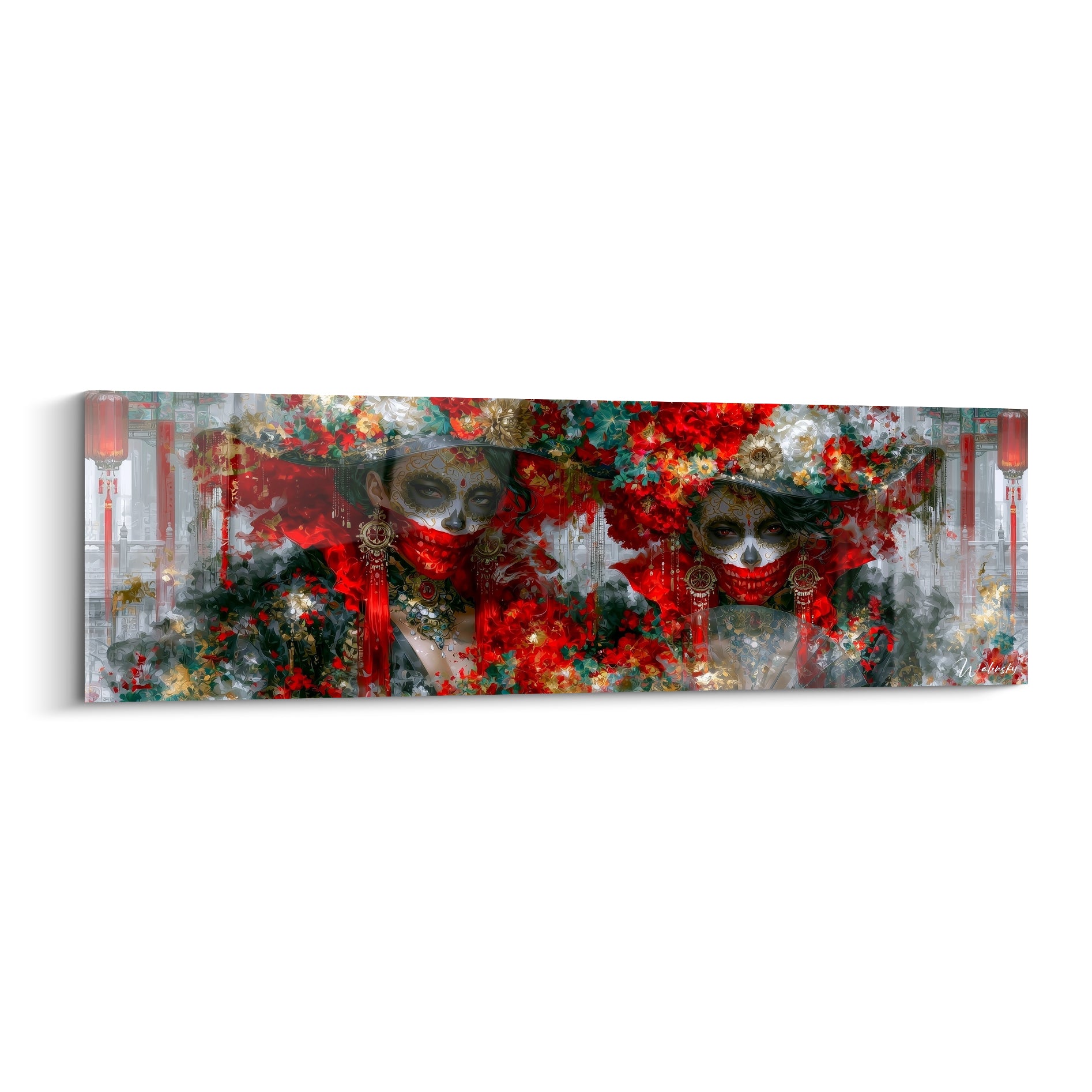






The Entrance: Creating an Emotional Impact at First Glance
October 11, 2025 · 20 min read · by Walensky
You open your front door and immediately feel that familiar frustration: your guests enter a bland, impersonal hallway that doesn't reflect your personality or the warm atmosphere of your interior.
The eye falls on bare walls, a commonplace console, perhaps a plant doing its best in this soulless corner. You discreetly observe the expression of your loved ones: that slight pause, that look searching for something striking, that almost imperceptible disappointment before they head to the living room.
You've tried a few solutions: a mirror here, a shelf there, maybe even invested in a designer lamp. But nothing works: your entrance remains desperately anonymous, like it’s just an obligatory passage to the "real" rooms of your house.
Rassurez-vous, it's neither a lack of taste nor a space problem. The real reason? The absence of a strong central element to instantly transform the energy of the place and create that memorable first impression you’re looking for.
In this article, you'll discover how to choose and position THE artwork that will transform your entrance into a true emotional calling card – and your guests will never forget their arrival at your home.
Why does your entryway determine the atmosphere of your entire home?
The first 7 seconds in your entryway completely condition how your guests will perceive your interior and your personality. Like a first date, this initial impression influences everything else about their visit. Waiting to reveal your style until you're in the living room is like starting a book with chapter 3: you miss the opportunity to create emotion from the very first contact.
💡 Interior designer revelation: Sarah, a decorator for 15 years, says: "I visited a beautifully decorated house, but the entrance was so neutral that I felt like I was entering a doctor's office. Even the sublime living room couldn’t erase that initial feeling of coldness. The owner changed their entryway artwork the following month – the effect on guest welcomes was spectacular."
Conversation with a decor expert
The golden rule for visual welcome: Your entrance should tell a story in less than 3 seconds – like a trailer that sets the tone of the film. With the right artwork, you'll see your guests’ attitude change during their first visit, usually within 48 hours of installation.

Do you recognize these signs of an entrance without impact?
Your guests quickly pass through your entrance without stopping, their conversations only resume once they reach the living room. You yourself avoid taking photos of this area during your receptions. Delivery people and visiting professionals seem eager to leave, without that little positive comment you hear elsewhere.
What’s really happening? Your entrance conveys no positive emotion – it remains in the “functional” register instead of switching to the “emotional” one. The problem isn't your decoration, but the lack of a focal point powerful enough to transform the energy of the place.
Think about your favorite restaurant: as soon as you walk through the door, you instantly know what kind of universe you’re entering. Your entrance should evoke the same feeling.
Mistake #1: Seeking to harmonize rather than captivate
Contrary to popular belief, a successful entrance doesn't need to “match” the rest of your home – it needs to create a desire to discover what’s next. The difference? A harmonious entrance reassures, but a captivating entrance creates excitement and curiosity.
It's like the difference between wearing a well-tailored suit (correct) and wearing an accessory that reveals your personality (memorable). Your entryway artwork is that signature accessory that transforms the correct into the unforgettable.
Concrete result: instead of guests who “pass through” your entrance, you get guests who “arrive” at your home with a smile and that immediate feeling of being in a unique place.
🔍 Revealing test: Film discreetly the reaction of your next guest within the first 5 seconds after crossing your threshold. Does their gaze seek something to admire or does it immediately move on? This 10-second video will tell you everything about the current impact of your entrance.
Many choose “wise” shades thinking to create a soothing atmosphere, but an entrance isn't meant to soothe – it’s meant to awaken. Neuroscience confirms it: our brain needs contrast and intensity to positively mark a spatial memory.
Imagine the difference between walking into a spa (relaxing but forgettable) and walking into a collector’s home (stimulating and memorable). Your entrance should emulate the latter.
The change you'll experience? You will enjoy coming home more and your guests will start complimenting you from the moment they step inside, not just once they’re settled.
Mistake #3: Choosing based on space rather than emotion
"My entrance is small, I can't afford something imposing" – this logic seems sensible but works in reverse to spatial psychology. A small space needs a strong impact not to appear cramped, just like a little black dress needs a statement jewelry piece to shine.
How do you spot it in your situation? You chose your entrance decor thinking first "what fits?" instead of "what transforms?”. You measure before dreaming, calculate before feeling.
Direct impact: your entrance becomes a mere technical vestibule between the outside and inside, instead of being that moment of emotional transition that prepares your guests to experience something special at your home.
🎯 The 3 signs your entrance lacks emotional impact:
- The smartphone test: No one ever takes a selfie in your entrance – it’s a sign that it doesn't generate any spontaneous positive emotion
- The 10-second rule: Your guests don’t make any comments during their first 10 seconds at your home – they are subconsciously looking for something to admire
- The mirror effect: You yourself avoid lingering in this area – if you feel nothing, neither will your guests
The trigger factor: the emotional contrast effect
What truly transforms an entrance is creating a striking contrast with the outside – like going from a generic hotel corridor to a presidential suite. This emotional shift acts as a switch: it instantly activates the feeling “I’m entering somewhere special”. You recognize it in your entrance when your guests naturally pause admiringly instead of rushing straight into the living room.
The law of first glance: Your guest must know within 3 seconds that they are entering the home of someone with taste and personality. If their eye doesn't find anything to “catch” immediately, the neutral impression is already etched – even a magnificent living room won’t erase it completely.
| ❌ Functional entrance | ✅ Emotional entrance | 💡 Mechanism | 🎯 Guest feeling |
|---|---|---|---|
| You quickly pass through it | You pause admiringly | Visual impact effect | "Wow, I can't wait to see the rest" |
| No spontaneous comments | Immediate compliment | Positive emotional trigger | "Tell me where you found that!" |
| Feeling of "necessary passage" | Impression of "arrival" | Creation of a psychological threshold | "I already feel good here" |
| Neutral and forgettable | Marking and memorable | Strong sensory anchoring | "This house has a soul" |

The 3-step method to transform your entrance
Rassurez-vous : creating an emotional impact at the entrance requires neither a large budget nor work. It's a question of method and strategic choice – like a chef who transforms simple ingredients into a memorable dish. The progression follows an unstoppable logic: first we analyze what exists, then we choose the transformative element, finally we optimize the staging. Guaranteed result: an entrance that marks people's minds in less than 48h.
🎯 Overview of the transformation: Step 1 = diagnosis of your natural focal point (15 min), Step 2 = selection of the emotionally right painting (30 min), Step 3 = theatrical staging (45 min). Each step already generates a small "wow" that motivates you for the next.
Step 1: Identify your maximum impact zone
Starting with this step is laying the right foundations – like a photographer who first finds the best angle before adjusting his camera. This analysis avoids the classic mistake of choosing a magnificent painting... misplaced. The immediate satisfaction? You discover the hidden potential of your entrance in minutes of observation.
What you need for this step
- Your smartphone in camera mode: It reveals the real perspective of your guests, unlike your usual eye which automatically "corrects" defects. Take 3-4 photos from the entrance threshold – the screen shows you what your guests really see, without the filter of familiarity. Avoid wall mirrors that distort this initial analysis.
- A flexible tape measure: To measure wall/ceiling height proportions in seconds. The principle? An impactful painting occupies between 1/3 and 1/2 of the width of the main wall – less goes unnoticed, more overwhelms the space. This measurement determines your target format immediately.
- Different lighting: Test your entrance in natural light, then with your usual evening lighting. A transformative painting must "exist" in all lighting conditions of your daily life - this is what guarantees a constant impact on your guests.
Let's move on to concrete action now
How to identify your impact wall in 15 minutes
Position of the first look: Stand exactly where your guests stand while waiting for you to open the door completely. Look straight ahead without moving your head – what you see first is your natural impact zone. Mentally note if it's a full wall, an angle, or a perspective towards another room.
⏱️ Time: 2 minutes | ✅ Successful when: You clearly identify the surface your guests naturally look at | ⚠️ Attention: Don't choose the largest wall – choose the one of first glance, even if it’s small
Natural circulation test: Walk the normal path of your guests from the door to the living room, noting when your gaze naturally seeks something interesting. These "visual search" points reveal where to place your captivating element. Mark 2-3 obvious locations with a sticky note.
⏱️ Time: 3 minutes | ✅ Successful when: You have identified 2-3 areas where the eye naturally “hooks” | ⚠️ Attention: Avoid direct traffic areas – prefer surfaces that are looked at while moving
Visual proportion measurement: Measure the width of your main wall and divide by 3 - this is your minimum size to create an impact. Divide by 2 for the maximum size before it becomes overwhelming. Note these dimensions: they determine your ideal artwork format, width AND height.
⏱️ Time: 5 minutes | ✅ Successful when: You have your precise min/max dimensions in cm | ⚠️ Attention: Don't underestimate - a piece too small is invisible, it’s better to border on “too big”
✨ Step validation: You must be able to say "the ideal artwork will measure X cm by Y cm and will be placed on this specific wall". Test by cutting out a cardboard to the correct dimensions and positioning it - if it “already does something”, you have found your zone. If you are still hesitating, it means that the location is not obvious enough.
— Our selection


OUR RECOMMENDED PRODUCTS
Step 2: Choosing your signature artwork
Now that you know your impact zone, it's time for the creative and personal part: selecting THE artwork that will transform the energy of your entrance. This step is more rewarding than the first because you enter pure emotion - you move from technical analysis to creating atmosphere. The snowball effect begins: each choice you make will illuminate the next.
Selection criteria that will change everything
- Emotional intensity above all else: Your artwork must provoke an immediate reaction - positive, intriguing, admiring, it doesn't matter, but not indifferent. Test by showing the photo to 3 different people: if at least 2 make a spontaneous comment within 5 seconds, that’s a good sign. Flee from polite “it’s pretty” – look for authentic “oh look at that!” The contrast with your usual world: If your home is rather understated, dare to choose a painting with character. If it's already colorful, opt for something graphic or textured. The principle? Your entryway artwork should be slightly "more intense" than the rest of your decor – that’s what sets the tone for your personality.
- The visible manufacturing quality: Your guests will approach to look at the details – materials, finishes, thickness of the support. A high-quality entryway painting immediately reassures about the level of your interior. Favor thick supports, neat finishes, colors that don't fade in the light.
The foolproof selection method
The spontaneous crush test: Spend a maximum of 20 minutes looking at visuals of paintings without thinking about constraints. Note those that make you react emotionally in the first 3 seconds – these instinctive reactions reveal your authentic style, which will naturally transpire in your welcome.
⏱️ Time: 20 minutes | ✅ Successful when: You have 3-5 visuals that "speak" to you immediately | ⚠️ Attention: Don't rationalize too quickly – keep even what seems "too daring" for the moment
Verification of impact from a distance: Display your favorites on your screen and look at them from 2-3 meters (typical distance in an entryway). Details disappear, only the general impression counts. A good entryway painting must "exist" and create an atmosphere even seen from afar, before approaching for the details.
⏱️ Time: 10 minutes | ✅ Successful when: 2-3 paintings remain "strong" even viewed from a distance | ⚠️ Attention: Eliminate those that become "blurry" or lose their impact at a distance
Test of projection in your entryway: Print your latest favorites in A4 format and temporarily tape them to the intended location. Look at them at different times of the day and ask a friend for their opinion when arriving home. This simulation reveals which one really transforms the atmosphere of your entryway.
⏱️ Time: 24 hours of observation | ✅ Successful when: One painting clearly stands out due to its impact | ⚠️ Attention: Don't keep the one that "goes well" – keep the one that "transforms"
🎯 Confirmation of final choice: Your painting is right when you feel a little pride in showing it and you already imagine the positive reactions of your guests. If you have doubts like "I hope it will work", it means that the choice is not assertive enough. Start again with bolder options.
Step 3: Staging the theatricality of your entryway
Do you have your favorite artwork? Great! Now, let's make it shine like a gallery exhibition. This final step gives you complete control over the experience your guests will have – you go from "informed enthusiast" to "visual reception expert". The final result will be an entrance that tells your story and which you'll be proud of for years.
The art of emotional hanging
Perfect psychological height: Position the center of your artwork at 1.60m from the floor – natural eye level for an adult. This gallery rule maximizes immediate impact without forcing the visitor to raise or lower their eyes. Measure from the floor to the physical center of the artwork, not to the top edge.
⏱️ Time: 10 minutes | ✅ Success when: The artwork is naturally within your field of vision | ⚠️ Attention: Too high = impression of distance, too low = loss of stature
Highlighting lighting: Your artwork should be slightly better lit than the rest of the entrance to naturally attract attention. Add a discreet sconce or reorient your existing lighting. The goal? Create a natural "spot" that enhances your work without apparent artifice.
⏱️ Time: 15 minutes | ✅ Success when: The artwork visually "stands out" from the wall | ⚠️ Attention: Avoid direct lighting that creates reflections on the surface
Support environment: Clear the space around your artwork of any competing elements (other frames, scattered decorative objects). Your artwork should reign alone on its wall – like a soloist on stage. Keep one complementary element (console, plant) that dialogues with it without competing.
⏱️ Time: 20 minutes | ✅ Success when: The eye goes directly to the artwork without distraction | ⚠️ Attention: Resist the urge to "fill" – the emptiness around reinforces the impact
🏆 Final success test: Invite a friend into your home normally and observe their gaze without saying anything. If they notice and comment spontaneously on your artwork within the first 10 seconds, you've won! If you have to draw their attention to it, refine the lighting or clear even more space around it.
Optimal progression rule: Each step should generate a small, immediately visible "improvement" – otherwise, you're not going far enough with your choices. Step 1 = "I found my potential", Step 2 = "this artwork suits me", Step 3 = "my guests will love it". If a step doesn't excite you, go back with bolder options.
Congratulations! You now master the codes of high-end visual welcome. But a few expert subtleties can still double the impact of your entrance and give you that quiet confidence of someone who knows exactly what they're doing when it comes to decoration.
🎨 Gallery secret: For maximum impact, choose a painting with a strong "visual signature" – unusual dominant color, marked texture, or very identifiable style. This signature should be subtly echoed elsewhere in your home (cushion, object, flower) to create a subliminal thread. Your guests will subconsciously feel the coherence without being able to explain it – that's the mark of a truly thought-out interior.
"I'm afraid it might be too bold for my usual style..."
"What if my guests find it too flashy or not in my style?"
This hesitation is perfectly normal – it even reveals your good taste and respect for your guests! But think: your friends come to your home to discover your personality, not to find the same neutrality as everywhere else. A painting that truly resembles you reassures your guests about your authenticity. Start by showing a photo to your closest loved ones – their enthusiastic reactions will give you confidence. And remember: we regret being too timid more often than too expressive in decoration.
💪 Confidence technique: Display your chosen painting as your phone wallpaper for a week – if you enjoy seeing it several times a day, then it really suits you. This familiarization will give you the confidence to install it at home.
— You may also like


The 5 pitfalls that sabotage the impact of your entrance
Now that you know the method, let's protect your investment by avoiding common mistakes that turn a beautiful painting into an ordinary decorative element. These pitfalls are insidious because they seem logical at first glance – I will help you thwart them before they ruin your "wow" effect.
- 🚫 Choosing "what goes with" rather than "what stands out": It's tempting to take colors that harmonize perfectly with your existing decor, but the entrance should break with the ordinary! Too perfect harmony lulls the eye instead of awakening it. Prefer a painting that dialogues with your decor without copying it – think "jazz accord" rather than "unison". This mistake affects 80% of people on their first attempt. 🚫 Multiplying decorative elements "to do more": Accumulation kills impact – it's an implacable law of decoration. You’ve found the perfect painting? Resist the urge to add a console, three photos, two plants and a mirror “to balance”. A single strong element is better than five average elements. Keep your painting as a unique star – accessories will naturally come later. 🚫 Failing to consider the importance of lighting: A beautiful painting in a poorly lit entryway becomes an invisible one. The classic mistake? Relying only on the hallway's general lighting. Your artwork deserves its own lighting, even subtle – a directional wall lamp or even a floor lamp will suffice. Otherwise, your emotional and financial investment goes unnoticed.
- 🚫 Copying Pinterest inspiration without adapting it: Magazine photos are beautiful but photographed in perfect conditions with professional lighting. Your entryway has its own constraints – ceiling height, brightness, traffic flow. Get inspired without copying: keep the spirit, adapt the form to your reality. Otherwise, disappointment is guaranteed.
- 🚫 Putting off the decision "later" due to perfectionism: "I'll wait to find THE perfect painting," "I want to be 100% sure," "I need to think about it more...". This perfectionism often hides a fear of asserting yourself. The result? Your entryway remains neutral for months. It’s better to make a very good choice installed today than a hypothetical perfect choice in 6 months.
🛡️ 4-point error prevention system: Before permanently installing, check that (1) your painting attracts the eye within the first 3 seconds, (2) it generates a positive emotion in you AND a loved one, (3) it remains visible and impactful even with evening lighting, (4) you have resisted the urge to add other decorative elements "to balance things out." If any point fails, adjust before finalizing.
— In the same vein


Your questions about transforming your entryway
Allow between €150 and €400 for a quality painting that will make a difference for years – less than what you probably spend on restaurants in a month. The trick to optimizing? Invest 80% of your budget in the painting itself, 20% in accompanying lighting. A €300 painting well lit is more impressive than a €500 painting in a poorly highlighted entryway.
The impact is immediate! From the first post-installation visit, you will notice the change in behavior: your guests naturally stop in the entryway instead of walking through it, spontaneously comment, and the overall atmosphere of their arrival is warmer. In 2-3 visits, this effect becomes your new normal – and you won't be able to imagine your entryway without this transformative element.
Great news: small entryways actually respond even better to impactful artworks! Like a statement jewelry piece on a simple outfit, the contrast effect is amplified. The trick? Choose a format that occupies 40-50% of your main wall – even in 2m², a 60x40cm artwork creates a striking effect. I've seen studio entries completely transform the overall impression of an apartment with this approach.
Test the 5-second rule: show the artwork to 3 people who know you well and ask them "would you see me with this in my home?". If at least 2 answer yes spontaneously, it means the style suits you. Another indicator: you must feel a little pride (not just satisfaction) at the idea of showing it off. If you're still looking for rational justifications, it means the emotion isn't strong enough.
Absolutely! Use the "cardboard test" method: cut out a piece of cardboard to the exact dimensions of your artwork and test several positions with repositionable tape. Photograph each attempt from the entrance – the camera immediately reveals the optimal position. Golden rule: the center of the artwork at 1.60m from the floor, and at least 20cm of free space on each side. This preparation eliminates 99% of hanging errors.
Your transformed entryway: the art of making an impression from the first glance
Imagine yourself in 3 weeks: your guests enter your home and spontaneously stop, their eyes drawn to your signature artwork that immediately tells them who you are. No more quick crossing to the living room – they take the time to admire, comment, ask where you found this masterpiece. Your entryway has become your emotional calling card, and this transformation radiates throughout their visit.
This mastery of visual welcome goes far beyond simple decoration: you have developed your artistic eye, your confidence in your aesthetic choices, and that rare ability to create an atmosphere with a few well-chosen elements. These skills will serve you for all your future decor projects – you now know the difference between "pretty" and "memorable", between "harmonious" and "transformative".
The hardest part is behind you: understanding the mechanics of visual impact was the crucial step. Now, all you have to do is choose your favorite artwork and install it according to the method you master. In 48 hours, your entryway will have joined the closed circle of interiors that really make an impression.
🌟 Your moment has arrived: You now have all the keys to create that entryway you've secretly dreamed of – the one that makes your guests feel privileged to be received in your home. The art of hospitality begins today, with your first transformative artwork!
Also read: ✨ Read more articles on emotional transitions

Explore our collections


