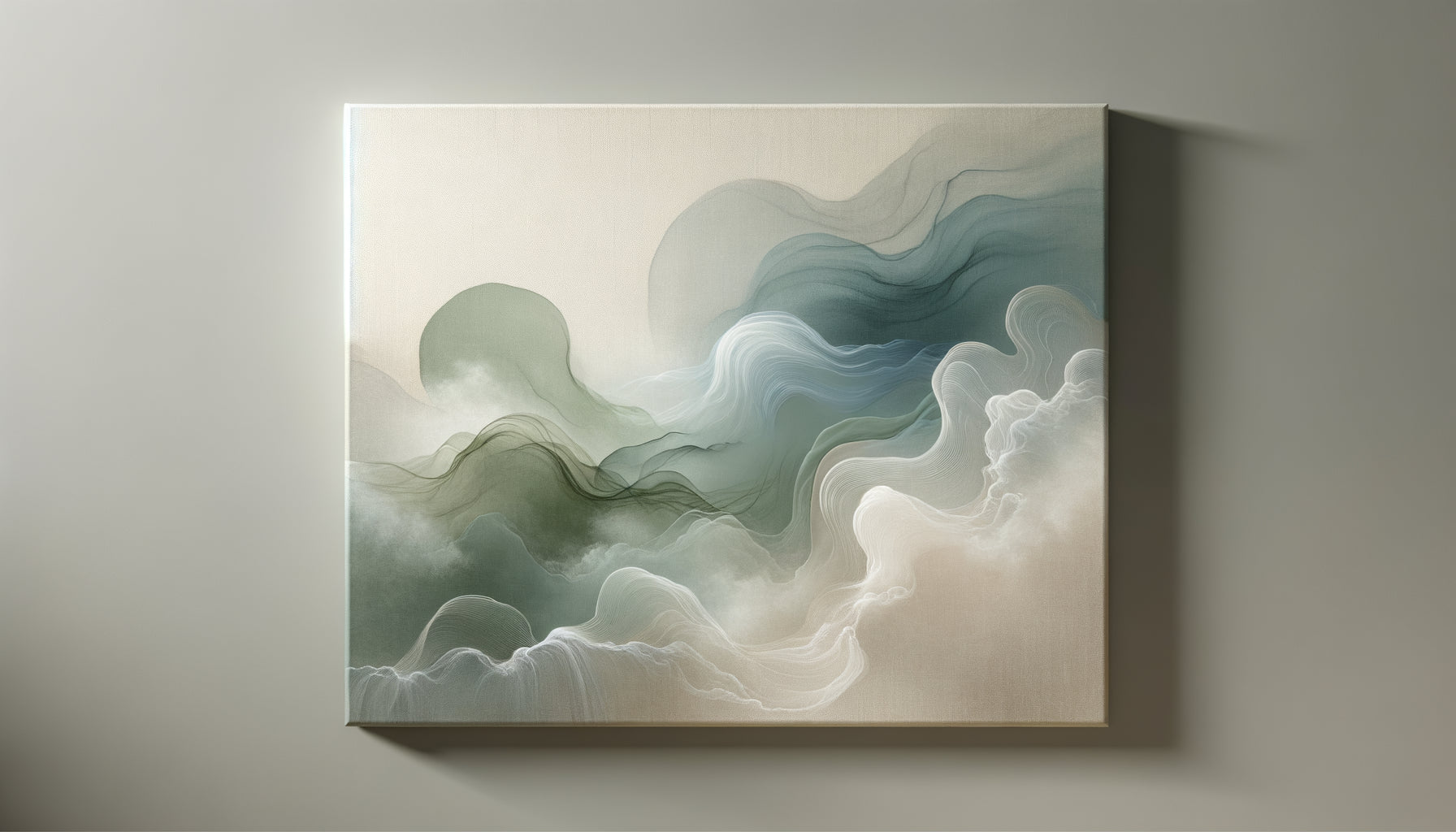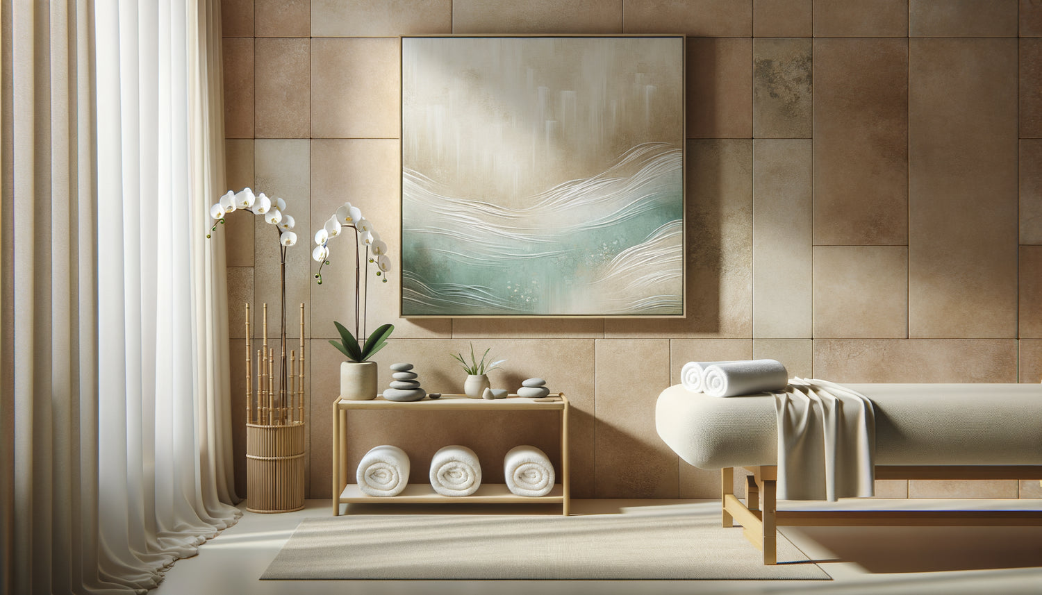
The first time I transformed an old medical office into an urban spa, I made the mistake of neglecting the walls. Everything was perfect: the soft lighting, the essential oils, the murmur of water. Yet, something was missing. Clients remained tense, their shoulders rigid despite the massages. It was by observing their lost gazes towards the bare walls that I understood: the visual atmosphere of a spa is as therapeutic as its treatments.
Here's what soothing artwork brings to your spa: they slow down heart rate upon entering, prolong the state of relaxation during treatments, and anchor this feeling of well-being in clients’ sensory memory. A well-chosen painting transforms a treatment space into a sanctuary of regeneration.
Many spa owners invest thousands of euros in equipment but neglect the artistic dimension. The result? A clinical environment where it's difficult to let go. Your clients deserve better than standardized decor that could belong to any establishment.
The good news? There are proven principles for selecting artworks that truly transform the atmosphere. After conceptualizing more than forty wellness spaces, I have identified visual codes that work universally, regardless of your clientele.
The psychology of color in the spa universe
Colors don't just decorate your walls: they change the brain chemistry of your clients. When a person looks at a shade for a few seconds, their nervous system reacts instinctively. Deep blues activate melatonin production, that hormone which prepares for sleep and relaxation. That’s why paintings evoking the ocean, the twilight sky or indigo hues work so well in massage rooms.
Greens, on the other hand, act differently. Coming from nature, they reduce cortisol, the stress hormone. A painting depicting a bamboo forest, lush foliage or mountain landscapes shrouded in mist creates that primal connection with the plant world. Your clients don’t understand rationally why they feel better, but their body knows.
Beware of bright reds and oranges: these stimulating hues increase blood pressure. Even in small touches, they can sabotage the soothing atmosphere you are trying to create. If you like warm tones, opt for soft earthy tones, powdery pinks or muted corals that retain a welcoming dimension without exciting the nervous system.
When blur becomes therapeutic
Here's a secret I discovered by observing clients in waiting rooms: overly detailed paintings tire the eye. A complex urban scene, a hyperrealistic still life or a precise geometric composition force the brain to analyze, decode, interpret. That’s exactly the opposite of what someone coming to recharge is looking for.
Abstract artworks with blurred outlines offer the brain permission to wander. A watercolor gradient that evokes without representing, organic shapes that suggest rather than impose, hazy horizons where earth and sky blend: these spa-ready paintings become meditative portals. The gaze glides without clinging, favoring that mental state between wakefulness and sleep where regeneration occurs.
I tested this approach in a thermal spa where clients complained of not being able to disconnect despite the treatments. By replacing sharp photographs of landscapes with abstract watercolors in shades of gray-blue, the feedback changed radically. Clients spontaneously described their experience as 'hypnotic' and 'enveloping'.
Formats that breathe
The size of a painting directly influences the feeling of space. In an intimate treatment room, a large panoramic format creates a virtual window that visually expands the room. The client lying on the massage table gazes at this ethereal landscape, which becomes their privileged view for an hour. Prioritize horizontal dimensions (120x60 cm minimum) which naturally accompany the reclining position.
For circulation areas and common areas, multiply medium formats rather than a single large painting. Three canvases of 60x60 cm arranged in a triptych create a soothing visual rhythm, like slow breathing. The eye gently travels from one work to another without effort, maintaining that precious state of relaxation.

Themes that transport without disturbing
Some subjects possess a universal resonance with relaxation. Water in all its forms comes to the top: stylized waves, reflections on a still lake, macro-photographed dew drops, misty waterfalls. Water symbolizes purification and renewal in virtually every culture. A painting evoking the aquatic element reinforces the therapeutic message of your spa.
Zen minimalist landscapes are another safe bet. Think of manicured Japanese gardens, sand dunes with clean lines, stones stacked in cairns. These balanced compositions visually convey the harmony that your treatments promise to bring. They work particularly well in spaces dedicated to yoga, meditation or holistic therapies.
Absolutely avoid human representations, even those that are soothing. A face irresistibly draws the eye and creates a psychological presence that can disrupt the intimacy of care. Even a serene portrait becomes a 'presence' in the room. Your client should be able to close their eyes without feeling watched.
Texture: this forgotten dimension
In a spa where touch plays a central role, the visual texture of paintings creates sensory coherence. Canvases with light relief, mixed media incorporating sand or natural fibers, prints on raw wood: these textured surfaces dialogue with the tactile universe of massages and body treatments.
I have a fondness for canvas paintings on raw linen where the weave remains visible beneath semi-transparent paint. This material authenticity contrasts with ultra-smooth laminated prints that betray their industrial origin. In a place dedicated to natural well-being, every detail counts to maintain the consistency of the experience.
Frames deserve the same attention. Forget gilded ornamental frames or black graphic moldings. Opt for driftwood, bamboo, or even the complete absence of frame for canvases on thick stretchers. The painting should seem to be part of the architecture, not superimposed as an artificial decorative element.
Lighting: the secret ally of your paintings
The most beautiful painting in the world loses its power under an aggressive neon light. Each spa artwork deserves dedicated lighting that transforms it into a source of soft light rather than simply an illuminated surface. Warm white LED spotlights (2700K maximum) oriented with a 30-degree angle create this enveloping luminosity that enhances nuances.
For rooms without natural light, install your paintings facing indirect light sources. Light bounces off the clear tones of the work and diffuses into the room, creating a soothing cathedral-like atmosphere. This technique literally transforms your painting into a therapeutic lighting device.

Composing a coherent gallery without monotony
The classic mistake? Buying paintings based on impulse without an overall vision, creating a visually exhausting patchwork. Your spa tells a story: the journey inward towards serenity. Your paintings should accompany this narrative from the entrance to the treatment rooms.
First, define a master palette of no more than three colors: for example, deep ocean blue, sand beige and off-white. All your paintings should fit within these tones, with variations in intensity according to the spaces. The reception area can support slightly more dynamic shades, while treatment rooms require the softest nuances.
Vary the themes while maintaining stylistic consistency. If your first painting is a mineral abstraction with touches of blue, the next could be a floral watercolor in the same tones, then a stylized seascape. The common thread remains invisible but perceptible: your client traverses different soothing universes without ever breaking the charm.
Transform your spa into a visual sanctuary
Discover our exclusive collection of paintings for spa that extend the therapeutic effect of your treatments and anchor serenity in every space.
When to replace your paintings: subtle signs
A soothing painting is not eternal in its effect. After several months, your regular clients no longer really see it: it becomes an element of the decor, invisible through familiarity. This visual habituation gradually diminishes the initial relaxing impact.
Establish a seasonal rotation, even slight. Replace one or two paintings every six months, ideally in line with the seasons. Cooler shades and aquatic evocations in summer, earthier tones and mineral textures in winter. This subtle evolution renews the experience without destabilizing your regulars.
Also observe reactions. If you notice that clients positively comment on certain paintings or their gaze lingers spontaneously, you have identified a particularly effective work. Conversely, a painting systematically ignored, even aesthetically successful, does not fulfill its therapeutic mission and deserves to be replaced.
Your spa is already a masterpiece in the making
Imagine your client stepping through the threshold of your spa tomorrow morning. Before the receptionist greets her, her gaze meets a painting with oceanic dawn hues. Her shoulders drop imperceptibly. As she walks down the hallway to the treatment room, she encounters abstract compositions that naturally slow her pace. Lying on the table, she stares at this hazy landscape that seems to breathe in time with her own breathing. She will never know why this spa relaxes her more than another, but her body remembers.
This is precisely the effect that intentionally selected artworks produce. They don't decorate: they heal. Start with a single piece in your main space, observe the transformation, then gradually extend this visual atmosphere throughout your establishment. Your clients may not compliment you on your paintings, but they will return without being able to explain exactly why they feel so good in your space. And that's precisely the point.
Frequently Asked Questions
Should original artworks or reproductions be preferred for a spa?
High-quality reproductions offer an excellent value for money to start. The essential thing is not artistic authenticity but the visual and emotional impact on your clients. Opt for textured canvas or wood prints rather than plasticized paper, which immediately betrays its industrial origin. If your budget allows, one or two original pieces in the reception area create a unique signature, while treatment rooms can accommodate carefully selected reproductions. The eye perceives colors, shapes and the overall atmosphere first: a professional art print produces 90% of the soothing effect of an original artwork at a fraction of the cost.
How to maintain paintings in a humid environment?
Humidity and essential oils diffused in a spa are indeed a challenge for the preservation of artworks. Opt for paintings on moisture-treated supports or prints on aluminum in the most exposed areas (hydrotherapy rooms, hammams). For traditional canvases, ensure sufficient ventilation and avoid placing works directly above essential oil diffusers. Gentle monthly dusting with a dry microfiber cloth is usually sufficient. If you notice halos or warping, it's a sign that the artwork is overexposed: move it to a less humid area and replace it with an alternative better suited to this specific environment.
How many paintings should be planned for a 100m² spa?
The rule is not quantitative but qualitative: each distinct space deserves at least one visually soothing presence. For 100m², count on generally 8 to 12 artworks strategically placed. The reception area benefits from a centerpiece (large format) accompanied by two smaller works. Each individual treatment room features an artwork facing the massage table. Corridors and transition areas receive medium-sized compositions every 3-4 meters to maintain atmospheric continuity. The relaxation space can support a triptych or more ambitious wall composition. Avoid clutter: it is better to have five perfectly chosen and positioned artworks than fifteen creating a visual cacophony. Let your walls breathe: emptiness is part of the zen experience.