I spent eight years designing wellness sanctuaries across Europe, from luxury spas to intimate yoga studios. In every project, the same question arises: what art should I hang on the walls? Too often, I've seen beautifully conceived spaces undermined by overloaded artworks that transform a haven of peace into a stifling gallery. The answer gradually became clear: minimalist paintings are not an aesthetic choice, but a functional necessity in wellness spaces. They create a silent visual dialogue that amplifies rather than distracts. You may be frustrated with these bare walls lacking character, but you fear that a wrong choice will turn your serenity space into a source of mental stimulation. I understand this dilemma. After equipping more than forty wellness centers, I can assure you that a well-chosen minimalist painting possesses an unsuspected power: it soothes without boring, structures without imposing, inspires without distracting.
Why the relaxing brain rejects visual complexity
When we enter a wellness space, our nervous system initiates a delicate transition. The prefrontal cortex begins to slow down, brain waves gradually shift from beta to alpha. This is a fragile biological process that I have learned to respect while working with neuroscientists specializing in therapeutic architecture. A minimalist painting facilitates this transition through its lack of competing details. Unlike a complex figurative work that engages our interpretive and recognition abilities, a streamlined composition offers the brain exactly what it needs: a visual anchor that asks for nothing in return.
I tested this hypothesis in a thermal spa in the Swiss Alps. We replaced detailed landscape reproductions with minimalist paintings with pearl gray and off-white gradations. Customer feedback was unanimous: time seemed to flow differently, relaxation settled more quickly. This was not a placebo effect, but a measurable physiological response. High-performing wellness spaces understand that every element must serve the primary objective: facilitating letting go. An overloaded painting acts like an unsolicited conversation during a moment of introspection.
Restricted palette as visual breathing
What fundamentally characterizes a minimalist painting, is its chromatic restraint. A maximum of three shades, often from the same tonal family. This colorimetric discipline is not a limitation, it's a liberation. In my spa and yoga center projects, I use monochrome or bichrome works that dialogue with the surrounding natural materials: blond wood, light stone, raw linen. This consistency creates what I call visual breathing, a soothing rhythm where nothing comes to create a brutal break.
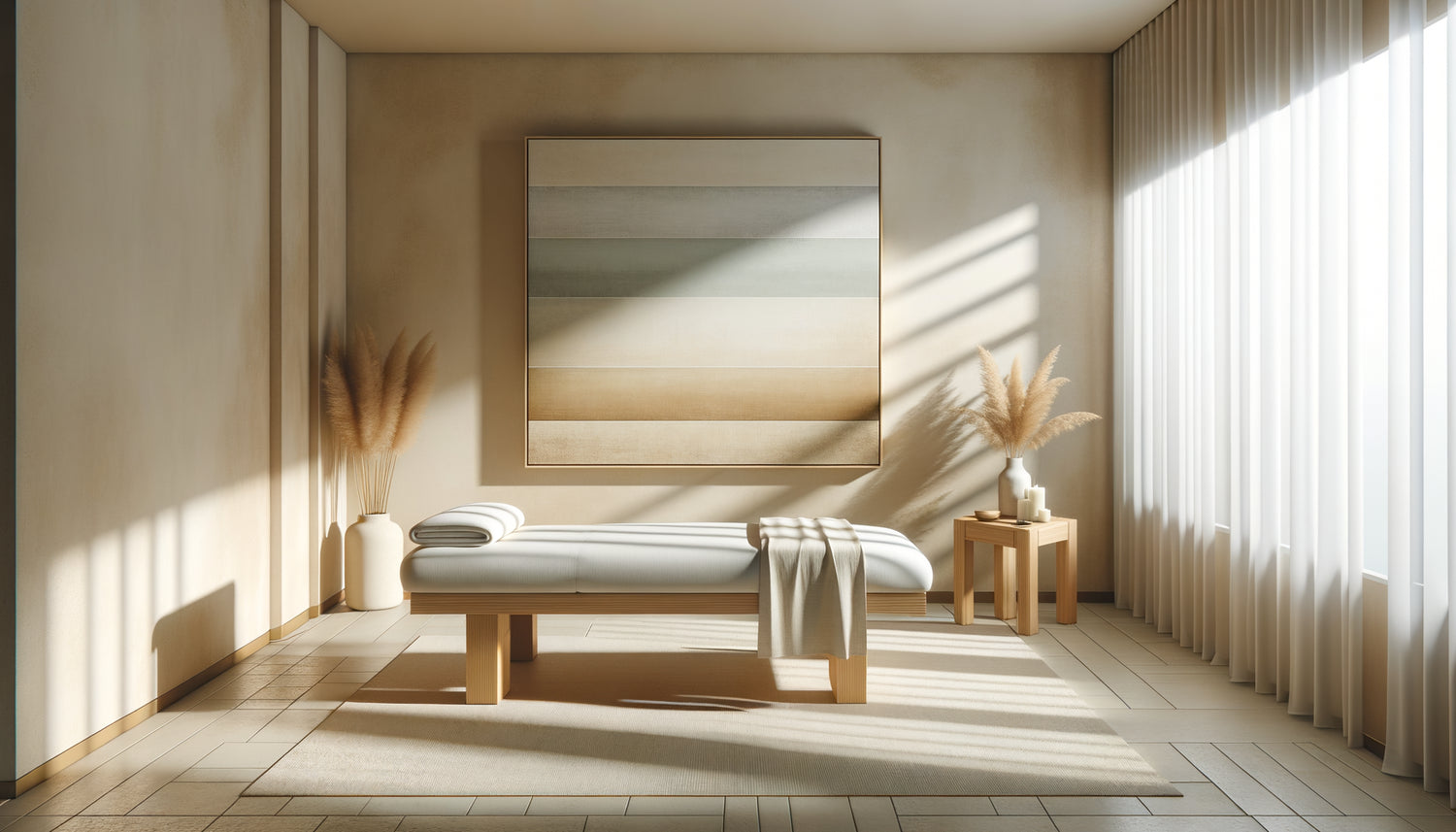
I recently worked with a meditation center in Barcelona where we installed a series of minimalist artworks in shades of sand and umber. Each piece presented a subtle variation on the same theme: horizontal bands whose thickness varied imperceptibly. Practitioners spontaneously began to use them as concentration aids, their gaze finding an active rest on these lines that evoked the horizon without representing it. That's exactly what a minimalist artwork achieves in a wellness space: it becomes a silent partner of practice rather than just decoration.
The balance between presence and absence
An excellent minimalist artwork for a spa has this paradoxical quality: it is there without imposing itself. I've observed that the most effective compositions use subtle textures rather than stark contrasts. A canvas with barely perceptible tonal variations, transparent superimpositions, surfaces that capture light differently depending on the time of day. This discreet depth allows the gaze to settle without clinging, just as breathing should be able to settle on the present moment effortlessly.

How clean forms influence the sensory experience
In a wellness space, all senses are stimulated simultaneously: essential oils diffused, ambient music, room temperature, textures of fabrics. The visual sense should not create dissonance in this sensory orchestration. I've learned to consider minimalist artworks as visual silences that allow other stimuli to fully express themselves. A simple geometric composition – a perfect circle, two superimposed rectangles, a single curved line – works as a resting point for the eye between moments of body awareness.
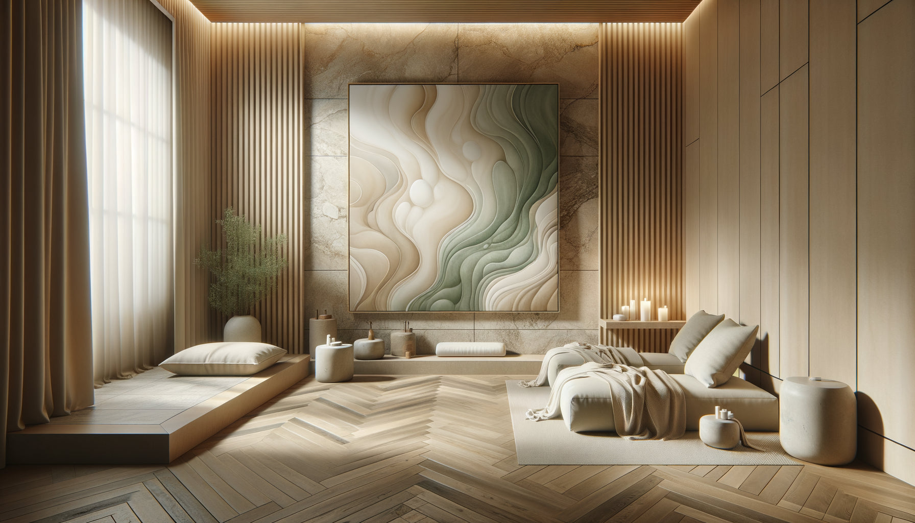
In an Ayurvedic institute near Brussels, we installed minimalist artworks representing abstract organic forms: gentle curves evoking pebbles smoothed by water. These primary shapes resonated with the massages practiced, creating continuity between the visual and tactile experience. Therapists noted that their clients entered a state of deep relaxation more quickly. This sensory synchronization is impossible with complex narrative works that create their own story parallel to the lived experience.
The fatal error of maximalist compositions
I was once called in to correct a problem in a newly opened spa in Lyon. The owners had invested in beautiful, very colorful contemporary paintings, thinking they would bring positive energy. The result? Customers found the space “stimulating” rather than “soothing.” The artworks weren't bad in themselves, but deeply unsuitable for their context. A wellness space is not a place where you come to seek intellectual or emotional stimulation. It’s a refuge from the overstimulation of everyday life.
We replaced these works with minimalist paintings in neutral tones: beiges, warm grays, off-whites with subtle accents of sage green. The transformation of the atmosphere was immediate. What many don't understand is that in a wellness space, art shouldn’t attract attention but liberate it. A minimalist painting creates a mental space for rest rather than a subject of active contemplation. This distinction is fundamental and makes all the difference between a space that works and one that fatigues.
When geometric abstraction becomes meditative
Some minimalist paintings use repetition as a structuring principle: parallel lines, grids, modular patterns. This visual repetition can induce a meditative state through its regular rhythm. I used this approach in a yoga room where we installed a series of three minimalist paintings presenting variations on the same concentric circles motif. Practitioners spontaneously used these artworks as concentration aids during breathing exercises, their gaze naturally following the soothing curves.

The materials and finishes that amplify serenity
Beyond the composition itself, the materiality of a minimalist painting plays a crucial role in a wellness space. I systematically avoid shiny surfaces that create distracting reflections. Matte or satin finishes are preferable because they absorb light rather than reflecting it unpredictably. In a spa, where lighting is often subdued and indirect, a minimalist painting with a textured surface subtly captures the ambient light and creates a soft presence.
I have developed a fondness for works on raw linen canvas, where the texture of the fabric remains visible beneath translucent washes. This material honesty perfectly aligns with the philosophy of contemporary wellness spaces that value authenticity and connection to natural materials. A minimalist artwork created with natural pigments on a noble support becomes an object of well-being in itself, an organic presence rather than a simple decorative element.
Transform your space into a sanctuary of serenity
Discover our exclusive collection of wall art for spas that combines visual purity and a soothing presence to create the perfect atmosphere of relaxation.
Composing a visual harmony without monotony
The main objection I hear regarding minimalist artworks in wellness spaces: “Isn’t it too cold, too impersonal?” It's a legitimate concern. Poorly executed minimalism can indeed create a clinical atmosphere rather than an appeasing one. The key lies in the nuance and warmth of the chosen tones. I avoid pure whites and cold grays in favor of more organic hues: off-whites tending towards cream, stone grays with warm undertones, sandy beiges.
In a thalassotherapy center in Brittany, we created a gallery of minimalist artworks inspired by the chromatic variations of the sea according to the seasons. Each work presented a subtle gradation from gray to pale blue-green, evoking the marine horizon without representing it literally. This approach made it possible to create a strong visual identity while maintaining the essential atmosphere of calm. Minimalist artworks do not impose monotony if they are chosen with sensitivity to nuances rather than dogmatic adherence to austerity.
The importance of scale and proportion
A minimalist artwork that is too small gets lost on a large wall and creates a feeling of incompleteness. Too large, it can paradoxically become oppressive despite its simplicity. I have learned to calculate the ideal proportions: in an individual treatment room, a medium format of 80x100 cm works perfectly. For a collective space such as a relaxation room, I dare more generous formats, sometimes triptychs that create a soothing visual rhythm without fragmenting the space.
The framing also deserves particular attention. For a minimalist artwork intended for a wellness space, I generally opt for discreet solutions: very thin natural wood frames, or even better, canvases mounted on thick stretchers that can be hung without a frame, creating an elegant floating presence. Every detail counts to maintain this quality of elegant erasure that characterizes a successful wellness environment.
Light as a revealer of depth
A fascinating aspect of minimalist artworks in wellness spaces is their ability to evolve with natural light. An apparently monochrome work reveals unexpected subtleties depending on the time of day and the quality of the light. I particularly like working with compositions that integrate several layers of semi-transparent paint. Under a flat morning lighting, textural variations appear. Midday, geometric simplicity dominates. In the evening, with indirect lighting, the artwork seems to radiate a contemplative presence.
This changing quality transforms the minimalist artwork into a living element rather than a static object. In a spa where I worked near Amsterdam, we strategically positioned minimalist artworks in places where natural light created subtle effects throughout the day. Patrons of the place developed an intimate relationship with these works, noticing their variations as one notices the changes of season. This temporal dimension adds an unexpected depth to the apparent simplicity.
Imagine your wellness space transformed: walls that breathe rather than clutter, artworks that accompany rather than distract, a visual consistency that amplifies every moment of relaxation. Start by identifying the wall that naturally catches the eye upon entering the space. That's where your first minimalist artwork will find its place, setting the tone for the entire experience. Choose a palette that dialogues with your existing materials, and let simplicity do its silent work.
Frequently Asked Questions about Minimalist Artworks in Wellness Spaces
Could a minimalist artwork risk making my spa too cold?
I perfectly understand this concern, and it stems from a confusion between minimalism and austerity. A well-chosen minimalist artwork is never cold if it incorporates warm tones and organic textures. The key lies in selecting natural hues rather than purely neutral colors. Opt for off-whites tending towards cream, sandy beiges, grays with warm undertones. I have found in my projects that minimalist artworks made with natural materials such as raw linen or presenting subtle textural variations create a warm and welcoming presence. The mistake would be to choose rigid and geometric compositions in cold colors. Instead, favor organic shapes, soft gradients, surfaces that subtly capture the light. A wellness space equipped with minimalist artworks in earthy tones exudes an enveloping serenity, never a clinical chill.How many minimalist artworks should you plan for a treatment room?
The golden rule I consistently apply: less is more, especially in a wellness space where every element must serve relaxation. For a standard individual treatment room, a single well-positioned minimalist artwork is quite sufficient. The ideal location is generally facing the massage table or within the client's natural field of vision when lying down. For larger spaces such as collective relaxation rooms, you can consider a composition of two or three works that dialogue with each other, either in triptych form or spaced with breathing room. The fatal mistake would be to want to dress all the walls: this creates a visual saturation contrary to the desired objective. I also recommend leaving some walls completely blank to create a soothing visual rhythm. In my most successful projects, minimalist artworks represent approximately 20 to 30% of the total wall surface area, the rest deliberately remaining uncluttered.
How to coordinate my minimalist artworks with my brand identity?
Integrating minimalist artworks into your visual identity requires a subtle but consistent approach. Start by identifying the two or three dominant colors of your graphic chart, then look for works that use these shades in a declined and soothing way. If your logo incorporates a vibrant emerald green, opt for minimalist artworks with sage green or grey-green tones much softer. The goal is not to replicate your corporate colors literally, but to create a harmonic resonance. I worked with a wellness center whose identity used an intense cobalt blue: we selected minimalist artworks featuring gradients from off-white to pale blue-grey, creating a subtle continuity without ever being aggressive. This approach allows you to strengthen your identity while maintaining the soothing atmosphere that is essential. Shapes can also carry your signature: if your logo uses organic curves, prioritize minimalist artworks with soft lines rather than rigid geometric compositions.