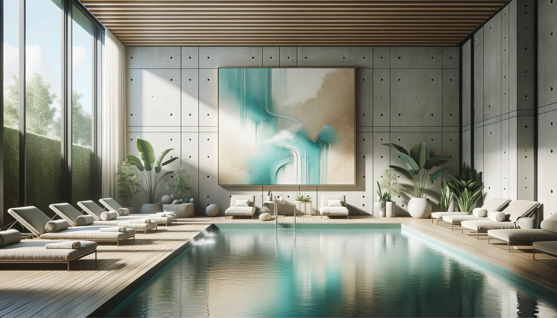
The first time I accompanied a clinic in redesigning its therapeutic visual identity, the director confided in me: "Our patients get lost between floors. Each department has decorated its walls without coordination." This invisible visual chaos contributed to the ambient anxiety. Harmonizing multiple artworks within a care pathway is not just an aesthetic matter: it's about creating a visual breathing space that guides, soothes and accompanies.
Here’s what a harmonious visual journey brings concretely: it reduces patient stress by creating reassuring consistency, it facilitates intuitive orientation between spaces, and it reinforces the soothing identity of your establishment. Yet, faced with endless corridors and multiplied waiting rooms, the impression of dispersing effort rather than creating unity often paralyzes decisions. No therapist wants their walls to tell conflicting stories. Rest assured: harmonizing does not mean standardizing. There are subtle connecting threads that transform a collection of disparate artworks into a fluid, almost musical visual experience.
The invisible thread: choosing your therapeutic intention
Before even thinking about colors or formats, ask yourself this fundamental question: what emotion do you want to cultivate throughout the care pathway? In a radiotherapy center where I was involved, the medical team chose “quiet strength” as the guiding intention. Each artwork, from reception to treatment room, should embody this duality: soothing compositions but never bland, soft colors but never dull.
This intention becomes your compass for harmonizing multiple artworks within a care pathway. It avoids the classic pitfall: accumulating “pretty pictures” without emotional cohesion. A patient who traverses your spaces shouldn't experience a disconnect between a bucolic watercolor in the waiting room and a dynamic abstraction in the hallway. The brain registers these dissonances, even unconsciously.
Concretely, translate your intention into a maximum of three adjectives: soothing/bright/natural or serene/elegant/comforting. These words will filter all your subsequent visual decisions, creating this invisible but terribly effective consistency.
The color palette: your silent signature
Color harmony is the most powerful pillar for unifying multiple artworks within a care pathway. I personally apply the 70-20-10 rule adapted to therapeutic environments: 70% of your palette rests on a dominant soothing color (deep blues, sage greens, warm beiges), 20% on a complementary hue that dialogues with the first, and 10% on accent touches to energize without jolting.
In a physiotherapy practice that I accompanied, we built the entire visual identity around a cerulean blue declined in varying intensities. The reception painting featured light and luminous shades, while those in the treatment rooms deepened into more saturated turquoise, creating a subtle but structuring chromatic progression. Patients spontaneously verbalized a feeling of « gradually entering care ».
Beware of the trap of exclusive neutral tones: a journey entirely in beige and white risks visual anemia. Harmonizing does not mean neutralizing. Introduce variations in intensity within the same color family: a pale blue is paired with an indigo, an almond green dialogues with a forest green. This tonal richness maintains visual interest while preserving unity.
Chromatic transitions between spaces
Think of your journey as a progressive colored walk. The reception area can accommodate slightly more vibrant tones (soft ochres, powdered pinks), transition areas adopt median shades, and treatment or rest rooms focus on colors with the most soothing frequencies. This chromatic gradation naturally accompanies the patient in their therapeutic journey.

The visual rhythm: formats and compositions in dialogue
To harmonize multiple paintings within a care pathway, master the alternation between formats and compositions. A hallway lined exclusively with identical 40x60cm paintings creates an institutional monotony. Conversely, a chaotic succession of disparate formats generates counterproductive visual fatigue.
I apply the principle of « breathing rhythm »: alternate between moments of visual density and spaces of pause. A horizontal triptych in the waiting room (ample, narrative composition) can dialogue with a refined vertical format in the adjacent hallway (minimalist, restful composition). This alternation mimics the breathing rhythm: inspiration-expiration, complexity-simplicity.
In a palliative care center, we installed soothing large formats in common areas (contemplative landscapes 80x120cm) and more intimate formats in the rooms (floral compositions 30x40cm). This hierarchy of scales created a natural emotional gradation, from collective to intimate.
The rule of reading distances
Adapt the complexity of your artworks to the average observation distance. A patient quickly crossing a hallway appreciates streamlined compositions, immediately readable. Someone in a waiting room for 20 minutes can explore a work richer in detail. This functional adaptation reinforces harmony, not just aesthetic.
Thematic unity without repetition
Many establishments fall into two extremes: either a unique theme repeated ad nauseam (15 different pebble paintings), or a complete lack of guiding principle. Harmonizing multiple artworks in a care pathway requires this subtlety: a theme broad enough to allow variation, precise enough to create unity.
Prioritize sensory themes rather than literal ones. Instead of “the sea” (which can quickly become tiresome), choose “soothing horizontality”: you then integrate marine horizons, but also desert landscapes, fields of lavender, streamlined architectural lines. The common denominator is emotional, not descriptive.
In a maternity ward, we worked around the concept of “gentle enveloping”: organic curves, cottony visual textures, rounded compositions. This theme was embodied in abstract watercolors, macro photographs of feathers, landscapes with undulating reliefs. No literal repetition, but a powerful sensory coherence that accompanied the protective dimension of the place.

The grammar of frames: the underestimated unifying element
It's the mistake I consistently observe: beautifully chosen artworks, sabotaged by heterogeneous frames. To harmonize multiple artworks in a care pathway, standardize your frames. No need for total uniformity, but establish a coherent frame family.
Two strategies work particularly well: either unification through color (all frames in light natural wood tones, for example), or unification through style (exclusively thin and contemporary frames). This visual constant then allows great freedom on the contents of the artworks themselves.
I accompanied a thalassotherapy center that exclusively used matte white frames with generous mats. This elegant neutrality allowed for alternation between mineral texture photographs, botanical watercolors, and abstract compositions, without ever losing visual unity. The frame became the silent signature of the place.
Consistent lighting : reveal without dazzling
An often-neglected aspect when seeking to harmonize multiple artworks in a care pathway: lighting. Perfectly chosen works can create cacophony if some are overexposed by natural light while others bask in shadow.
Think of light intensity as a component of your harmony. If possible, equip yourself with LED spotlights with constant color temperature (around 3000K for a warm atmosphere, 4000K for neutral clarity). This unified lighting dramatically strengthens the cohesion of your collection.
In a pediatric dental office, we deliberately created a gradual light gradation: more dynamic lighting in the playful reception area, progressively softening towards the treatment rooms. The artworks were lit with the same logic, creating a global harmony between architectural lighting and visual journey.
Ready to transform your care pathway into a consistent visual experience?
Discover our exclusive collection of wall art for spas that facilitates the harmonization of your spaces thanks to chromatic series designed to dialogue together.
From theory to tangible transformation
You now have the fundamental principles to harmonize multiple artworks in a care pathway: a clear therapeutic intention, a color palette structured around 70-20-10, a visual rhythm alternating density and breathing, a sensory rather than literal theme, a consistent framing family, and thoughtful lighting consistency.
Imagine your patients crossing your threshold tomorrow morning: their eyes naturally glide from one artwork to another, like a visual breath. No abrupt rupture, no fatigue, just a soothing continuity that accompanies them from reception to the treatment room. This invisible fluidity is precisely what creates a harmonized visual journey.
Start modestly: identify your most frequented space and apply these principles with two or three artworks. Observe reactions, refine your palette, then gradually extend your visual consistency. Harmony is not decreed overnight: it is cultivated, refined, felt.
Frequently asked questions about harmonizing artworks in care pathways
Should I absolutely use the same colors in all my artworks to create harmony?
Absolutely not, and that's great news! Harmony relies on the coherence of color families, not identical repetition. You can perfectly combine a painting with blue tones with another with green shades, provided they share the same temperature (warm or cold) and comparable intensity. Think in terms of a “chromatic conversation”: your colors should dialogue, not repeat. A deep blue can beautifully accompany a golden beige if both share a common softness. The trick is to identify your anchor color (the one that will appear most often) and surround it with complementary variations. In my practice, I often use the rule of three: choose a maximum of three colors that will return in different proportions throughout your journey, and you will obtain this unity in diversity.
How to harmonize existing artworks without replacing everything?
This is the most common situation, and it offers exciting creative solutions! Start by identifying the pieces that can become your “artwork pivots” – those that already correspond to the therapeutic intention you want to develop. Then work by subtraction before adding: remove works that create major dissonances (incompatible glaring colors, inappropriate themes). Often, removing 2-3 problematic artworks instantly creates more harmony than adding 5 new ones. Next, strategically reorganize your existing artworks: group by chromatic or thematic affinities in specific areas. An artwork that seemed unsuitable in the entrance can sometimes find its place in a relaxation room. Finally, unify through framing: having your existing artworks framed in a consistent style radically transforms their coexistence, often for less than 50€ per piece. It is the intervention with the best transformation/investment ratio.
How many artworks are needed in a care pathway to create true coherence?
The question is less about quantity than strategy. I have seen wonderfully harmonious layouts with only 5 perfectly positioned paintings, and spaces cluttered with 30 artworks creating chaos. The golden rule: prioritize natural visual pause points – where the eyes spontaneously rest during waiting or movement. Specifically, aim for a painting every 4-5 meters in hallways, and at least one artwork per station area (waiting room, treatment box). For a standard office of 80-100m², a harmonious collection generally counts between 8 and 15 paintings. But be careful: it is better to have 6 perfectly chosen and harmonized artworks than 20 disparate works. Harmony is built on the accuracy of choices, not on accumulation. Start with a coherent core of 4-5 pieces in your main spaces, then gradually expand while scrupulously respecting the chromatic and thematic principles you have established. This progressive approach also allows you to observe reactions and fine-tune your artistic direction.