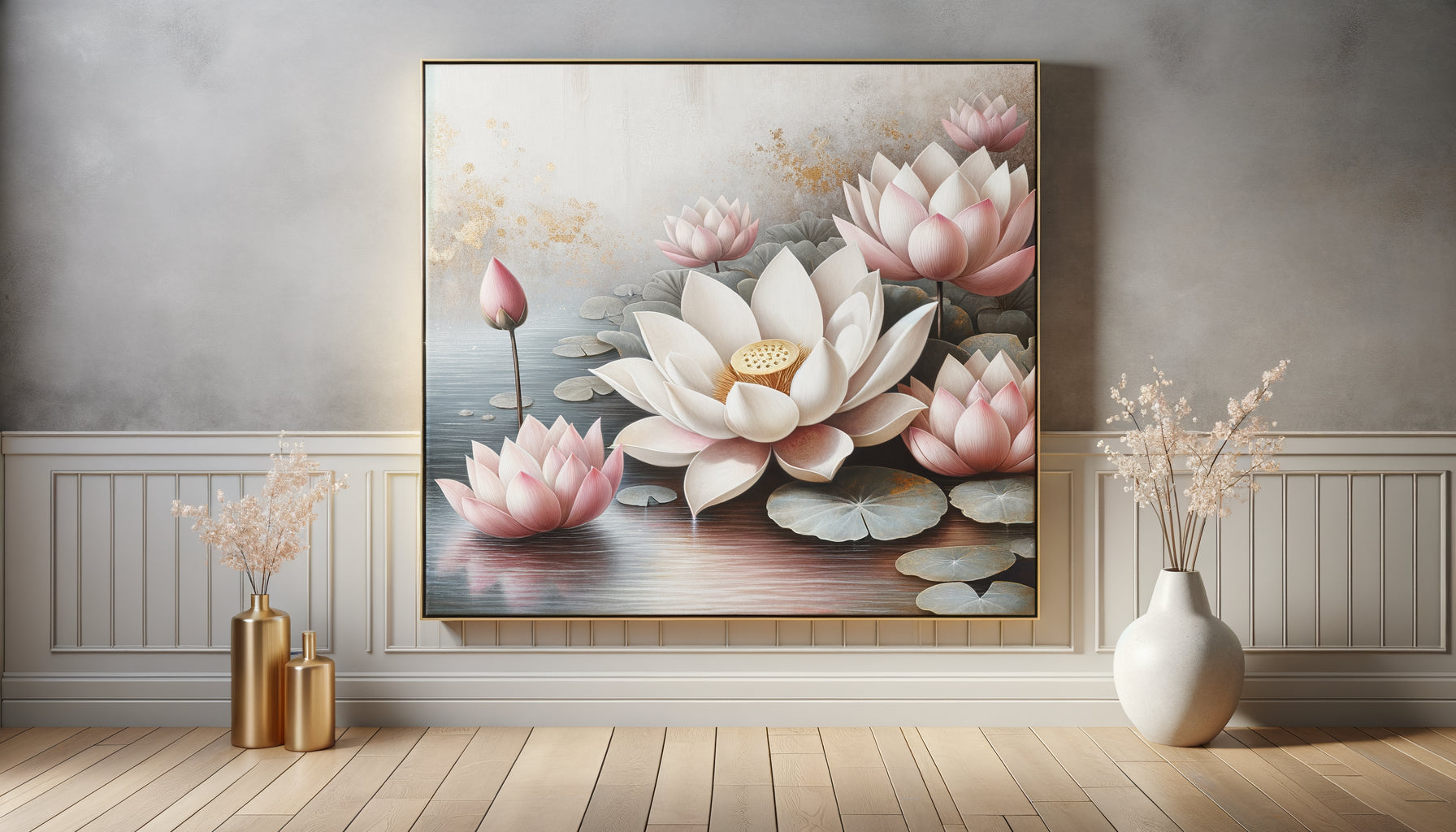
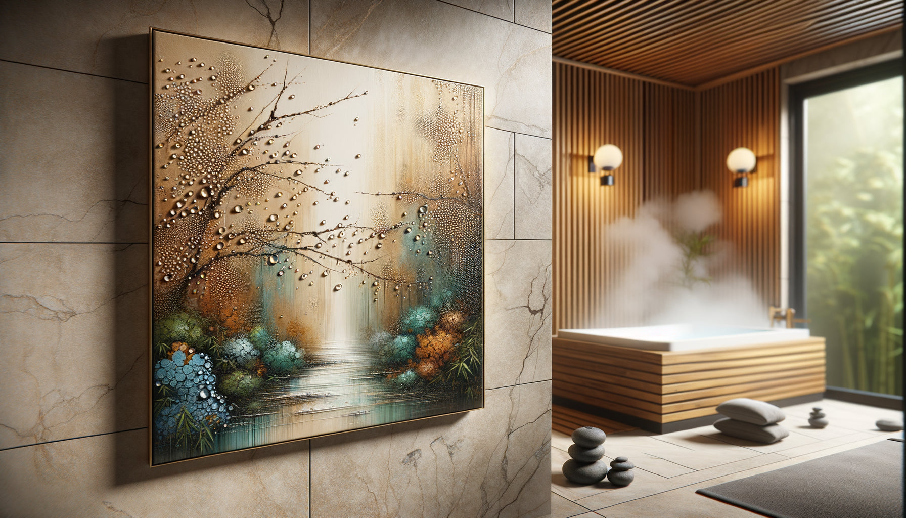
When I opened my first holistic wellness space in Brussels twelve years ago, I had everything planned: quality essential oils, an ergonomic massage table, soft lighting. Yet, my clients left relaxed… but the effect faded as soon as they stepped out the door. One day, a client confided in me: 'At your place, I feel like I’m in a bubble. But as soon as I leave, the magic disappears.' That sentence changed everything. I realized that the visual environment played a role just as crucial as my massage techniques.
Here's what therapeutic paintings bring: they anchor relaxation into the space, create a visual memory of well-being, and transform every glance into a micro-regenerating pause. Since incorporating artworks specifically chosen to prolong the soothing effects of treatments, my clients report feeling the benefits several days after their session. The secret? Paintings that don't just decorate, but heal.
Many think a pretty landscape is enough. Or that art in a spa is simply about aesthetics. Mistake. Choosing paintings that truly prolong the therapeutic effects of treatments requires a subtle understanding of the psychology of colors, visual composition and their interaction with the nervous system. I'm going to share what I’ve learned by supporting hundreds of people towards lasting well-being, anchored in their daily environment.
The visual memory of care: why your brain needs an anchor
During a massage or energy treatment, your nervous system switches to parasympathetic mode. Your heart rate slows down, your breathing deepens, and your muscles release tension. But this precious state only persists if your brain can easily recall it.
This is where the power of therapeutic paintings comes in. When you look at a work during or after a treatment, your brain creates a neural association between the image and your state of relaxation. A few days later, simply by glancing at this painting in your hallway or waiting room, your nervous system remembers. Your shoulders drop spontaneously. Your breathing deepens. Without conscious effort.
I’ve observed this phenomenon hundreds of times: clients who choose paintings evoking soothing natural elements – calm waters, open horizons, soft lights – maintain a significantly lower stress level between sessions. Their body has learned to recognize the visual signal as an invitation to let go.
The three chromatic families that truly prolong relaxation
Not all colors are equal when it comes to supporting therapeutic effects. After years of testing different artworks in my wellness space, I identified three particularly effective palettes.
Deep blues and aquatic greens
These shades activate what neuroscientists call the natural relaxation response. Blue lowers blood pressure and slows heart rate. Green, especially in jade and celadon tones, balances the nervous system. In my practice, a large painting depicting calmed marine depths consistently provokes sighs of relief from new clients.
Earthy tones and soft ochres
Contrary to popular belief, warm colors can be deeply soothing if they remain desaturated. A blush beige, a pale ocher, a diluted Sienna earth create a feeling of protective embrace. These shades work particularly well for treatments that focus on grounding and inner security.
Nuanced whites and pearl grays
For spaces dedicated to meditation or subtle energy healing, paintings in these tones create a blank mental space. They impose nothing, allowing the gaze to settle effortlessly. One client once told me that an almost monochrome painting, slightly textured, helped her 'clear her mind like never before'.

The breathing composition: how visual structure influences your breath
Beyond color, the way elements are arranged in a painting determines its therapeutic power. I have noticed that the most effective compositions share certain specific characteristics.
Horizontal lines – horizons, strata, sheets of water – naturally induce a more ample and regular breathing. They create a feeling of expansion and calm. Conversely, too many verticals can energize, which is less suitable for deep relaxation spaces.
Asymmetrical balance works better than perfect symmetry. A painting that is too centered, too ordered, keeps the mind alert. A slightly off-center composition, with visual breathing room, allows the gaze to travel without tension. Observe how your eyes scan the work: if they jump nervously, it is not therapeutic. If they glide smoothly, you have a valuable ally.
The depth of field also plays a crucial role. Paintings that suggest space – a path receding into the distance, successive planes, an aerial perspective – invite the mind to project beyond immediate concerns. This visual escape replicates the effect of self-care: creating distance from daily stress.
The fatal error of overly stimulating artworks
I regularly see well-intentioned practitioners make the same mistake: choosing paintings 'inspiring' or 'energizing'. Vivid colors, dynamic compositions, complex subjects. Result? The effect of self-care evaporates immediately.
An effective therapeutic painting should never engage the intellect. No symbols to decode, no minute details that force concentration, no colors that scream for attention. The ideal artwork almost disappears while subtly imbuing the space.
I removed a magnificent abstract painting with vibrant reds from my waiting room after noticing that clients arrived more tense than before its installation. Replaced by a composition in soothing blues-grays, the atmosphere radically changed. Conversations softened, phones remained in bags.

Size and placement: the art of creating islands of calm
A small painting lost on a large white wall generates visual anxiety. A format that is too imposing can, conversely, crush the space and create subtle oppression. The rule I apply: the painting should occupy between 60% and 75% of the width of the furniture on which it rests visually, or cover about one-third of the height of the wall if hung alone.
Place your therapeutic paintings in transition zones: the entrance to the treatment room, the hallway leading to the relaxation area, facing the chair where clients sit before the session. These strategic locations create visual decompression points that progressively prepare the nervous system.
Height also matters. A painting placed too high forces the gaze upwards, slightly activating the sympathetic nervous system. Ideally: the center of the work at eye level for a seated person or slightly below. The gaze does not have to search, it finds rest naturally.
Natural themes: when the image becomes a visual forest bathing experience
Research into biophilia – our innate need to connect with nature – confirms what I observe daily: images of natural elements have a measurable physiological effect on stress. But not all landscapes are created equal.
Scenes of calm water – still lakes, expansive seas, peaceful reflections – are particularly effective for treatments aimed at deep relaxation and emotional release. Water unconsciously symbolizes fluidity, effortless movement, surrender.
Bright forests and undergrowth bathed in soft light work beautifully for energy treatments and self-reconnection practices. They evoke protection, replenishment, a return to essentials. Avoid dark or overly dense forests that can generate a feeling of oppression in some sensitive clients.
Clear skies and horizons are suitable for spaces dedicated to meditation, breathwork, or treatments involving an expansion of consciousness. They offer the mind an infinite space to unfold, without limit or constraint.
Transform your space into a lasting wellness sanctuary
Discover our exclusive collection of wall art for spas that extends the soothing effect of each treatment and creates a visual memory of well-being.
The artwork-treatment association: creating visual rituals
The most subtle dimension, one that few practitioners exploit, is to consciously associate certain artworks with specific types of treatments. This approach considerably amplifies the therapeutic effectiveness.
For deep tissue massages and body treatments, prioritize works with visible textures, slightly tactile. The suggestion of material – smooth stone, patinated wood, crumpled fabric – creates a resonance with the bodily sensations of the treatment.
For subtle energy treatments such as Reiki or Shiatsu, purified compositions in light tones allow clients to maintain a meditative state. One client told me that she literally 'traveled' within an almost abstract painting during her sessions, deepening her experience.
For visualization and hypnosis practices, paintings suggesting a path or passage – trail in the dunes, stone bridge, slightly open door – facilitate access to the unconscious. They metaphorically offer a direction without imposing it.
Beyond the practice room: advising your clients for their personal space
The most lasting impact occurs when your clients recreate this therapeutic environment at home. I systematically encourage people I accompany to integrate soothing paintings into their bedroom, meditation corner, or even their office.
To make their choice easier, I suggest the rule of sigh: facing the artwork, take three deep breaths. If, on the third exhalation, your shoulders drop spontaneously and you feel a slight release, the work is therapeutically compatible with you.
Also recommend the gentle rotation: changing paintings according to the seasons or the emotional needs of the moment. A soothing snowy landscape in summer, a comforting golden light in winter. This adaptability maintains the freshness of the therapeutic effect.
Imagine yourself in three months. You enter your care space, and before you even speak, your clients sigh with relief. Their shoulders relax. Their face softens. The visual environment you have created is already working, preparing the ground for your intervention. And when they leave, they take this soothing image, this visual anchor that will remind them for days: 'I can find this calm. I have access to it.'
Start with a single painting. Choose it intentionally, place it carefully, observe its effect on you first, then on your clients. The rest will follow naturally, like a breath that deepens, one artwork at a time.
Frequently Asked Questions
Should abstract or figurative paintings be favored for a therapeutic effect?
Both can be effective depending on the context. Figurative paintings depicting nature – soothing landscapes, aquatic elements, soft lights – create an immediate and accessible connection for everyone. They activate our innate need to connect with the natural world. Abstractions work wonderfully when they respect calming palettes and flowing compositions, as they allow the mind to project its own meaning without imposing a narrative. The golden rule: avoid overly intellectual or symbolic compositions that solicit analysis rather than relaxation. Test your instinctive reaction: if you have to 'understand' the artwork, it is probably not therapeutic. If your breathing deepens naturally when contemplating it, you have found.
How many paintings are needed in a care space to create a soothing effect?
Contrary to intuition, less is often more. A single large painting strategically placed facing the client's gaze during or after treatment creates a powerful anchor. Too many works disperse attention and can generate counterproductive visual stimulation. In my 30m² office, I only have three paintings: one large format in the main care room, one medium-sized in the reception area, and one smaller in the dressing room. This sobriety allows each work to truly breathe and exert its soothing influence. If you have multiple rooms, create a chromatic consistency between the paintings without necessarily matching them exactly – think subtle variations on the same theme rather than an eclectic collection.
Are gilded or silver framed paintings suitable for a therapeutic environment?
Ornate frames draw attention to themselves rather than serving the artwork and its soothing effect. In a therapeutic context, prioritize discreet framing: natural light wood, matte white, muted gray, or even no frame at all for canvas prints. The ideal frame disappears, allowing the eye to dive directly into the image without abrupt transition. Gold and silver, even in matte finishes, create formality that can establish an uncomfortable distance. Exception: if your overall aesthetic is deliberately inspired by a classic luxury spa, a very thin and discreet gold frame may work, but always test the effect on several people before validating your choice. Ask yourself: does this frame help me breathe deeper, or does it make me think about the price of the artwork?