







Are XXL Wall Art Pieces Suitable for Restaurants with Low Ceilings?
October 20, 2025 · 8 min read · by Walensky
I remember this Lyon brewery, with ceilings at 2.4m (8ft), a stifling atmosphere. The owner wanted character, presence. He opted for an XXL triptych 3 meters (10ft) wide. Result? The space seemed to have shrunk by half. Customers felt compressed, oppressed. Three months later, he removed everything.
This costly mistake illustrates a dilemma I regularly encounter in my scenography projects for restaurants: how to create visual impact without accentuating the constraint of a low ceiling? The answer isn't as straightforward as one might think.
Here’s what wall art in restaurants with low ceilings can bring: controlled visual impact that expands the space, a distinctive atmosphere that compensates for architectural constraints, and a strong identity that diverts attention from structural limitations. The secret lies in the approach, not in giving up.
You may run a cozy restaurant, a neighborhood pizzeria, or a contemporary bistro. You dream of personality, soul, that visual signature that makes your establishment memorable. But these 2.5m (8ft) of ceiling height paralyze you. You fear an overwhelming effect, a confined atmosphere, a disastrous choice.
Rest assured: I have transformed dozens of constrained spaces into memorable places. Low ceilings are not a decorative fatality, but an opportunity to create sophisticated intimacy. Let me show you how.
The fatal error: confusing format and impact
XXL is alluring. These 2-meter (6.5ft) wall art pieces that you see in magazines, these spectacular compositions that occupy an entire wall. But in a restaurant with low ceilings, the XXL dimension quickly becomes problematic.
The fundamental rule? A painting should never occupy more than 60% of the height of the wall in a space with low ceiling height. With a ceiling at 2.4m (8ft), that means a maximum of 1.45m (4.75ft) for your artwork. Beyond that, you create a visual imbalance that perceptually lowers the ceiling.
I equipped a Mediterranean restaurant with horizontal wall art measuring 180cm (6ft) wide by 90cm (3ft) high. The impact? Considerable. The effect on perceived height? Neutral, or even beneficial. The panoramic format visually expands the space instead of compressing it vertically.
Proportionality before size
In a restaurant with low ceilings, three formats work remarkably well:
The elongated horizontal format (2:1 or 3:1 ratio) creates a lateral dynamic that perceptually expands the space. Perfect above banquettes or in friezes along main walls.
Series compositions: three 60x60cm (24in x 24in) artworks create as much impact as one 180cm (71in) piece, but with breathing room between each element. This fragmentation brings rhythm without oppression.
Medium square formats (80x80 to 100x100cm - 32in x 32in to 39in x 39in) offer a strong presence while preserving essential empty spaces for visual breathing.
When Color Compensates for Height
A low ceiling naturally creates a sense of proximity. Your color choices can either amplify this problem or transform it into a cozy asset.
I worked on a contemporary Japanese restaurant, ceilings at 2m35. We installed wall art in light tones: off-white, bright beige, touches of sage green. These reflective colors created an illusion of depth. The dark ceiling (anthracite gray) seemed to recede visually.
Conversely, saturated and dark colored artworks in a low space create an effect of density that can be sought after for an intimate atmosphere. In a wine cellar, I used XXL horizontal format paintings with deep burgundy tones. The space certainly felt more compact, but with a tactile richness that perfectly matched the identity of the place.
The Motifs That Elevate the Eye
The visual content of your wall art for restaurants plays a strategic role. Compositions with subtle vertical lines (stylized forests, slender architectures, ascending abstractions) naturally draw the eye upwards, creating an impression of increased height.
Avoid marked horizons, compositions that are too obviously horizontal in the subject matter itself. A seascape with a central horizon line will visually reinforce the limitation of the ceiling.

Strategic Placement: The Art of Directing the Gaze
Hanging height becomes crucial in a restaurant with low ceilings. The natural temptation? To center the painting on the wall. The classic mistake that accentuates the architectural constraint.
Place your wall art slightly lower than the museum standard (which recommends centering at 1m45-1m50 from the floor). In a low ceiling space, position the center between 1m30 and 1m40. This creates intimacy with seated customers (your primary audience) while visually freeing up the space between the top of the painting and the ceiling.
This free band of 80cm to 1m above the painting? It becomes your ally in creating a sense of vertical space. The brain interprets this empty space as available height.
Exception Zones
Some locations in your restaurant tolerate XXL formats better even with constrained ceilings:
The back wall, visible from the entrance, can accommodate a more imposing piece as it is perceived from a distance. This depth of field attenuates the vertical compression effect.
Above the bar or counter, where customers do not stay long, a bolder format creates a focal point without generating lasting discomfort.
Alcoves or recesses: these micro-spaces benefit from a cocooning effect that a more present painting can positively accentuate.
— Our selection


Lighting: your best vertical ally
A poorly lit painting in a low space reinforces the feeling of oppression. Controlled lighting transforms the same work into an airy element that lightens the space.
Adjustable LED spotlights installed on the ceiling, directed at 30° towards your wall paintings, create a column of light that attracts the eye upwards and then guides it to the artwork. This vertical movement of the gaze gives an impression of height.
I particularly appreciate minimalist spot rails for restaurants with low ceilings. They allow several paintings to be illuminated with a single discreet system, without visually overloading the already constrained ceiling.
Indirect lighting, with LEDs placed behind the painting (halo effect), creates an illusory depth. The painting seems to float, detached from the wall, adding dimension to the space.

— You may also like


When XXL becomes your signature
Not everything is forbidden. I designed an Italian restaurant where the low ceiling (2m45) was embraced as an element of identity. We installed an XXL wall painting measuring 2m20 wide by 1m30 high: a scene of a Neapolitan market in vibrant colors.
The secret? We painted the ceiling in a shade coordinated with the painting, creating a visual continuity. The work no longer stopped at the frame; it dialogued with the architecture. The low ceiling became an asset: it brought customers closer to this vibrant scene.
This approach works if you fully embrace the intimacy of your space. Do not try to create an illusion of height, embrace proximity and transform it into sophisticated coziness. Your XXL wall paintings then become enveloping elements rather than crushing ones.
Styles that work well in generous formats
Some visual universes better support large formats in constrained spaces:
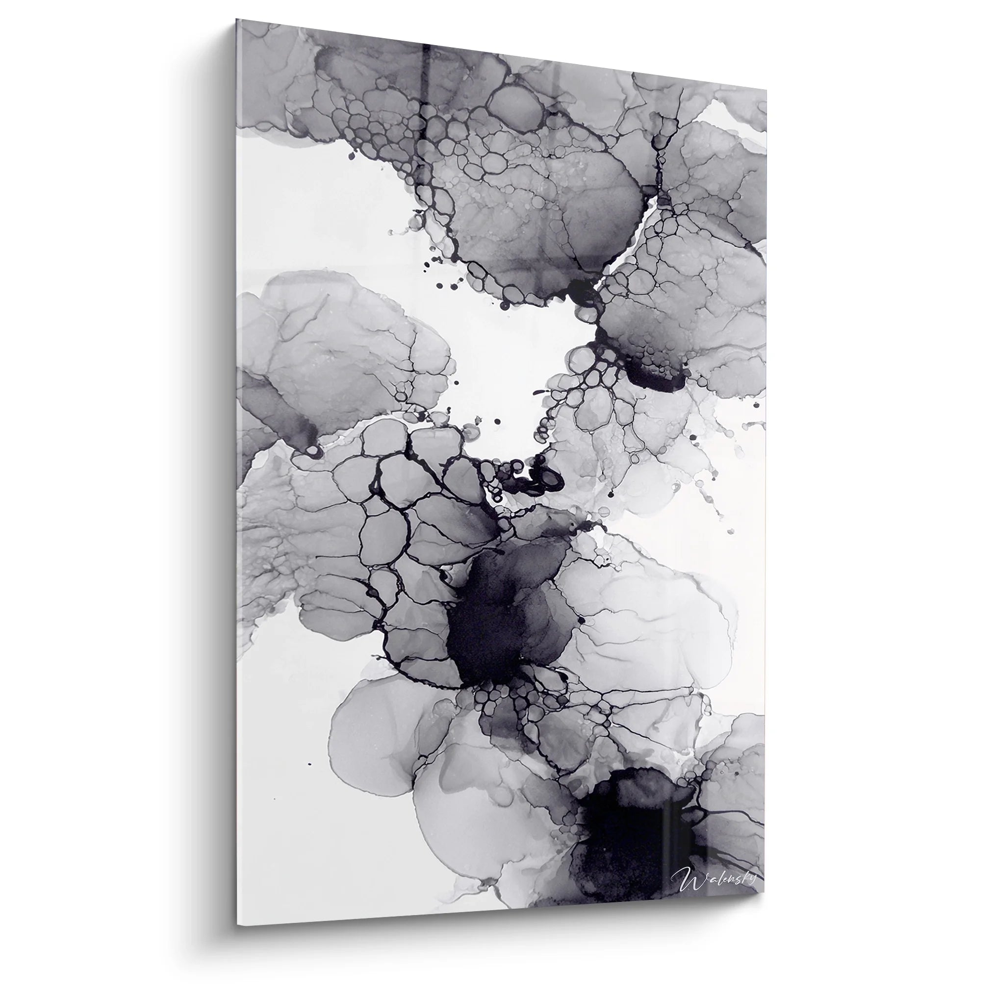
Fluid and clear abstraction: organic shapes in pale tones create movement without visual weight. A XXL abstract white/beige/grey piece brings presence without oppression.
Purified scenes: a minimalist landscape, stylized architecture, simplified nature. Compositional simplicity compensates for the generosity of the format.
Monochrome textures: a textured painting in shades of grey, pale blues or aquamarine offers tactile richness without visual saturation.
Your restaurant deserves a visual identity that transcends its architectural constraints
Discover our exclusive collection of wall art for Restaurant that transforms low ceilings into character assets.

In the same vein
Japanese Artwork No. 3 - Japan Around the World Edition
233,90€
Discover this artwork →Your space, your visual signature
This restaurant with 2m40 under the ceiling is not a limitation, it's your canvas of creation. XXL wall paintings are neither forbidden nor systematically recommended: they become relevant according to your overall approach.
If you are looking to create an illusion of space, prioritize generous but moderately high horizontal formats, light tones, airy compositions. If you embrace the intimacy of your place, dare to use more imposing pieces that envelop rather than crush.
Next week, observe restaurants that seduce you. Look up. Mentally measure the proportion between artworks and available height. You will discover that the most memorable spaces are not always the tallest, but the most coherent.
Start with one wall, one artwork, a clear intention. Your restaurant will then tell its story, low ceiling or not.
FAQ: Your questions about wall paintings in restaurants with low ceilings
What is the maximum recommended size for a painting in a restaurant with a 2m50 ceiling?
For a 2m50 ceiling, I recommend a maximum height of 1m40-1m50 for your wall paintings. This leaves about 1m of space above the work (counting the furniture below), creating an essential visual breathing space. The width can be more generous: up to 2m or even 2m50 for a panoramic format that perceptually widens the space. The trick is to prioritize horizontal extension rather than vertical. Three 60x80cm paintings arranged horizontally will create more impact than a single 1m80 high XXL vertical painting, while preserving the feeling of space. Also consider the viewing distance: in a restaurant, your customers mainly observe from their table, 2-4 meters away. At this distance, a 1m20 wide painting already offers a remarkable presence without requiring extreme dimensions.
Are dark artworks to be absolutely avoided in spaces with low ceilings?
No, dark wall art are not systematically banned, but their use requires more strategy. In a restaurant with a low ceiling, dark tones create an intimate and sophisticated atmosphere that can become your signature. I equipped a wine cellar with paintings in burgundy, black and gold tones: the cocoon effect was exactly what was sought. The key? Compensate with generous and targeted lighting. Install LED spotlights that bathe the painting in light, creating a bright contrast that lightens the whole thing. Also combine your dark artworks with clear elements: furniture in neutral tones, white tableware, light tablecloths. This alternation prevents an overwhelming effect. Finally, limit dark paintings to a maximum of one or two walls, leaving other spaces brighter. The overall balance of your restaurant counts as much as each individual choice.
Is it better to have one large artwork or several small ones in a restaurant with a low ceiling?
The multi-artwork composition often presents more advantages in a restaurant with a low ceiling. Three 70x70cm paintings create a visual impact equivalent to a single 2m10 wide painting, but with additional benefits: fragmentation brings rhythm, creates multiple points of interest that guide the eye horizontally, and offers more flexibility. You can adjust the spacing according to your needs, create varied alignments (horizontal, staggered, constellation), and even modify the composition depending on the seasons. This approach also reduces the risk of error: if one painting does not work perfectly, you can replace it without doing everything again. However, a single artwork of generous size can become your signature piece, your strong identity element. My advice? Start with a composition of 2-3 medium paintings. Once your style is established and your clientele is in place, you can consider a unique masterpiece if the desire arises. Gradual evolution limits financial and aesthetic risks.


