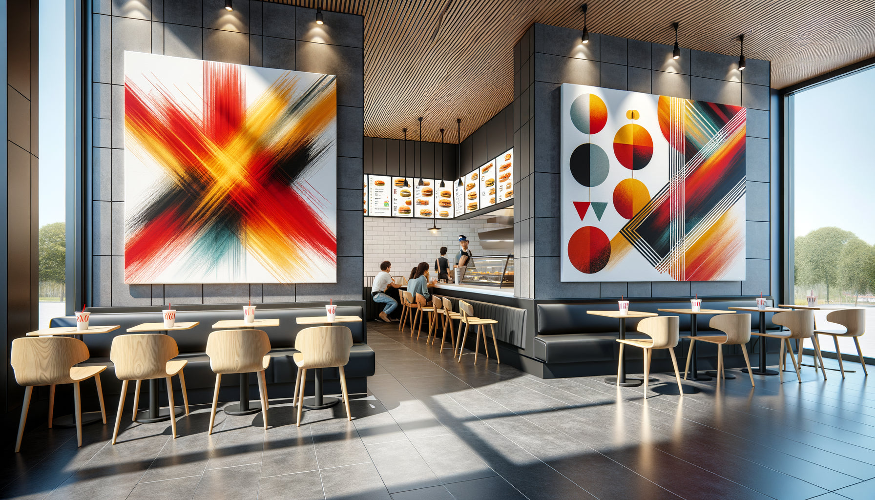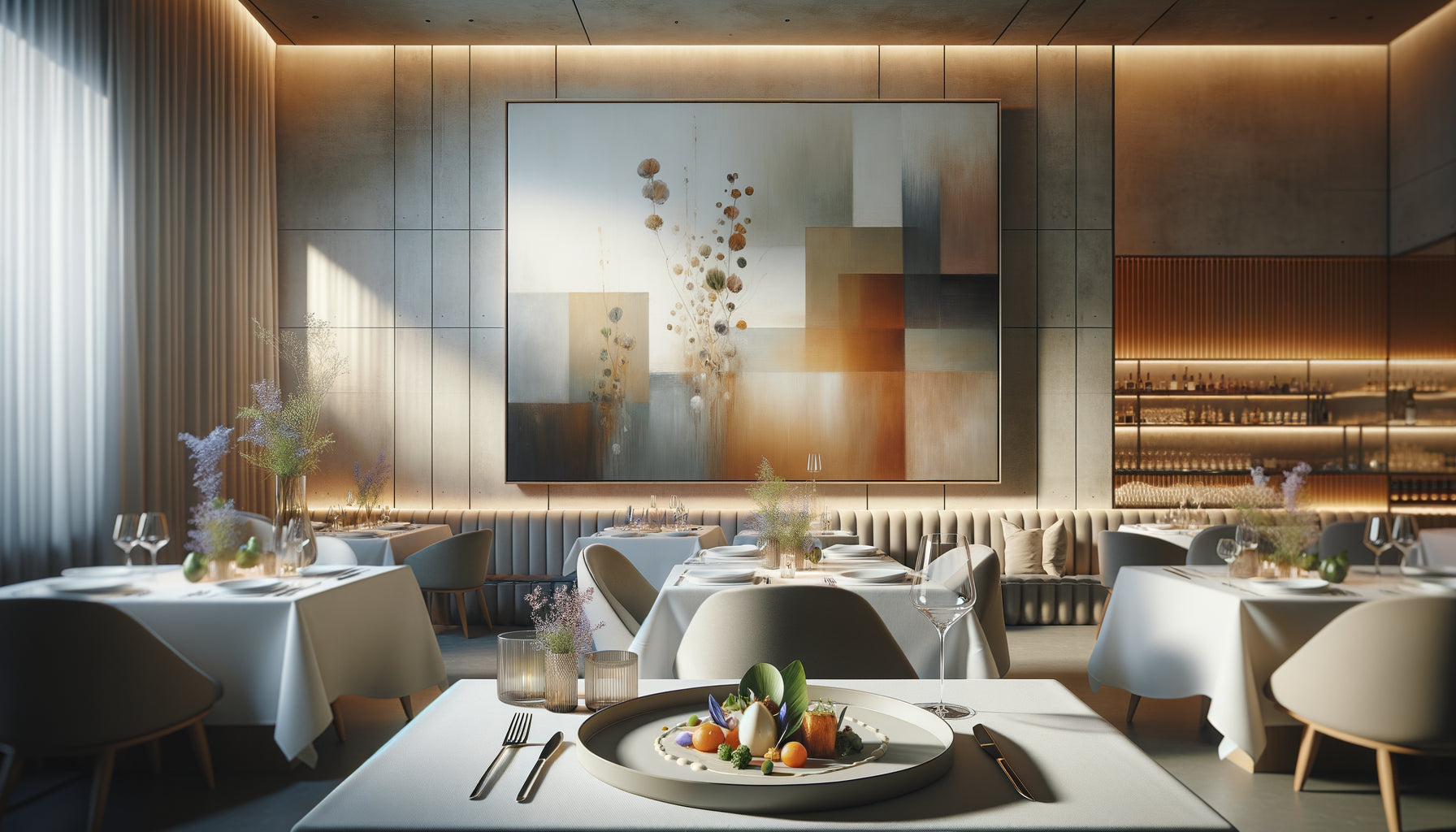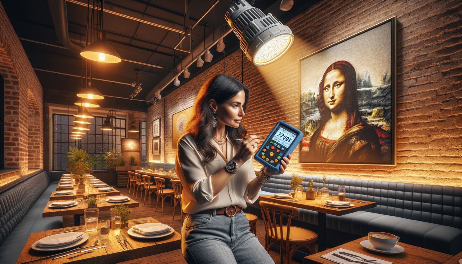
I still remember that disastrous opening night in a contemporary bistro in Lyon. The owner had invested in a magnificent abstract canvas with deep tones. Under the natural light of day, the work breathed elegance. But as soon as night fell, under the cold white LED lights installed on the ceiling, the magic vanished: blues turned gray metallic, reds lost their warmth, and the whole thing gave a cold, almost clinical impression. The first customers felt this malaise without being able to name it. After ten years of designing atmospheres for restaurant spaces, I understood a fundamental truth: light doesn't just reveal a painting, it reinvents it.
Here's what compatibility verification between your wall art and LED lighting brings: visual consistency that extends the dining experience, a controlled atmosphere that fosters customer loyalty, and the certainty that your artistic investment will truly enhance your space rather than create a subtle but persistent dissonance.
You may have already experienced this frustration: you spot the perfect painting, the one that embodies exactly the atmosphere you want to create in your restaurant. You install it with enthusiasm, but something is wrong. The colors seem muted, the atmosphere lacks depth, and you don't understand why this work that had so seduced you doesn't produce the expected effect. The culprit? Rarely the painting itself, but almost always the incompatibility between its color palette and your LED lighting.
Rest assured: this verification requires neither training in colorimetry nor sophisticated equipment. It simply takes understanding a few light principles and following a simple methodology that I will share with you, the very one that has saved me from many disappointments on my recent projects.
I promise you that by the end of this article, you will know exactly how to anticipate the rendering of any wall art under your LED lighting, how to correct existing problems, and how to create this visual harmony that transforms a simple restaurant into a memorable experience.
Color temperature: the invisible parameter that changes everything
Let's start with the most decisive factor: the color temperature of your LEDs, measured in Kelvin. In a uniformly lit showroom, a wall art reveals its ideal version. But in your restaurant, this same painting bathes in specific light that radically alters its perception.
Cool white LEDs (5000-6500K) create a bluish light that enhances cool tones – blues, greens, silvers – but dramatically impoverishes warm hues. I have seen paintings with ochre and burnt sienna tones lose all their richness under this type of lighting, giving the impression of an inexpensive reproduction. Conversely, warm white LEDs (2700-3000K) enhance reds, oranges, and yellows, but can make blues dull and purples muddy.
To check compatibility, first note the color temperature of your existing LEDs (usually indicated on the bulb or documentation). Then analyze your wall art's dominant palette. If your LED lighting is cool and the artwork favors warm tones (or vice versa), you are likely facing an incompatibility. This simple preliminary check saves you 80% of common mistakes.
The practical test before installation
Before permanently hanging your wall art, perform what I call the triple moment test: observe the artwork under your LED lighting at three key times of your service. Midday with residual natural light, early evening when LEDs begin to dominate, and in full darkness when they are the only light source.
Position the artwork in its intended location and step back. Photograph it with your smartphone (without flash) at each of the three moments. The photos often reveal chromatic discrepancies that the eye subconsciously tries to correct. If colors appear washed out, contrasts flatten, or the overall atmosphere seems inconsistent with your decor, this is a warning sign.
The Color Rendering Index: the secret of professionals
Here's a parameter that most restorers ignore, but which makes all the difference: the CRI (Color Rendering Index) of your LEDs. This number, between 0 and 100, measures a light source’s ability to faithfully reproduce colors.
Low-end LEDs often display a CRI of 70-75. Under this lighting, even the most beautiful wall art loses nuances and depth. Chromatic subtleties disappear, gradients become harsh. For a restaurant where visual ambiance matters, I systematically recommend a minimum CRI of 85, ideally 90 or more.
To check the CRI of your current installation, consult the packaging of your LEDs or their datasheet. If you are below 85 and your wall art features a rich and nuanced palette – especially with deep reds, subtle greens, or skin tones – you have identified the problem. The solution can be as simple as replacing your LEDs with high-CRI models, a modest investment that completely transforms the perception of your artworks.
How to test CRI without a measuring device
Without a professional luxmeter, you can perform a revealing empirical test. Place several brightly colored objects under your LED lighting: a well-red tomato, an orange, a lemon, some green leaves. Compare their appearance to that of when they are under natural light near a window. If the differences are marked, if the colors seem artificial or flat, your CRI is probably insufficient to enhance a wall art with complex tones.

The angle and intensity: managing reflections and shadows
A wall painting may have colors that are perfectly compatible with your LED lighting, yet still miss the mark due to an unsuitable light positioning. I have resolved several problematic situations simply by adjusting the orientation or intensity of the light sources.
Directional LEDs often create hot spots – these areas of overexposure that bleach part of the painting and crush details. Conversely, too diffuse or weak LED lighting plunges the artwork into a semi-darkness that neutralizes its impact. The balance lies in what I call enveloping lighting: enough intensity to reveal the work, enough diffusion to avoid reflections.
To check this aspect, position yourself at different viewing angles in your restaurant, especially in locations where your customers will be seated. If you see bright reflections on the wall painting, if certain areas disappear into shadow, or if the LED lighting creates a visible halo around the artwork, the configuration needs adjustments.
Supplementary lighting solutions
Sometimes, your general LED lighting cannot be modified without compromising the overall ambiance of the restaurant. In this case, adding a dedicated supplementary lighting for the wall painting works wonders. A discreet LED strip positioned above the frame, set to the right color temperature and with a high CRI, creates a luminous bubble that isolates the artwork and highlights it independently of the ambient lighting.
This technique allows you to keep your existing LEDs for general lighting while creating artistic focal points that enrich your customers' experience. I applied this method in a Parisian brasserie where cold white LEDs were imposed by the architect: dedicated warm white LED spotlights for the wall paintings created islands of visual warmth that perfectly counterbalanced the overall coolness.
The painting’s finish: glossy, matte or textured facing LEDs
A parameter often overlooked: the surface finish of your wall painting interacts radically differently with LED lighting depending on whether it is glossy, matte or textured.
Glossy or varnished finishes create mirror reflections under directional LEDs, particularly problematic with recessed ceiling spotlights. These reflections transform portions of your artwork into blind spots where the image disappears behind reflected light. If your restaurant uses powerful and directional LEDs, always choose wall art with a matte finish.
Textured surfaces – relief canvases, mixed media techniques, oil paintings with impasto – create a play of shadows and lights under LED lighting. Depending on the angle of incidence, this texture can enhance the artwork or create parasitic shadows that fragment the image. Check this interaction by moving an LED source around the artwork and observing how the texture reacts. A harmonious texture enriches perception; a conflicting texture distracts the eye.

Anticipating variations in lighting ambiance
In a modern restaurant, LED lighting is not static. You probably modulate the intensity according to service times, creating a more vibrant atmosphere for lunch and a more intimate one in the evening. Your wall art should remain consistent through these variations.
Test your artwork under different light intensities. LED dimmers can create unexpected effects: some models slightly shift the color temperature when dimmed, others generate subtle flickering at reduced intensity. A wall art with saturated colors may appear vibrant at full intensity but aggressive in subdued lighting, while a work with muted tones may blend into invisibility when you lower the LEDs.
I have developed what I call the rule of three tiers: your artwork should retain its visual interest at maximum intensity (100%), at half power (50%), and in a cozy atmosphere (20-30%). If the work disappears or is disturbing at one of these levels, either the choice of artwork or the LED lighting configuration needs to be adjusted.
The impact of colored LEDs and RGB systems
Some restaurants integrate RGB LED systems to create colorful atmospheres for special events. If this is the case, be sure to check the compatibility of your wall art with these color variations. A beautiful artwork under white light can become grotesque under a magenta or cyan hue.
Test your artwork under each LED color you use. If some create disastrous effects, program your system to exclude those shades in areas where the work is visible, or accept that these particular moments temporarily transform artistic perception – which can be an assumed choice for certain festive events.
Are you looking for a wall art piece designed for LED-lit spaces?
Discover our exclusive collection of wall art for Restaurant that reveal all their beauty under different types of LED lighting, with optimized finishes and universal color palettes.
Correcting an existing incompatibility without changing everything
You have already installed a wall art piece and noticed an incompatibility with your LED lighting? Before starting over, several corrective solutions exist.
The simplest : adjust the color temperature of your LEDs in the area of the artwork. If your installation allows it, replace only the LEDs that illuminate the work directly with models at an adapted temperature. This localized modification creates artistic consistency without disrupting the overall ambiance of your restaurant.
Second option : add a colored gelatin filter in front of your existing LEDs. These tinted transparent films, used in theater and photography, compensate for chromatic imbalances. An amber filter softens cool white LEDs, a blue filter corrects warm LEDs. This economical and reversible solution simply requires testing different shades until you find one that harmonizes artwork and light.
Third approach : strategic framing. A well-chosen frame can create a visual transition between your wall art piece and the surrounding lighting ambiance. A gold frame captures and reflects warm light, a black matte frame creates a visual airlock that isolates the work from its luminous environment. This technique works particularly well when the incompatibility is moderate.
Imagine your restaurant in a few weeks: each customer, upon crossing the threshold, is immediately captivated by this visual consistency where wall art pieces and LED lighting dialogue harmoniously. The artworks are no longer simple decorations, but living elements that breathe with the ambiance, enrich every moment of service, transform a meal into a complete sensory experience. This harmony is not due to chance, but to an understanding of a few simple light principles.
Start today: note the color temperature and CRI of your current LEDs, observe your wall art at different service times, photograph them to reveal invisible discrepancies to the naked eye. These initial checks will tell you exactly where to focus your efforts. And if you are about to acquire a new artwork, take this technical information with you - it is worth all aesthetic advice in the world.
Frequently Asked Questions
Can I use any wall art with cool white LEDs?
Cool white LEDs (above 5000K) are mainly suitable for wall art whose palette favors cold tones: blues, greens, grays, silvers. If your artwork contains reds, oranges, yellows or flesh tones, these colors will appear dull and washed out under this type of lighting. You can partially compensate for this problem by adding a warm white LED accent light directly on the wall art, creating a luminous bubble that preserves the color integrity of the work. Alternatively, prioritize abstract or graphic wall art for this type of lighting where chromatic distortions become an artistic effect rather than a defect.
How do I know if my LEDs have sufficient CRI without a professional lux meter?
First check the packaging or documentation of your LEDs: the CRI (or CRI in English) is usually indicated there. If it exceeds 85, you are in an acceptable range to enhance a wall art. If this information is not available, perform the natural color test: place under your LED lighting a selection of colorful fruits and vegetables (red tomato, orange carrot, yellow lemon, green leaves) and compare their appearance to that they have under natural light. If the differences are minimal, your CRI is probably good. If colors appear artificial, flat or distorted, your CRI is insufficient and will negatively affect your wall art. Another clue: LEDs with high CRI generally cost 20-40% more than standard models, so if your LEDs were particularly inexpensive, their CRI is likely limited.
My wall art looks perfect during the day but is disappointing in the evening under LEDs, what should I do?
This classic situation reveals an incompatibility between natural light (which has a CRI of 100 by definition) and your artificial LED lighting. You have three pragmatic solutions. First option: replace the LEDs illuminating the painting area with high-CRI models (90+) and color temperature adapted to the artwork's palette, which will more faithfully reproduce natural lighting conditions. Second option: install dedicated LED accent lighting for the wall art, such as a discreet strip above the frame or adjustable spotlights, with optimal lighting characteristics. Third option: move the painting to a location where it benefits from better existing LED lighting, even if it means slightly rearranging your wall decor. This day/night incompatibility is never inevitable; it simply indicates that your artificial lighting does not faithfully reproduce colors.