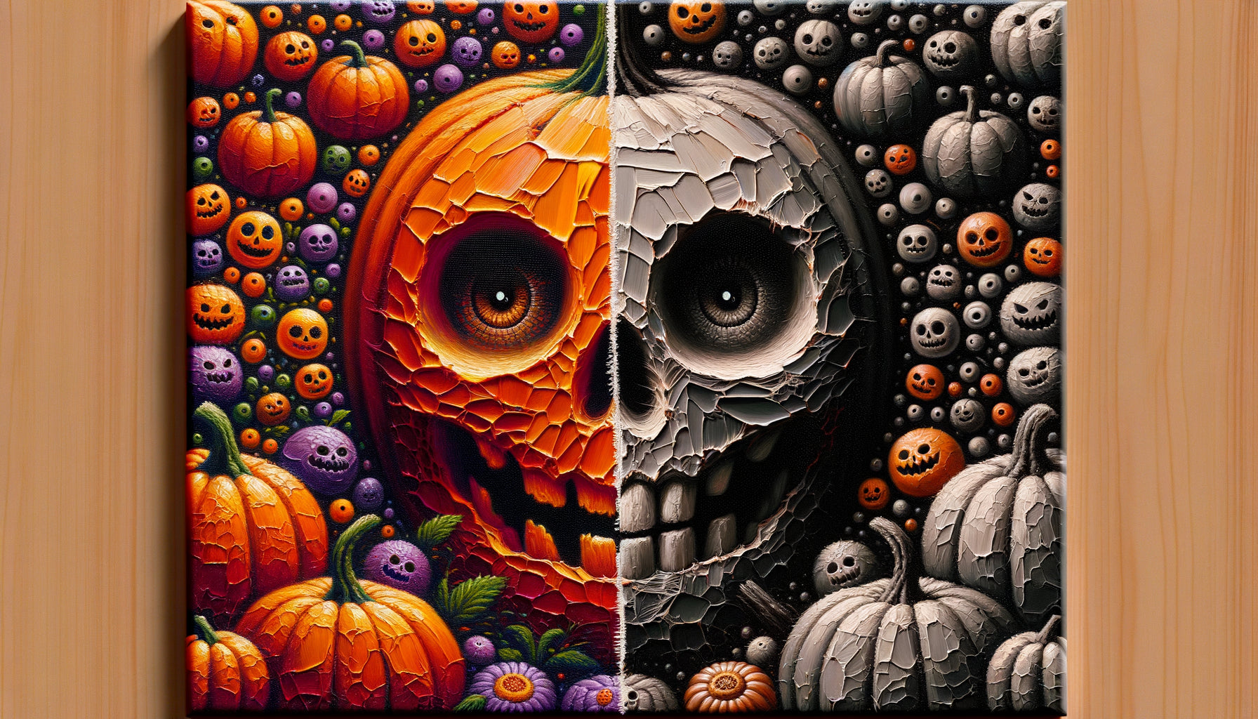
I recently advised the CEO of a Parisian fashion house who wanted to "de-clutter" his executive office without compromising his credibility. His question made me smile: "Can you really hang a Halloween illustration in a power space?" My answer surprised him: not only is it possible, but when you choose Halloween illustrations Art Deco, you assert a bold positioning that combines historical sophistication and contemporary character.
Here's what Art Deco Halloween illustrations bring to an executive office: an aesthetic legitimacy rooted in a recognized artistic movement, a defined personality without frivolity, and a cultural conversation that reinforces your authority rather than diluting it.
Many executives hesitate to introduce festive elements into their office for fear of judgment. "Won't I appear childish?" "Will my clients take my decisions seriously?" These legitimate questions reveal a confusion between mass-market themed decor and thoughtful artistic choices. Rest assured: Art Deco has never been synonymous with lightness. This movement dressed the headquarters of the largest companies in the 1920s-1930s. Choosing an Art Deco Halloween illustration is to join this lineage of aesthetic excellence while assuming a touch of uniqueness. I'll show you how this unlikely alliance becomes your best asset for creating a memorable executive office.
Art Deco: when geometric elegance meets nocturnal imagination
Art Deco has never been just decorative. Between 1920 and 1940, this movement redefined the aesthetics of power: clean lines, bold symmetries, contrasting color palettes. Think of the halls of New York skyscrapers, the lounges of transatlantic liners. These spaces breathed authority through their controlled geometry.
Applying this visual language to the Halloween universe creates a fascinating tension. An Art Deco Halloween illustration transforms popular symbols – pumpkins, bats, mysterious moons – into sophisticated architectural compositions. Forms become graphic, colors structure themselves into clean blocks. It's no longer seasonal decor: it's a collectible piece that dialogues with the history of art.
In an executive office, this approach brilliantly solves the impossible equation: how to express your personality without compromising your professional stature? An Art Deco Halloween illustration affirms: "I know my classics, I master the codes, and I dare uniqueness."
Why an executive office deserves more than aseptic neutrality
I observe a worrying trend: interchangeable executive offices, where only the view from the window changes. White walls, Scandinavian furniture, harmless abstract artwork. This strategic neutrality aims to offend no one... but marks no one either.
Your contacts – partners, investors, talents to recruit – form an opinion of you in 7 seconds. Your office communicates before you even speak. A Art Deco Halloween illustration well chosen sends several powerful subliminal messages:
Asserted visual culture. You don't decorate by default, you collect with intention. Art Deco testifies to a knowledge of major 20th-century artistic movements.
Assumed confidence. Choosing a Halloween theme requires personal assurance. You do not need to conform to expectations to establish your legitimacy.
Sophistication-humanity balance. The geometric elegance of Art Deco tempers the playful dimension of Halloween. You remain professional while revealing a memorable human dimension.
The visual signature effect
In the corporate world, memorability is a strategic asset. After a meeting, people rarely remember the detailed arguments, but always the general atmosphere. An Art Deco Halloween illustration becomes your visual signature : “Ah yes, the office with that incredible Art Deco piece…” This memory anchor distinguishes you durably.

The color palettes that legitimize Halloween in a professional context
The color palette determines the success of integration. Halloween illustrations for the general public focus on bright orange and neon purple – unsuitable for an executive office. Art Deco offers infinitely more refined chromatic alternatives.
Gold, black and cream. This classic trio of Art Deco transforms Halloween motifs into precious compositions. A golden moon on a matte black background evokes a cabinet of curiosities rather than a supermarket display window.
Navy blue, silver and anthracite gray. These cool tones bring metallic elegance. A stylized bat in silver on Prussian blue becomes a graphic architectural element.
Deep burgundy, forest green and bronze. For traditional wood-paneled interiors, this palette creates a luxurious continuity. Halloween symbols blend into an English library atmosphere.
The golden rule: prioritize clear contrasts rather than gradients, plain blocks rather than textures. The Art Deco Halloween illustration should be readable like a logo: immediately identifiable, timelessly elegant.
Where and how to position your illustration in the directional space
Location determines the message. The same Halloween Art Deco Illustration will produce radically different effects depending on its position.
Behind the desk: asserting personal authority
This is the strongest visual territory. Visible during video conferences, contemplated by your face-to-face interlocutors, this wall expresses your identity unfiltered. A large format Halloween Art Deco Illustration becomes your modern coat of arms. Opt for a symmetrical, centered composition framed in a simple frame (black matte or brushed brass depending on your furniture).
On the side wall: progressive discovery
Positioned on an adjacent wall, the illustration is gradually revealed to the visitor as they settle in. This more subtle approach suits personalities who prefer suggestion to assertion. The element of surprise works particularly well: “I hadn’t noticed this piece when I came in…”
In the office relaxation area: mastered humanization
If your office incorporates a lounge or library corner, this is the ideal location to reveal a more personal facet. The Halloween Art Deco Illustration dialogues with chosen objects – rare edition, sculpture, crystal decanter – creating a contemporary cabinet of curiosities.
Recommended dimension: between 60×80 cm and 100×120 cm for optimal visual impact without overwhelming dominance. Too small, the message dilutes; too large, the intention becomes invasive.

Composing a coherent ensemble: the Halloween Art Deco Illustration and its environment
A common mistake: hanging a striking piece without considering its dialogue with the existing space. Your Halloween Art Deco Illustration must integrate into a consistent visual narrative.
With minimalist contemporary furniture. The contrast works brilliantly. The clean lines of a Knoll or USM desk amplify the graphic impact of Art Deco. Opt for ultra-thin black or metal frames to maintain this purity.
With classic wooden furniture. Look for formal echoes. If your office has geometric moldings, your Art Deco illustration will create architectural resonances. Wood-stained frame or patinated brass to harmonize materials.
With an industrial decoration. The alliance is natural. Exposed brick, raw metal and Art Deco geometry share a common structural aesthetic. Let the illustration bring controlled color into this subdued universe.
Complete the ensemble sparingly: a desk lamp with geometric lines, a rug with discreet graphic patterns, possibly a second smaller Art Deco element (vase, clock) to create an echo without redundancy.
Transform your office into a memorable power space
Discover our exclusive collection of Halloween wall art that combines Art Deco sophistication and distinctive character to affirm your professional uniqueness.
Beyond October: The timelessness of an Art Deco Halloween illustration
The question always comes up:
A true
Think of the great surrealist works exhibited all year round in executive offices. No one suggests taking down a Magritte because its content is enigmatic. Your illustration operates on the same principle: it belongs to the artistic register, not the seasonal decorative register.
This permanence also reinforces your message. Taking down the work in November would signal that it was a temporary gadget. Keeping it all year affirms: The only conceivable exception: if you practice rotating works of art in your office, integrate your Not all executive offices are equally open to this bold proposal. Some sectors offer particularly fertile ground. Startups and scale-ups. Technological disruption is often accompanied by aesthetic disruption. Thirty to forty-year-old founders seek to distinguish themselves from traditional corporate codes without falling into the cliché hipster loft. Premium liberal professions. Specialized lawyers, strategic consultants, family offices: these environments cultivate a personal sophistication where controlled originality becomes a competitive differentiator. Luxury retail. Directions of high-end houses inherently understand the value of a distinctive aesthetic. Art Deco resonates particularly in the universe of jewelry, leather goods and watchmaking. More conservative sectors (traditional banking, public institutions, heavy industry): the approach remains possible but requires more subtlety. Favor medium formats, subdued palettes (black, gold, cream), lateral rather than frontal locations. Your aesthetic choices are never insignificant. They reveal your relationship to conformity, your ability to navigate between established codes and personal expression, your confidence in your own judgment. An Art Deco Halloween Art in your executive office is not an eccentricity: it's a sophisticated statement of intent. You affirm that professional excellence and distinctive personality are not mutually exclusive. That visual culture constitutes a strategic asset, not a frivolity. That controlled boldness better defines modern leadership than aseptic caution. The next time an interlocutor contemplates your office, they will not simply see Halloween decor. They will perceive a leader confident enough to transcend conventions, cultured enough to anchor their choices in the history of art, and human enough to assume a touch of nocturnal mystery. And that perception is worth all the speeches in the world. Start by identifying the wall that deserves this masterpiece. Then choose your illustration according to your existing palette and the intensity of message desired. Your executive office will never be just a workspace again: it will become the tangible reflection of your leadership philosophy. This legitimate concern stems from a confusion between mass-market Halloween decor and Art Deco Halloween illustration. The former uses childish codes (bright primary colors, cartoonish shapes, explicit humor) unsuitable for an executive office. The latter applies the formal vocabulary of Art Deco – rigorous geometry, refined color palette, architectural symmetry – to universal nocturnal symbols. The result is anything but puerile: it's a sophisticated artwork that dialogues with art history. Think of it this way: no one would describe a surrealist work representing dreamlike elements as childish, because the maturity of the aesthetic treatment outweighs the subject matter. Your illustration works exactly according to this principle. The key lies in the choice: systematically prioritize execution quality, frame sobriety, and thoughtful integration into your overall environment. With these precautions, the illustration affirms your visual culture rather than questioning it. The process begins with an analysis of your existing dominants: color palette, main materials, furniture style, lighting ambiance. For a contemporary minimalist office (whites, grays, clean lines), opt for an illustration with strong contrasts – black and gold, or navy blue and silver – with an ultra-thin frame that maintains the general purity. For a classic office with wood paneling (mahogany, oak, leather), prioritize warm tones – bordeaux, forest green, bronze – and a stained wooden or patinated brass frame that creates material continuity. For an industrial style (metal, concrete, brick), the illustration can bring the controlled chromatic touch that the space expects, with raw metal frames. Then look at your architectural lines: if your space has marked geometric elements (moldings, metal structures, screens), look for illustrations with symmetrical compositions that will create visual echoes. If your office is very understated, the illustration can instead provide the missing graphic complexity. Mentally test the scale: a 60x80 cm piece suits offices of 15-25 m², while a 100x120 cm format is essential in spaces of 30 m² or more. The illustration should assert itself without overwhelming. Absolutely not – and that’s precisely where the strength of this approach lies. A successful Art Deco Halloween Illustration communicates its sophistication without requiring explanation. If you feel the need to justify your choice, it's usually a sign that the piece is not aesthetically accomplished enough or poorly integrated into the space. The work should produce an immediate effect: positive intrigue, implicit recognition of the quality of execution, visual memorability. Your interlocutors do not need to know the term “Art Deco” to perceive geometric elegance and chromatic mastery. They will intuitively understand that it is a consciously assumed cultural choice, not a temporary festive decoration. Conversely, if someone spontaneously expresses curiosity – “This piece is remarkable, where does it come from?” – you can then briefly share your approach. But this conversation should emerge naturally from the visitor's interest, never from a defensive need on your part. The quiet confidence with which you inhabit your space communicates more than any explanation. Your illustration is not a subject of conversation: it is an ambient element that quietly works to affirm your professional uniqueness.Sectors particularly receptive
Conclusion: Calculated boldness as a signature of leadership
FAQ: Your questions about Art Deco Halloween illustrations in executive offices
Could an Halloween illustration risk appearing childish in a professional context?
How to choose the right Art Deco Halloween illustration for my existing office style?
Should I inform my visitors of the Art Deco dimension so they understand the choice?