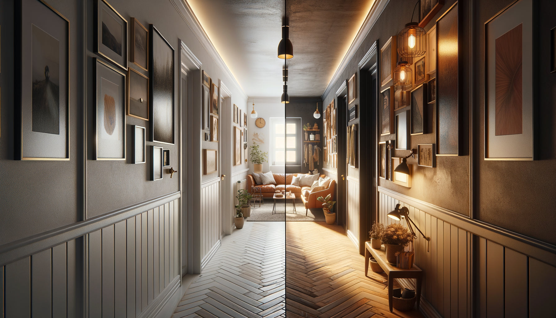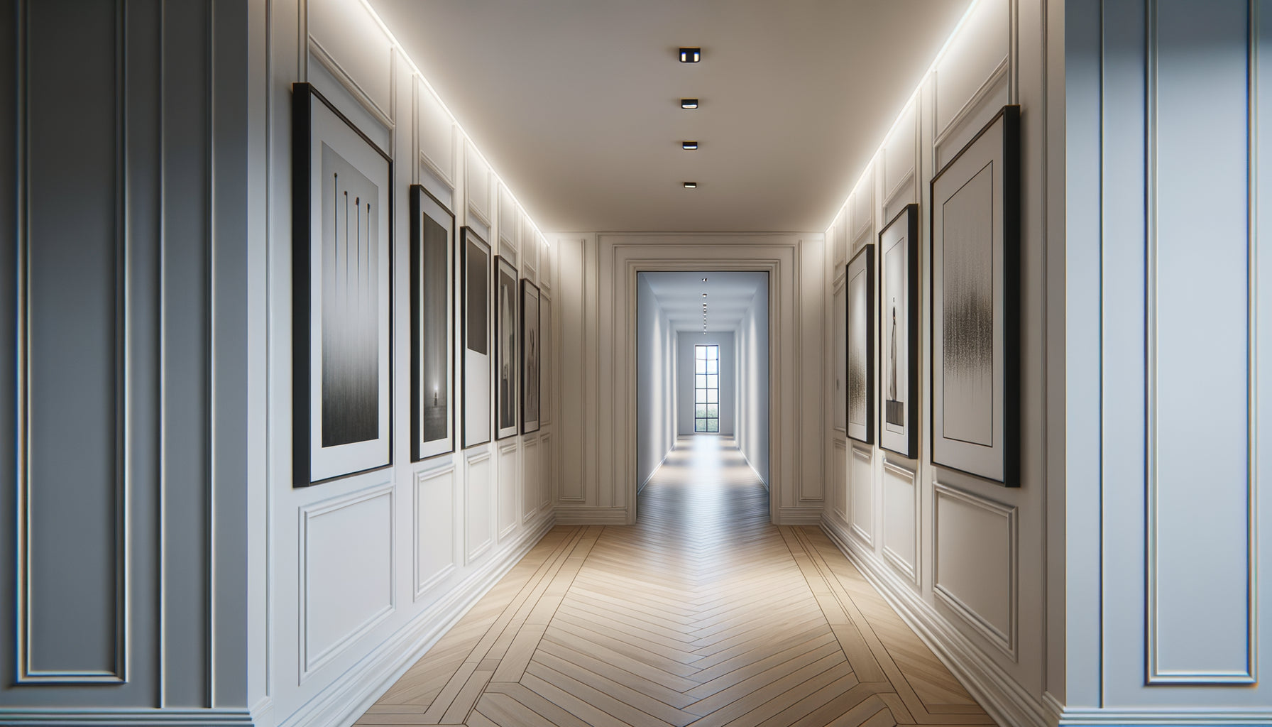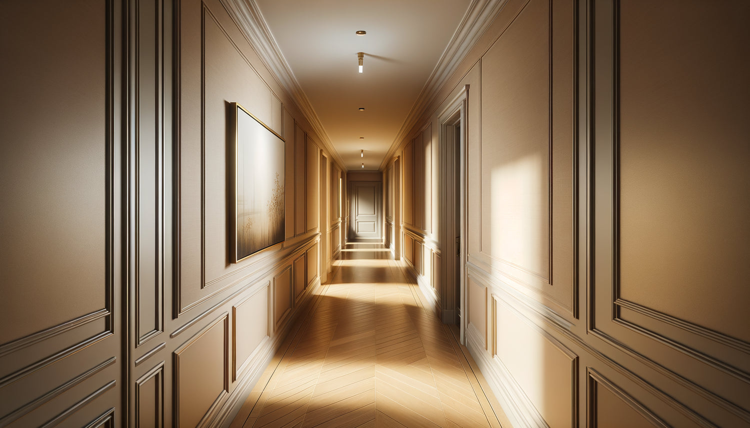
This narrow hallway connecting your entrance to the living room. Barely a meter wide, with white walls that seem to suck you into an endless tunnel. Every morning, you traverse it mechanically, this passage having become invisible through familiarity. Yet, all it takes is a well-chosen artwork to transform this simple circulation into a true intimate gallery.
Here's what a suitable artwork brings to your narrow hallway: it creates a captivating focal point that diverts attention from the smallness, it visually structures the space by rhythmizing perspective, and it reveals the unique character of this often-neglected transitional area.
You have probably already hesitated in front of this empty wall. Too large, the artwork would stifle the space. Too small, it would seem ridiculous, lost like a postage stamp on an envelope. This uncertainty paralyzes: it's better to leave the wall bare than to make a visible mistake every day.
Rest assured: choosing the appropriate size of an artwork for a narrow hallway follows precise principles, tested in thousands of similar spaces. Simple rules exist, mathematical proportions but also visual tricks that transcend measurements. You will discover how to turn this architectural constraint into a decorative opportunity.
I promise you that at the end of your reading, you will know exactly which dimension to prioritize, where to position your artwork, and how to avoid the classic pitfalls that ruin so many otherwise promising hallways.
The golden rule of proportions for confined spaces
In a hallway less than one meter wide, the critical dimension is not that of the artwork but that of the breathing space around it. The fundamental rule: your work should occupy between 50% and 70% of the available wall width. On an 80-centimeter wall, aim for a maximum width of 40 to 55 centimeters.
This proportion avoids two major pitfalls. An artwork that is too wide creates a feeling of oppression, as if the walls are closing in. Your gaze has nowhere to rest; the space appears even narrower. Conversely, a work that is too small gets lost in the void, paradoxically accentuating the endless length of the hallway.
For height, think in terms of format rather than absolute centimeters. Vertical formats are your best allies in a narrow hallway. A 40-centimeter wide artwork by 60 or 80 centimeters high naturally follows the verticality of the space. It draws the eye upwards, giving an impression of increased ceiling height, counterbalancing the horizontal narrowness.
When perspective dictates the ideal size
Here's a truth that few decorators mention: the viewing distance radically transforms the perception of an artwork. In your spacious living room, you admire a work from 3 or 4 meters away. In a narrow hallway, you discover it at 50 centimeters, sometimes less.
This mandatory proximity changes everything. A 60-centimeter wide artwork can seem monumental when you brush past it. Imagine yourself standing in front of it: can your field of vision comfortably embrace the entire work, or do you have to move your head to grasp its edges?
Test this critical dimension before you buy. In a hallway that is 80 centimeters wide, stand in the center. Extend your arms laterally at a 45-degree angle: the distance between your two hands represents the maximum recommended width for your artwork. Beyond that, the work overflows from your natural field of vision, creating a subtle but permanent discomfort.
The length of the hallway also influences your choice. A short hallway (less than 3 meters) is ideally suited to a single medium-sized painting measuring 40 to 50 centimeters. A long hallway (more than 5 meters) calls for either a composition of several small spaced paintings or a unique large format that creates a focal point in this extended perspective.

The magical formats that visually expand the space
Certain dimensions possess an almost architectural power. In a narrow hallway, the horizontal panoramic format (e.g., 40 x 20 centimeters) creates an illusion of widening. This elongated rectangle placed on a side wall suggests an opening, like an imaginary window that pierces the wall.
Paradoxically, this format works precisely because it goes against the vertical logic of the hallway. Your eye, accustomed to following the parallel lines of the walls, suddenly encounters a horizontal line that breaks this monotony. The space breathes.
Square formats (30 x 30 or 40 x 40 centimeters) offer reassuring stability in a naturally unbalanced space. The square neither pulls towards height nor width: it asserts its presence without attacking the architecture. Ideal for hallways that open onto several rooms, where formal neutrality becomes an asset.
For the daring, the very large vertical format (50 x 120 centimeters) transforms the hallway into an art gallery. This option requires courage: the painting massively occupies the wall, becoming the undisputed star of the space. But the effect is striking. The hallway ceases to be a simple passage and becomes a destination in itself.
The mistake that ruins 80% of decorated hallways
I have seen countless hallways sabotaged by a recurring error: multiplying small paintings in the hope of not overloading the narrow space. Five frames measuring 15 x 20 centimeters aligned on a hallway wall create a “patchwork” effect that visually fragments the space rather than unifying it.
In a hallway less than one meter wide, restraint is key. It's better to have one appropriately sized painting than three small ones. The eye rests, focuses, and then glides along the rest of the hallway. This simplicity creates a fluidity that the multiplication of attention points systematically destroys.
If you love the idea of a multiple composition, respect this rule: space your paintings by at least 80 centimeters to 1 meter. Each work then becomes a distinct stage in crossing the hallway, a visual rhythm rather than a jumble. And maintain a uniform size (for example three paintings of 30 x 40 centimeters) to preserve harmony.
The other fatal mistake: ignoring placement height. Even a perfectly sized painting will look disproportionate if it is hung too high or too low. The center of the work should be between 1.50 and 1.60 meters from the floor, aligned with your natural line of sight when walking. In a hallway, you don't stop to contemplate: the height must correspond to your vision in motion.

How the painting's style influences the optimal size
An abstract painting with bright colors can afford a larger size than a black and white photograph with high contrast. Why? The visual intensity compensates or amplifies the physical dimension.
A minimalist work with 80% white and a few black lines can measure 60 x 80 centimeters in your narrow hallway without being oppressive. The visual lightness counterbalances the physical span. Conversely, a canvas saturated with details and saturated colors should remain more modest (40 x 60 centimeters maximum) so as not to overwhelm the confined space.
The subjects depicted also play a role. A landscape with deep perspective (a road leading into the distance, a forest seen in depth) creates an illusion of space that justifies a generous format. This imaginary window opens the narrow hallway onto elsewhere. A close-up portrait, on the other hand, requires more restraint: this face looking at you 50 centimeters away can become intimidating if it exceeds 40 centimeters wide.
Paintings specially designed for these confined spaces often incorporate these principles into their composition itself: suggested depths, guiding lines, palettes that breathe.
The mock-up technique to never be wrong
Before permanently hanging, simulate with newspaper. Cut out a rectangle of the intended dimensions, stick it to the wall with painter's tape. Live with it for 48 hours. Walk through your hallway at different times of the day, under different lighting.
This mock-up reveals truths that abstract figures hide. Does the imaginary painting seem naturally integrated, or does it attract attention like an anomaly? When you pass someone in the hallway, does the paper appear cumbersome or insignificant?
Adjust the dimensions on your simulation. Widen by 5 centimeters, reduce by 10. This risk-free experimentation avoids costly returns and walls riddled with poorly placed holes. Photograph each version with your smartphone: the camera often captures disproportion that your accommodating eye forgives.
Also check practical constraints. Does your painting physically fit into the hallway without being presented at an angle? A frame 70 centimeters in diagonal may refuse to pass through a 90-degree angle in a hallway 85 centimeters wide. Measure passages, anticipate logistics. The most beautiful painting in the world is useless if it remains stuck in the entrance.
Your hallway deserves better than a simple forgotten passage
Discover our exclusive collection of paintings for Hallway that transform narrow spaces into captivating galleries, with dimensions designed for each configuration.
Visualize your hallway transformed
Imagine: tomorrow morning, you leave your bedroom. Instead of mechanically crossing this white tunnel, your gaze rests on this painting with perfect proportions. Its size respects the space without dominating it. Its colors dialogue with natural light filtering from the living room. Your hallway has ceased to be an architectural constraint to become a harmonious transition, an airlock where you like to pause, even briefly.
This transformation begins with a simple decision: measure your wall, apply the 50 to 70% rule, choose a format that respects your line of sight. No complex calculations, no innate artistic talent. Just correct proportions, tested and proven in thousands of spaces similar to yours.
This weekend, take your measuring tape. Note the exact dimensions. Cut out your mock-up from newspaper. Let your hallway speak to you: it knows what size painting suits it. Listen to it.
FAQ: Your questions about paintings in narrow hallways
Can you put a painting in a 70 centimeter wide hallway?
Absolutely, and it’s even recommended! A hallway of 70 centimeters can ideally accommodate a painting that is 35 to 50 centimeters wide. Prioritize a vertical format that complements the natural proportion of the space. The trick is to choose a work with plenty of white space or a light palette that doesn't visually overwhelm. An aerial landscape, a soft watercolor, or a minimalist photograph work wonderfully. Avoid frames that are too thick and ornate: opt for a thin frame (a maximum of 2-3 centimeters) that doesn’t nibble away at precious visual centimeters. And above all, hang only one piece: in such an intimate space, multiplicity would become oppressive.
Is it better to have several small paintings or one large one in a narrow hallway?
In a hallway of less than one meter, a single medium-sized painting almost always surpasses a collection of small works. The reason is psychological: your gaze naturally seeks a unique focal point when you traverse a confined space. Several small paintings create a visual competition that fragments attention and can give an impression of disorder, even with perfectly aligned hanging. The exception: if your hallway exceeds 6 meters in length, you can consider a series of three identical paintings (same size, same frame) spaced regularly to create rhythm. But in this case, consider these three works as a unique installation rather than separate elements. Minimalism remains your best friend in narrow spaces.
How to prevent a painting from making my hallway even narrower?
The key lies in three principles that are often overlooked. Firstly, choose colors that recede rather than advance: blues, soft greens, and pastel tones create an impression of depth, while reds, oranges, and bright yellows seem to jump off the wall towards you. Secondly, prioritize subjects with perspective: a path that disappears into the distance, an open sky, a sea on the horizon. These compositions visually open up the space instead of closing it in. Thirdly, scrupulously respect the 50-70% rule of wall width: a painting that leaves at least 15 centimeters of margin on each side allows the space to breathe. Finally, lighting is enormously important: a small sconce directed towards the painting creates depth and diverts attention from the narrowness of the hallway itself.