I still remember this mother, Marie, desperately showing me the four small paintings lovingly purchased for her daughter's room. They had been leaning against the wall for three months. "I don't know where to start, I'm afraid of messing it up," she confided in me. I’ve witnessed this scene dozens of times in ten years of helping families decorate their children's spaces. Creating a children's gallery wall transforms a simple room into a stimulating universe where imagination flourishes. Here's what a well-thought-out gallery wall brings: it visually structures the space by creating a soothing focal point, it nourishes the child’s creativity through evolving compositions, and it deeply personalizes their haven according to their tastes and age. Yet, faced with these small paintings scattered around, frustration quickly rises. Where do you hammer in the first nail? What distance should you respect? How do you avoid a “cluttered” effect? Rest assured: composing a harmonious gallery wall doesn't require any particular talent, just a simple method and a few visual guidelines. I’m going to reveal the progressive approach that transforms hesitation into creative confidence.
The secret of a successful composition begins... on the floor
Before taking your hammer, sit down comfortably on the floor. Spread all your small paintings in front of you, like the pieces of a giant puzzle. This step that I call “the horizontal laboratory” changes absolutely everything. You will experiment without risk, move things around, permute until you find THE composition that makes you smile.
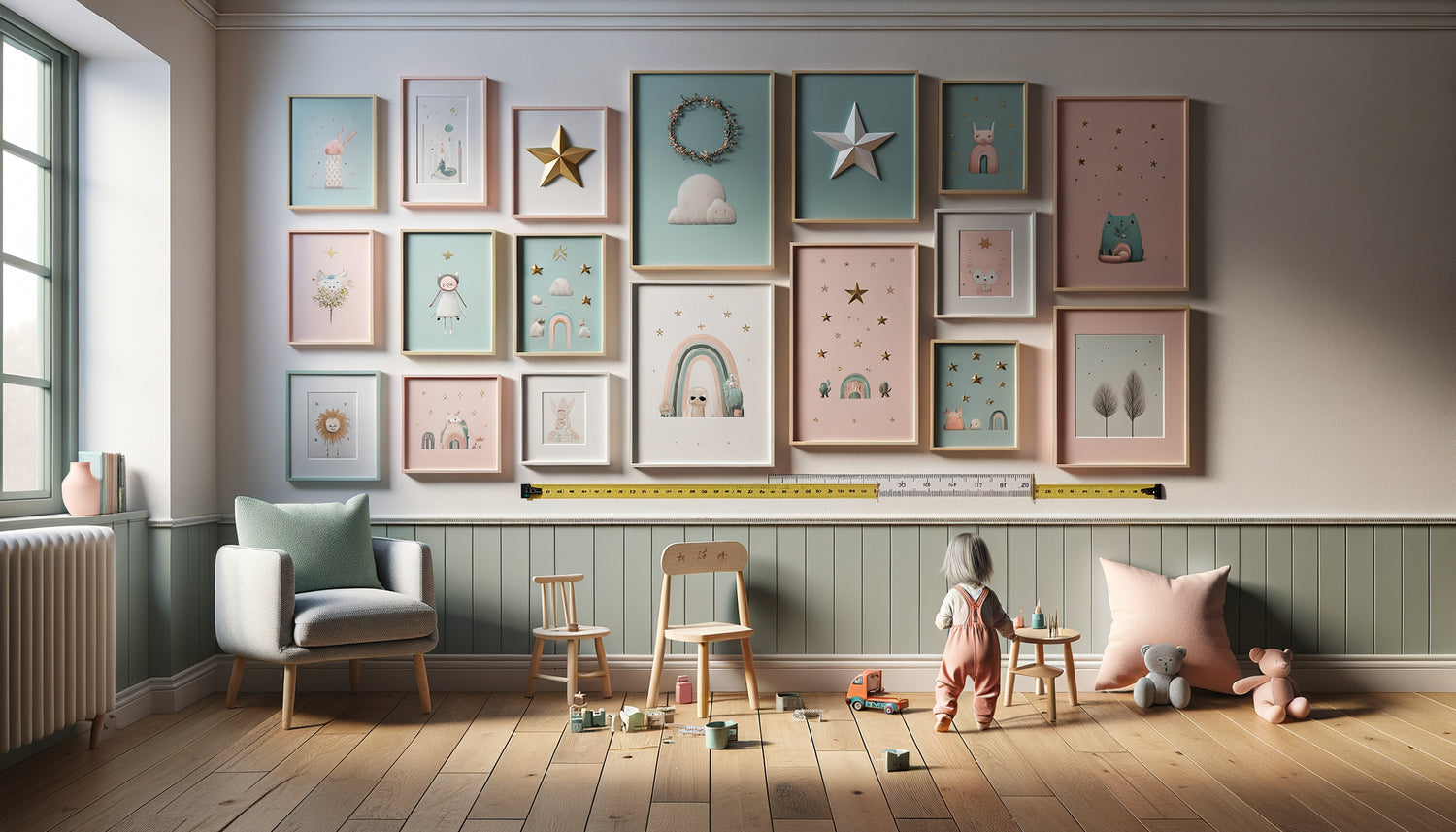
For a children's gallery wall, three configurations stand out. Geometric alignment creates a reassuring structure: imagine four frames arranged in a perfect square, or six paintings forming two regular rows. This approach is particularly suitable for children who appreciate order and symmetry. The organic constellation, my preferred approach for little ones, allows each work to breathe with irregular but balanced spacing, like stars in a benevolent sky. Finally, the horizontal line composition, perfect above a bed or desk, visually stretches the space.
Photograph each attempt with your phone. This visual archive becomes your valuable guide once you are standing facing the wall. I’ve seen so many parents forget their ideal arrangement in just a few minutes! Also take measurements between each frame: note the spacing that pleases you. Generally, 15 to 20 centimeters between the paintings creates a pleasant visual breathing space for a child's room, close enough to create an ensemble, far enough to let each illustration breathe.
The golden rule of height (that no one ever respects)
How many times have I seen beautiful gallery walls... placed at adult height in a child's room! The classic mistake that transforms a decoration designed for the child into a decoration admired only by the parents. For a truly child-centric children's gallery wall, the center of your composition should be between 120 and 140 centimeters from the floor.
This height corresponds to the eye level of a child between 5 and 10 years old. Lucas, age 7, told me in his own words: "Now, my animals really look at me!" after we repositioned his gallery. For toddlers, lower it even to 110 centimeters. Imagine your child sitting on their bed or playing on the floor: their art prints should be within their natural field of vision, not yours.
A simple technique: ask your child to stand naturally against the wall. Discreetly mark the level of their eyes with a pencil. This is your reference line, the heart of your wall gallery. For a multiple composition, this point generally corresponds to the center between the highest and lowest artwork. If you are creating a gallery above a piece of furniture, maintain a distance of 15 to 25 centimeters between the top of the furniture and the bottom of your first frame.

The paper template technique (zero unnecessary hole)
Here's the trick that saves your walls and your peace of mind. Cut out rectangles from kraft paper or newspaper with the exact dimensions of each small artwork. Write a corresponding number on the back for each frame. These templates become your life-size draft on the wall.
Secure them with repositionable adhesive tape. Step back several meters. Sit in different places in the room: on the bed, near the door, where the desk is. A successful child's gallery works from all viewing angles of the room. Don't hesitate to live with these templates for 24 or 48 hours. Morning light is different from evening light, and your eye picks up imbalances invisible during the initial placement.
I always encourage parents to involve their child in this phase. Emma, age 6, moved one of the templates "because the unicorn wanted to be closer to the rainbow." This childlike spontaneity often brings the final perfect touch that our adult logic would have missed. When you are satisfied, mark precisely with a pencil the locations of the fixings through the paper. Number each mark. Remove the templates: your drilling plan is ready, precise, without approximation.
Composing with colors and themes without falling into chaos
A harmonious wall gallery for children is not an anarchic accumulation of everything cute. Visual coherence transforms several individual small artworks into a set that tells a story. Three guiding threads create this unity: the color palette, the thematic universe, or the graphic style.
For the palette, choose two to three dominant colors that dialogue with the existing decor. If the room breathes in sage green and dusty rose tones, your tableaux should pick up at least one of these shades. This doesn't mean all frames have to be identical – on the contrary! One painting can be predominantly green with a touch of pink, another the opposite. This variation within continuity creates a captivating visual rhythm.
A thematic approach works wonderfully for children's gallery walls. Forest animals, marine creatures, space and planets, vehicles, playful letters and numbers... These coherent universes stimulate the imagination while visually structuring the composition. Nathan had an "exploration" gallery mixing a stylized world map, animals from different continents, a hot air balloon, and a vintage compass. The thematic unity allowed this diversity without chaos.
Also consider the frames themselves. For a calming children's gallery wall, I generally recommend frames of the same color (natural wood, white, or matte black) even if their dimensions vary. This consistency in the container allows for all the fantasy in the content. Conversely, if your illustrations are very clean and monochrome, differently colored frames bring just the right dynamism.

Mistakes that break the harmony (and how to avoid them)
After hundreds of installations, some mistakes consistently reappear. The first: the syndrome of forced perfect alignment with tableaux of very different sizes. Wanting to absolutely align the top edges of 20x20 cm and 15x30 cm frames creates visual tension. Instead, prioritize center alignment or accept a harmonious asymmetrical rhythm.
The "all small everywhere" error dilutes the impact. If you have six small paintings of similar formats, group them on one wall rather than scattering them throughout the room. A concentrated children's gallery wall creates a strong focal point that structures the space. The rest of the walls can breathe, accommodate a shelf or simply let the color express itself.
Also be careful of thematic overload. I have seen rooms where a princess gallery coexisted with dinosaur stickers, star garlands and jungle wallpaper. The child's brain, overwhelmed by stimuli, finds no point of rest. Your gallery wall should be the main decorative element, accompanied by more discreet touches elsewhere.
Finally, the lack of scalability. Children's tastes change quickly. Prefer mounting systems that allow you to easily replace a painting without having to redo all the holes. Picture rails, wall mounts or even adhesive strips for lightweight frames offer this valuable flexibility. When Zoé moved from her "unicorns" phase to her passion for astronomy, her parents simply swapped three frames in ten minutes. The structure of the wall gallery remained identical, only the content evolved with it.
Ready to transform the room into a personal gallery?
Discover our exclusive collection of paintings for children's rooms that harmonize perfectly to create captivating and evolving wall compositions.
Your wall gallery grows with your child
Close your eyes for a moment. Imagine your child waking up every morning to discover HIS wall gallery, this space that resembles him, that tells his passions, that evolves with him. These small paintings carefully positioned are not just decoration: they constitute the first works of his personal museum, the visual validation that his tastes count, that his space deserves attention and creativity.
Start this week with the floor step. Take out your paintings, play with compositions, involve your child. Photograph the arrangement that makes you all smile. Then, with your paper templates, test full-size without stress. A successful child's wall gallery does not require perfection, it simply asks to dare to compose, adjust, create a set that tells YOUR family story.
And remember: this gallery is never fixed. It will live, breathe, change at the pace of your child's discoveries. In two years, you might add his first framed drawing in the middle of the illustrations chosen today. That's exactly how decoration becomes a true living space, evolving and deeply personal.
Frequently asked questions about children's wall galleries
What distance should be left between each small painting in a wall gallery?
For a harmonious childlike gallery wall, I generally recommend between 15 and 20 centimeters of space between each frame. This distance creates a pleasant visual breathing room: the artworks clearly form a unified ensemble while allowing each illustration to express itself individually. If your frames are very small (less than 15x15 cm), you can reduce to 10-12 centimeters. Conversely, with larger formats or on a very large wall, you can go up to 25 centimeters. The trick I use: place your open hand between two frames. The space between your thumb and little finger (about 18 cm for an adult) visually offers a balanced distance. Always test with your paper templates before drilling: what looks perfect on the floor may seem too tight or too spaced once vertical. Trust your eye and don't hesitate to ask another person for their opinion, which will bring a fresh perspective to your composition.
How to create a gallery wall if my artworks are all different sizes?
Artworks of varying dimensions actually create the most dynamic and personal gallery walls! The trick is to create a consistent visual envelope. Imagine an invisible rectangle or square that would contain your entire composition: even if your frames have different sizes inside, this overall shape structures the gaze. To harmonize varied formats, you can align certain elements: for example, align the bottom edges of three artworks, or create a central vertical axis around which you distribute your frames symmetrically. Another approach is to alternate large and small formats according to a regular rhythm: large-small-small-large creates a soothing visual cadence. For a childlike gallery wall, I particularly like the “satellite” technique: position your largest artwork as a central element, then gravitate the smaller ones around it like planets around a sun. This composition works wonderfully in a reading corner or above a bed. Remember: always test on the floor and then with templates before drilling.
From what age can we install a gallery wall in a child's room?
There is no minimum age to create a child-friendly gallery wall! Even for a baby, soft illustrations positioned at the right height visually stimulate and create a welcoming atmosphere. For toddlers under 2 years old, prioritize a secure installation: solid fixings, lightweight frames, sufficient height to prevent the child from grabbing them while standing in their bed. Choose contrasting and simple visuals that their developing vision can appreciate. Between 2 and 5 years old, the child begins to express their preferences: this is the ideal time to create a gallery wall together that reflects their first passions. Position at least some pictures at their eye level so they feel truly involved. From 6-7 years old, actively involve your child in all decisions: choice of illustrations, layout, adjustments. This participation transforms the gallery into a real personal project they will be proud of. The wonderful advantage of a gallery wall: it evolves! You can start with three soft frames for a newborn and then gradually enrich the composition over the years, adding their own creations or new illustrations that correspond to their growing interests.