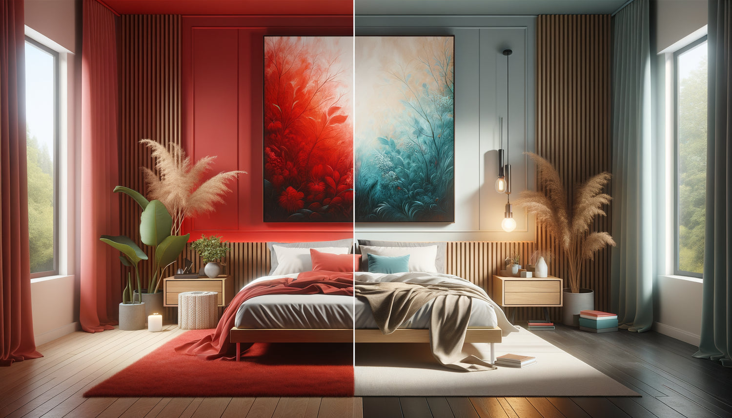
I received a desperate call yesterday from a Parisian client. After spending three nights unable to sleep, he had just realized: the magnificent vermilion triptych he had hung facing his bed was to blame. His heart rate accelerated every evening for no apparent reason, his sleep was restless, and even his mornings seemed to start with tension. It wasn't a coincidence. Bright colors in a bedroom, and particularly red, act as permanent stimulants on our nervous system.
Here's why avoiding brightly colored paintings in your bedroom protects your well-being: they disrupt sleep quality by maintaining high brain activity, create visual stimulation incompatible with relaxation, and prevent the installation of this enveloping atmosphere essential for deep rest.
You may have succumbed to this vibrant canvas in a gallery, seduced by its vibrant energy. But once installed in your bedroom, something is wrong. The ambiance isn't the same. Instead of inviting relaxation, your space seems to vibrate with an energy that keeps you awake. You thought you were creating an inspiring focal point, but you have unintentionally transformed your sanctuary into a stimulating space.
Rest assured: this mistake is extremely common. Understanding the psychophysiological impact of bright colors on your bedroom will allow you to create a true haven of peace, conducive to nighttime regeneration. I am sharing with you today the discoveries that will transform your approach to bedroom decoration.
The neurological effect of saturated colors on sleep
When you observe a painting with bright colors, particularly in shades of red, orange or intense yellow, your brain reacts instantly. These saturated hues stimulate the production of cortisol, the hormone of arousal and vigilance. This is exactly the opposite of what your body needs to enter restorative sleep phases.
Studies in chronobiology demonstrate that warm and intense colors maintain activation of the sympathetic nervous system. Your heart rate remains slightly elevated, your blood pressure does not drop to its optimal resting level. Even if you don't perceive it consciously, your body remains in a subtle state of alert.
I have observed this phenomenon many times: a bedroom with a large red painting can reduce sleep latency by 30 to 45 minutes. The duration of deep sleep phases also decreases, which explains these mornings where you wake up tired despite eight hours in bed.
The contrast created by bright colors constantly captures the attention of your gaze, even in the dim light. Your brain continues to process this stimulating visual information, preventing the mental disconnection necessary for true rest.
Red: a color of action incompatible with rest
Red possesses a fascinating biological peculiarity: it accelerates our perception of time. In a room dominated by this color, minutes seem to pass faster, creating an unconscious sense of urgency. This is wonderful for a creative space or a dynamic office, but disastrous for a bedroom.
This hue activates our primal instincts: passion, danger, immediate action. Evolutionarily, red signaled blood, fire, the need to react quickly. A red painting in your nighttime field of vision keeps these ancestral neural circuits awake, even at low light intensity.
I accompanied a communication consultant who suffered from unexplained nocturnal anxiety. Her magnificent abstract red and orange painting, positioned facing her bed, created a permanent tension. Three days after moving it to her living room, her sleep quality dramatically improved. She had regained complete and restorative nights.
Variations of red – from vermilion to deep burgundy – all present the same challenge: they are too energetic for a resting space. Even a dark burgundy, which seems elegant and muted, retains this charge of activation that subtly disrupts falling asleep.

The psychological impact of saturated colors on your sanctuary
Your bedroom should function as a protective bubble, a space where the outside world gradually fades away. Vibrant color paintings create the opposite effect: they project energy outwards, they assert, they claim, they stimulate.
This energetic dynamic subtly transforms your perception of space. Instead of feeling enveloped and protected, you are confronted with a dominant visual presence. Your gaze is constantly drawn, solicited, activated. Mental relaxation becomes difficult, if not impossible.
A couple confided in me that they had developed more frequent arguments after installing a large intense orange painting in their bedroom. Initially without understanding it, this stimulating visual presence created latent tension, making each minor disagreement more difficult to defuse. The space no longer offered the soothing quality necessary for serene communication.
Vivid colors also amplify negative emotions. A stressful day followed by an evening in a visually stimulating bedroom prevents emotional decompression. Your nervous system needs environmental signals that indicate “here, it’s time to pause,” not “here too, you need to be on alert.”
Gentle Alternatives That Preserve Character
Abandoning bright colors doesn't mean giving up personality. On the contrary, it’s an opportunity to discover a more subtle, enveloping sophistication. Dusty hues, deep blues, sage greens, complex beiges offer visual richness without the stimulating intensity.
I guided one interior designer towards artworks in burnt Sienna earth tones, soft ochre and bluish gray for her own bedroom. She initially feared a bland atmosphere. Six months later, she told me she had never slept so well, and found these nuances infinitely more refined than her former vibrant canvases.
Artworks with soft colors create visual depth that gradually reveals itself. Rather than shouting their presence, they whisper an invitation to quiet contemplation. Your eye rests on these soothing harmonies instead of being constantly stimulated.
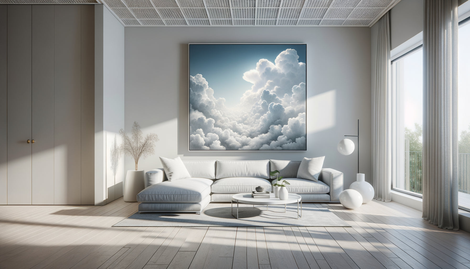
Think of misty landscapes, monochromatic blue nocturnes, botanical compositions in neutral tones. These works possess undeniable artistic presence while respecting the primary function of your bedroom: to be a space for regeneration.
The 60-30-10 Rule Adapted for the Bedroom
If you absolutely want to integrate a touch of bright color, respect the 60-30-10 proportion: 60% soothing neutral tones, 30% soft secondary colors, and a maximum of 10% vibrant accents. Within this framework, a small colorful artwork can find its place on a side wall, never facing the bed.
This approach allows you to express your personality while preserving the energetic balance of the space. The eye catches the color note as a punctuation accent, not as a dominant presence that dictates the overall atmosphere.

Creating a Calming and Personal Wall Gallery
The solution isn't the absence of art, but the conscious choice of artworks that serve your well-being. A composition of several artworks in complementary soft tones creates a rich visual interest without the aggressiveness of saturated colors.
I encourage my clients to prioritize monochromatic schemes: several nuances of the same family of soothing colors. A wall with four artworks declining different twilight blues, for example, offers remarkable visual sophistication while maintaining this essential enveloping quality.
Photographic artworks in black and white are also an elegant alternative. They bring character, tell stories, create an atmosphere without the stimulating chromatic load. A grayscale Icelandic landscape has a powerful evocative force without disturbing your rest.
Also consider textures: a painting with relief, natural materials such as linen or jute, dried botanical compositions under frame. These three-dimensional approaches enrich your decoration while respecting the soft palette necessary for a true sanctuary.
Transform your bedroom into a true haven of peace
Discover our exclusive collection of bedroom wall art that promotes serenity and restorative rest through carefully selected tones.
Learning to read the signals of your space again
Your body instinctively knows what it needs. If you feel unexplained agitation in your bedroom, if falling asleep becomes difficult, if your awakenings lack gentleness, question your visual environment. Paintings with bright colors are often the invisible culprits.
Try this: temporarily remove any artwork with saturated tones for a week. Observe the difference in your sleep quality, your morning mood, and your overall feeling of rest. This simple experience often reveals unsuspected connections between decoration and well-being.
The bedroom is not an area for maximum expression of your personality. It's your base for regeneration, the place where your nervous system needs to be able to completely reset. Reserving bright colors for your daytime living spaces isn’t a limitation; it’s wisdom.
Choosing wall art with soft tones for your bedroom is an act of self-listening. It’s recognizing that true rest requires an environment that collaborates with your biology, not fights it. It's prioritizing quality of life over immediate decorative effect.
Imagine yourself in six months. You slip into your bed, your gaze rests on this painting with twilight tones that harmonizes with your bedding. A descending feeling of calm washes over you naturally. Your breathing slows down, your shoulders relax. The space lulls you to sleep instead of keeping you awake. You wake up rested, restored, ready to greet the day with a serene energy.
This transformation begins with a simple choice: honor the primary function of your bedroom by choosing artworks that serve your rest. Look at your walls with new eyes. Which paintings deserve to stay? Which would be better placed elsewhere? Your body will thank you for this conscious attention to your sleep environment.