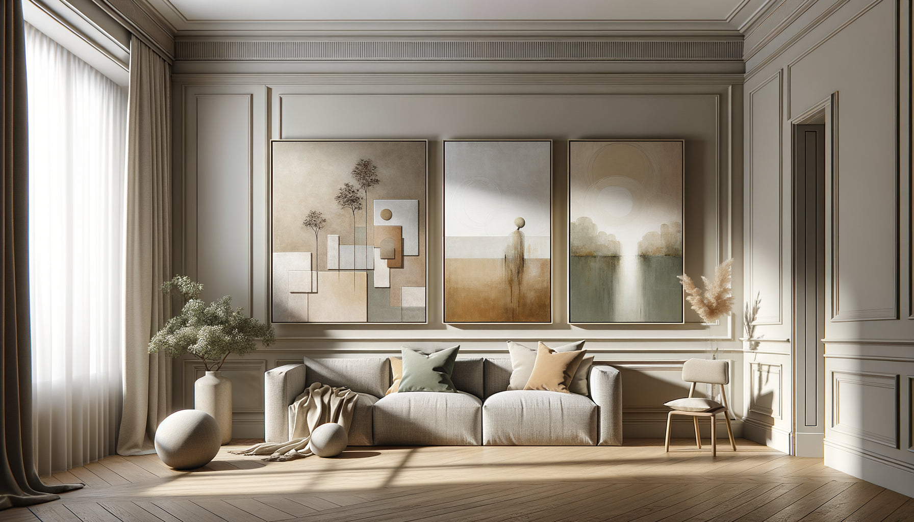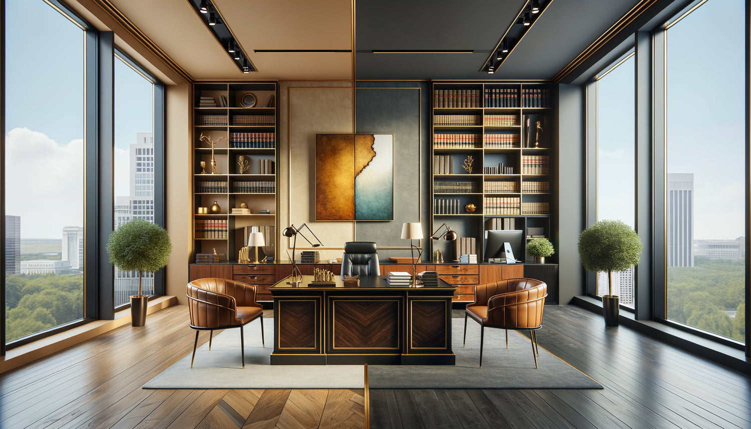
When I first crossed the threshold of a renowned notary’s office in Paris’s 7th arrondissement, I immediately understood why their signing rate exceeded that of their colleagues: on the wall, a painting with ochre and golden hues instantly warmed the protocol atmosphere. Clients didn't just come to sign deeds; they experienced an important moment in their lives within a reassuring setting.
Here’s what a thoughtful choice of warm hues or cool tones brings to a notary’s office: a decisive first impression that influences client trust, a balanced atmosphere between professional seriousness and human warmth, and a distinctive personality that values your expertise while soothing the natural tensions associated with important transactions.
Many notaries find themselves facing a dilemma: how to create a welcoming environment without compromising the expected solemnity? How to choose between warm hues that humanize the space and cool tones that inspire confidence and rigor? This hesitation often leads to overly neutral choices, transforming the office into an impersonal space where the client feels like they are on an administrative visit rather than being accompanied through a decisive moment.
The good news? The choice between warm or cool tones for your notary’s office isn't a matter of fashion, but of emotional strategy adapted to your practice, your clientele, and even the architecture of your space. I will guide you through the principles that transform a simple painting into a silent ally in your client relationship.
The psychology of color at the service of notarial trust
In a notary’s office, every detail communicates. A painting with warm hues – deep reds, ochres, golds, warm browns – acts as an emotional counterbalance to legal formality. These colors activate brain areas associated with comfort, family security, and human warmth. When a couple enters to sign the deed to their first home, these tones visually translate the accomplishment and underlying joy of the transaction.
I have observed that warm hues work particularly well in notarial offices specializing in family law and residential real estate transactions. They create a welcoming atmosphere that facilitates conversation, encourages questions, and tempers the natural anxiety associated with significant financial commitments. A painting with autumnal oranges or earthy reds in the waiting room can noticeably reduce pre-appointment tension.
Conversely, cool tones – deep blues, silver grays, aquamarine greens, muted purples – instantly project authority, reflection, and intellectual rigor. These colors slow heart rate, promote concentration, and evoke stability. In a notarial context focused on commercial law, complex successions, or sophisticated wealth management, cool tones reinforce the perception of expertise and mastery.
Adapting color choices to your notarial specialty
The nature of your practice largely dictates the choice between warm or cool tones. An urban notary focused on commercial transactions and business advice will benefit from a painting with cool tones, structured composition: an abstract composition in navy blues and anthracite gray communicates sophistication and an analytical approach. These colors resonate with a business clientele seeking efficiency and discretion.
Conversely, a local notary in a rural or semi-urban area, who accompanies families across generations, will gain more by favoring organic warm tones. A landscape with autumnal hues, a still life with ochres and burnt siennas, or even a figurative scene with warm reds immediately establishes continuity, a territorial anchor that reassures. Clients subconsciously perceive this warmth as an extension of the intergenerational relationship of trust.
Shared offices: when balance becomes essential
In firms with multiple partners with varied specialties, I have found that paintings subtly combining warm and cool tones offer the necessary versatility. A contemporary work where a deep blue dialogues with touches of copper orange, or a landscape where a cold sky contrasts with warm earth, allows each client to find their emotional anchor according to their needs at the moment.
This balanced approach is particularly suitable for common areas – waiting rooms, circulation corridors – where clients with diverse expectations pass through. The welcoming notary's office modern recognizes this diversity and responds to it with a nuanced visual strategy rather than monolithic.

Architecture and light: allies in your chromatic choice
A notary's office located in a Haussmannian building with high ceilings and generous windows can absorb warm intense tones without risking oppression. Deep reds, bordeaux, golds take on a majestic dimension there that reinforces the solemnity of the places while humanizing them. Abundant natural light naturally tempers chromatic intensity.
Conversely, a modern office with reduced or north-facing windows requires a different approach. Bright cool shades – sky blues, pearl grays, aquatic greens – compensate for the lack of natural light and create a sense of space. Paradoxically, in these configurations, overly saturated warm hues can accentuate a feeling of confinement rather than comfort.
I've also noticed that ceiling height significantly influences the perception of colors. A low ceiling (under 2.70m) is better suited to light cool shades that create an illusion of elevation. A high ceiling can accommodate deep warm hues that structure the vertical space without crushing it.
Artistic styles that serve your color intentions
The choice between warm or cool shades is not limited to pure color; it embodies an artistic style that carries your professional message. For a welcoming notary's office rooted in tradition, a realistic landscape with autumnal warm hues evokes permanence and natural cycles – values that resonate with the notary’s mission of securing over time.
Geometric abstractions with cool shades are suitable for firms that cultivate a modern and avant-garde image. They communicate order, mental structure, ability to abstract – essential qualities for navigating contemporary legal complexity. A Rothko with superimposed blues or a minimalist gray-blue composition instantly signals a sophisticated analytical approach.
Figurative art to humanize cool shades
A particularly effective strategy is to choose a warm figurative subject treated in cool shades. Imagine an antique family portrait with blue-gray tones, or a village scene in muted greens. This combination offers the best of both worlds: the color rigor that inspires confidence, tempered by a subject that recalls the human element at the heart of every notarial act.
Conversely, an abstraction with mastered warm hues – a Mark Rothko with deep reds, a Soulages composition with warm browns and blacks – brings intellectual sophistication while retaining an accessible emotional dimension. This approach is suitable for notaries who want to project contemporary expertise and a human approach simultaneously.

Warm Tones: When and How to Integrate Them with Discernment
Warm tones in a notary's office work best in measured doses. A large painting with intense reds facing the desk can create an uncomfortable visual confrontation during already tense interviews (divorces, inheritance disputes). On the other hand, the same painting placed in the library or relaxation area becomes a positive emotional anchor.
I have found that earthy warm tones – ochres, sienna earths, chocolate browns, antique golds – offer warmth and authority simultaneously. They evoke old bindings, parchment, the patina of time which legitimizes the notary's institution. A painting in these shades creates continuity between tradition and modernity, particularly relevant for century-old firms that are renewing themselves.
Oranges and corals, more contemporary, suit younger offices seeking to differentiate themselves with a less rigid approach. These energizing warm tones signal accessibility and dynamism without compromising professionalism. They work especially well in reception areas to compensate for entry anxiety.
Cool Tones: Creating Reassuring Authority
Cool tones naturally dominate notaries' offices for a simple reason: they instantly communicate control, reflection and emotional stability. A painting with deep blues behind your desk visually establishes your role as a trusted third party, this position of neutral and benevolent authority that characterizes the notary function.
Sophisticated grays – silvers, anthracite, bluish grays – create a neutral background that highlights your diplomas and certifications without visual competition. These cool tones allow the client to focus on the content of the interview rather than the environment. In complex negotiations or delicate announcements, this chromatic sobriety becomes a professional asset.
Greens: The Family of Cool Tones That Reconciles
Among cool tones, greens occupy a unique position. Neither totally cold nor completely neutral, they evoke growth, renewal and balance – concepts particularly relevant for a welcoming notary's office. A landscape with deep forest greens, an abstract work in jade and emerald tones, or even a photograph of vegetal architecture brings this tempered authority of vitality.
Watery greens and celadons, brighter, suit spaces that lack natural light. These delicate cool tones create a soothing atmosphere without the sometimes intimidating coolness of pure blues. They signal openness and listening skills, essential qualities for quickly establishing the trust necessary for patrimonial confidences.
Your office deserves a work that reflects your unique approach to notarial support
Discover our exclusive collection of wall art for law firms that transforms your professional space into a place of trust and welcome.
Compose your visual identity: beyond the single artwork
An inviting notary's office is not limited to a single artwork. The composition of several works allows for a richer chromatic narrative. Imagine a trilogy where a central piece with cool tones dialogues with two satellite works with warm tones. This strategy makes it possible to modulate the atmosphere according to the functional areas.
In your private office, where confidential interviews take place, prioritize a work that personally recharges you. If you are naturally analytical, warm tones can temper this tendency and facilitate empathy. If you are spontaneously warm, cool tones can reinforce your perceived authority during firm advice.
The waiting room, an anticipatory anxiety space, almost always benefits from warm tones. A large format with soft oranges or earthy reds immediately creates a reassuring envelope. Clients who wait before an important signature need this positive emotional anchor that compensates for procedural stress.
Visualize your ideal office and take action
Imagine for a moment: your next client walks through the door of your firm. Their gaze naturally scans the space and stops on the artwork you have chosen. In that fraction of a second, before you even speak, a connection is established. Warm tones whisper to them that behind legal formalism, they will find listening and humanity. Or cool tones confirm that they have come to the right place to navigate the complexity of their estate situation.
The choice between warm or cool tones for your notary's office is not a decorative detail, it is a strategic decision that influences the quality of your client relationships on a daily basis. Start by observing your space with a new eye: what emotion currently dominates? What emotion do you want to cultivate?
Visit galleries, browse catalogs, observe how colors resonate with your practice. An inviting notary's office is not a neutral showcase, it is the tangible reflection of your professional philosophy. And that reflection begins with a conscious and assumed color choice.
FAQ
Do warm tones risk making my notary's office too informal?
This legitimate concern stems from a confusion between chromatic warmth and excessive casualness. Sophisticated warm tones – deep bordeaux, noble ochres, antique golds, chocolate browns – bring richness and humanity without compromising professional authority. The key lies in saturation and context: an earthy red in a classic gold frame evokes a heritage library more than a relaxed living room. Observe prestigious Anglo-Saxon law firms: they massively use deep warm tones precisely because they communicate tradition, solidity and institutional warmth. The risk of informal drift exists mainly with very saturated and bright warm tones (bright orange, poppy red) which are actually better suited to other professional contexts. In a notary's office, prioritize muted and deep warm tones that enrich without destabilizing the expected visual codes.
How do I know if my notary's office lacks natural light enough to require light cool tones?
A simple test is to photograph your office at different times of the day with your smartphone, without flash. If the photos consistently need brightening to look inviting, your space probably lacks sufficient natural light. In this case, bright cool tones – sky blues, pearl grays, aqua greens – will act as light amplifiers by reflecting available light. Conversely, if your windows offer beautiful lighting for several hours a day, you have the latitude to explore deeper warm tones or saturated cool tones without risking visual darkening. Also note the orientation: an office facing north almost always benefits from warm tones to compensate for naturally cold light, while a south-facing exposure can accommodate cool tones without creating a chilly sensation. Don't hesitate to test with temporary reproductions before making a final investment.
Can I mix warm and cool tones in different rooms of my notary's office?
Not only can you do this, but it is often the most effective strategy for a welcoming notary's office that responds to varied emotional needs. Consistency does not mean chromatic uniformity. Imagine an entrance and waiting room with warm tones creating a reassuring welcome, individual offices with cool tones promoting concentration and authority, and a signature room with balanced tones combining both families to accompany this solemn and emotional moment. This chromatic progression subconsciously guides the client through the different phases of their experience. The key to success lies in maintaining stylistic consistency (similar frames, harmonious formats) even with chromatic diversity. Also ensure that transition spaces (corridors, landings) provide a smooth connection between atmospheres. A modern notary's office recognizes that different notarial acts carry distinct emotional burdens, and the chromatic environment can subtly support this diversity.