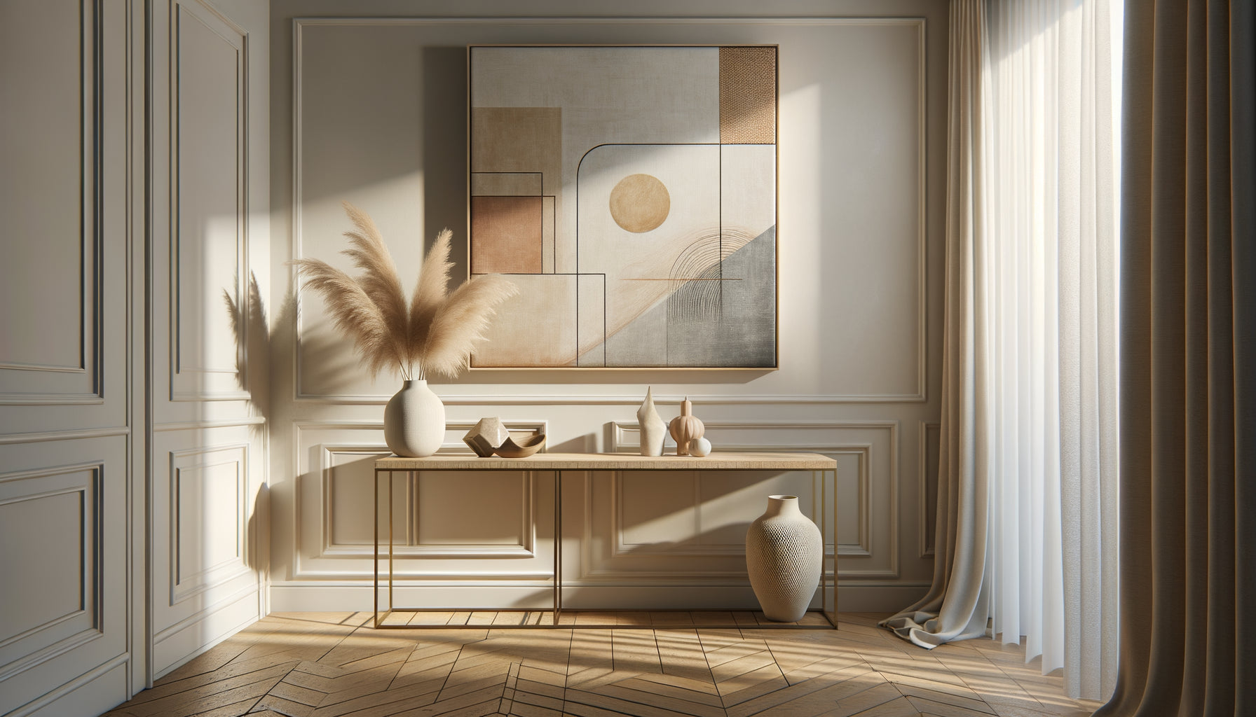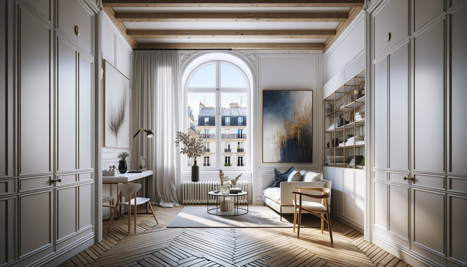
I spent ten years transforming Parisian maids’ rooms into havens of life. Ten years juggling every square centimeter, every ray of light, every illusion of space. And I can guarantee you: in a 18m² Parisian studio, a single well-chosen artwork does more than ten designer pieces of furniture. It redesigns volumes, captures the gaze, tells a story that transcends missing square meters.
Here's what a unique artwork brings to your studio: it creates visual depth that expands the space, it establishes a focal point that structures the layout, and it infuses a strong personality that diverts attention from surface constraints. It’s the centerpiece that transforms a box into a refuge.
You've probably felt this frustration: despite your storage efforts, your studio remains stifling. The white walls close in on you. Every object seems superfluous. You hesitate between forced minimalism and giving up all decoration. This hesitation paralyzes, and your space remains neutral, impersonal, almost invisible.
Rest assured: an 18m² studio is not an aesthetic prison. It’s a creative challenge that simply requires understanding the rules of spatial play. And the first rule? A strong element is better than ten timid touches. A single artwork can change everything.
In this article, I'll reveal how to choose this transformative artwork, what dimensions to prioritize, which subjects to avoid absolutely, and how to install it to maximize its impact on your perception of space.
The paradox of small spaces: why large format rhymes with amplitude
It's counterintuitive, I know. In an 18m² studio, your first instinct is to choose a small artwork so as not to overload it. Fatal error. I’ve seen dozens of studios scattered with 20x30 cm frames that gave exactly the opposite effect sought: an impression of clutter, DIY work, and temporariness.
A large-format artwork - I'm talking about at least 80x120 cm - imposes a presence that structures. It becomes the missing architecture of your studio. Your eye no longer seeks to measure square meters: it gets lost in the composition, travels through colors, follows lines. This capture of the gaze is essential in a small space.
I transformed an attic studio in Le Marais with a single 100x150 cm abstract artwork. Vertical blues and golds that rose towards the sloping ceiling. The owner feared being overwhelmed. Result? The space seemed to have gained a meter of height. The artwork created an upward perspective that counterbalanced the slope of the roof.
The rule of two thirds
Here's my formula tested on more than fifty Parisian studios: your unique artwork should cover at least two thirds of the width of the piece of furniture or wall it surmounts. On a 140 cm sofa, aim for an artwork of at least 90 cm. On an 180 cm wall, prioritize a minimum of 120 cm. This proportion creates visual coherence that avoids the 'lost postage stamp on a wall' effect.
In a studio, you don't have the luxury of multiplication. A painting that is too small will go unnoticed. A painting with the right dimensions becomes the heart of your decor, the one that sets the tempo for all other elements.
Color and light: the painting as a source of brightness
A Parisian studio of 18m², is often a skylight, a window overlooking a courtyard, or a shared greenhouse. Natural light is precious and rare. Your unique painting should become a secondary light source, not a visual abyss.
I learned this lesson with a studio on rue Oberkampf. The tenant had fallen for a dark painting, almost black, very fashionable. Magnificent in a gallery. Catastrophic at home. The work absorbed all available light, transforming the studio into a cave. We replaced it with a composition of light tones - beiges, off-whites, touches of terracotta - and the space literally breathed.
Favor paintings with a luminous hue. Not necessarily pure white, which can seem clinical, but shades that reflect light: warm beiges, pearl grays, pastel blues, sea greens, soft yellows. These colors act as amplifiers of natural brightness.
The trick of vibrant touches
But be careful: bright does not mean faded. A unique painting must also bring energy. My favorite formula for a studio? A light base (60% of the composition) with vibrant accents (40%) - a burnt orange, a Klein blue, a fuchsia pink. These touches of intense color create points of vitality without weighing down the space. They give character without visually reducing volume.
In a studio on rue de Belleville, I installed a beige and white painting with gold and turquoise accents. These vibrant touches dialogued with the sofa cushions, creating a chromatic circulation that guided the eye throughout the space. The studio seemed three times larger.

Depth and perspective: the subjects that enlarge
Not all paintings are created equal in the face of the challenge of a small space. Some subjects crush, others liberate. The difference? The suggestion of depth. A painting that invites the eye to travel beyond the frame psychologically pushes back the walls of your studio.
Landscapes with perspective – a road receding into the distance, a beach on the horizon, a forest disappearing into the depths – create this illusion of continuation of space. I saw a 17m² studio transformed by a painting depicting a path of white pebbles disappearing into a clear mist. It felt as if you could step into the image, that the studio extended beyond its physical walls.
Abstract compositions with lines that converge or diverge produce the same effect. Vertical lines suggest height. Horizontal lines widen. Diagonals create dynamism and break the rigidity of a rectangular space.
What to absolutely avoid
Conversely, certain subjects are pitfalls in a Parisian studio. Compositions that are too busy, overloaded with detail, create visual fatigue. Your eye doesn't know where to rest, the agitation of the image contaminates the space. Close-up portraits can also be oppressive - a gaze fixed on you in 18m² quickly becomes stifling.
Very dark paintings or those with dull colors absorb light as I mentioned. And beware of closed subjects – walls, closed doors, barred windows – which symbolically close off the space even more. Prefer openings, glimpses, visual breaths.
Strategic placement: where to hang to maximize impact
An exceptional unique painting poorly placed loses 70% of its transformative power. In an 18m² studio, every furnishing decision must be tactical. The location of your painting does not deviate from this rule.
The wall facing the entrance is your major ally. It's the first visual plane when you open the door. A large painting on this wall immediately captures attention and sets the tone for the entire space. It creates an immediate depth: the eye traverses the studio to reach the artwork, this visual traverse widens the perception of volumes.
I furnished a studio on rue du Temple where we installed an abstract turquoise and sand painting (110x140 cm) directly facing the door. The effect was striking: even visitors noticed that the studio seemed larger than advertised. The painting acted as a vanishing point that structured the entire perspective.
Above the sofa bed: the classic reinvented
If your configuration does not allow for the wall facing the entrance, the wall above the sofa bed remains a safe bet. It's the heart of your living and relaxation space. A unique painting here defines the ambiance of the entire studio. Be sure to center it perfectly and respect a distance of 15-20 cm between the top of the backrest and the bottom of the frame.
In a dormer attic studio that I decorated, it was impossible to use the wall facing the entrance (too low, sloped). We opted for an immense horizontal painting (140x90 cm) above the convertible sofa. Shades of gray, white and blush pink. The horizontal format compensated for the excessive verticality of the room, creating a perfect visual balance.

Style and coherence : how your painting dialogues with the rest
A unique painting doesn't float in a vacuum. It must converse with your furniture, your textiles, your light. But be careful: conversing does not mean repeating. The trap of the studio is the temptation of a total look that quickly becomes monotonous.
If your studio has a Scandinavian minimalist style - light wood, clean lines, white dominant - your unique painting can introduce a touch of Mediterranean warmth. Ochres, terracotta, textures reminiscent of clay. This slight stylistic break creates narrative depth, a conversation between North and South that enriches without distorting.
Conversely, in an industrial studio - exposed brick, metal, concrete - a painting with abstract softness, with organic shapes and soothing colors, creates a refined contrast. This sophisticated opposition humanizes the space, avoids the brutal loft effect, brings visual comfort.
The rule of three colors
Here's how I guarantee coherence in a small space: I select three colors from the unique painting that I subtly repeat throughout the rest of the studio. A cushion picks up the blue, a plaid recalls the beige, a decorative candle evokes the gold. These chromatic echoes create a visual unity that links all elements together. The studio becomes a harmonious composition rather than an assemblage of objects.
But limit these repetitions to discreet touches. Too many exact matches give an artificial showroom effect. Art is about suggesting connection, not imposing it.
Your studio deserves its signature work
Discover our exclusive collection of airbnb paintings that transform small spaces into characterful showcases.
From purchase to hanging: making the transformation a reality
You’ve identified your ideal unique artwork. Now, a few technical steps ensure that its transformative power is fully expressed in your 18m² Parisian studio.
First rule: hanging height. Forget the academic formula of museums (center of the painting at 1.60 m from the floor). In a studio, adapt to your furniture and daily line of sight. If you spend a lot of time sitting on your sofa, position the artwork slightly lower than usual, so that it is comfortably visible from this position. The optical center should be at eye level when you are in your main posture.
Second crucial point: lighting. A unique artwork in a studio deserves dedicated lighting. An adjustable wall lamp or a small discreet LED strip changes everything. In the evening, when natural light disappears, your illuminated painting becomes a soft light source that maintains the impression of space. I have installed clip-on LED spotlights (15€ from a hardware store) in dozens of studios: the investment is minimal, the impact maximal.
Finally, secure hanging. In an old Parisian building, walls can be capricious - crumbly plaster, hidden bricks, metal rails. For a large painting, prioritize anchors suitable for the type of wall (test by drilling discreetly). A 3-4 kg painting that falls at 3 am in 18m² wakes up the whole building and ruins your artwork. Invest in two solid anchor points rather than one precarious one.
Imagine yourself in three months. You come home after a busy day. You push open the door to your studio. Your gaze immediately rests on that unique painting that has changed everything. The 18m² no longer oppress you: they welcome you. The artwork captures your attention, tells its silent story, reminds you that your space is a chosen refuge, not a suffered constraint. You have transformed a standard Parisian studio into a place that resembles you. And it all started with a single painting, chosen with intention.
This transformation is not reserved for substantial budgets or art connoisseurs. It simply requires understanding the rules of small spaces and daring to use large formats, the right color, strategic placement. Your studio awaits its signature artwork. It's up to you to find it.
Frequently asked questions about choosing a painting for a studio
What budget to plan for a painting that really transforms an 18m² studio?
The question of budget always comes up, and I understand it. In a Parisian studio, every euro counts. But here’s my conviction after hundreds of interior designs: it's better to have one quality artwork for €150-€300 than three mediocre pieces at €50 each. The visual impact isn't proportional to the price, but to the presence. Look for young artists on online platforms, emerging galleries, museum-quality art prints. A large format, well framed within this price range radically transforms your space. Consider this purchase as an investment in your daily wellbeing: you’ll spend thousands of hours looking at this artwork. Divided by the number of days, that represents a few cents of visual happiness per day. And unlike furniture, you'll take your artwork with you every time you move - it's the most nomadic and durable element of your decor.
Can you really put a large artwork in such a small space without overwhelming it?
This fear is universal and totally legitimate. We've been told that in small spaces, you should go for small pieces. It’s exactly the opposite. I tested both approaches on dozens of identical Parisian studios. Spaces with multiple small artworks always look more cluttered, more confusing, smaller. Those with a single large format (minimum 80x120 cm) give an impression of order, mastery, breathing room. Why? Because your brain processes a large artwork as an architectural element - a window, an opening, a perspective. It stops counting objects and starts perceiving the space globally. The artwork becomes the wall itself, not an addition to the wall. This visual fusion is impossible with small formats. Test it if you doubt: hang a large artwork, live with it for a week. I bet you’ll never go back to multiplied small formats. The space breathes differently.
How to choose between abstract and figurative to maximize the effect of space?
The question is not so much abstract versus figurative, but open versus closed. A figurative landscape with a receding perspective expands space just as an abstract composition with lines that escape does. The essential thing is that the painting suggests something beyond the frame, a possible continuation. In the figurative style, favor horizons, paths that disappear, endless beaches, clear skies, luminous forests. Avoid still lifes (by definition static and closed) and frontal portraits (which can become oppressive in a small space). In abstract art, look for compositions with movement: brushstrokes that traverse the canvas, colors that blend into gradients, shapes that seem to continue beyond the edges. Avoid overly geometric and rigid compositions that visually compartmentalize. My practical advice: when you look at a painting, ask yourself if your eye can travel freely or if it bumps against limits. The first will enlarge your studio, the second will reduce it.