This morning again, I received this message from a desperate Airbnb owner: "I bought three vintage posters on a decor site... my guests find them tacky. How do I save my retro concept?" After styling forty short-term rentals in the seventies spirit, I can tell you: the line between vintage elegance and involuntary kitsch hinges on three specific elements.
Here's what a well-chosen painting brings to a retro Airbnb from the 70s: a visual authenticity that justifies your premium rates, a stylistic consistency that reassures demanding travelers, and a photographic identity that explodes your bookings on platforms.
The problem? You browse dozens of sites, you come across reproductions of psychedelic posters, orange and brown geometric patterns, portraits of women with voluminous hairstyles... and you don't know which ones will give that
Good news: you don't need to be an antiques dealer to master the visual codes of this decade. I am going to pass on the exact method that I use to select 70s paintings that seduce an international clientele without ever falling into caricature. Objective criteria, concrete examples, and above all: the logic that allows you to make your own choices with confidence.
The rule of three color palettes (or how to avoid the systematic orange-brown-mustard)
First fatal mistake: believing that the 70s are summed up in the trio of burnt orange, chocolate brown and mustard yellow. This palette exists, certes, but it represents the mass market decorative approach of the time, that of La Redoute catalogs from 1974. Not those of designer interiors.
For an elegant retro Airbnb, prioritize one of these three authentic color palettes:
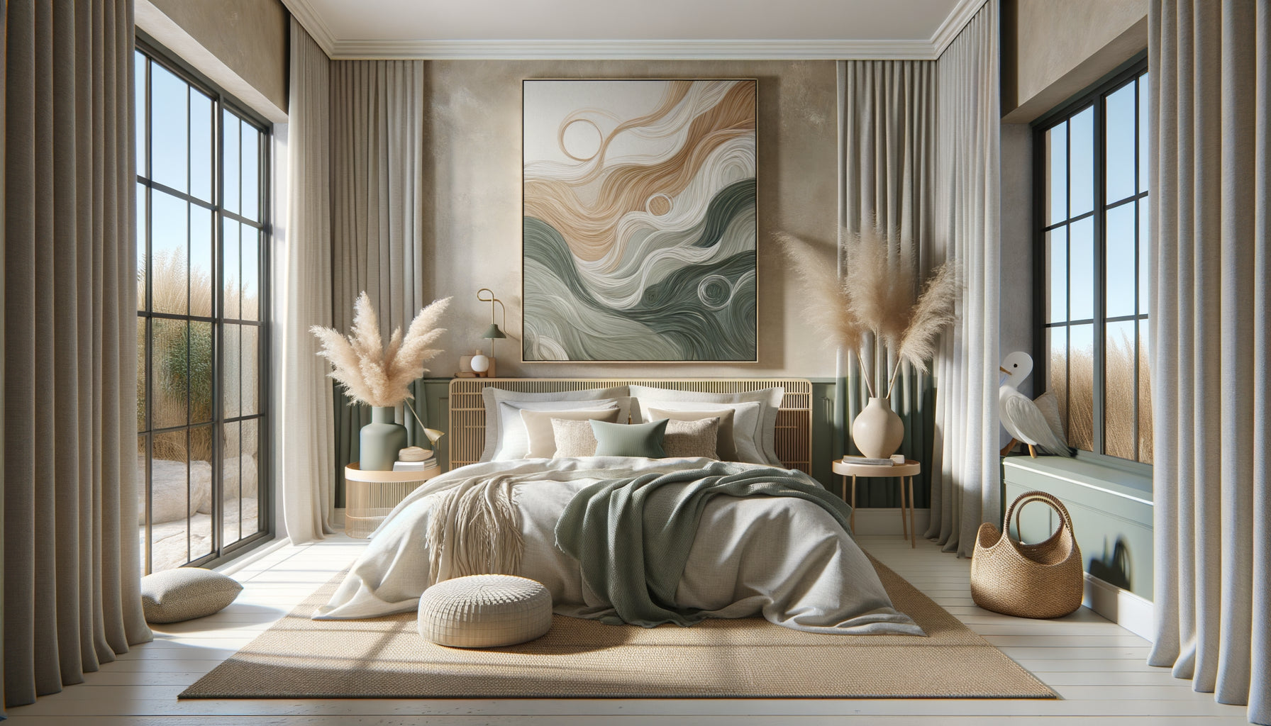
The "California Dream" palette: soft terracotta, beige sand, sage green, touches of Klein blue. Think of the Palm Springs interiors photographed by Julius Shulman. An abstract painting with organic shapes in these tones immediately evokes Californian modernism without shouting "seventies costume".
The "Late Bauhaus" palette: black, white, primary red, lemon yellow, with natural wood. The legacy of Scandinavian design that dominated progressive interiors in the 70s. A minimalist geometric composition in these colors dialogues perfectly with Eames furniture or vintage reproductions.
The "Botanical Seventies" palette: deep greens (forest, olive, emerald), subtle ochres, off-white. The era when indoor plants became major decorative elements. A stylized botanical illustration or an abstraction inspired by foliage works wonderfully in a vegetated retro space.
The secret? Choose ONE palette and stick to it for all your artworks. A living room with an orange psychedelic poster, a Klein blue serigraph, and a sepia photograph creates a stylistic confusion that your guests will perceive as unintentional kitsch.
Formats and compositions: think architecture, not decoration
The 70s mark the peak of art as an architectural element, not just wall decor. Interiors from that era integrated artworks into the very structure of the space.
For a convincing retro Airbnb, opt for formats that dialogue with your walls:
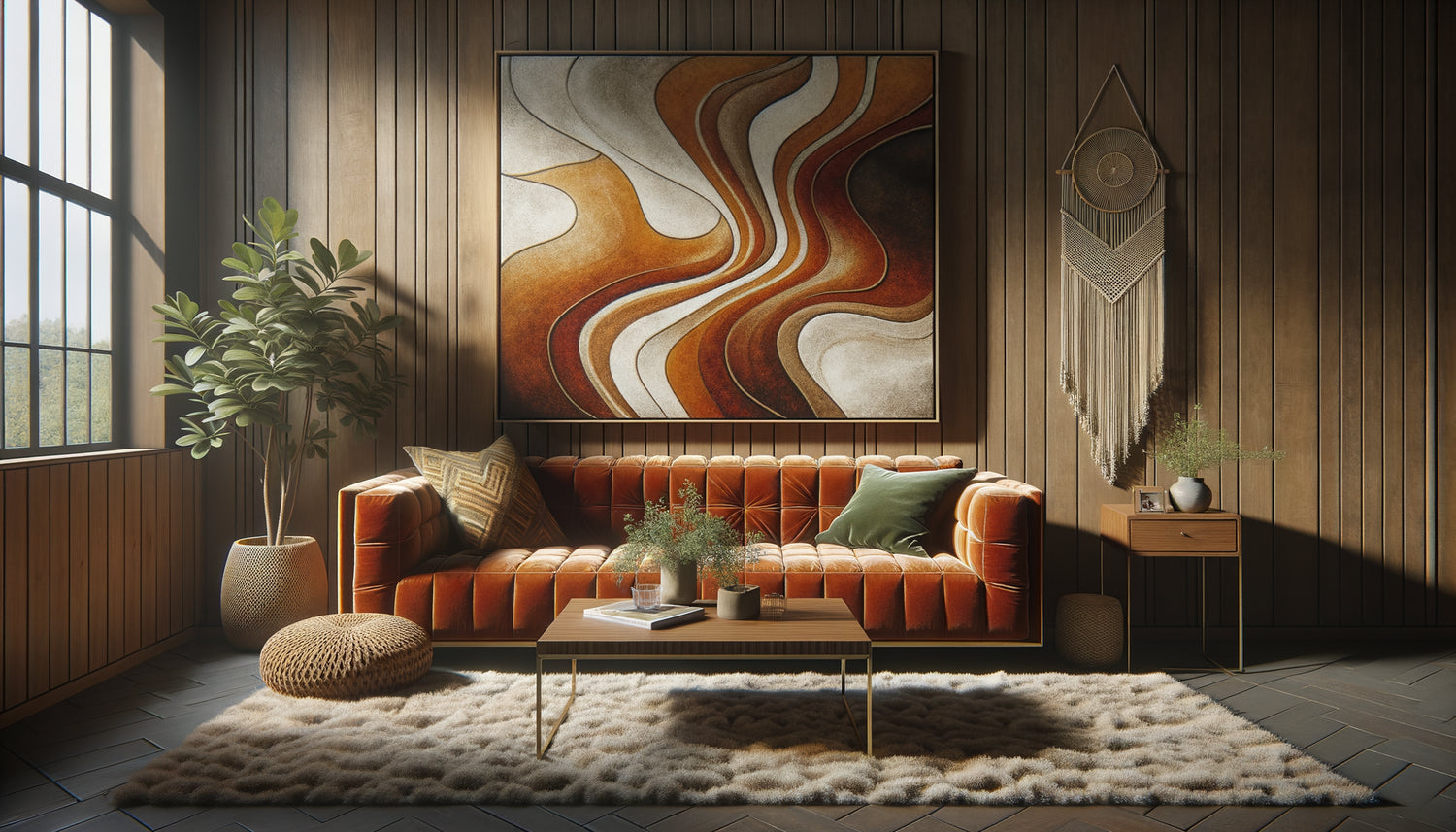
A large horizontal format above the sofa (120-150 cm wide): a panoramic artwork with a clean composition visually anchors your room. Favor soft geometric abstractions or stylized landscapes. Absolutely avoid collages of multiple framed posters: it's kitsch number one marker of failed 70s decor.
The diptych or triptych vertical: two or three artworks of the same dimension aligned vertically (40x60 cm each) create this characteristic verticality of seventies interiors, where volumes in height counterbalanced the low lines of furniture. Perfect for a hallway or next to a door.
The imposing square in the bedroom (80x80 cm or 100x100 cm): the square format immediately evokes vinyl records and graphic compositions from that era. Above a low headboard, it recreates this iconic proportion of bedrooms in the 70s.
Golden rule: an artwork should occupy at least 60% of the width of the furniture it overlooks. A small 30x40 frame lost above a large sofa betrays a contemporary decorative approach and breaks the retro immersion.

The authenticity photographic test
Here is my ultimate selection criterion, the one that separates an elegant artwork from a kitsch piece: Could it have appeared in a photographically documented interior of the 70s?
Take any image from your selection and imagine it in a reportage from Elle Décoration in 1973 or in an apartment from the movie 3 Days of the Condor. If the anachronism is obvious, abandon.
The most frequent traps:
Movie posters or vintage advertisements: unless your Airbnb is theatrically assumed as a « pop museum », these too literal references create a « themed bar » effect. An authentic interior of the 70s did not display Campari advertisements; it lived with art.
Generic « vintage » black and white photos: A Parisian or New York street photo from the 50s-60s doesn't tell you anything about the seventies. If you want photography, look for prints inspired by the photographic art of the time: minimalist series, refined nude studies, contrasting desert landscapes.
Reproductions of too famous works: A Warhol, a Lichtenstein, a Vasarely instantly recognizable transforms your Airbnb into a dentist's waiting room. Prefer compositions in the spirit of these artists, original works by contemporary artists inspired by these movements.
Photographic authenticity doesn’t mean « reproduction from the era », but visual coherence with the real aesthetic codes of the decade.
Materials, textures and presentation: the details that credit your approach
A retro 70s painting is not limited to its motif. Materiality counts as much as the image.
The support: Favor canvas prints on wooden frames rather than framed posters under glass. The seventies valued textile texture, the absence of reflection, the tactile presence of the canvas. A frame under glass evokes the 80s-90s more. Exception: if you opt for a frame, choose light natural wood (ash, oak) without molding, or ultra-thin matte black metal.
The finish: Avoid overly glossy or saturated prints that betray contemporary digital production. Look for matte, slightly textured finishes that mimic screen printing or acrylic paint. Some publishers offer prints with UV relief or selective varnish that recreate the depth of vintage techniques.
The hanging: 70s paintings are positioned lower than today, at about 145-150 cm from the floor (center of the work), in line with low seating and horizontal lines of furniture. A painting hung too high immediately modernizes the space and cancels out the retro effect.
Last detail that changes everything: group your paintings by room according to a thematic logic. Living room = geometric abstraction, bedroom = soothing organic shapes, kitchen = botanical illustration. This specialization by space was a signature of thoughtful seventies interiors.

The three refuge motifs (safe bets to start with)
If you are starting your retro Airbnb project and want to secure your first choices, here are three types of paintings that consistently work:
Gentle geometric abstraction: rounded shapes (arches, circles, waves), color gradients, symmetrical or mirrored compositions. These artworks evoke the textile design of the era (think Knoll or Herman Miller upholstery patterns) without visual aggression. They bring structure without dominating the space.
Minimalist stylized landscape: deserts, canyons, sunsets simplified to the extreme with blocks of color. This aesthetic draws on the American road trip and the conquest of the West revisited through a seventies sensibility. A large horizontal format of this type beautifully anchors a living room.
Graphic botanical illustration: monstera leaves, palms, ferns treated as silhouettes or with un-naturalistic colors (emerald green, midnight blue). This approach blends the urban jungle trend of the 70s with the graphic rigor of the time. Perfect for kitchens and bedrooms.
These three families share a common DNA: they simplify reality through clean shapes and assertive colors, just as progressive interior design did in the 1970s. They avoid kitsch because they prioritize suggestion over literal quotation.
Want to transform your Airbnb with artworks that capture the authentic seventies elegance?
Discover our exclusive collection of Airbnb art that respects the aesthetic codes of the decade without veering into caricature.
Visualize the final transformation
Imagine the arrival of your next guests. They push open the door to your retro Airbnb, and their gaze immediately stops on this large abstract artwork with terracotta arches that dialogues with the low sofa and Berber rug. They take out their phone, not to report a problem, but to photograph this space they are about to share on Instagram.
In the bedroom, the vertical diptych of organic green shapes creates that soothing atmosphere that generates laudatory comments: “Well-cared decor, we would have felt like we were in a magazine”. Your listing photos instantly stand out in search results. Your booking rate climbs.
This transformation is not by chance nor requires a disproportionate budget. It stems from a thoughtful selection based on objective criteria: consistent color palette, architectural formats, visual authenticity, credible materiality.
From today, review your list of potential artworks and apply the photographic authenticity test. Eliminate anything that resembles a literal quotation from the 70s. Keep what breathes the era without citing it. Your retro Airbnb deserves this requirement which will make all the difference between an ordinary rental and an immersive experience booked months in advance.
Frequently Asked Questions
How many artworks should I plan for a 50 m² retro 70s Airbnb?
For a 50 m² apartment, aim for 3 to 5 artworks maximum, strategically positioned in the main living areas. A large format (120-150 cm) above the sofa in the living room, a medium format (60-80 cm) in the bedroom above the headboard, and possibly a small format (40x50 cm) in the entrance or kitchen. The mistake would be to overload: elegant seventies interiors breathed thanks to large bare walls and a few statement pieces. Think visual punctuation rather than wallpaper. Each artwork should have its breathing space, at least 30-40 cm of empty space around it. This restraint is what creates the sophistication that distinguishes assumed retro from accidental kitsch. If your budget is limited, prioritize a single high-quality large artwork rather than three small generic ones.
Can I mix authentic vintage artworks and contemporary reproductions?
Absolutely, and it is even recommended to avoid the frozen museum effect. The important thing is not the historical authenticity of the object (you are not creating a reconstruction), but the visual coherence of the whole. A well-designed contemporary reproduction that respects the color palettes and compositional codes of the 1970s will integrate better than an authentically vintage poster poorly chosen. The trap with real vintage pieces? They often show yellowing, creases, dated typography which can tip over into involuntary kitsch. My recommendation: if you find an original 1970s screenprint in excellent condition and it exactly matches your palette, go for it. Otherwise, prioritize contemporary creations inspired by the era rather than direct reproductions of iconic posters that everyone recognizes.
How to test if an artwork works before hanging it permanently?
Professional technique that I consistently use: photographic validation. Before drilling your walls, simply place the artwork against the wall in its intended location (on a console, sofa...) and take a photo with your smartphone from the entrance of the room, as a guest discovering the space would. Look at this photo, not the actual scene. The objective reveals imbalances that your eye naturally accommodates: artwork too small, clashing colors, composition that disappears. Send this photo to two or three trusted people without context: their initial reactions will inform you. If you are hesitating between several options, photograph each configuration and compare side by side. Another test: display the photo in black and white. If the artwork disappears, it means its impact relies too much on garish colors and not enough on a solid composition. A good vintage artwork should work in grayscale.