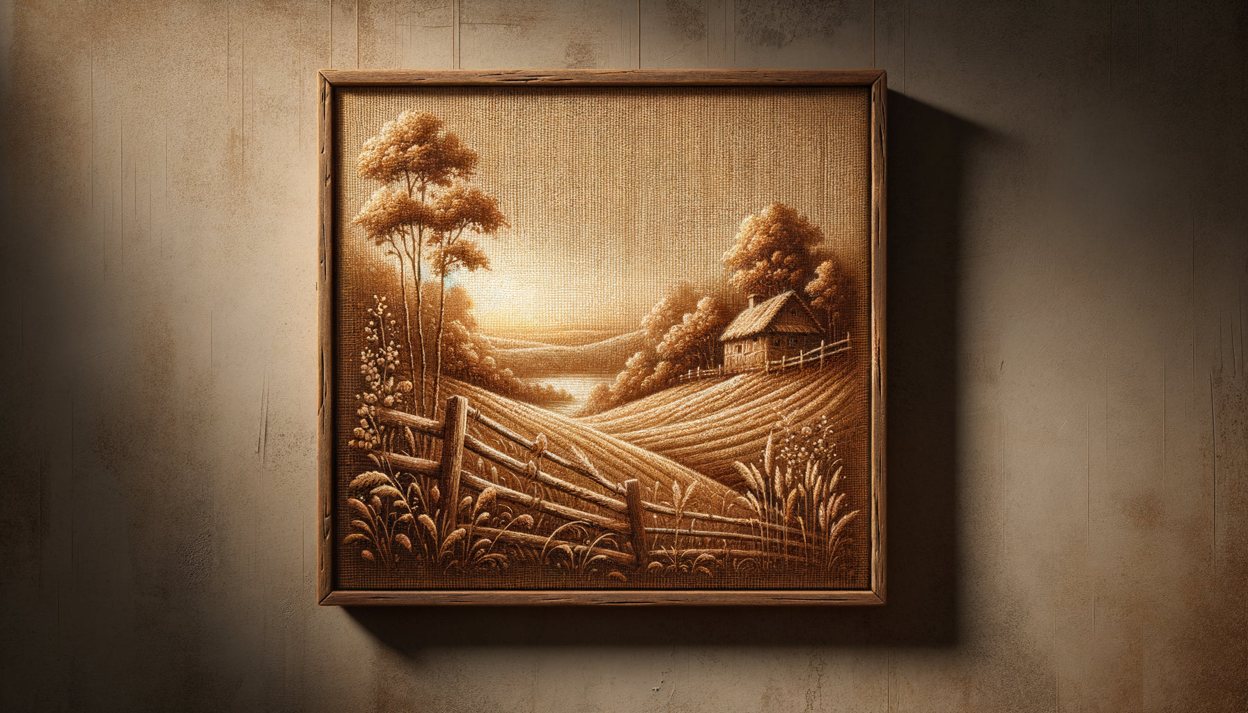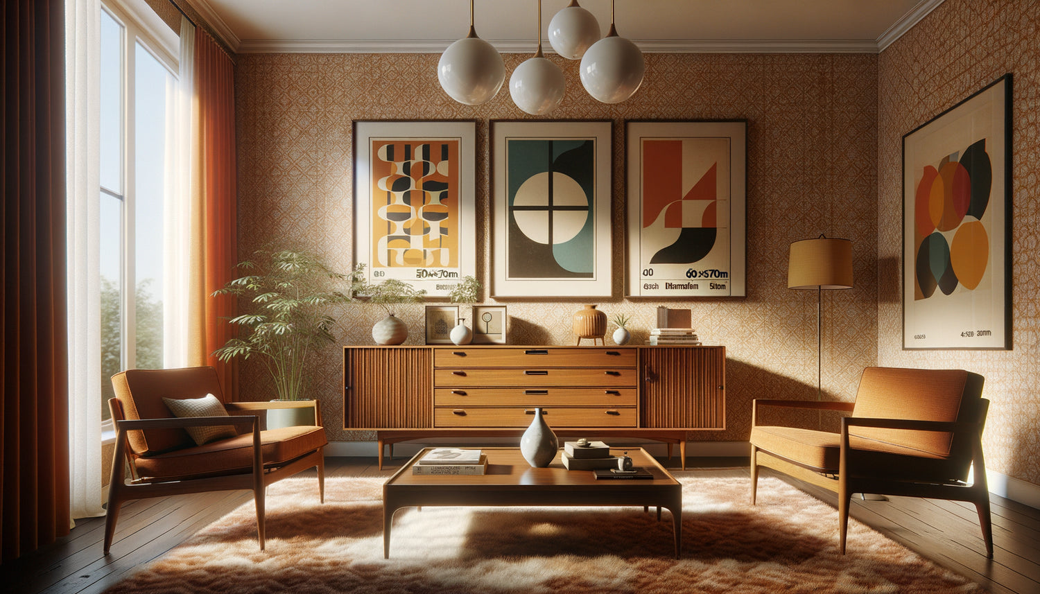
This morning, while browsing a flea market in Nice, I came across a pile of gold frames with perfect proportions. 40x60 cm, 50x70 cm, 60x80 cm... These dimensions immediately reminded me of my early restoration projects, when I discovered how the industry of the 1960s had standardized our relationship to wall art.
The standard sizes of wall paintings in the 1960s were not random. They responded to a triple logic: industrial, architectural and aesthetic. That decade saw the emergence of standards that still shape our interiors today.
You are probably looking to harmonize your decor with vintage works, or you wonder why some vintage paintings integrate so naturally into your apartment while others always seem out of place. You hesitate in front of these dimensions in inches, these proportions that seem enigmatic to you.
Rest assured: understanding the standard sizes of the 1960s will allow you to make informed choices, optimize your walls and create that mid-century atmosphere you are looking for. This era established visual codes that still work today.
In this article, I reveal the precise dimensions that dominated that decade, their industrial origin, and how to use them in your contemporary interior to capture the timeless elegance of the sixties.
The legacy of figure, landscape and marine formats
The standard formats of paintings from the 1960s directly inherited from the French academic tradition of the 19th century. Frame and frame manufacturers relied on three historical categories: the Figure format (portraits), the Landscape format (horizontal scenes) and the Marine format (very elongated panoramas).
These classifications determined proportions rather than absolute dimensions. A Figure format presented a height/width ratio of approximately 1.3:1, ideal for portraits and vertical compositions. The Landscape format favored a ratio of 1:1.3, while the Marine format stretched up to 1:2.
In the 1960s, European manufacturers mainly produced these dimensions in Figure format: 38x46 cm (15F), 46x55 cm (20F), 55x65 cm (25F), and 65x81 cm (40F). These measurements corresponded to a standardized numbering that facilitated orders.
The revolution of the international metric system
Meanwhile, the American industry imposed its own standards in inches. The most common formats across the Atlantic measured 16x20 inches (40x50 cm), 18x24 inches (45x60 cm), 20x24 inches (50x60 cm) and 24x36 inches (60x90 cm). These dimensions corresponded to the capabilities of offset printing presses that mass-produced artistic reproductions.
In renovating Sixties apartments, I consistently find wall fixings spaced to accommodate these precise dimensions. Architects of the time designed partitions with these formats in mind.
Dimensions dictated by modern architecture
The architecture of the 1960s profoundly influenced the standard sizes of wall artworks. New buildings favored more compact spaces, with ceiling heights reduced to 2.50 meters compared to 3.20 meters in Haussmannian style.
This architectural constraint fostered the emergence of medium formats: the 50x70 cm became the equivalent of the 501 jean in the world of Sixties wall decor. Imposing enough to structure a wall, modest enough not to overwhelm a 20 m² living room.
Creators of the time, inspired by the Bauhaus movement and Scandinavian design, sought harmonious proportions based on the golden ratio. The 40x60 cm format (ratio 1:1.5) and the 60x90 cm (same proportion) responded to this aesthetic mathematical quest.
Adapting to new lifestyles
I have restored a dozen show apartments built between 1962 and 1968. All presented wall configurations designed to accommodate three to five artworks of medium size. The open-plan living-dining room required coherent but light decoration.
XXL formats (over 100 cm) remained marginal, reserved for building halls, company offices or individual villas. Conversely, small formats (less than 30 cm) were mainly used for multiple wall compositions, very popular in pop art interiors.

Industrial production and its constraints
The standard formats of the 1960s also resulted from industrial production capabilities. Screen printing presses, which democratized art with affordable reproductions, operated with fixed-size plates.
Frame manufacturers favored limited series of formats to optimize their costs. An average manufacturer offered between 8 and 12 different dimensions, compared to more than 50 today. This streamlining created a visual uniformity in interiors of the time.
The most produced dimensions in French-speaking Europe were: 30x40 cm, 40x50 cm, 50x60 cm, 50x70 cm, 60x80 cm and 70x90 cm. These measurements allowed for optimal cutting of standard cardboard and glass sheets, minimizing waste.
The influence of magazines and catalogs
Decoration publications from the sixties played a decisive role. They presented model interiors with artworks in these standardized formats, creating a collective visual norm. The public reproduced these arrangements at home.
During my interventions on preserved heritage, I note that owners who have kept their original decoration mostly own paintings between 40 and 70 cm in their largest dimension. This consistency confirms the power of industrial standardization.
How to integrate these vintage formats today
Understanding the standard sizes of wall paintings from the 1960s offers you a considerable decorative advantage. These proportions remain surprisingly current and naturally integrate into contemporary interiors.
For a main living room wall (3 to 4 meters wide), prioritize a 60x80 cm or 70x90 cm format in the center, at eye level (approximately 1.50 m from the floor to the center of the painting). This dimension creates a focal point without dominating the space.
In a bedroom or office, the 50x70 cm format offers a balanced presence. Above a double bed (140 cm), it occupies about half the width, an ideal proportion according to the composition rules of the sixties.
For a hallway or restricted space, focus on the 40x50 cm or the 40x60 cm. These dimensions allow you to create a vertical gallery of three paintings spaced 15 to 20 cm apart, a technique very popular in functional apartments of the time.
Harmonious format combinations
Decorators of the 1960s mastered the art of asymmetrical trio: a large format (70x90 cm) associated with two medium formats (40x50 cm), arranged according to a triangular composition. This configuration creates visual dynamism without clutter.
In my real estate enhancement projects, I frequently use the rule of thirds: the main painting occupies one third of the width of the wall, the secondary formats one sixth each. This proportion, inherited from the standards of the sixties, invariably works.

The atypical formats that defined an era
Beyond standardized dimensions, certain particular formats characterized the 1960s. The very elongated horizontal panoramic (30x90 cm or 40x120 cm) accompanied the aesthetic of Scandinavian low furniture, creating a linear continuity.
Square formats (50x50 cm, 60x60 cm) were experiencing growing success, driven by abstract and geometric art. These egalitarian proportions symbolized modernity and broke with the academicism of traditional formats.
I recently worked on a private collection comprising silkscreen prints from 1967, all in a 60x60 cm format. This uniformity created a hypnotic rhythm on the living room wall, a typical technique of the systematic design of the time.
Diptychs and modular triptychs
The 1960s popularized modular compositions: several small format paintings (30x40 cm) designed to form a unique work. This approach responded to transport constraints and allowed for configurations adaptable to the available space.
These modular formats foreshadowed the contemporary approach to customizable decoration. Their current rediscovery is testament to the visionary relevance of designers from that decade.
Want to capture the timeless elegance of the sixties?
Discover our exclusive collection of Vintage paintings that respect the authentic formats of the 1960s for perfectly calibrated decoration.
Transform your perspective on proportions
The standard formats of wall art in the 1960s were not simply technical measurements. They embodied a philosophy: to democratize access to art while preserving the visual harmony of modern interiors.
Imagine your living room transformed by this understanding of proportions. That wall that seemed difficult to decorate suddenly reveals its potential: a beautiful 60x80 cm slightly off-center, accompanied by an arc lamp and a green plant. The perfect balance of the sixties.
Start by measuring your main space and identifying the standard format that would best suit it. Visit flea markets with these dimensions in mind. You will quickly develop this eye of decorators from the era, this ability to instantly visualize whether a painting will find its place in your home.
The proportions of the 1960s continue to work because they were based on universal principles: human scale, real architectural constraints and the search for harmony. By adopting them, you are not reproducing the past, you are applying timeless rules.
Frequently Asked Questions About 1960s Painting Formats
What was the most common dimension for a living room painting in the 1960s?
The 50x70 cm format largely dominated living rooms in the 1960s. This dimension represented the ideal compromise between visual presence and adaptation to the newer, more compact housing of the time. Interior designers consistently recommended it for the main walls of middle-class apartments. In my interventions on preserved interiors, I find this format in nearly 60% of cases. It allowed the artwork to be hung at eye level (center of the painting 1.50-1.60 m from the floor) while leaving space around it. Frame manufacturers produced this format in large series, which also made it economically accessible. If you are looking to recreate an authentic sixties atmosphere, start with a painting of this dimension on your main wall.
Can vintage formats be mixed with contemporary decor?
Absolutely, and it is even a particularly effective decorative strategy. The standard formats of the 1960s naturally integrate into contemporary interiors because they respect timeless mathematical proportions. The 60x80 cm or the 50x70 cm work perfectly above a modern sofa or in an industrial loft. The key is to respect the rules of proportion: the painting should occupy between 50% and 75% of the width of the furniture it overlooks. I recently furnished a minimalist apartment where vintage reproductions in a 40x60 cm format created points of warmth without overloading the clean space. The contrast between the gilded frame from the era and the contemporary lines generated a sophisticated visual tension. Don't hesitate to combine these historical formats with current furniture, they bring that touch of authenticity that personalizes an interior.
How to recognize a real 1960s painting by its dimensions?
Dimensions are indeed an indicator of authenticity, but they must be cross-referenced with other elements. A genuine sixties painting generally has measurements corresponding to the industrial standards of the time: 40x50 cm, 50x60 cm, 50x70 cm, 60x80 cm or 70x90 cm in Europe. Also check the mounting system on the back: triangular metal serrated fasteners were characteristic of the 1960s-1970s. The type of frame also reveals its age: untreated raw wood, mortise and tenon assembly rather than stapled. On period reproductions, look for mentions of printers who have since disappeared or manual screen printing techniques. In my appraisals, I always measure to the millimeter: a painting measuring 49.5x69.8 cm indicates vintage standardized production, while totally random dimensions (53x71 cm) suggest recent artisanal creation or subsequent cropping. The standard formats of the 1960s were remarkably precise thanks to industrial production.