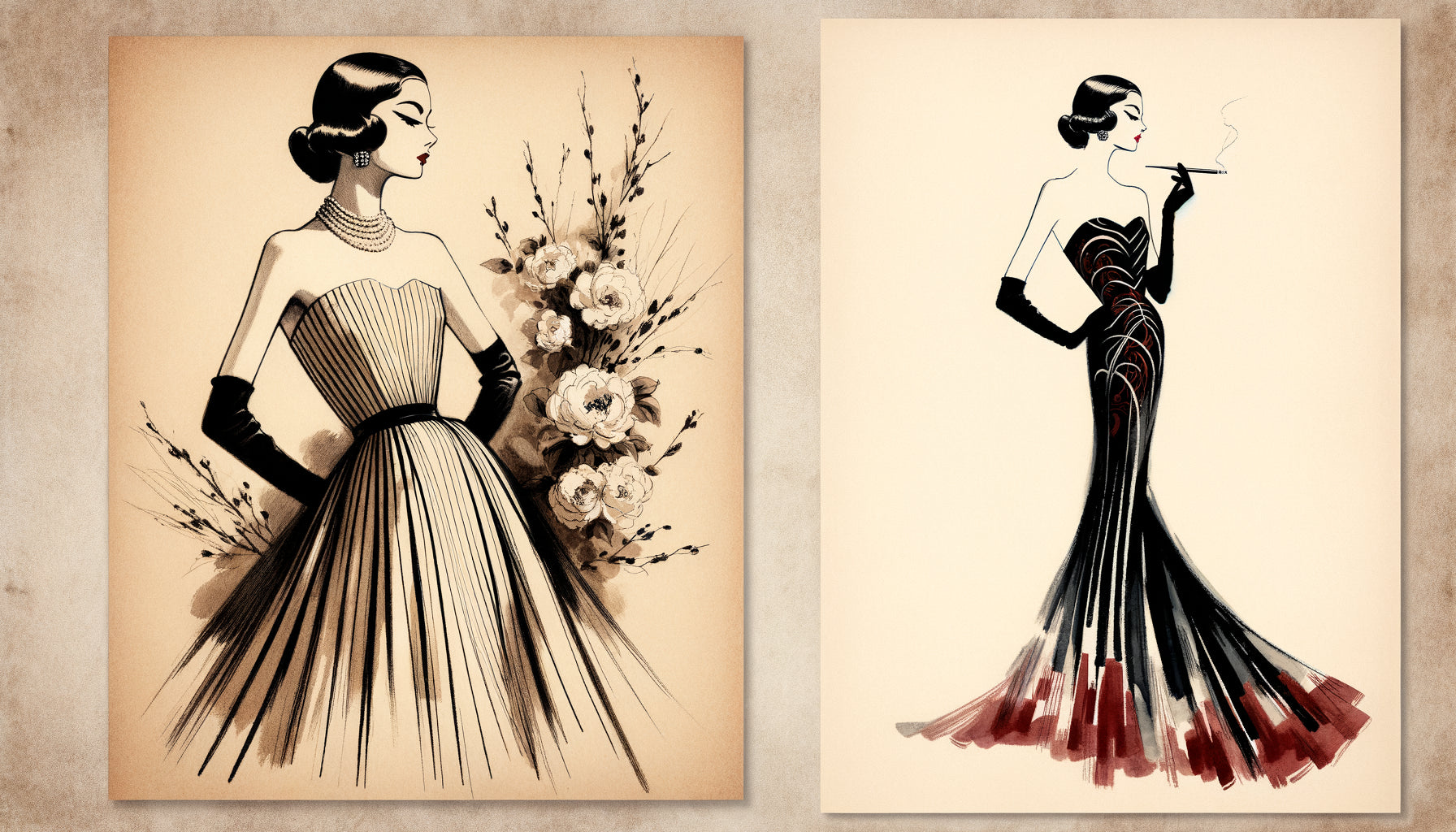
I've seen so many projects ruined by this mistake: a sublime fashion artwork hung facing a Ligne Roset sofa, and yet, something is wrong. The work seems to float in a parallel universe, disconnected from the surrounding beautiful furniture. This visual dissonance transforms what should be a sophisticated harmony into a failed dialogue between two worlds that refuse to speak to each other.
Here's what a successful association between fashion wall art and contemporary furniture brings: an aesthetic coherence that enhances each element, an elegant atmosphere where luxury and modernity meet, and a space that tells a fluid visual story.
You may have just purchased this sublime fashion illustration that captures the essence of Parisian chic. But in front of your interior with clean lines, doubt creeps in: won't this painting create a stylistic clash? How to combine the glamorous world of fashion with the sobriety of your contemporary furniture without turning your living room into a confusing art gallery?
Good news: this association is not only possible, it is even one of the most elegant you can create. The key lies in understanding visual codes and the art of dialogue between styles.
In this article, I reveal the precise principles that I apply to create these harmonious pairings where fashion artworks and contemporary furniture mutually sublimate each other, transforming your interior into a space that is both trendy and timeless.
The principle of chromatic bridge: your visual Ariadne's thread
Before talking about composition, let's talk about colors. This is where 70% of the success of your association is played. A fashion wall art generally has a distinctive palette: deep blacks, bright whites, powder pinks, subtle golds or iconic reds.
The classic mistake? Completely ignoring these shades in the rest of the space. Your painting then becomes a visual UFO, beautiful though it may be. The solution lies in what I call the chromatic bridge: repeat at least two colors from the painting in your furniture or accessories.
Specifically, if your fashion artwork features a black and white silhouette with touches of antique pink, integrate these shades via a rose velvet cushion on your grey anthracite sofa, or a gold-footed lamp that echoes the frame's gilding. This repetition creates a visual thread that unifies the whole.
However, be careful with the dose: it is not about reproducing the proportions of colors exactly. If pink dominates your painting, use it in touches in your contemporary decor. The art of dosage makes all the difference between a refined harmony and a visual redundancy.
The rule of three points
To anchor your painting in the space, create a minimum of three chromatic connection points. One in the textile area (cushion, plaid), one in the accessories (vase, photo frame), one in a piece of furniture (coffee table tray, chair seat). This visual triangulation naturally connects your work to the rest of the room.
The balance of lines: when curves and straight lines dialogue
Contemporary furniture often plays with clean lines, sharp angles, and a defined geometry. In contrast, a fashion artwork captures the fluid movement of fabric, the curve of a silhouette, the elegant gesture of a mannequin.
This opposition might seem problematic. It is actually your best ally. The contrast between the architectural rigor of your furniture and the organic fluidity of your wall art creates a dynamic visual tension that brings space to life.
The key: dose this contrast intelligently. If your sofa has very strict lines and is low, avoid a frame that is too massive and angular. Instead, opt for a thin, almost minimalist framing that lightens the whole ensemble. Conversely, if your furniture already has some curves (compass feet, rounded backs), you can afford a more present frame.
I also observe that fashion artworks work particularly well above low-lying pieces of furniture with marked horizontal lines: consoles, buffets, sofas. This arrangement creates a stable visual anchor while allowing the artwork to breathe vertically, like a window open onto the world of haute couture.

The power of the frame: that detail which changes everything
Let's be frank: the frame of your fashion artwork plays a role as a translator between two aesthetic languages. It is what allows or prevents harmonious dialogue with your contemporary furniture.
For a smooth integration, prioritize frames with finishes that echo your furniture. A contemporary interior with golden metallic accents? A fine or brushed gold frame will naturally impose itself. Your decor plays the card of matte black and chrome finishes? An elegant black frame or a thin silver framing will create the desired visual connection.
My specialist's advice: avoid overly ornate frames in baroque or rococo style with contemporary furniture. This combination rarely works, except in a deliberately eclectic approach that is very well mastered. Prefer fineness to ornamentation, the quality of materials to the complexity of forms.
The frameless option: when to dare absolute modernity
For fashion artworks on canvas or rigid supports, the absence of a frame can create an even more direct connection with minimalist contemporary furniture. This option works particularly well with sofas featuring very clean lines and plain walls. The artwork then becomes a natural extension of the interior architecture.
The question of scale: proportions and visual presence
A wall art fashion piece that is too small in relation to a large contemporary sofa will be visually overwhelmed. Too imposing, it crushes the furniture and unbalances the space. Scale is a fundamental parameter that I often see neglected.
The rule of two-thirds is your best reference: your artwork should occupy approximately two-thirds of the width of the furniture above which it is placed. For a 2m sofa, aim for a painting (including frame) between 120 and 140cm wide. This proportion creates a natural visual balance without one element dominating the other.
For wall compositions, consider the overall presence. Three medium-sized fashion artworks can create together the necessary visual mass in front of a large contemporary piece of furniture. The advantage: this approach allows you to play on variations while maintaining thematic consistency.
Don't forget the placement height: the center of your artwork should be approximately 145-150cm from the floor, which is standard eye level. This position creates a natural connection between the work and the viewer, regardless of the style of surrounding furniture.

Dialogue zones: where to strategically place your artwork
Not all locations are equal for creating harmony between fashion art and contemporary furniture. Some areas naturally favor stylistic dialogue.
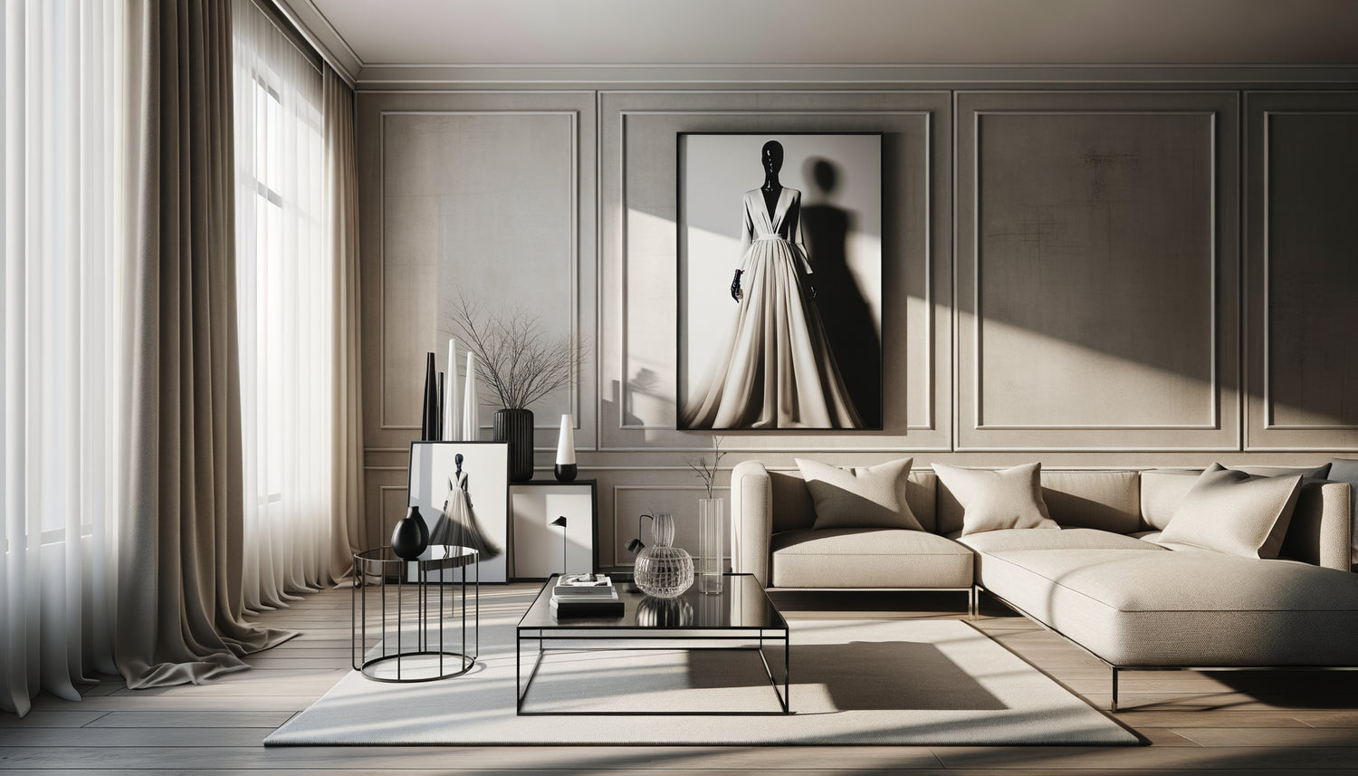
Above the sofa, the classic but effective location, your artwork becomes the focal point of the living room. It dialogues directly with cushions, throws, coffee tables. This is the ideal place to affirm your fashion universe while anchoring it in your contemporary decor.
Facing the sofa, on a clear wall, your work contemplates itself in a position of strength. This arrangement works beautifully with low furniture (buffet, console) that does not visually compete with the artwork. The space breathes, the eye circulates freely.
In a contemporary bedroom, above the bed, a wall art fashion piece brings that touch of sophisticated glamour that transforms the room into a design hotel suite. Here, the connection is made via the bedding, bedside tables and ambient lighting.
The entryway deserves a special mention: a fashion artwork facing sleek contemporary furniture (a slim console, a designer mirror) creates a memorable first impression. It's your aesthetic calling card, setting the tone from the moment you step inside.
The mistake of an overloaded wall
With contemporary furniture featuring clean lines, avoid the temptation to fill all the walls. Let your fashion artwork breathe. A vacant or very understated adjacent wall paradoxically reinforces the presence of your work and preserves the clarity of your contemporary decor.
The art of staging: accessories and lighting
A fashion painting perfectly chosen and well placed can still fail without proper staging. Accessories and lighting play the role of style ambassadors between your artwork and your contemporary furniture.
Create thematic clusters: near your fashion painting, arrange a few fashion books on the coffee table, a vase with contemporary lines, a scented candle in a designer container. These elements create subtle visual echoes that weave links between the world of fashion and your current decor.
Lighting radically transforms integration. A directional spotlight or a designer wall lamp directed at your painting creates a luminous focus that enhances the work while fitting into contemporary aesthetics. Light itself becomes a decorative element that unifies styles.
Also consider materials: the brushed metal of a contemporary lamp responds to the finishes of the frame, the velvet of a cushion echoes the texture suggested in the fashion painting. These tactile, even visual correspondences reinforce overall coherence.
Transform your contemporary interior into a stylish gallery
Discover our exclusive collection of fashion paintings that harmonize perfectly with contemporary interiors and bring that touch of Parisian sophistication to your decor.
Visualize the final transformation
Imagine your living room in a few days: this fashion wall art you've chosen reigns above your contemporary sofa. The clean lines of your furniture dialogue with the elegant silhouette of the illustration. The color accents of the painting are subtly repeated in your cushions, your throw blanket, that vase placed on the console.
Lighting highlights the work without isolating it. Each element finds its place in a harmonious composition where modernity and fashion elegance mutually enhance each other. Your guests will not see a mix of styles, but a clear and assumed decorative intention.
This harmony is not the result of chance, but a precise understanding of visual codes. You now have all the keys to create this alchemy: the chromatic bridge that unifies, the balance of lines that energizes, the frame that translates, the scale that balances, the placement that enhances, the staging that sublimates.
Start with one principle: choose two colors from your future artwork and integrate them in touches into your current decor. Then gradually build this visual conversation between your fashion universe and your contemporary furniture. The result will surprise you with its natural fluidity.
FAQ: Your questions about combining fashion art and contemporary furniture
Can I mix multiple fashion artworks with contemporary furniture?
Absolutely, and it's even an excellent strategy to create a sophisticated gallery wall. The key is consistency: choose artworks that share at least one common element (similar color palette, comparable illustration style, or unified theme like fashion accessories). With contemporary furniture, prioritize identical frames or similar finishes to avoid visual dispersion. Space your artworks 5 to 10cm apart to create an airy composition that respects the clean spirit of your furniture. A gallery wall of three to five fashion artworks creates a strong visual presence without weighing down the space, particularly effective in a living room or bedroom with pure contemporary lines.
What wall colors work best for this combination?
Neutral walls are your best ally: white, light gray, warm beige, or even dark gray for the daring. These shades create a backdrop that allows the fashion artwork and contemporary furniture to freely dialogue without chromatic interference. A pure white wall brings brightness and modernity, enhancing the colors of the artwork. Light gray offers sophistication and softness, particularly elegant with black and white artworks. If your artwork features vibrant colors (red, fuchsia pink, electric blue), a neutral wall becomes essential to avoid visual overload. Avoid walls with patterns or textures that are too present, which would compete with your work: with already streamlined contemporary furniture, simple walls guarantee harmony.
My fashion artwork is very colorful, my furniture very understated: is that compatible?
Not only is it compatible, but it's often the most successful combination! A subdued contemporary furniture (gray, white, black, light wood) offers the perfect backdrop for a colorful fashion artwork that becomes the star of your decor. This approach follows the principle of focal point: your artwork brings personality and color, your furniture provides structure and balance. To perfect the harmony, pick up one or two colors from the artwork in small accessories: a cushion, a throw, a decorative object. This touch is enough to create the link without weighing down the space. Simply avoid adding other very colorful elements elsewhere in the room, which would disperse attention. Let your fashion artwork shine against the elegant sobriety of your contemporary furniture.