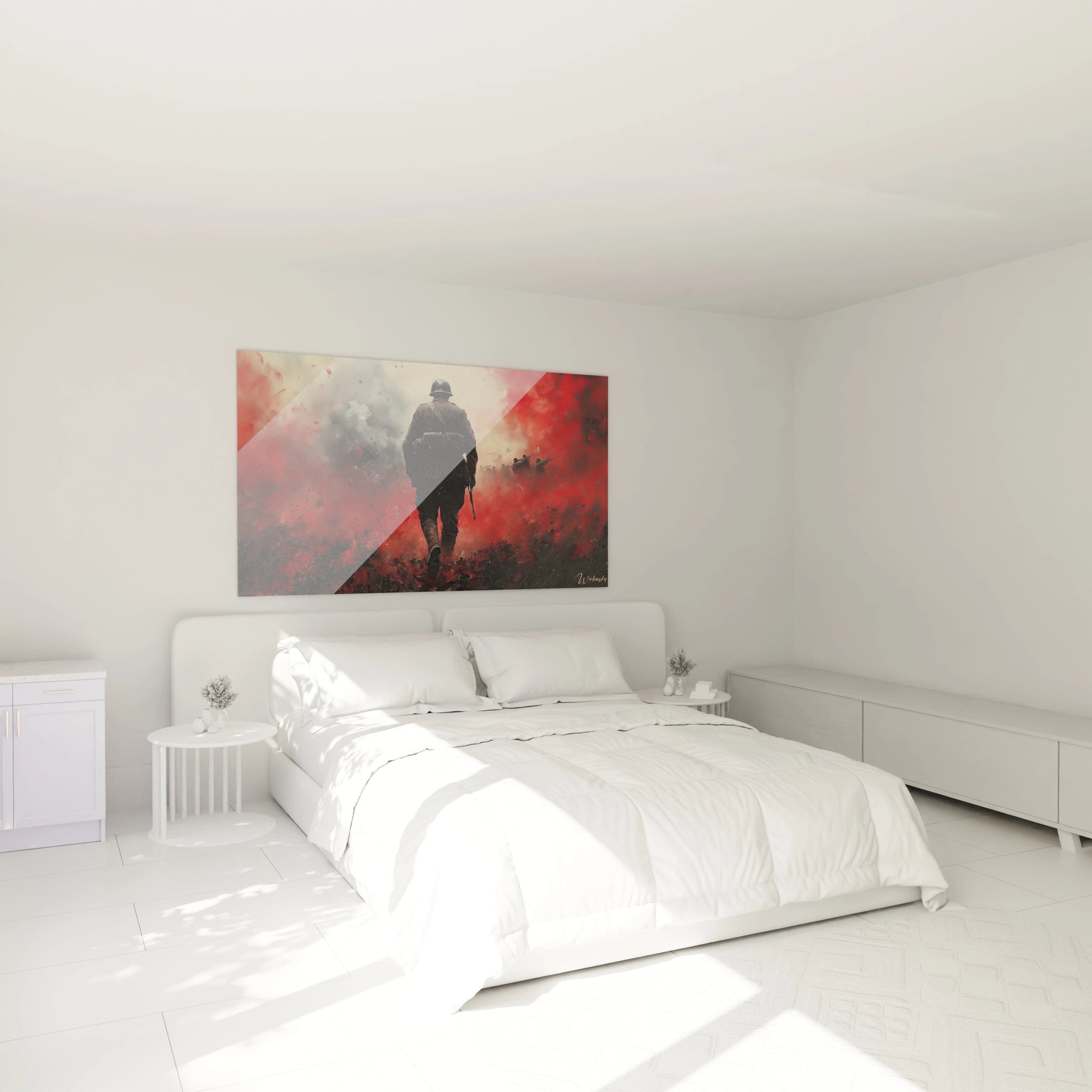
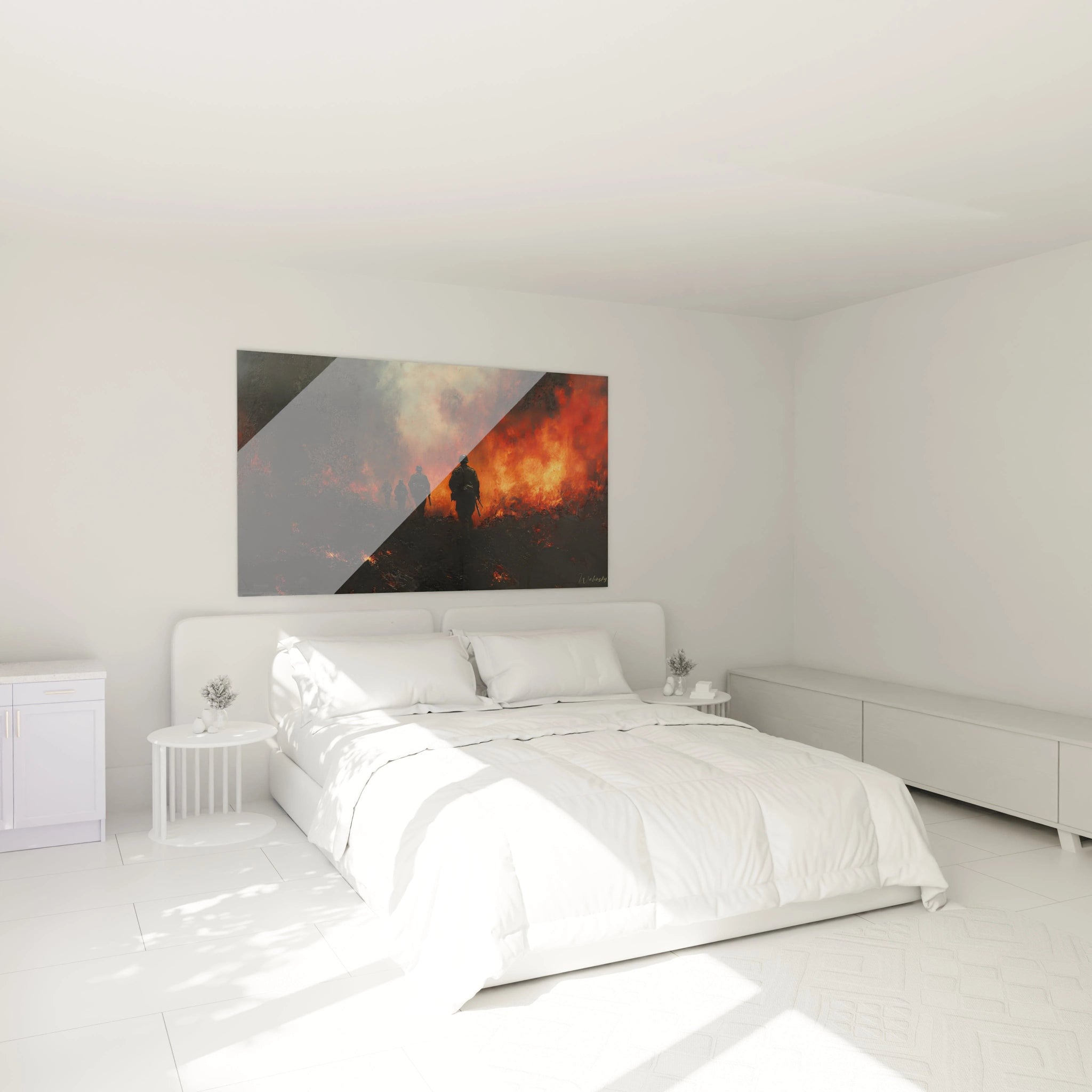
Artistic representations of World War II in color offer an unparalleled emotional and historical dimension. Unlike black and white representations that evoke documentary austerity, a colored World War II painting transforms historical narratives into immersive visual experiences that capture attention and stimulate reflection. These large-scale wall artworks combine historical authenticity and chromatic intensity to create striking focal points in modern spaces.
Memorial Chromotherapy: When Colors Elevate History
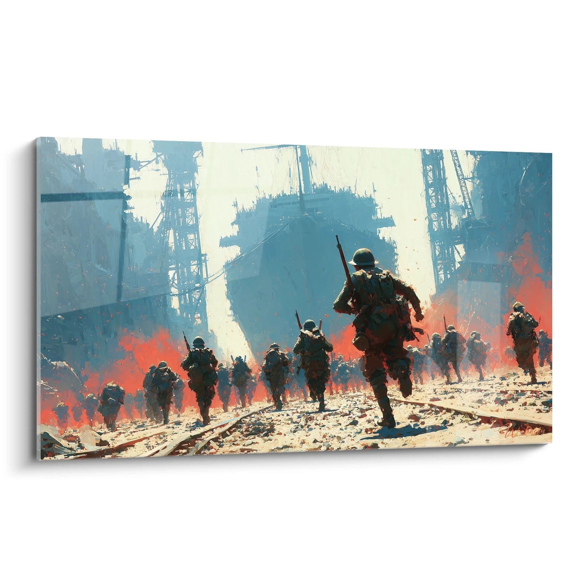
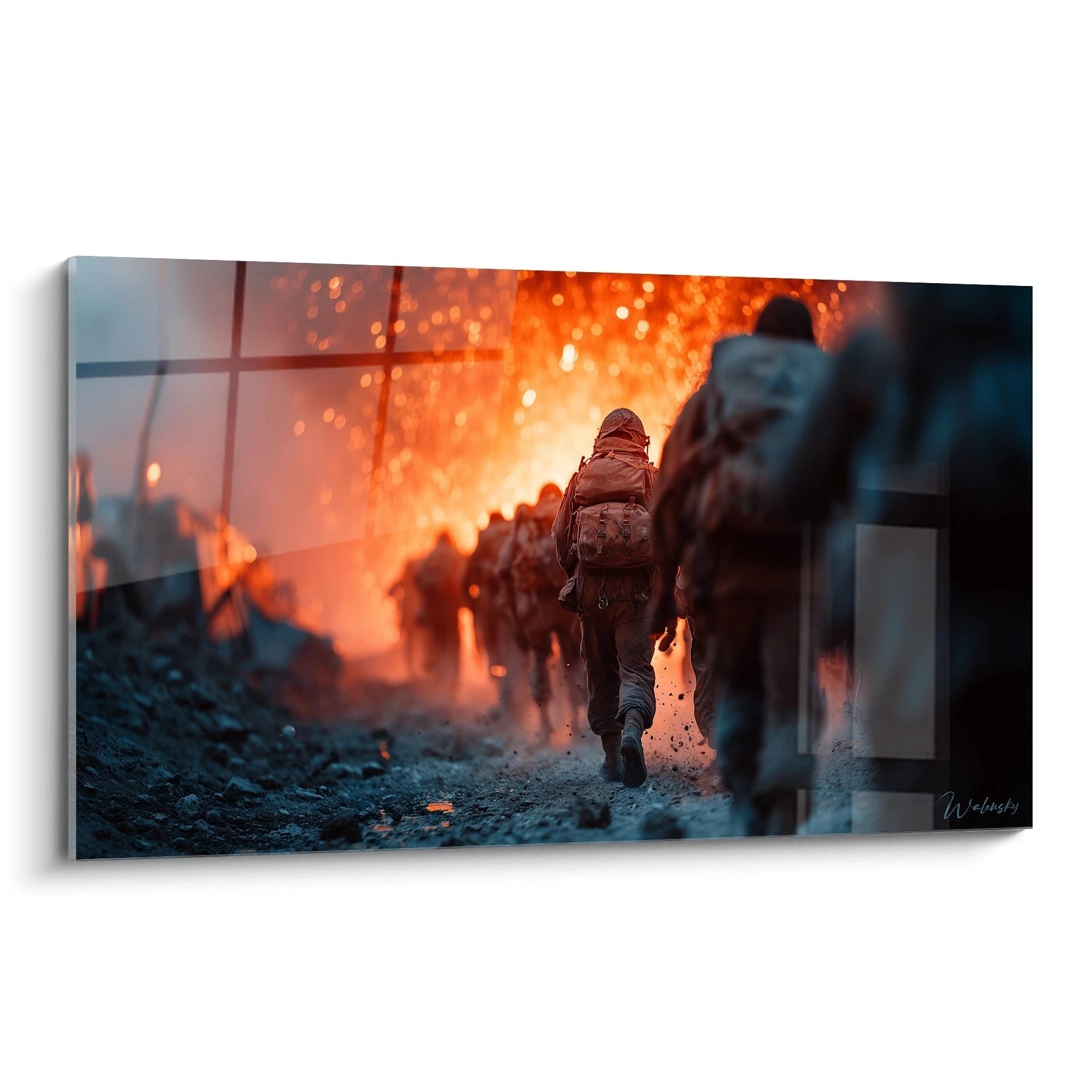
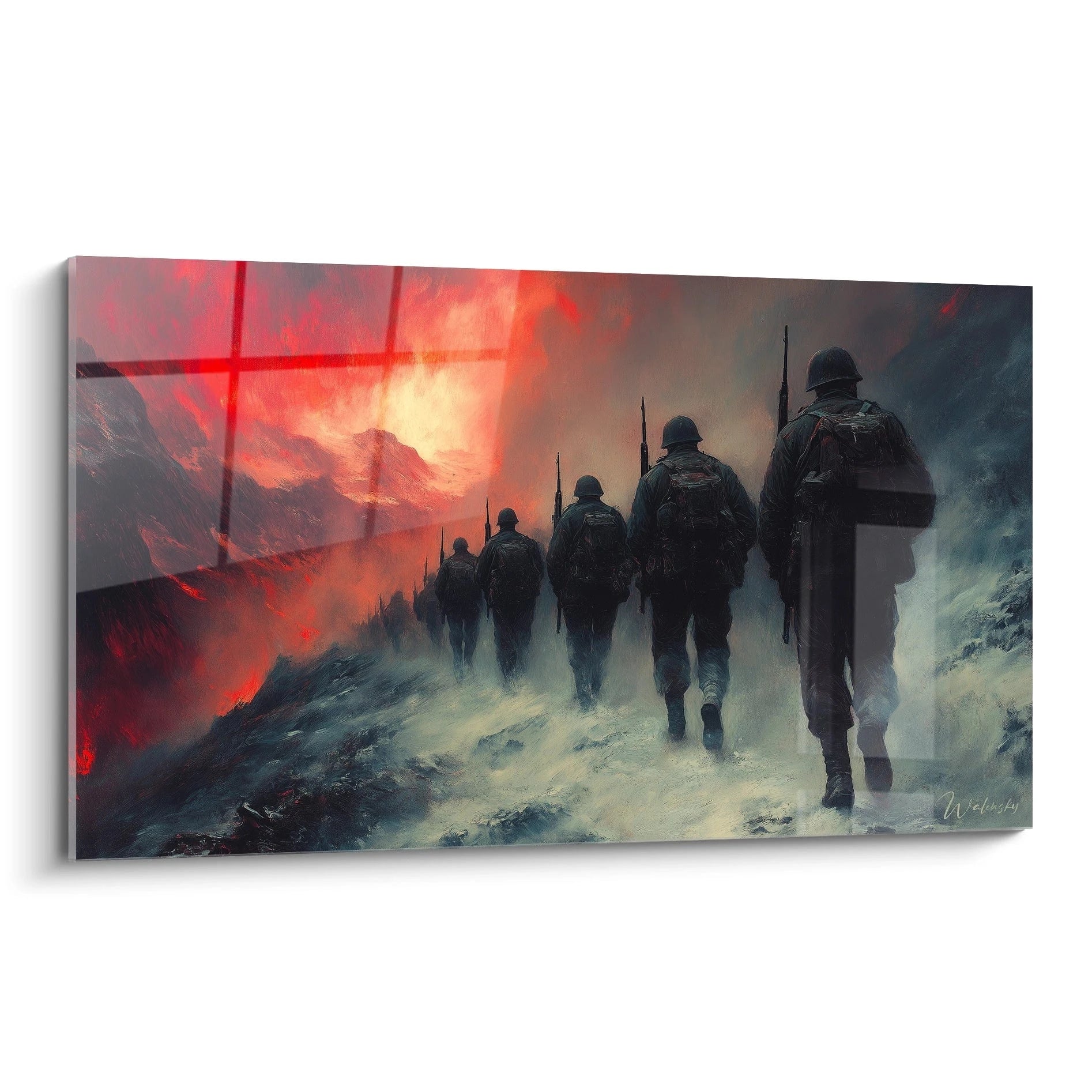
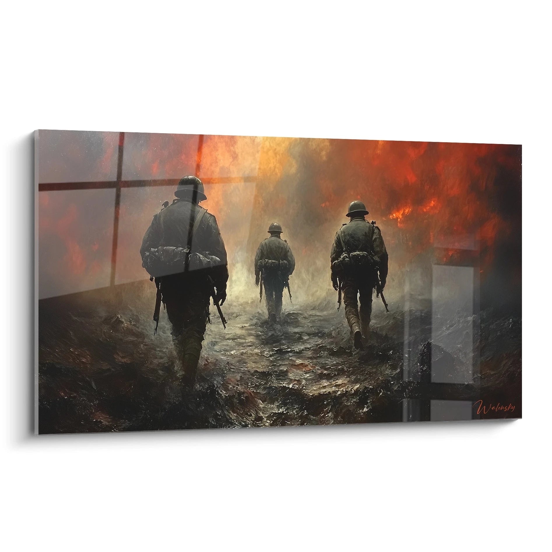
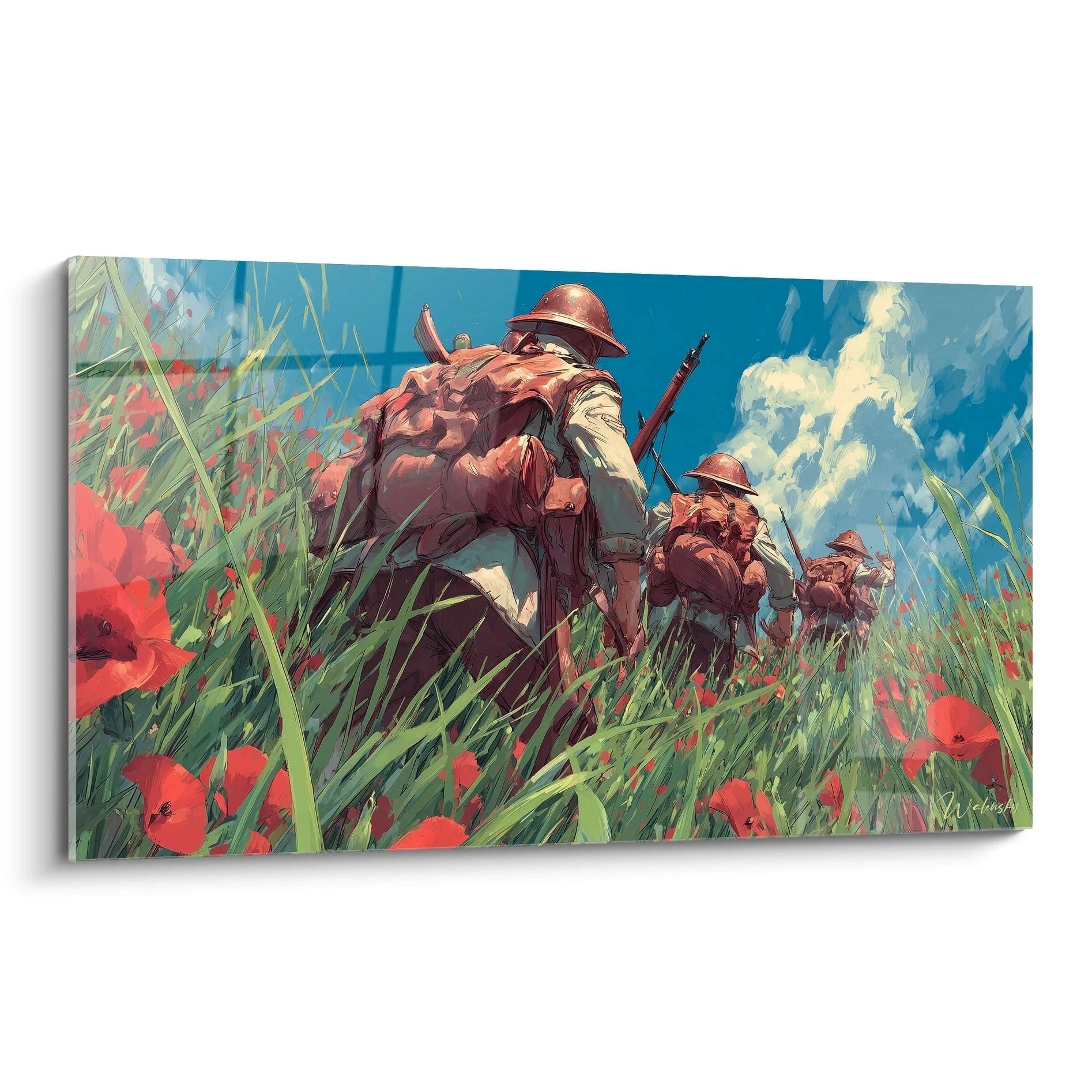
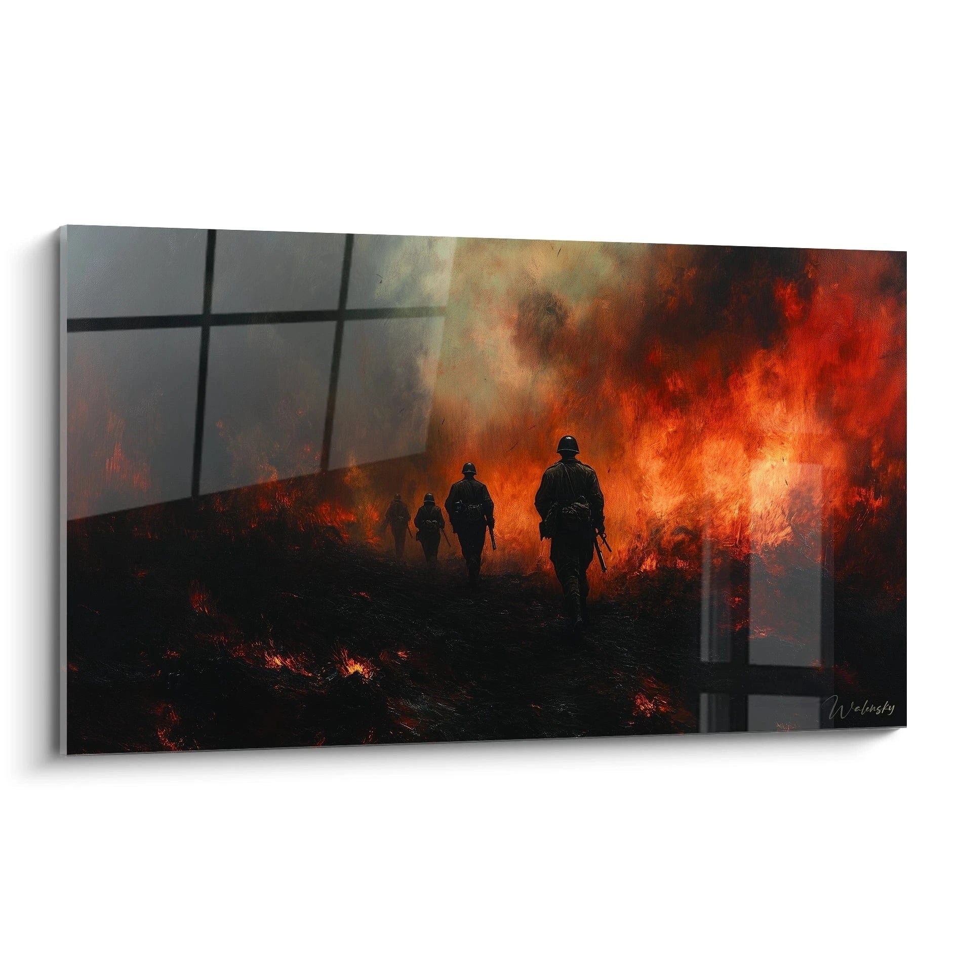
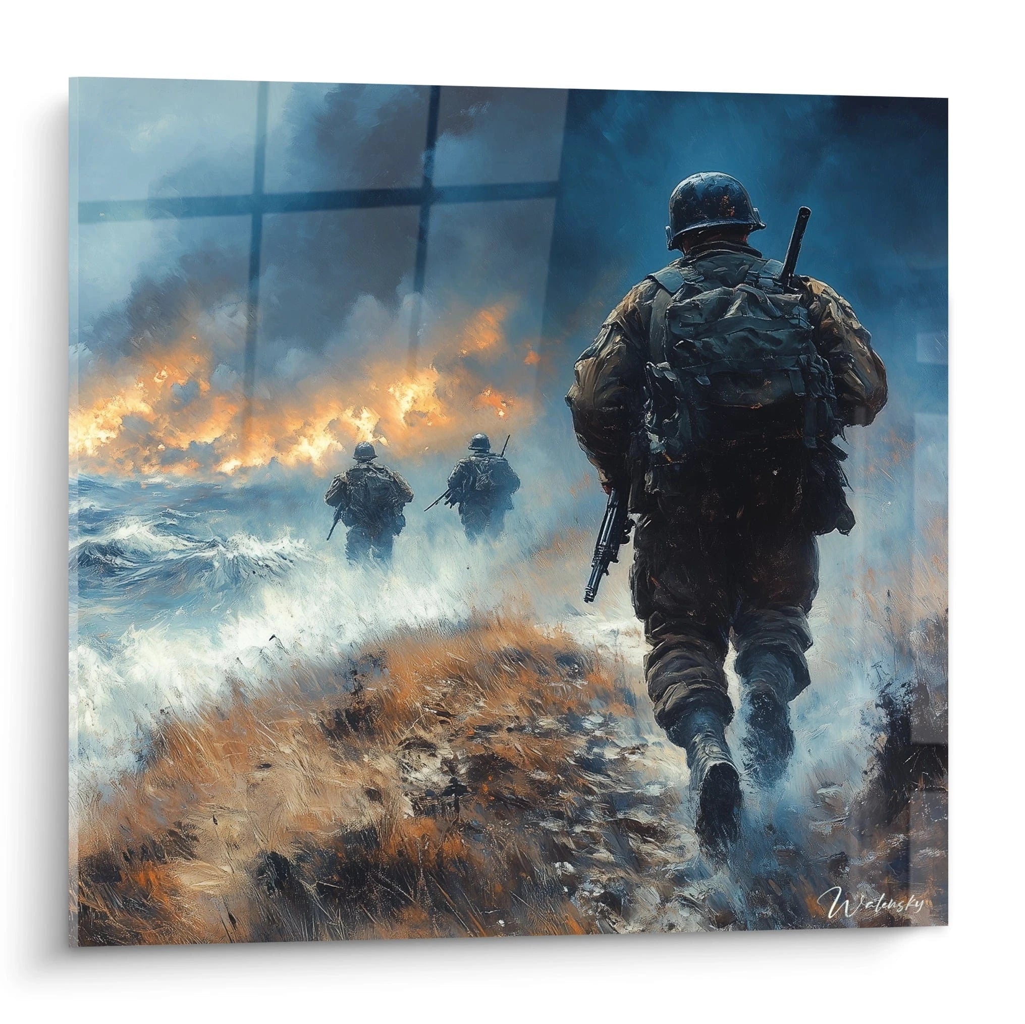
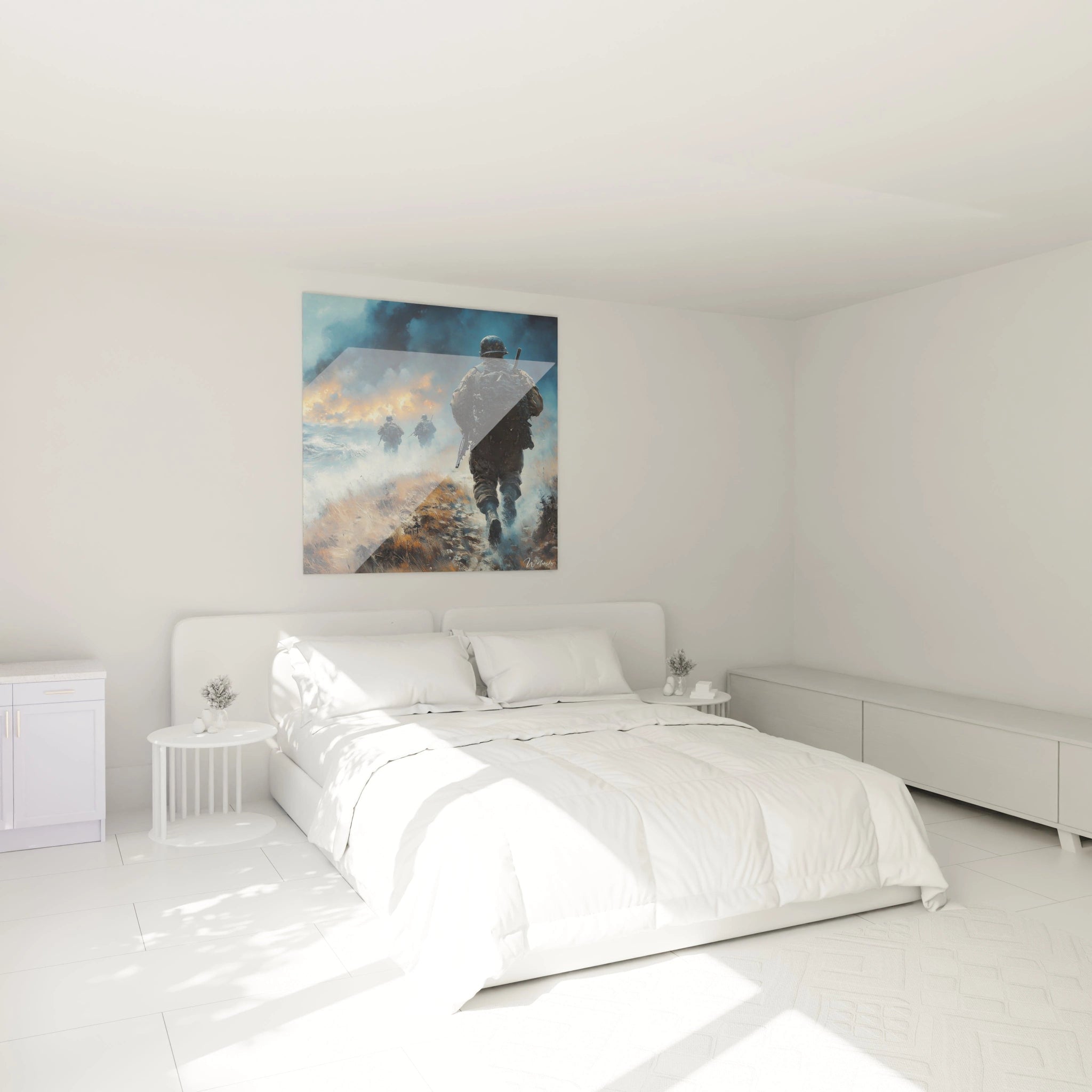
A colored World War II painting transcends simple historical representation to become a powerful emotional vector. The saturated hues of a sky ablaze above London, the deep blues of Allied uniforms, or the vivid reds of flags bring the events of 1939-1945 to life with an intensity that monochrome cannot match. This chromatic approach transforms each visual detail into a memorial marker.
Why choose a colored representation for this historical period?
Artistic colorization of historical military scenes allows contemporary generations to emotionally connect with events eight decades old. The shades of green in forest camouflage, the ochres of beaten earth, and the metallic grays of military equipment create a narrative depth impossible to achieve in black and white. For discerning collectors, a large-format colored World War II wall painting constitutes a decorative investment that engages with contemporary architecture while honoring collective memory.
The psychological impact of restored military palettes
Warm tones applied to soldier portraits humanize these historical figures, while contrasts between cool and warm colors in battle compositions accentuate spatial dramatization. A large-dimension colored World War II painting exploits these chromatic dynamics to generate a visual presence capable of entirely structuring an entryway wall or transition zone. Educational institutions and commemorative spaces favor these imposing formats that transform historical teaching into sensory experience.
The color codes of different armies as visual language
Each belligerent nation possessed distinctive chromatic codes: American olive green, German feldgrau, British khaki. These visual identifications, when magnified on extended wall surfaces, become elements of instantaneous reading that enrich narrative understanding. Military history enthusiasts specifically seek these authentic colored representations that respect the historical accuracy of uniforms and vehicles while offering modern aesthetics compatible with design interiors.
Strategic Deployment in Institutional and Cultural Environments
Installing a colored World War II painting in schools, local museums, or cultural centers addresses specific educational objectives. These monumental formats capture visitor attention upon arrival, creating a visual anchor point that stimulates historical curiosity. High school entrance halls, university corridors, and conference rooms particularly benefit from these chromatic compositions that transform transitional spaces into places of reflection.
How does a large colored format structure museum space?
Curators favor colored wall paintings from the 1939-1945 period for their capacity to create visual narrative sequences. Unlike traditional archival photographs, these artistic interpretations allow reading from a distance while revealing complex details upon approach. Chromatic saturation naturally guides the eye's journey, establishing a visual hierarchy between principal and secondary elements of the composition. For interior architects specializing in cultural spaces, these works solve the difficult equation between immediate visual impact and contemplative depth.
Integration into historical libraries and reading rooms
Spaces dedicated to historical research gain immersive atmosphere thanks to colored large-format representations of World War II. Warmed sepia tones and desaturated greens create a studious ambiance while maintaining stimulating visual presence. A colored World War II painting for library purchase becomes a functional element that delimits thematic zones while enriching the experience of researchers and students. Panoramic formats particularly adapt to longitudinal walls in consultation rooms.
Which palette to prioritize for modern commemorative spaces?
Contemporary architects design memorials that balance solemnity and accessibility. Colored historical paintings offer this dual dimension: their chromatic realism avoids cold abstraction while maintaining aesthetic dignity. Earthy tones associated with deep blues create a reverent atmosphere without sinking into darkness. Managers of commemorative spaces seek colored historical wall artworks that resist visually to varying lighting conditions while preserving their emotional impact during ceremonies and school visits.
Emotional Amplification through Dimension and Chromatic Saturation
A colored World War II painting exploits color psychology to intensify the emotional resonance of historical events. The vivid reds of explosions, the brilliant yellows of night combat lighting, and the deep greens of Normandy forests create a visual score that simultaneously activates historical memory and contemporary aesthetic response. This duality makes these works particularly sought-after decorative investments by collectors who value the intersection of art, history, and interior design.
Why do large formats amplify historical impact?
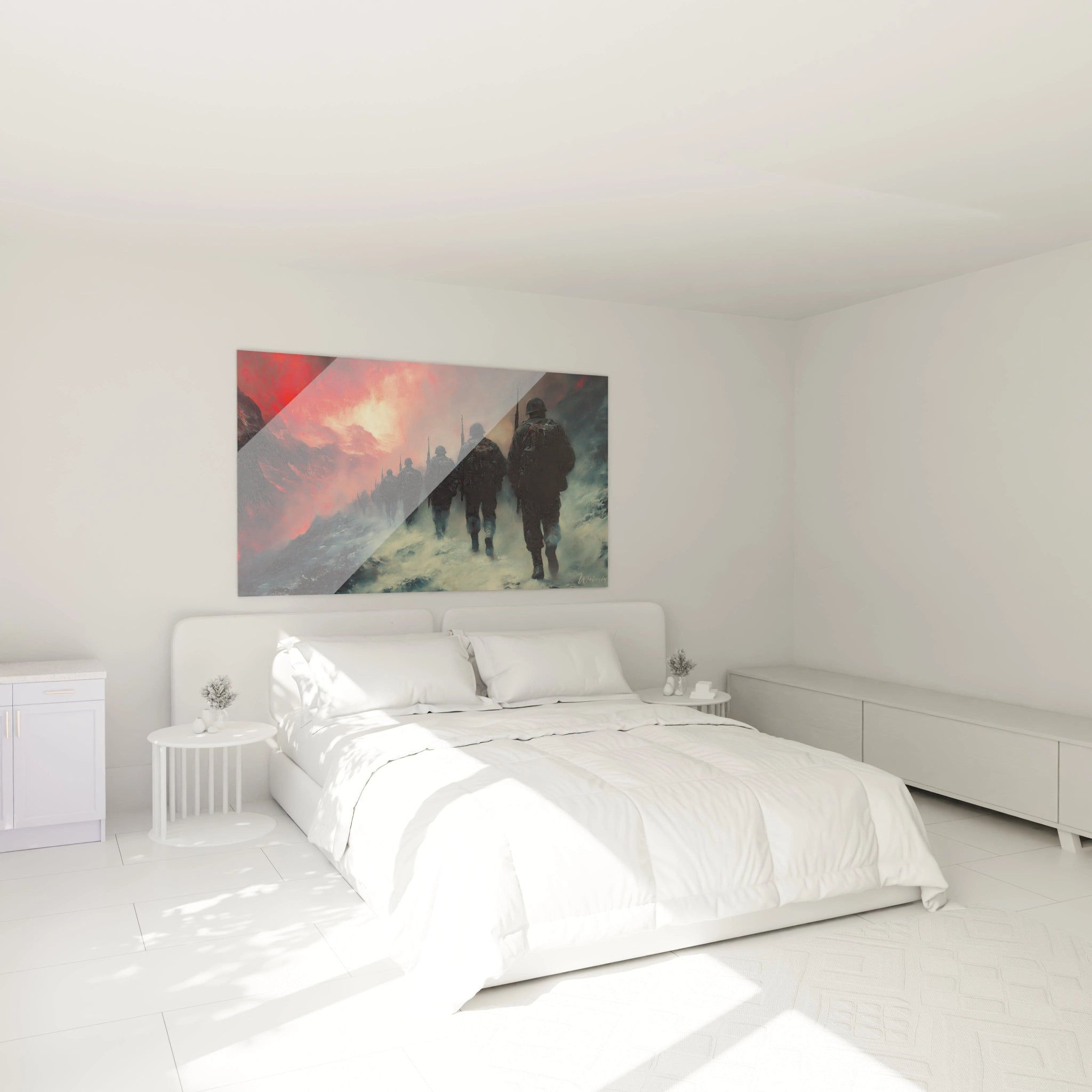
The physical monumentality of a colored historical wall painting creates spatial immersion that transforms the spectator into a virtual witness. When the artwork occupies several square meters, the human proportions of represented figures approach real scale, generating psychological identification impossible with reduced formats. Interior architects specializing in corporate spaces exploit this dimension to create memorable meeting zones where history serves as a catalyst for contemporary strategic reflection. A large-format colored World War painting thus becomes a cultural branding tool for companies valuing their heritage or memorial commitment.
Chromatic contrasts as narrative vectors
Oppositions between dark and brilliant zones in a colored historical composition create visual tensions that mimic the dramatic quality of represented events. Contemporary artists specializing in military themes use these dynamics to direct attention to crucial narrative points: a foreground soldier, an emblematic vehicle, a decisive moment. Discerning buyers seek these sophisticated compositions that offer multiple reading levels depending on observation distance, guaranteeing renewed visual interest over time.
Perceptual evolution of colors in large spaces
A large-dimension colored World War II painting interacts differently with natural and artificial light depending on the time of day. Warm tones intensify under morning lateral lighting, while blues and grays gain depth under zenith light. This chromatic variability transforms the artwork into a living architectural element, particularly appreciated in high-end residential spaces where decoration evolves with seasons and uses. Wall art consultants recommend these formats for double heights and stairwell walls where their presence reveals itself progressively.
Is a colored World War II painting suitable for contemporary interiors?
Absolutely. Historical military palettes harmonize naturally with current trends favoring earthy tones, olive greens, and metallic grays. Balanced compositions offer visual sophistication that transcends simple historical interest to become a design element in its own right, particularly in industrial interiors or urban lofts.
What size should be prioritized to maximize the impact of a colored World War II painting?
Formats exceeding 120 cm in width create the necessary immersion for chromatic details to operate fully. In open living spaces or contemporary offices, panoramic dimensions allow comfortable reading from distance while revealing compositional complexity upon approach, thus optimizing your decorative investment long-term.
How to maintain color vibrancy on these large-format historical paintings?
Current printing technologies guarantee exceptional chromatic stability without special maintenance. Simply avoid prolonged direct sun exposure and favor LED lighting to preserve the intensity of reds and blues over several decades, ensuring the longevity of your artistic and memorial acquisition.