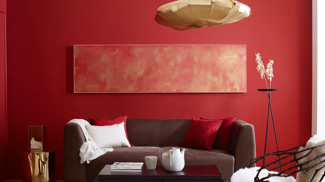
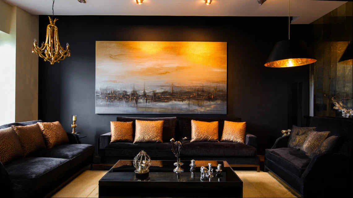
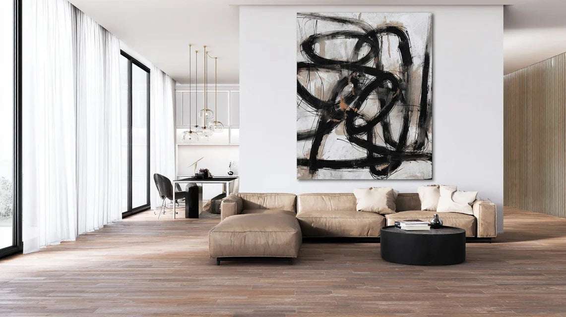
A Pastel Artwork to Temper a Wall Color That Is Too Vivid
By Alexandre MARY
⏱️ Reading time : 8 minutes
You've just repainted your living room in that vibrant color you’d been dreaming of at the store, but now that you live with it every day, it literally assaults your eyes as soon as you walk through the door.
That bright shade which was meant to bring personality to your interior transforms every moment of relaxation into a visual ordeal. Your guests blink when they enter, your partner now avoids this room, and you yourself feel eye fatigue after only a few minutes spent in that space.
You’ve probably tried to mitigate the impact with thicker curtains, changed the lighting, or even considered repainting everything - but none of these expensive solutions have really solved the underlying problem.
It's perfectly normal to find yourself in this situation: 65% of homeowners regret at least one wall color in their home. The problem isn’t your initial choice, but the lack of a visual balancing element capable of tempering this chromatic intensity.
By the end of this article, you will master the art of harmonizing a wall color that is too vibrant thanks to the soothing power of pastel paintings, and you will finally be able to enjoy your space serenely without having to redo everything.
Why does your vibrant wall create this visual discomfort?
The human eye works like a sophisticated camera that constantly adjusts to visual stimuli. When it is bombarded by an intense color without a resting point, it enters a state of permanent chromatic stress. If you wait any longer, this visual fatigue could become permanent and affect your daily well-being in the space you love.
🏠 Real testimonial : Sarah, a Parisian interior architect, says: "A client had painted her office vermilion red to stimulate creativity. Three months later, she could no longer stand working there and developed headaches. A simple pastel triptych in lavender and beige tones transformed the space in 24 hours. She now spends 10 hours a day there without fatigue."
💬 Conversation with a decor expert
"My orange wall is beautiful, but I have the impression that it's going to end up sickening me... Will it get better with time?"
No, the eye never really gets used to an excess of color. It’s like wearing orange sunglasses permanently: your brain continues to fight against this overstimulation. The solution isn't habituation, but visual balancing through soothing elements.
"I was always told that you had to perfectly match paintings to the color of the walls..."
This rule from the 80s is completely outdated! Today, we prioritize harmonious contrast. A pastel painting on a vibrant wall creates visual breathing space, just like a splash of freshness in a colorful desert. It's this controlled opposition that brings balance.
The golden rule of chromatic balancing: The more saturated your wall is in color, the more you need pastel and muted tones to create visual resting areas. The soothing effect is felt instantly, and your space regains its harmony in less than an hour after hanging.
What's really behind your visual discomfort
You are probably experiencing these three warning signs: your eyes get tired quickly in this room, you subconsciously avoid staying there too long, and your guests comment on the intensity of the color - even if they try to be polite.
What's happening is a phenomenon called "excessive chromatic saturation": your brain spends considerable energy constantly processing this intense visual information. The problem isn't you, but the lack of visual elements that allow your eye to "breathe".
Imagine your gaze like a mountaineer: after an intense climb, they need resting points to recover. Without these visual pauses provided by pastel tones, your eyes remain in constant tension.
The first hidden cause: the "chromatic tunnel" effect
Contrary to what one might think, it's not the color itself that is problematic, but the lack of a smooth transition between this intensity and the rest of your decor. Your eye desperately seeks an anchoring point of peace that it cannot find.
It’s exactly like listening to music at full volume constantly: even your favorite song becomes unbearable without variations in intensity. Your vibrant wall needs its visual “pianissimos” to become truly appreciable.
This revelation changes everything in your approach: instead of suffering from your wall color, you will learn to enhance it with the soft contrast of pastels. The emotional impact is immediate and transformative.
✨ Revelatory test: Place a white sheet in front of your colored wall for 30 seconds, then remove it. Observe how your eyes “sigh” with relief. That's exactly the effect a pastel painting will create permanently and aesthetically.
The second cause: the trap of "total coherence"
Many people think that all decorative elements should be coordinated in the same color range, but this approach actually creates a monotonous and tiring environment. The human eye has evolved to appreciate variety and subtle nuances.
Think of a successful English garden: its beauty comes precisely from the alternation between colorful flowerbeds and soothing green spaces. Without this breathing space, even the most beautiful flowers become overwhelming.
This is why you feel that visual fatigue: your space lacks harmonious counterpoints that would allow your wall color to reveal all its splendor without being overwhelming.
The third cause: ignorance of the "retention" effect
Here's what almost no one notices: after fixing an intense color, your eye automatically generates its complementary color in negative. If you look at a bright red wall and then turn away, you will see ghostly green traces. This phenomenon exhausts your visual system.
You can spot this eye fatigue in your home: more frequent blinking in that room, desire to close your eyes for a few seconds, or feeling of "overload" after a moment in the colored space.
This overstimulation affects your daily comfort and can even influence your mood and productivity in this space you designed to recharge.
🔍 The 3 telltale signs:
Your gaze instinctively flees: You look out the window, at your objects, everywhere except the wall - it's your brain that is looking for visual rest
The room seems smaller: Intense colors visually bring surfaces closer and create a feeling of confinement
You constantly adjust the lighting: You automatically dim to attenuate the intensity - sign that the chromatic balance has not been found
The trigger: the theory of "visual anchors"
What really makes the difference is the presence of soft "visual anchors" that allow your eye to rest between intense stimulations. A pastel painting acts as a chromatic haven that transforms the experience of the entire room. You can identify the need for these anchors when your eyes constantly seek to "escape" to less stimulating areas - windows, neutral objects, empty spaces.
The rule of soothing contrasts: Your space needs 20 to 30% surface area in pastel tones to balance an intense wall color. You can check this by observing your level of visual comfort before and after adding soft elements.
❌ Misconception
✅ Scientific reality
💡 Why it works
🎯 Immediate benefit
You have to match perfectly
Soft contrast is more restful
The eye needs variety to relax
Instant visual comfort
Pastels fade on bright colors
They enhance the main color
Highlighting effect by contrast
Your wall becomes more beautiful
It's a passing trend
Timeless scientific principle
Based on how the eye works
Durable and effective solution
You have to repaint to correct
One painting is enough to rebalance
Focal point that transforms perception
Quick and economical solution
The gentle method for taming your intense wall
Don't worry, you won't have to redo everything or master complex color theories. This method works like cooking: you gradually add the missing ingredient to balance a dish that is too spicy. In three simple steps, your space will regain its harmony, and you will feel an immediate sense of calm as soon as the first picture is hung.
🗺️ Overview of your transformation: First step: identify the right pastel shade that dialogues with your wall (immediate satisfaction). Second step: choose the strategic location to maximize the soothing effect. Third step: create perfect harmony with the right proportions. Final result: a space where you will love spending time.
🎨 Step 1: Decoding Your Wall Color's Personality
Starting with this analysis is crucial because every vibrant color has its own "chromatic personality" that calls for specific pastels. It’s like building a harmonious relationship: you first need to understand the needs of your existing color. Once this step is mastered, you will feel that feeling of "seeing right" that comes with an informed choice.
🔍 Color Analysis Tools
Your smartphone in camera mode: The lens captures the nuances that your eye, tired of the intensity, no longer perceives clearly. Look at your wall through the screen to identify its hidden undertones (golden, bluish, pinkish reflections). Avoid relying solely on your direct perception which can be altered by habit.
A pastel color chart: These shade cards allow you to visually test harmonies without making bad choices. Place different pastels against your wall to observe which ones create a "visual sigh". Quality is recognized by the fineness of the graduations between shades.
Optimal natural lighting: Daylight reveals true colors without artificial distortion. Observe your wall at different times to understand how it evolves with brightness - this knowledge will directly influence your choice of pastel.
Now, let's move on to practice with your space
🎯 How to Decode Your Color's Needs
Photograph your wall at 3 times of the day: Take pictures at 10am, 2pm and 6pm to capture all the nuances revealed by natural light. This photographic technique allows you to objectively see undertones that your accustomed eye does not notice. It is more precise than direct observation because the camera is not influenced by visual fatigue.
⏱️ Time: 15 minutes | ✅ Success when: You identify reflections you hadn't noticed with the naked eye | ⚠️ Attention: Avoid artificial light which distorts colors - many people make mistakes choosing in the evening under electric lighting
Test the "soothing complement" rule: Identify the color directly opposite yours on the color wheel, then choose its very softened pastel version. For example, if your wall is bright red, pastel green will be your ally. This ancestral technique of painters guarantees a natural harmony that soothes the eye without creating visual conflict.
⏱️ Time: 10 minutes | ✅ Success when: Your eye feels an immediate sense of calm seeing the two colors together | ⚠️ Attention: Don't take the pure complementary color (too aggressive) but its very soft pastel version
Perform the "natural gaze" test: Stand at the entrance of your room and observe where your eyes spontaneously go - do they avoid the colored wall? This analysis reveals areas of visual tension and indicates precisely where to place your future pastel artwork to create a point of rest.
⏱️ Time: 5 minutes | ✅ Success when: You clearly identify the areas that your gaze avoids or seeks | ⚠️ Attention: Repeat this test several times as the first glance can be influenced by your current concerns
🎪 Stage validation: You should now know the undertones of your wall color and have identified 2-3 pastels that create an immediate sense of calm when you visually place them near your wall. If you are still hesitating, that's normal: give yourself a day to reflect, your intuition will refine the choice. The next step will allow you to definitively confirm your selection.
OUR RECOMMENDED PRODUCTS
📐 Step 2: Mastering the art of strategic placement
You are now entering the visual composition phase where every centimeter counts to maximize the soothing effect. This is where your pastel artwork will become that "beacon of softness" that guides the eye and transforms the atmosphere of the entire room. This step is particularly rewarding as you see the impact taking shape in real time.
🛠️ Your professional placement kit
Kraft paper or newspaper: Cut a rectangle to the exact dimensions of your future artwork to test the location without making holes. This simulation avoids costly mistakes and allows you to experiment with different positions. A simple repositionable tape will suffice to hold it temporarily.
Spirit level or smartphone app: The eye immediately perceives even a minimal misalignment, which reduces the desired soothing effect. The precision of the level guarantees perfect visual harmony that reinforces the positive impact of your pastel artwork.
Measuring tape: Correct proportions are crucial for creating the optimal visual balance - neither too small (ineffective), nor too large (overwhelming). The rule of thirds applied to your wall will give you the ideal dimensions for maximum effect.
🎨 The science of harmonious placement
Apply the "soothing thirds" rule: Mentally divide your wall into three horizontal parts and three vertical parts, then place your artwork at the intersection of these lines of force. This technique from professional photography automatically creates a visual balance that naturally guides the eye to your color resting zone.
⏱️ Time: 20 minutes | ✅ Successful when: The artwork seems "in its place" naturally | ⚠️ Attention: Avoid the perfect geometric center which can create a feeling of rigidity
Test the "visual breathing" effect: Place your artwork simulation and step back 3 meters to observe the overall impact. Your eye should be able to "travel" naturally between the intense color of the wall and the softness of the pastel without effort or jerkiness. It is this smooth movement that creates the sought-after soothing.
⏱️ Time: 15 minutes | ✅ Successful when: You feel an immediate eye relaxation | ⚠️ Attention: If your gaze "bumps" into the artwork, it is poorly positioned or disproportionate
✨ Step 3: Creating perfect proportion harmony
You are now reaching the level of decorative mastery where you will refine every detail to achieve that magical feeling of perfect balance. At this stage, your space will reveal its full potential, and you will feel that particular pride in having created a truly harmonious environment that you can enjoy for years.
🎭 The secrets of visual harmony
Multiple pastel artwork formats: Having the choice between portrait, landscape and square format allows you to finely adjust the balance according to your specific space. Each format creates a different dynamic: portrait elongates, landscape soothes, square stabilizes. Quality is recognized by the subtlety of the pastel nuances which must remain visible even from afar.
Dedicated accent lighting: A spotlight or reading light directed at your pastel artwork amplifies its soothing effect, especially in the evening when the wall color may appear more aggressive under artificial lighting. Avoid direct lights that create parasitic reflections.
Complementary decorative elements: Cushions, plaid or object in the same pastel range as your artwork create a "chromatic echo" which reinforces the overall effect. This subtle coherence amplifies the feeling of harmony without creating monotony.
🔮 The final orchestration of your space
Calculate the optimal "visual mass": Your pastel artwork should represent approximately 8 to 12% of the wall surface to create an effective counterweight without dominating. Measure your wall and multiply by 0.10 to obtain the ideal size of your artwork. This scientific proportion guarantees maximum calming effect.
⏱️ Time: 10 minutes | ✅ Success when: The artwork creates a balance without crushing or disappearing | ⚠️ Attention: A painting that is too small will be ineffective, too large it will dominate instead of soothing
Orchestrate the lighting to sublimate the effect: Create a soft lighting towards your pastel artwork at the end of the day, when your wall color may become more aggressive. This highlighting transforms your visual rest area into a true haven of peace that naturally attracts tired eyes.
⏱️ Time: 25 minutes | ✅ Success when: The artwork "radiates" gently without dazzling | ⚠️ Attention: Avoid overly white lighting which hardens the pastels
🏆 Final validation: Your space should now provide an immediate feeling of well-being upon entering the room. Your eyes naturally find rest on the pastel artwork, and the wall color reveals its beauty without aggression. If you still feel tension, slightly adjust the position or lighting - perfection is within reach.
The rule of harmonious progression: Start with a single perfectly placed artwork, observe the effect for a week, then adjust if necessary. Visual harmony is built through progressive touches - it's better to have one perfect element than several approximate ones.
You now master the three pillars of chromatic balancing. Here are the expert subtleties that will make the difference between a simple adjustment and a real decorative transformation that will impress even interior design professionals.
🎯 Technique of master decorator: Create an "easing gradient" by arranging 3 pastel elements of decreasing sizes from largest (main artwork) to smallest (candle or decorative object). This progression gently guides the eye and multiplies the relaxing effect of your main wall color.
💭 Questions you might be asking yourself
“I find my pastel artwork pretty, but I'm afraid it will look 'faded' next to my vibrant wall...”
This concern is very understandable as we tend to think that you need to "compete" with intensity. In reality, it's exactly the opposite that happens: the softer and more soothing your artwork, the more it will highlight the vibrancy of your wall color. It’s like wearing a delicate piece of jewelry with a colorful outfit - subtlety enhances the whole look instead of competing with it. Many customers are surprised to discover that their wall looks even more beautiful after adding a pastel artwork. You can start with a temporary test using a reproduction or sample to convince yourself of the magical effect.
🧪 Conviction Test: Temporarily stick a printed pastel image on paper for 48 hours to see for yourself how it enhances your wall color. You will be surprised by the transformation and gain confidence in choosing your definitive artwork.
Pitfalls to Avoid for Successful Balancing
Some mistakes can negate all the desired effect and even worsen your visual discomfort. I prefer to tell you about them now to spare you these disappointments - 95% of these mistakes are avoidable with the right information.
🚫 Choosing a pastel that is too "loud": You want it to “show” against your intense wall, so you opt for a pastel that is too saturated which competes instead of soothing. Result: two colors fighting and even more tiring the eye. Always choose a very soft pastel, even if it seems "too discreet" at first glance - it's this discretion that will create harmony.
🚫 Placing the artwork too high or too low: The desire to “hide” a problematic part of the wall leads to unsuitable locations which break the visual balance. A poorly positioned artwork loses 70% of its soothing effectiveness. Follow the rule: center of the artwork at eye level (5ft3in from the floor) for optimal effect.
🚫 Multiplying pastel elements everywhere: Thinking that you need to “drown” the bright color under an avalanche of pastels creates a reverse imbalance and a faded look. A single well-chosen and well-placed artwork will be infinitely more effective than a multitude of scattered elements. The desired effect is breathing, not suffocation.
🚫 Neglecting the lighting of the artwork: A beautiful pastel artwork in a dark area loses all its soothing power. Many forget that pastels need light to reveal their softness. Without adequate lighting, they appear dull and no longer balance anything - it's a very common but easy-to-correct mistake.
🚫 Changing your mind too quickly: Visual adaptation takes 48 to 72 hours - many panic after a few hours if the effect is not immediate. Your eye, accustomed to overstimulation, needs time to appreciate the new softness. Allow yourself time for familiarization before any adjustment.
🔍 Your success checkpoints: After installation, check these 4 positive signals: you naturally stay longer in the room, your eyes instinctively rest on the artwork, your guests positively comment on the atmosphere (not necessarily the artwork directly), you feel less visual fatigue after 30 minutes in the space. Warning sign: if you want to "hide" or move the artwork after 24h, something is wrong with the choice or placement.
Because you took the time to inform yourself, enjoy 10% discount on your first order:
ART10
⏰ Valid 72h after reading • Applicable to all our products
🤔 Frequently asked questions about color harmonization
💰 How long does it take to see the effects, and what budget should you plan for?
The soothing effect of a well-chosen pastel artwork is felt instantly upon hanging, but your complete appreciation develops over 48-72h as your eye adapts to this new comfort. In terms of budget, expect €80-300 for a quality artwork depending on the dimensions - that's 10 times less than a full repaint. Optimize your investment by first choosing an artwork of medium size (60x80cm) which you can complement later if needed.
🎨 My wall is bright orange, what pastels work best?
For a bright orange wall, your pastel allies are powder blue, almond green and very soft lavender purple. These shades create a perfect visual breathing space without extinguishing the energy of your orange. Avoid pink or yellow pastels which would amplify the warmth. Test first with a very soft pastel blue - it is generally the most effective for soothing intense oranges.
🏠 Does this technique work in all rooms?
Absolutely! Balancing with pastels is particularly effective in living rooms, bedrooms and offices where you spend time. In the kitchen, prioritize smaller formats resistant to humidity. For a colorful bathroom, opt for pastels on waterproof support. The important thing is to adapt the size and support to the use of the room while maintaining the principle of visual soothing.
🔧 Should I hire a professional for hanging?
For a standard artwork (less than 5kg), you can perfectly manage with a drill, suitable wall plugs and a level. Invest 20 minutes in careful hanging rather than rushing - the accuracy of placement directly influences the soothing effect. Hire a professional only for large formats (over 100cm) or on fragile walls like plasterboard without structure.
⭐ Can we combine several pastel artworks?
Yes, but in moderation! The golden rule: one main artwork (the largest) that does the balancing work, and a maximum of 1-2 smaller pastel elements echoing it. Arrange them according to the harmonious triangle rule (not aligned) and within the same pastel range. More than 3 items risks creating a "patchwork" effect which loses efficiency. Start with one artwork, observe the effect, then add eventually.
🌟 Your new life in a finally harmonious space
In a few weeks, you won't be able to imagine this space without your salvatory pastel artwork. Your guests will immediately notice this soothing atmosphere without being able to put their finger on what has changed - that is the mark of a successful balancing act. You will feel that particular pride in having transformed a decor challenge into a real asset, and your entourage will ask you for advice for their own colorful spaces.
Beyond the aesthetic aspect, you will have developed an expert eye for chromatic balance which will serve you in all your future decor projects. This understanding of visual harmonies gives you a head start to create spaces that truly resemble you, without ever sacrificing comfort to style.
Understanding was indeed the most difficult thing - now that you master the principles, your first action will be to photograph your wall under different lighting conditions to identify its undertones. This simple gesture will trigger your transformation and lead you towards that harmonious space you dreamed of without knowing how to achieve it.
🚀 Your transformation starts now: Your bold wall color was not a mistake, it was just waiting for its perfect complement. With this knowledge in your pocket, you will create a unique space that combines character and serenity - exactly what you were looking for from the start!
📚 To go further into the art of contrasts
You now master the balancing of bright colors, but there are other fascinating techniques to play with contrasts in materials and textures which further sublimate your spaces. Discover how to combine artworks and different supports to create even more refined atmospheres.