

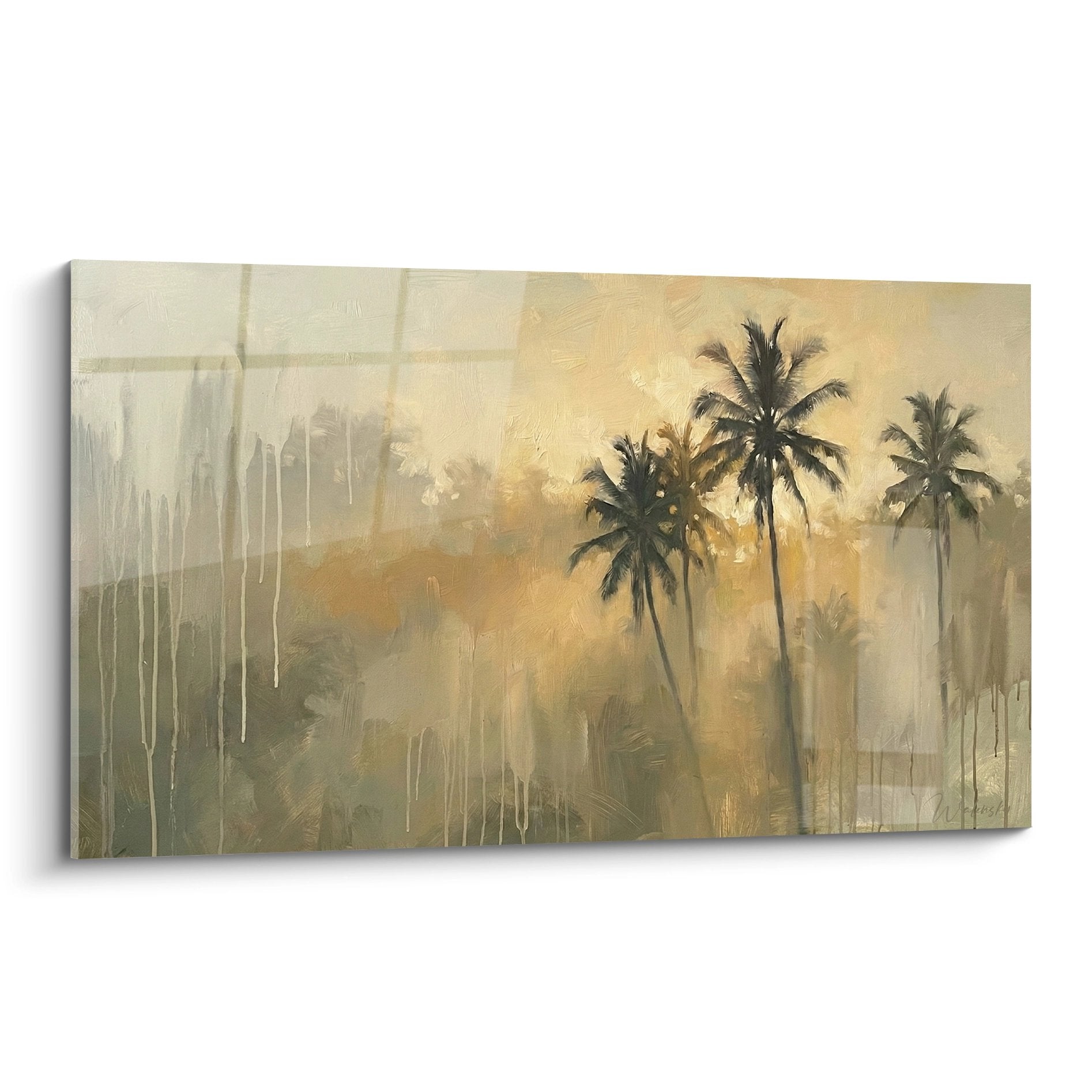






Are Triptych Wall Art Pieces Suitable for Long Restaurant Walls?
January 1, 2026 · 10 min read · by Walensky
I still remember that trendy restaurant in the Marais, where the owner had hung a succession of disparate frames on his huge 8-meter white wall. The effect? A chaotic gallery that overwhelmed customers before they even opened the menu. Three months later, I returned: a monumental contemporary triptych had replaced this visual clutter. The atmosphere was unrecognizable, calmed, consistent.
Here's what triptych wall art brings to restaurant long walls: a narrative continuity that guides the eye without tiring it, an artistic presence that structures space without weighing it down, and a professional decorative solution that immediately enhances your establishment.
Do you also stare at that endless wall that runs along your dining room, aware that it represents as much an opportunity as a decorative challenge? Too empty, it gives the impression of being unfinished. Too cluttered, it turns your restaurant into a flea market. This equation seems impossible to solve, especially when every detail counts to create the experience your customers deserve.
After collaborating with dozens of restaurateurs to transform their spaces, I have identified simple but remarkably effective principles. The wall triptych is not just a decorative trend: it's a precise architectural response to the problem of long walls. Let me show you why this solution could transform your establishment.
The triptych: when three panels tell better than one
The principle of the wall triptych is based on an ancestral logic borrowed from medieval altarpieces: divide to conquer. On a restaurant wall that stretches 5 to 10 meters, a single giant painting would create an overwhelming visual mass. Conversely, multiplying small frames generates an unpleasant confusion during the meal.
The triptych offers a harmonious segmentation that respects the natural movement of the eye. Our eyes naturally scan from left to right, particularly in a restaurant setting where customers subconsciously seek soothing visual cues. The three panels create a rhythm, almost a visual punctuation that accompanies the gastronomic experience without dominating it.
I tested this configuration in a Mediterranean restaurant: a triptych depicting progressive coastal landscapes – from dawn to dusk – installed on the main 7-meter wall. Customers stayed an average of 18 minutes longer, a detail the owner immediately linked to the calming atmosphere created by this narrative continuity.
The perfect proportional balance
On a long restaurant wall, the question is not only what to hang, but how to fill the space without saturating it. The triptych painting solves this equation with elegance: its three panels can cover 60 to 70% of the total wall length, allowing the ends to breathe while asserting an undeniable artistic presence.
Let's take a standard wall of 6 meters: three panels of 100 x 70 cm each, spaced 30 cm apart, create a total composition of approximately 3.60 meters. This leaves roughly 1.20 meter on each side – enough to avoid the « stuck to the corners » effect, while visually structuring the central space where guests' attention is focused.
Why discerning restaurateurs choose the triptych
In my interior design consultations for commercial spaces, I notice that sophisticated restaurateurs no longer decorate randomly. They understand that every visual element directly influences customer behavior, length of stay, and even the amount spent.
The triptych wall art simultaneously achieves several strategic objectives. First, it creates distinct visual zones without physically partitioning the space – particularly valuable in long restaurants where you want to avoid a « corridor » effect. Second, it offers enough visual richness to justify a high-end positioning, while remaining sufficiently clean to not compete with the presentation of dishes.
A Michelin-starred chef recently confided in me: “My culinary work is visual before it is gustatory. I don't want my plates to compete with cluttered walls.” His abstract triptych in earthy tones creates a sophisticated backdrop that enhances his creations rather than eclipsing them.
Thematic flexibility as a major asset
Triptych wall art for restaurants adapts to all culinary concepts. For a Japanese establishment, I selected a triptych of stylized cherry blossoms – each panel representing a stage of flowering. In a Parisian brasserie, three black and white urban scenes evoke the nostalgia of Doisneau without falling into cliché.
This stylistic versatility also allows adapting the ambiance according to seasons or marketing repositionings, without reinventing everything. Some restaurateurs invest in several triptychs that they alternate: warm and golden tones in autumn-winter, fresh and marine nuances in spring-summer.

Fatal errors to avoid on a long restaurant wall
Let me spare you the missteps I see too often. The first mistake is choosing a wall triptych too small for fear of overdoing it. The result? Three little frames lost on an ocean of white, giving an impression of hesitation, almost amateurism. On a long wall, you need to embrace a certain monumentality.
The second mistake: prioritizing quantity over coherence. I've seen restaurateurs hang five, six, or seven different frames on an 8-meter wall, thinking they were creating an artistic gallery. What works in a New York loft becomes cacophony in a place where people need to focus on their dining experience.
Third classic trap: ignoring lighting. A triptych without dedicated lighting loses 70% of its impact. I always insist on installing adjustable spotlights or lighting rails that create a museum-like highlighting, transforming your wall into a true architectural focal point.
The question of hanging height
In a restaurant, unlike an art gallery, customers are mostly seated. This reality completely changes the rules of hanging. The visual center of your wall triptych should be between 140 and 150 cm from the floor – slightly lower than the standard museum rule of 160 cm applied for standing visitors.
This difference of 10 to 20 centimeters seems minimal on paper, but radically transforms perception from a table. I have readjusted dozens of installations simply by lowering the paintings, and the effect is immediate: customers feel more “in” the atmosphere rather than “under” a decoration that overlooks them.
— Our selection


Triptych versus other decorative solutions: the match
Let's be honest: the wall triptych is not the only option for dressing a long restaurant wall. Alternatives exist: painted mural, panoramic wallpaper, series of identical frames, mirror installation, or even living wall. So why does the triptych often come out on top?
Compared to a painted fresco, the triptych offers unparalleled flexibility. You can replace it, adapt it, move it according to the evolution of your concept. A fresco commits you for years. Panoramic wallpaper ages poorly in a restaurant environment (humidity, suspended grease, wear), while paintings under glass or varnish are easy to clean.
Mirrors enlarge the space but can sometimes create an unpleasant visual confusion in a crowded room – no one likes eating facing their own reflection or seeing other tables multiplied. As for the living wall, its complex maintenance and cost dissuade most pragmatic restaurateurs.
The triptych represents the ideal compromise: strong visual impact, minimal maintenance, reasonable investment, maximum flexibility. It is the solution of the professional who wants an immediate and lasting result.

How to choose the perfect triptych for your establishment
Selecting a triptych painting for your restaurant should meet three fundamental criteria: consistency with your culinary identity, the color palette of your space, and the emotion you want to evoke.
For a refined gastronomic restaurant, prioritize abstract triptychs with subtle tones – pearl gray, natural beige, discreet golden touches. These sophisticated compositions create a cozy atmosphere that enhances the experience without distracting from it. In a contemporary bistro or trendy concept, dare to use more marked contrasts: graphic black and white, touches of bright colors, bold geometric compositions.
The dimension of the panels should adapt not only to your wall but also to your ceiling height. With standard ceilings of 2.40 m (7 ft 10 in), panels 70 to 80 cm (27.5 to 31.5 in) high work perfectly. If you are lucky enough to have volumes of 3 meters (9 ft 10 in) or more, you can consider vertical formats of 100 to 120 cm (39.4 to 47.2 in) which will sublimate your generous proportions.
The material makes all the difference
Not all triptych wall paintings are created equal in terms of durability. In a restaurant environment, look for works on stretched canvas on wooden frame or, even better, prints on dibond (composite aluminum) which impeccably resist humidity and temperature variations.
Avoid simple framed posters that look cheap and fade quickly under continuous lighting. Your customers, even unconsciously, perceive the quality of the materials and associate it directly with the standing of your establishment. A museum-quality triptych sends the message that you compromise on nothing – not even decorative details.
Ready to transform your long wall into a major asset?
Discover our exclusive collection of wall art for Restaurant that combines artistic sophistication and professional resilience, specially designed to enhance demanding catering spaces.
— You may also like


Professional installation: non negotiable
I must emphasize this point because I have seen too many beautiful triptychs ruined by approximate installation. On a long restaurant wall, the precision of positioning and perfect alignment of the three panels are absolutely crucial. Even a slight difference of a few centimeters in height can destroy all harmony.
Invest in a professional hanging system: anchors suitable for the type of wall (drywall, concrete, brick), museum-quality hooks, laser level to guarantee horizontal alignment. If your mural triptych is particularly heavy (some aluminum composite panels weigh over 15 kg each), through fixings with metal brackets are essential.
The spacing between the three panels also deserves your full attention. An effective rule of thumb: leave a distance equivalent to 10-15% of the width of one panel. For paintings 80 cm wide, count 8 to 12 cm between each element. This space creates visual breathing without fragmenting the overall composition.
Finally, anticipate the evolution of your space. Restaurant walls undergo modifications: new electrical installations, occasional rearrangements. Provide a system that allows you to easily remove and replace your triptych without damaging the walls or the artworks. Modular hanging rails are an excellent solution for this flexibility.

In the same vein
Japanese Calligraphy Painting No. 1 - Japan Around the World Edition
233,90€
Discover this artwork →Visualize the transformation
Imagine your dining room tomorrow morning, when natural light caresses the three perfectly aligned panels of your new triptych. This wall that has mocked you for months has become your visual signature, that detail that your customers will talk about in their online reviews. “The atmosphere is incredible,” “the setting is refined,” “you immediately feel good” – these are the comments that make all the difference in a highly competitive sector.
A mural triptych is not a decorative expense; it's a strategic investment in the customer experience. On a long restaurant wall, it has even become the solution of choice for professionals who refuse to compromise. Start by accurately measuring your space, identify your dominant color palette, and let your creative instinct guide you. Your wall awaits its transformation.
Frequently Asked Questions
What total width should be planned for a triptych on an 8-meter wall?
For an 8-meter restaurant wall, aim for a total composition of 4.5 to 5.5 meters including the spacing between panels. Specifically, three 120 x 80 cm panels spaced 40 cm apart create a presence of 4.40 meters – imposing enough to structure the space while allowing the ends to breathe. This proportion creates the perfect balance between decorative affirmation and refined elegance. Remember that your mural triptych should attract attention without dominating it: it accompanies the gastronomic experience rather than competing with it. If your wall has architectural elements (doors, windows, sconces), adjust these dimensions to maintain a harmonious visual symmetry.
Does a triptych suit all restaurant styles?
Absolutely, provided you choose the right style of triptych. For a Japanese restaurant, opt for minimalist zen compositions with plenty of negative space. An Italian restaurant will benefit from triptychs evoking Tuscany or Mediterranean still lifes. Contemporary establishments shine with bold graphic abstractions. Even a traditional restaurant can find its place with classic landscape triptychs or bucolic scenes. The key is consistency between your culinary concept and the visual universe of the triptych. I always recommend considering the dominant colors of your dining room – furniture, textiles, tableware – and choosing a triptych that dialogues with this existing palette rather than contradicting it. Chromatic harmony creates that sense of a “thought-out” space that customers immediately perceive.
How to maintain a triptych in a restaurant environment?
Maintaining a triptych wall art in a restaurant is surprisingly simple if you have chosen suitable materials. For varnished canvas prints or dibond, weekly dusting with a dry microfiber cloth is sufficient. Every quarter, wipe with a slightly damp cloth (clear water only) to remove inevitable microscopic grease deposits in a dining room. Absolutely avoid harsh cleaning products that alter the pigments. If your triptych is placed near the kitchen, consider acrylic glass protections which facilitate cleaning while preserving the artworks. Check the fixings annually, especially if your establishment generates vibrations (music, heavy foot traffic). A well-maintained triptych retains its brilliance and visual impact for 10 to 15 years, making it a particularly cost-effective decorative investment compared to other ephemeral solutions.


