

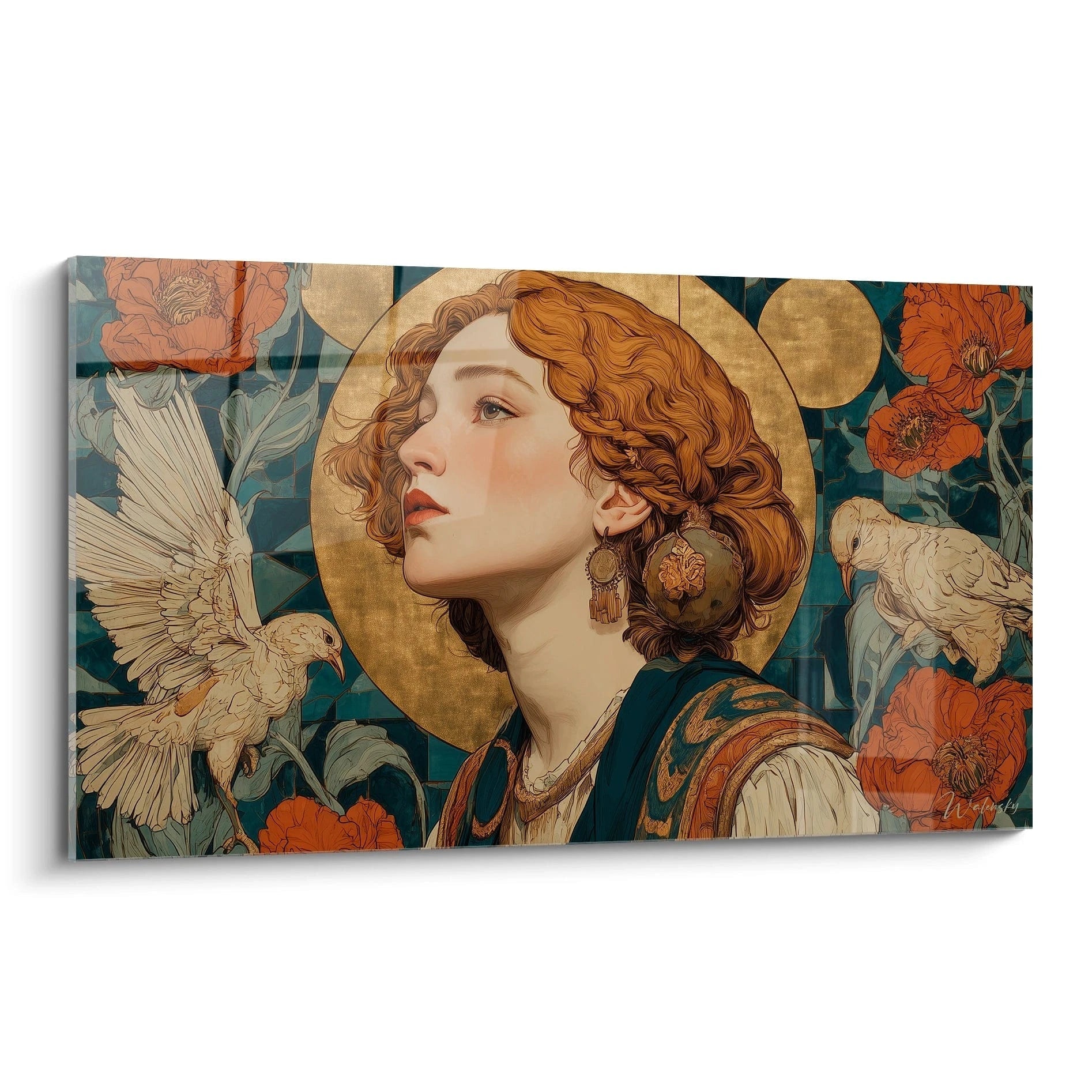






How to Create a Cohesive Gallery Wall on a Budget of €1500?
December 1, 2025 · 8 min read · by Walensky
In my Parisian studio, where I have been assisting collectors in composing their walls for eight years, I always observe this magical moment: when a client steps back three paces, observes the ensemble they have just created, and murmurs “this is exactly what I wanted without knowing how to articulate it”. A successful wall art gallery is not measured by the number of frames hung, but by that visual coherence which makes you immediately feel an atmosphere when entering a room. Here's what a coherent wall art gallery brings: it transforms a simple wall into a declaration of personal style, it creates a focal point that structures the entire space, and it reveals your aesthetic sensitivity without saying a word. Many abandon this project for fear of making mistakes in proportions, lacking chromatic harmony, or simply wasting their budget on disparate choices. Yet, with €1500 and a thoughtful method, you have a perfect envelope to compose a wall art gallery that will rival the most beautiful installations in magazines. I will guide you through each strategic decision, from design to final hanging.
The rule of proportions: 60-30-10 applied to your wall art gallery
Before even thinking about visuals, understand this golden rule that I systematically apply in my wall compositions: 60% of your budget and surface area should be dedicated to a centerpiece, 30% to supporting elements, and 10% to surprising accents. For a coherent wall art gallery, this translates concretely into a central large format (around €900) of at least 120x80cm, three to four medium formats of 40x60cm (around €450), and two or three small formats or complementary decorative objects (€150). This visual architecture naturally creates a hierarchy that the eye understands instantly.
On a standard 3-meter living room wall, your centerpiece anchors the gaze while the secondary formats create movement, a visual narrative. I have seen too many wall art galleries fail due to accumulation of identical formats: the effect is flat, static, like a catalog page. The variation in dimensions generates rhythm, just as a musical composition alternates tempos and intensities. Your €1500 budget allows for this sophisticated orchestration without compromise on quality.
Choosing your centerpiece: the strategic investment
For this centerpiece, which will represent 60% of your wall gallery budget, prioritize an iconic fashion visual: a black and white haute couture runway photograph, a portrait of an iconic designer, or a floral composition in the spirit of Vogue campaigns. The frequent mistake is to choose a "pretty" image rather than a "powerful" one. Your masterpiece must be able to stand alone on this wall and already tell a complete story. Test mentally: if you only had to hang it, would you be satisfied? If the answer is yes, you have your foundation.
The color palette: three colors maximum for impeccable coherence
A coherent fashion wall gallery relies on strict chromatic discipline. In my curation experience, the most successful compositions never use more than three dominant colors. For a fashion universe, I systematically recommend this trilogy: black and white as a base (70% of the visuals), a warm accent color such as blush pink or camel (20%), and metallic gold or silver touches (10%) brought by frames or visual details.
This chromatic restriction may seem restrictive, but it is precisely what transforms an accumulation of images into a professional fashion wall gallery. When you select your visuals, print them in miniature and arrange them on a table: the harmony must be immediately apparent at this reduced scale. If one element clashes, it will clash ten times more on your wall. I have observed that with a budget of €1500, there is a great temptation to buy impulsively "because it's beautiful", but coherence requires sometimes sacrificing a favorite piece for the sake of overall unity.
Unified framing: the detail that professionalizes the whole
Never underestimate the impact of frames in your wall gallery. For maximum coherence with your budget envelope, opt for a single frame family: either entirely matte black, or entirely fine gold, or a controlled 80/20 blend (80% black, 20% gold for accents). Frames represent about €200 to €300 of your total budget. A mid-range quality but uniform frame always surpasses a disparate mix of high-end frames. The eye perceives continuity, not the unit price.

Our favourite
Digital Art Artwork - Fragmented Contemplation - male beauty edition
233,90€
Discover this artworkThe spatial composition: three proven layouts for your fashion wall gallery
Having accompanied dozens of gallery wall projects, I identify three architectures that consistently work for a coherent fashion universe. The asymmetrical constellation layout: your centerpiece offset to the left with secondary formats gravitating to the right and upwards, creating an elegant upward movement. The horizontal line layout: all your elements aligned on a central axis, perfect for a hallway or above a sofa, creating a narrative frieze. The deconstructed grid layout: a base in a four-element grid with two pieces that deliberately overflow, bringing a contemporary sophistication.
To test your composition before drilling the wall, cut rectangles of kraft paper to the exact dimensions of your future frames and attach them with masking tape. Live with this full-size mockup for 48 hours. You will immediately see if the proportions work, if the balance is right, if the fashion gallery wall harmonizes with your furniture. This free step avoids 90% of the hanging errors I observe in consultations.
The spacing that breathes: 5 to 8 cm between each element
The spacing between your frames determines whether your gallery wall will appear professional or amateur. The rule I consistently apply: between 5 and 8 cm of uniform distance between each element, never less, rarely more. Below 5 cm, the composition chokes and loses readability. Above 10 cm, the elements dissociate and lose their overall coherence. Use a graduated ruler and mark your references lightly with pencil: precision at this stage makes all the difference between an approximate installation and a fashion gallery wall worthy of a luxury boutique.
— Our selection


Distributing your €1500 intelligently: the investment matrix
Let's detail precisely how to allocate your budget for a coherent and impactful fashion gallery wall. Masterpiece: €800 to €900 for a quality gallery photographic print, fine art paper printing with pigment inks, 120x80 cm or 100x70 cm format depending on your wall. Medium formats: €400 to €500 for three or four complementary visuals in 40x60 cm or 50x70 cm, same printing quality to guarantee uniformity. Frames: €200 to €250 for the entire set, favoring thin and elegant profiles rather than massive moldings that would weigh down your fashion composition.
Remaining €50 to €100 for professional hanging accessories: laser level (essential), X hooks suitable for weight, quality dowels and screws. Never economize on hardware: a frame that falls destroys months of reflection in one second. This budget allocation, refined over dozens of projects, guarantees a gallery wall where every euro invested is visible and contributes to the overall impact. Avoid the temptation to distribute €200 per frame evenly: you would get seven mediocre elements rather than a composition with a real central statement.
Smart opportunities to stretch your budget
With €1500, you can also play smart. Some limited edition vintage fashion photography offer an incomparable cachet for €300 to €400. Mixing one or two authentic vintage prints with contemporary impressions brings a fascinating historical depth to your wall gallery. Another tip: licensed fashion campaign visuals, often available between €150 and €300 in medium format, allow access to iconic images (Dior, Chanel 90s) without blowing your budget.

— You may also like


Lighting: the impact multiplier often overlooked
A consistent fashion wall gallery without appropriate lighting is like a show in the dark. On your €1500 budget, I recommend dedicating €100 to €150 to dedicated lighting, either via adjustable rail spotlights (ideal solution for a gallery rendering) or via sconces with articulated arms positioned on either side. Lighting literally transforms perception: it sculpts reliefs, intensifies contrasts, and gives your visuals a physical presence.
Prefer a color temperature between 2700 and 3000 Kelvin for a warm rendering that enhances the flesh tones of fashion photographs, and a CRI (Color Rendering Index) greater than 90 for chromatic fidelity. If your budget is really tight, repositionable LED strips with dimmer constitute a €50 alternative that already significantly improves your wall gallery. Lighting is not an optional luxury: it's what makes your composition exist between 6pm and 11pm, precisely the hours when you enjoy your interior.
Ready to compose your custom fashion wall gallery?
Discover our exclusive collection of fashion paintings that will transform your wall into a true aesthetic manifesto, with visuals selected for their coherence and impact.

The final hanging: the midpoint technique
Here is the professional technique I teach for a perfect arrangement of your fashion wall gallery. First, identify the midpoint of your overall composition (not each frame individually): this is the visual center of gravity of the whole. This point should be located between 145 and 155 cm from the floor, corresponding to the average eye level. Mark it discreetly with pencil.
Next, work in symmetrical extensions: if your masterpiece is on the left of this point, balance it with elements on the right whose visual mass compensates. A large artwork visually equals three small ones. Always hang from the center outwards, checking each addition to ensure that the overall balance remains consistent. This method, derived from museum staging techniques, guarantees a fashion wall gallery that appears « obvious », as if it had always been there. The amateur hangs frame by frame randomly; the connoisseur thinks in unified visual archipelago.
The critical perspective: 72 hours to adjust
Once your wall gallery is installed, live with it for three days before considering the project finished. You may notice that an element needs a 2 cm shift, that spacing seems less harmonious than anticipated, that one piece could be permuted with another. These micro-adjustments, invisible on paper, make the difference between a beautiful composition and an exceptional composition. Coherence refines over time, according to the changing natural lights at different hours. Your fashion wall gallery is a living organism that dialogues with its environment: give yourself time for this conversation.
You are now equipped with the complete methodology to transform 1500€ and a blank wall into a coherent fashion wall gallery that will reflect your unique aesthetic sensibility. You will never look at that wall the same way again: it will become the focal point of your interior, the one you show first to guests, the one that makes you smile every morning while drinking your coffee. Coherence is not improvised, it is built stone by stone, or rather frame by frame, with method and sensitivity. Start by identifying your masterpiece, the one that makes your heart beat a little faster, and the rest will follow naturally around it like planets around their sun.
Explore our collections


