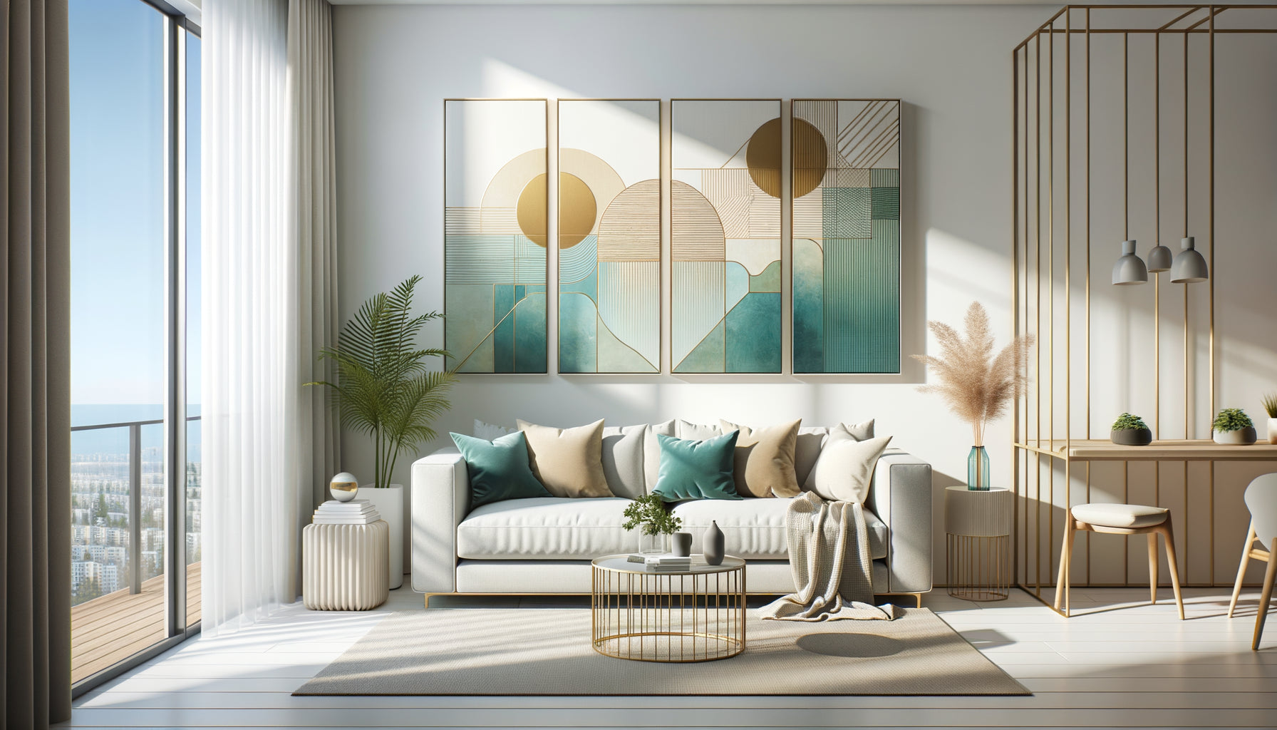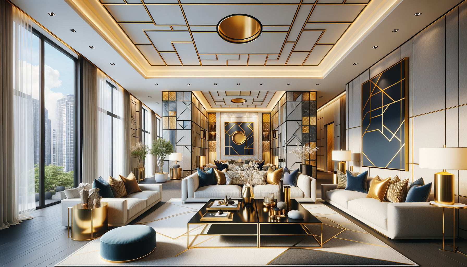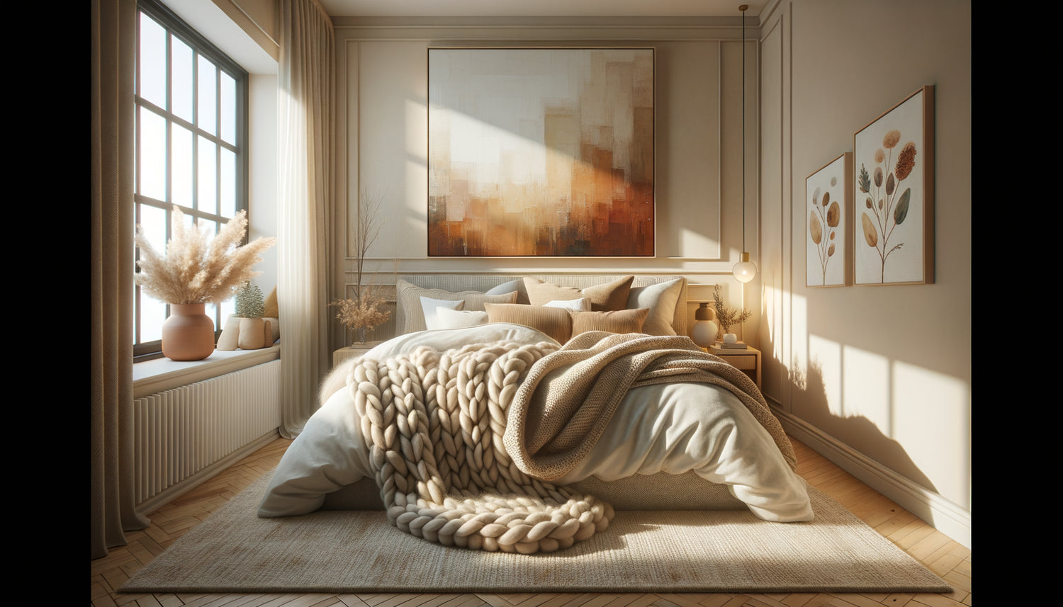
It's 6 p.m. on a Sunday in November. Outside, the rain drums against the windows. Your traveler pushes open the door of your Airbnb, drops their soaked bag... and sighs with relief. That precise moment, that transition between external chaos and inner softness, is exactly what you are looking to create. But what transforms a simple accommodation into a true cozy refuge?
Here's what a well-chosen cozy wall art brings to your Airbnb: it envelops the space with an immediate visual warmth, it slows down the mental pace of your guests as soon as they arrive, and it creates that tactile sensation of comfort that words struggle to describe. Three effects that radically transform the stay experience.
The problem? Most hosts accumulate decorative elements without understanding why some spaces breathe with comfort while others remain cold despite all their efforts. You multiply cushions, throws, candles... but the atmosphere still lacks that cozy magic that generates enthusiastic five-star reviews.
Rest assured: you don't need to rethink everything. Wall art has this unique power to diffuse an atmosphere throughout a space. A single Airbnb wall art strategically placed can redistribute the energy of an entire room, provided you understand the sensory mechanisms of coziness.
In this article, I will reveal exactly which artworks create that feeling of a cozy refuge, where to place them to maximize their enveloping effect, and how to avoid visual traps that break the cozy atmosphere. Concrete choices, tested in dozens of seasonal rentals.
The visual psychology of refuge: why some artworks literally envelop the space
Close your eyes and think about your most comforting memory. A cabin in the woods? A chalet under the snow? A library with deep armchairs? All these spaces share precise visual constants: warm tones, soft outlines, subdued lighting, an intimate scale.
Your artworks should reproduce these sensory codes. Specifically, this means prioritizing works with earthy colors - ochres, sienna earths, warm grays, deep forest greens. These shades unconsciously activate our neural associations with safety and warmth. Conversely, electric blues or icy whites, even beautiful, create an emotional distance incompatible with coziness.
Composition is as important as color. Enveloping landscapes - misty forests, rolling hills, subdued interiors - naturally invite protective retreat. Curved and organic lines relax the nervous system, unlike the aggressive angles of contemporary geometric art. You are looking to slow down the gaze, not stimulate it.
The fatal error of oversized formats
A cozy artwork should never violently dominate a room. XXL formats create impact, certainly, but rarely comfort. For a 20m² living room, prioritize medium sizes (60x80cm to 80x120cm) that interact with the space without overwhelming it. Cocooning is born from just proportion, that reassuring human scale.
The 4 types of artworks that transform an Airbnb into a refuge
After observing the best-rated rentals on the criterion of « comfort and atmosphere », four families of artworks consistently reappear. These are not coincidences, but precise responses to universal emotional needs.
1. Soothing natural landscapes
Autumn forests with russet foliage, forest paths disappearing into the mist, mountain lakes at dusk... These nature artworks act as mental windows to calm. They psychologically expand the space while creating a visual cocoon. Place them facing the main sofa: your guests will subconsciously anchor their relaxation moment in this natural escape.
2. Organic abstractions in muted tones
Not the screaming abstractions of modernism, but these soft compositions where forms blend – clouds of earthy colors, superimpositions of mineral textures, vegetable gradients. These artworks create an enveloping atmosphere without imposing a specific subject. Perfect for bedrooms: interesting enough to furnish the wall, neutral enough not to disturb sleep.
3. Intimate interior scenes
A steaming cup near a fogged window. An empty armchair facing a fireplace. A stack of books in soft light. These representations of cozy interiors act as emotional mirrors: they show the activity your guests are about to experience. Guaranteed effect in a reading corner or near the breakfast area.
4. Stylized botanicals in muted tones
Forget clinical botanical prints on a white background. I'm talking about contemporary plant representations – foliage in sage and taupe tones, abstract herbariums, minimalist branches on textured backgrounds. These botanical artworks bring the softness of life without visual agitation. Ideal for creating continuity between several rooms without monotony.

The rule of three depths to amplify the cozy effect
Here's a professional technique rarely shared: a truly cozy space plays on three levels of visual depth. Your paintings should integrate into this stratification.
Depth 1 (the foreground): your textiles, cushions, decorative objects. Depth 2 (the intermediate plane): your furniture and their arrangement. Depth 3 (the background): your walls and therefore your paintings. It is this third depth that anchors everything else.
In concrete terms? If your sofa features terracotta cushions and your plaid is mustard yellow, your painting for seasonal rentals should pick up these warm tones in a more muted, deeper version. Not a perfect match (risk of fading), but a chromatic kinship that unifies the space. The eye naturally travels between the three planes, creating this overall enveloping sensation.
The classic mistake: hanging a painting with cool tones (gray-blue) in a living room decorated with warm textiles. Your brain immediately perceives the inconsistency, and the cozy feeling evaporates. Travelers won't be able to identify the problem, but they will intuitively note that “something doesn’t work.”
Where to hang your cozy paintings to maximize their protective effect
The placement of a painting radically changes its emotional impact. The same forest landscape will create comfort above the sofa, but discomfort facing the bed (you don't want visual depth where you close your eyes).
In the living room: facing seating areas
Your guests should be able to contemplate the painting from their main relaxation position. Ideal height: the center of the painting 1.50-1.60m (approximately 5-5.25 feet) from the floor, slightly lower than the museum standard. Why? In a seated position, the natural gaze rests 10-15cm (4-6 inches) lower than in a standing position. A painting that is too high forces you to look up, creating a micro physical tension incompatible with relaxation.
In the bedroom: on the wall adjacent to the bed
Never facing the bed (too stimulating before sleep), but on a side wall or behind the headboard. A cocooning bedroom artwork should be discovered gradually, upon waking up, not imposed on tired eyes in the evening. Prioritize soft abstractions or minimalist botanicals here: enough visual presence to structure the wall, enough neutrality to avoid disturbing rest.
In the entrance: the visual promise of refuge
The first artwork your visitors see sets the tone for their entire experience. Choose a piece that announces a cocooning atmosphere: a soothing landscape, a warm interior scene, an enveloping abstraction. Absolutely avoid conceptual art or aggressive colors in this transitional area. You are creating an emotional promise that the rest of the space must fulfill.

Texture-artwork combinations that amplify the cozy feeling
A decorator's secret: cocooning arises as much from the dialogue between materials as from individual elements. Your artwork does not exist alone - it converses with the textiles, surfaces, and light sources around it.
Near a corduroy velvet sofa, an artwork with a strong painted texture (visible impasto, marked brushstrokes) creates a tactile resonance. The brain subconsciously associates visual roughness with soft touch, amplifying the feeling of comfort. Conversely, near a smooth leather banquette, prioritize artworks with more uniform surfaces - watercolors, matte photographic prints.
Frames count enormously. To maximize the cocooning effect, forget shiny metal frames or clinical white frames. Opt for natural wood frames (oak, walnut, pine) or wood painted in muted tones (taupe gray, olive green). Wood visually warms up any artwork and reinforces the sensory codes of refuge.
Also think about lighting: a cocooning artwork deserves soft light, never direct spotlights that create harsh contrasts. A table lamp whose light grazes the side of the artwork generates an incomparably more enveloping atmosphere than zenithal lighting.
Transform your rental into an unforgettable haven
Discover our exclusive collection of Airbnb art that wraps your spaces in an immediate warmth and generates enthusiastic five-star reviews.
Anti-cozy traps to avoid at all costs
Some mistakes instantly break the cozy atmosphere you are meticulously building. The most common? Mixing contradictory visual intentions. A Scandinavian minimalist painting (cool tones, white spaces, clean lines) does not harmonize well with a warm bohemian decor. You create a cognitive dissonance that prevents your guests from feeling fully comfortable.
Another trap: paintings that are too personal or controversial. A political work, a raw street photograph, an intensely expressive portrait... can fascinate, but rarely comfort. Cozying requires a form of benevolent neutrality: enough character to create an atmosphere, enough universality for everyone to project themselves comfortably.
Also beware of compositions that are too busy. A gallery wall of fifteen small frames may seem charming on Pinterest, but often creates a visually agitated effect contrary to the refuge. For cozying, prioritize fewer paintings but more impactful: one or two medium-sized pieces per main wall is quite sufficient.
Finally, avoid urban dynamic themes - skylines of metropolises, animated street scenes, energetic graphics. Even beautifully executed, these works convey the agitation that your travelers are precisely fleeing when booking your Airbnb. Cozying is the antithesis of perpetual urban movement.
How to renew the cozy atmosphere with the seasons
Here's an advanced strategy for hosts who want to maintain a high occupancy rate: subtly adapt your paintings according to the seasons. Not a complete revolution, but adjustments that extend the seasonal refuge feeling.
Autumn-winter: intensify warm tones. From forest landscapes with golden foliage to abstractions in rust and chocolate tones, from scenes of interiors with suggested fireplaces. Your travelers are then looking for protective retreat, comfortable hibernation. Your Airbnb art must amplify this expectation.
Spring-summer: lighten the palette slightly without abandoning softness. Lighter greens but still muted (sage, eucalyptus), warm blues (blue-gray, soft petrol), more airy natural scenes but still enveloping - clearings rather than dense forests. Summer cozying is lighter but just as comforting.
This seasonal rotation has a major commercial advantage: it renews the interest of loyal travelers and generates different photos on your listing, suggesting a living space that is carefully maintained.
You don't need to multiply investments. Keep your major artworks (those in the living room and main bedroom) and vary only 2-3 secondary rooms (entrance, dining area, guest room). That’s enough to refresh the overall atmosphere without diluting your visual identity.
Conclusion : from decor to emotional refuge
Now imagine your next travelers. They cross the threshold after a tiring journey. Their gaze glides over the woodland scene above the sofa, lingers on the gentle abstraction of the bedroom, captures the intimate scene in the entrance. Unconsciously, their breathing slows down. Shoulders relax. They have just found their refuge.
This isn't decoration. It’s visual hospitality. Your cocooning artworks work silently to create that rare sensation of being exactly where you should be, protected, welcomed, comforted. This emotion translates directly into enthusiastic reviews, repeat bookings, and spontaneous recommendations.
Start simply: identify your main wall, the one your guests naturally contemplate while relaxing. Find the artwork that breathes enveloping softness, that slows down time rather than accelerating it. Hang it at eye level when seated. Observe the transformation. The cozy refuge is not born of chance, but of precise and intentional visual choices. You have just made the first.
FAQ : Cocooning artworks for Airbnb
How many artworks are needed in an Airbnb to create a cocooning atmosphere without overwhelming the space?
The golden rule is simple: one to two artworks per main room, never more than three even in large spaces. For a typical T2 apartment, aim for 4-5 artworks in total: one large format in the living room (above the sofa), one medium format in the bedroom (side wall), one in the entrance, possibly one small in the bathroom and one in the dining area. Cocooning is born of visual breathing space: each artwork should have enough empty space around it to breathe. A bare wall with a single beautiful artwork creates infinitely more refuge than a wall saturated with frames. Always prioritize quality over quantity - an excellent cocooning artwork of medium size will have more impact than five small generic prints. If a room seems empty despite a well-chosen artwork, the problem rarely comes from the number of works, but rather from their size (too small) or location (too high, off-center). Remember: in a cozy refuge, every element counts and is noticed. Overload dilutes the intention.
What colors of artworks should be prioritized for a cocooning Airbnb that appeals to all travelers?
Earthy and muted tones are your best guarantee of universality: ochres, soft terracotta, deep forest greens, warm grays (taupe, greige), nuanced beiges, rust, chocolate. These colors subconsciously activate our associations with nature, warmth, and security - universal emotions beyond personal preferences. Complement with touches of deep but never garish colors: stormy blue-gray, sage green, muted mustard, extinguished burgundy. Absolutely avoid saturated and primary colors (bright red, electric blue, lemon yellow) which strongly divide tastes and stimulate rather than soothe. Pure whites and blacks create contrasts that are too harsh for a cozy atmosphere - if you like neutrals, prefer cream off-whites and grays diluted in anthracite. A professional tip: mentally test your paintings in the light of a rainy late afternoon. If the colors remain warm and welcoming in this gray and dull light, they will work perfectly to create a cozy retreat. If they become dull or cold, look for richer tones. Cocooning requires colors that generate their own visual warmth, regardless of outside lighting.
Is it better to have framed or unframed paintings for a cocooning atmosphere in a vacation rental?
To maximize the cozy effect, always prefer framed paintings, but not just any kind. A frame fulfills three essential functions: it protects the artwork (crucial in a rental with rotating tenants), it visually structures the wall by creating a clear boundary, and above all, it adds material depth that amplifies the feeling of warmth. Choose frames made of natural wood (light oak, walnut, pine) or painted wood in muted tones aligned with your palette (taupe gray, olive green, cream white). Gold or silver metal frames, even thin ones, create a formality incompatible with a cozy retreat - reserve them for classic or glamorous styles. The ideal thickness is between 2 and 4 cm: enough presence to anchor the painting, not enough to dominate it. Very thin frames (less than 1 cm) give an impression of fragility and temporality that weakens the cocooning effect. Unframed canvases (painted edges) can work for contemporary abstract works, but lose the depth and finished look subconsciously expected by travelers. A painting Airbnb well framed immediately communicates: this space is thought out, cared for, stable - exactly the qualities of an authentic refuge. Invest in mid-range quality frames: they will transform even affordable prints into legitimate and durable decorative elements.