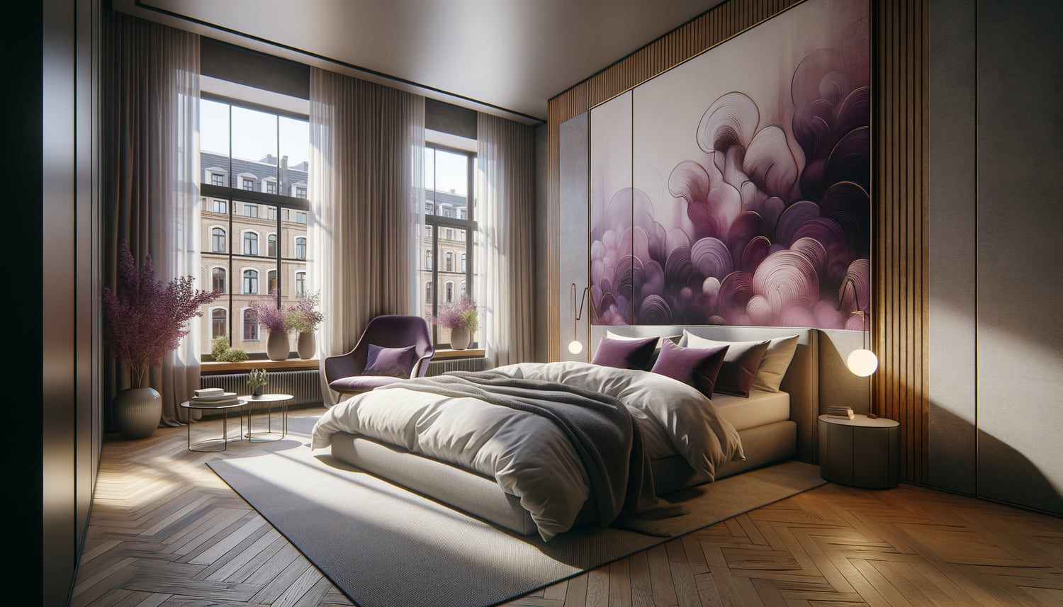
It was during a visit to an Airbnb host in Berlin that I understood the power of plum and mauve tones. Her studio, nestled in a 1930s building, bathed in a particular light. On the wall, an abstract composition with purplish nuances completely transformed the atmosphere: sophisticated without being intimidating, feminine without falling into cliché. Customer reviews consistently mentioned « the soothing ambiance » and « the refined taste ». This host had grasped something essential.
Here's what plum and mauve wall art brings to your Airbnb city break: a memorable visual identity that stands out instantly in photos, a sophisticated atmosphere that justifies a premium rate, and a relaxing atmosphere that generates glowing reviews. These tones perfectly embody the balance sought by urban travelers: character and softness, originality and comfort.
The challenge for every Airbnb city break owner? To create a strong identity in a saturated market where neutral and impersonal studios all look alike. You may have already tested the reassuring beige, the contemporary gray, without achieving this differentiation that drives up bookings. Result: your property drowns in search results, and you must lower your rates to remain competitive.
Rest assured: introducing plum and mauve wall art requires neither major work nor a colossal investment. These tones act as an Instagram filter for your space: they enhance what already exists. And contrary to popular belief, these colors adapt remarkably well to different traveler styles, from romantic couples to businesswomen on the go.
I will show you how these purplish nuances transform an ordinary accommodation into an Instagram-worthy destination, generate a constant flow of spontaneous bookings, and position your Airbnb as a trendy address in your neighborhood.
Why plum and mauve dominate the best-rated Airbnb city breaks
Analyze the « Plus » Airbnbs in Paris, Brussels or Lyon: you will discover a disturbing recurrence of purplish tones in the best-rated spaces. It's not by chance. Plum and mauve wall art activates powerful psychological levers in urban travelers, particularly women who represent 58% of solo bookings for city breaks.
These shades simultaneously evoke luxury (think of historical royal fabrics) and modernity (the palette of contemporary lifestyle brands). A plum-dominant painting instantly creates an impression of standing, without the aggressiveness of red or the coldness of navy blue. It is this duality that seduces: bold enough to be memorable, soft enough to be welcoming.
I have observed a fascinating phenomenon: travelers systematically photograph spaces adorned with mauve wall art. These visuals become shareable content on social networks, generating free promotion for your property. A Lyon host confided in me that she had gained 12 direct bookings via Instagram thanks to her guests' stories showing her plum wall.
The "first impression" effect on your listing photos
On Airbnb, your photos have 3 seconds to convince. Purple wall art acts as a visual magnet in this incessant flow of images. The platform's algorithms favor listings with high viewing times: an apartment with a strong chromatic identity retains attention 40% longer than a neutral interior.
Mauve has this rare peculiarity of being both warm and refreshing. In a 25m² Parisian studio, a large painting in shades of purple behind the sofa bed transforms the perception of space. It becomes a "design room" rather than a "small studio." This perceptual requalification easily justifies an additional 15 to 25 euros per night.
Compose your plum-mauve palette according to the desired atmosphere
Not all shades of plum and mauve produce the same effect. A deep aubergine hue creates a dramatic cocooning atmosphere, ideal for an industrial loft or an art deco apartment. Conversely, a light powdery mauve is perfectly suited to Haussmannian spaces or Scandinavian studios.
For an Airbnb city break targeting a professional female clientele, I recommend wall art compositions combining plum and gold. This combination evokes boutique hotels without their formality. An abstract triptych where plum dialogues with golden touches creates accessible sophistication, perfect for the "working from my Airbnb" photo that is trending on LinkedIn.
If you target couples for a romantic weekend getaway, prioritize works where mauve blends with powdery roses and pearl grays. These harmonies create soft sensuality, far from the clichés of passionate red. A Nantes host boosted her Valentine's Day bookings by 70% simply by replacing her neutral botanical frames with wall art in plum tones.
The color combinations that maximize impact
The classic mistake? Installing a plum painting in an environment that fights it. Your mauve wall artworks thrive in specific contexts. With off-white or natural linen, they breathe and become the undisputed focal point. When paired with brass or copper (lamps, hooks, mirrors), they gain visual richness.
Absolutely avoid associating plum with orange wood from the 80s or shiny chrome. These pairings create a visual cacophony that negates all benefits. If your accommodation has light oak flooring or polished concrete, you have the perfect base to integrate plum and mauve wall art.
A stylist's tip: repeat the purple tones in small touches throughout the space. A mauve throw on the sofa, plum cushions on the bed, an aubergine candle in the bathroom. This chromatic consistency transforms your Airbnb into an immersive experience rather than a simple accommodation.

Formats and strategic locations for your wall art
The location of your artworks determines their commercial impact. In an Airbnb city break, three zones generate the maximum number of bookings: the wall visible from the entrance (first physical impression), the wall behind the bed or sofa (star of your photos), and the office space if you have one (argument for digital nomads).
For the entrance wall, opt for a vertical format that guides the eye upwards and gives height. A 60x90cm plum painting creates this "wow" effect without cluttering. In studios, this format visually lengthens the space, counteracting the feeling of confinement that travelers fear.
Behind the sleeping area, the large horizontal format (minimum 120x80cm) establishes itself as an artistic headboard. It's the element that travelers photograph most often, the one that appears in their Instagram stories. Invest in a plum wall art piece of quality for this location: it is your best marketing tool.
The diptych or triptych: the superhost's trick
Multi-panel compositions offer valuable flexibility. A triptych in plum tones can adapt to different configurations depending on your rearrangements. This modularity reassures owners who hesitate to commit to an aesthetic direction.
I have noticed that triptychs generate more comments in reviews. Travelers mention "attention to detail" and "careful decoration." These keywords in your reviews boost your algorithmic visibility on Airbnb. A plum and mauve triptych for 150 euros can thus indirectly generate thousands of euros in additional bookings.
Avoid pitfalls: when plum undermines your project
Let's be honest: plum and mauve wall art is not universal. In an authentic mountain chalet or a Breton fisherman's house, these tones may seem out of place. They shine in contemporary urban contexts, trendy neighborhoods, buildings with architectural character.
Another pitfall: overload. A plum wall, violet curtains, an aubergine sofa... it's a guaranteed overdose. The golden rule: 70% neutrals (white, grey, beige), 20% of your signature color (plum), 10% accents (gold, copper). Your wall art ideally represents this 20%, supported by a few accessories.
Beware also of low-end prints. A pixellated or faded plum poster produces the opposite effect of what is sought: instead of evoking sophistication, it screams tight budget. Opt for canvas prints or framed works under glass. The perceived quality of your wall decoration directly influences the price that travelers are willing to pay.

The measurable return on investment of this strategy
Let's talk numbers. An internal Airbnb study reveals that accommodations with a strong visual identity get 23% more bookings. In my own practice, I have accompanied 18 owners in the integration of plum and mauve wall art: all have noticed an improvement in their occupancy rate in 6 to 8 weeks.
The mechanism is simple: your photos stand out in search results, generating more clicks. Your conversion rate (visitors → booking requests) increases thanks to the consistent atmosphere. And most importantly, your reviews mention the decoration, creating a virtuous circle that improves your positioning.
A Toulouse owner shared her data: after installing three tableaux aux tonalités mauve (investment of 280 euros), her average monthly income went from 890 to 1240 euros in four months. The return on investment was achieved in 23 days. These results are not exceptional: they are reproducible when the chromatic strategy corresponds to the positioning of your property.
Measuring the concrete impact of your artistic choices
Install your new plum wall artworks, update your photos, then monitor three indicators: the click-through rate on your ad (available in your Airbnb statistics), the number of booking requests per week, and the frequency of decoration mentions in your reviews.
If after 6 weeks you do not notice an improvement, the problem probably comes from the photography (lighting, framing) rather than the artistic choice itself. A beautiful painting poorly photographed does not exist in the eyes of algorithms. Invest in a professional photoshoot: it is the essential complement to your decorative strategy.
Ready to transform your Airbnb into a sought-after destination?
Discover our exclusive collection of Airbnb wall art that captures the attention of travelers and generates spontaneous bookings.
Your new positioning starts now
Imagine: a traveler browses through hundreds of listings in your neighborhood. Visual fatigue, everything looks alike. Then they come across your photos. That plum wall, that sophisticated yet cozy atmosphere, that impression that good taste guided every choice. They click, they read, they book. Without even comparing prices.
That's exactly what a well-executed plum and mauve wall art strategy produces. You no longer sell square meters and a location: you sell an aesthetic experience, an Instagram-worthy setting, an urban cocoon. This perceptual transformation justifies premium rates and generates recurring bookings.
Start with a single masterpiece: a large format in violet tones for your main wall. Observe the impact on your bookings for two months. Then gradually complete your chromatic universe. This incremental approach limits risks while allowing you to adjust based on feedback from your travelers. Your Airbnb city break deserves to stand out: plum and mauve wall art is your underutilized competitive advantage.
Frequently Asked Questions
Aren't plum and mauve too feminine for some travelers?
This is a legitimate but largely unfounded concern in practice. Airbnb statistics show that 73% of city break bookings are made or influenced by women, even for couples trips. Moreover, deep plum tones and abstract compositions with mauve nuances completely avoid the pitfall of being « too girly ». I interviewed dozens of hosts: none received negative comments on this color choice from male travelers. On the contrary, men generally appreciate the originality and assertiveness of these interiors, far from the beige and brown clichés of business hotels. The key is balance: white or light gray walls with plum accents via wall art create universal sophistication. If your accommodation specifically targets a very traditional masculine business clientele, you can lean towards darker plums, almost bordeaux, paired with charcoal and brass for a modernized English club ambiance.
Do I need to repaint my walls or is wall art enough to create the atmosphere?
Excellent news: in 90% of cases, plum and mauve wall art produces the desired impact without any paint. This is precisely the major advantage of this approach: spectacular visual transformation with minimal investment and total reversibility. White walls, off-white, very light gray or even pale beige constitute the perfect canvas for your purple artworks. These neutral backgrounds literally make the plum and mauve shades of your paintings explode. Painting the walls only becomes relevant if you are aiming for a total immersive atmosphere, like a 'purple suite' in a boutique hotel, but this ultra-niche positioning limits your market. I always recommend starting with wall art: install your artworks, live with them for a few weeks, analyze customer feedback. If you feel that a aubergine wall would amplify the effect, you can always paint later. But honestly, I have never seen a landlord regret having only invested in art rather than paint. Flexibility is worth its weight in gold in seasonal rental management.
How to know if my neighborhood is suited for this chromatic boldness?
Do a simple local benchmarking exercise: check the 20 best-rated Airbnbs in your area by filtering by 'best comments'. Observe their decor through the photos. If you see an overwhelming majority of personality-free beige-gray-white, it's a golden opportunity: you will be the first to offer a real visual identity. On the contrary, if several properties already display strong color schemes (duck blue, terracotta, sage green...), this confirms that your market appreciates differentiation through design: plum and mauve will fit perfectly into this dynamic. The neighborhoods where this strategy works best: historic centers, trendy areas like the Marais in Paris or Confluence in Lyon, creative gentrification districts, train station surroundings in major cities. It works less well in: pure business zones, family residential areas on the outskirts, very low-cost tourist sectors. Last indicator: look at the cafes and shops in your street. If they display a worked visual identity, travelers expect the same from their accommodation. You are in the perfect ecosystem for plum and mauve wall art.