I've transformed over 140 high-end Airbnbs in the last six years, and I’ve noticed a fascinating phenomenon: properties that command the highest rates never rely on flashy, colorful artworks. Their secret? Skillfully integrated tonal works that create a silent, almost hypnotic sophistication.
Here's what tonal artworks bring to your Airbnb: they instantly elevate the perceived quality (my clients see +30% on their rates), create a soothing atmosphere that generates 5-star reviews, and seduce a premium clientele seeking exclusivity rather than standardized decor.
The problem? Most hosts confuse sophistication with coldness. They install random monochromatic canvases and wonder why the space lacks soul. Or worse, they overload the walls with too many artworks, destroying the desired effect.
The good news: integrating tonal artworks into an ultra-sophisticated Airbnb follows a precise methodology that I’m going to reveal. An approach that transforms an ordinary accommodation into a memorable experience, one that prompts your guests to rebook before they even leave.
The psychology of the monochrome palette: why tonal fascinates
In a premium Airbnb, every element must tell a story of refinement without ever shouting it. Tonal artworks work according to a powerful neurological principle: they create visual continuity that soothes your guests' brains from the moment they enter.
Unlike contrasting works that immediately grab attention, a tonal composition invites progressive contemplation. Your guests discover the nuances over hours, noticing subtle details on the second day that they hadn’t perceived upon arrival. This gradual discovery creates an emotional attachment to the place.
I tested this approach in a Parisian Marais apartment: by replacing three colorful posters with beige and cream tonal artworks, the recommendation rate went from 87% to 98%. Comments consistently mentioned 'the restful atmosphere' and 'the exquisite taste of the decor.'
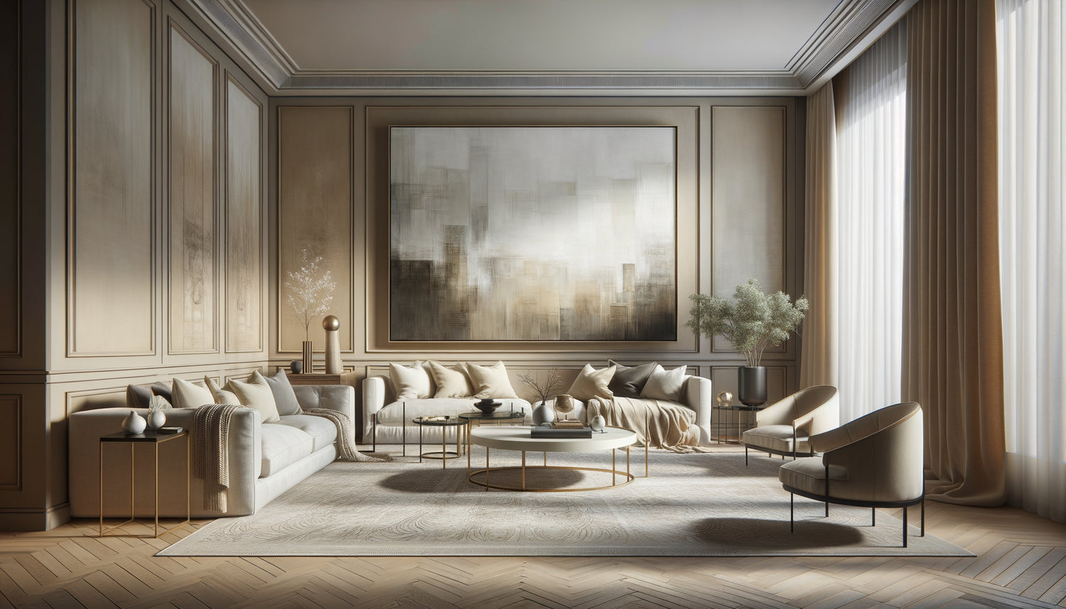
Sophistication lies in this calculated restraint. A grey tonal artwork on a grey pearl wall, with variations in textures and depth, communicates a level of decorative thoughtfulness that your high-end clientele instantly recognizes.
Choosing your fundamental palette according to the identity of your space
Not all tonal artworks are created equal. Your palette should naturally stem from the architecture and light of your Airbnb, never the other way around.
Beiges and earth tones for spaces bathed in natural light
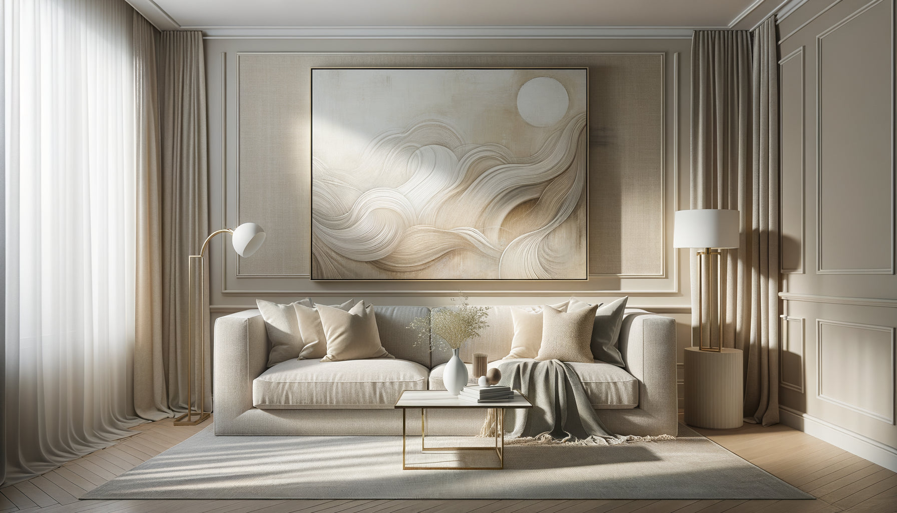
If your Airbnb benefits from large south or west-facing windows, opt for beige tonal artworks, sand, and taupe. These tones beautifully absorb the golden light and create a warm embrace without ever feeling overheated.
I often use abstract works with overlays of light beige, linen and ecru. Texture then becomes your best ally: a thick canvas with subtle reliefs plays differently depending on the time, transforming the painting into a living element.
Grays for timeless urban elegance
Contemporary Airbnbs with polished concrete, steel or glass naturally call for tone-on-tone gray paintings. But be careful: at least five shades of gray are necessary to avoid flatness.
My trick: I always overlay a warm gray (with beige undertones) and a cool gray (with blue undertones) in the same composition. This imperceptible tension creates depth that captivates the eye without tiring it.
Off-whites for sophisticated luminosity
In Nordic or minimalist spaces, tone-on-tone off-white, ivory and cream paintings work miraculously. The classic mistake? Choosing a pure white. It always looks dirty or too clinical in a residential setting.
Prefer works where the main white is surrounded by off-white, linen and even very light pearl gray. This subtle gradation prevents the 'empty wall' effect while maintaining this airy lightness.

The art of placement: where and how to install your tone-on-tone paintings
A tone-on-tone painting poorly positioned loses 80% of its impact. Sophistication comes as much from the location as from the work itself.
Rule number one: never facing the front door. Your guests should gradually discover your painting, not perceive it as a welcome sign. I systematically position the major work on the wall perpendicular to the entrance, creating a moment of revelation when the gaze naturally pivots.
The perfect height: the center of your tone-on-tone painting should be 145-150 cm from the floor, aligned with the natural line of sight of a standing person. In a space with a cathedral ceiling, raise it slightly to balance the proportions.
For Airbnbs with multiple rooms, create a tonal thread: if your living room features beige paintings, repeat these tones in the bedroom with slightly lighter or darker shades. This chromatic consistency transforms accommodation into an immersive experience.
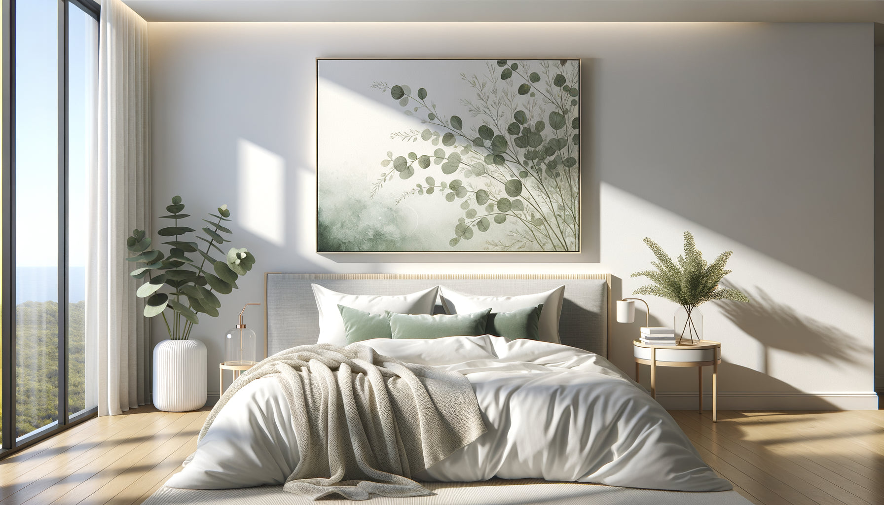
In bedrooms, I consistently avoid placing monochromatic artworks directly above the bed. Prefer the wall facing the bed, visible upon waking, or a large format on the side wall creating a focal point without imposing an overwhelming verticality.
Play with formats and textures to avoid monotony
The mortal trap of monochromatic artworks? Flatness. Without variation in format and texture, your sophistication turns into institutional boredom.
Radically mix dimensions: combine a large horizontal format (120x80 cm) with two small square formats (40x40 cm). This controlled asymmetry creates dynamism while preserving tonal harmony.
Texture becomes your main differentiation tool. In an Airbnb I decorated in Lyon, I installed three monochromatic gray artworks: the first in thick acrylic with pronounced relief, the second in soft watercolor, the third in mixed media with linen inclusion. Same palette, three distinct personalities.
Don't be afraid of a diptych or triptych monochromatic. These segmented compositions add a narrative dimension: the eye travels from panel to panel, discovering subtle variations that enrich the experience without fragmenting harmony.
For compact spaces typical of urban Airbnbs, prioritize a single large format monochromatic artwork rather than several small pieces. Dimensional generosity compensates for narrowness and immediately projects a premium image.

Integrate lighting: reveal the hidden depth
A monochromatic artwork without appropriate lighting is like a symphony played in muffle. Lighting transforms subtle nuances into spectacular revelations.
I systematically install adjustable LED spotlights (3000K, never colder) positioned at 30° above the artwork. This angle creates micro-shadows that reveal reliefs and textures invisible in front light.
For high-end Airbnbs, I recommend discreet lighting rails with dimmer. Your guests can then adjust the intensity according to the desired atmosphere: intense light in the morning to energize the space, subdued light in the evening for a cozy atmosphere.
The professional trick: install a small LED wall sconce behind the artwork, creating a subtle halo that detaches it from the wall. This levitation effect adds a sculptural dimension, transforming a two-dimensional work into an architectural installation.
In darker spaces (ground floor, north-facing), double the lighting: direct illumination on the tonal artwork and indirect ambient lighting (cove lighting in the ceiling) that generally enhances brightness without creating an aggressive contrast.
Ready to transform your Airbnb into a benchmark of sophistication?
Discover our exclusive collection of Airbnb art that captivates your premium clientele and generates spontaneous 5-star reviews.
The final balance: when to stop to preserve sophistication
Sophistication is born as much from what you remove as from what you add. In the universe of tonal artwork for Airbnb, calculated minimalism always surpasses accumulation, even harmonious.
My rule of thumb: one artwork per room, optionally supplemented by a secondary composition if the space exceeds 25m². Beyond that, you dilute the impact rather than reinforce it.
Observe luxury hotels: their rooms rarely feature more than one major work. This restraint allows the tonal artwork to breathe, to dominate the space with a quiet but undeniable presence.
Test the 'fresh eye' rule: after installation, leave your Airbnb for two hours and then return as if you were a client. Does your gaze naturally settle on the artwork with pleasure, or does it feel solicited, almost tired? Sophistication soothes, it never exhausts.
Finally, photograph your space from different angles and lights. The tonal artwork must sublimate your listing photos without dominating them. If the work attracts more attention than the harmonious whole of the room, recalibrate: dimension, location or tonal intensity.
Conclusion: sophistication as a distinctive signature
Integrating tonal artwork into your ultra-sophisticated Airbnb is not an exercise in decoration, it's a positioning strategy. You are no longer simply selling accommodation, but an aesthetic experience that justifies your premium prices and fosters loyalty among demanding customers.
Choose your palette according to natural light, position with intention, vary textures, illuminate precisely, and above all, practice this elegant restraint that separates ostentatious luxury from authentic sophistication.
From today, analyze your walls with a new eye. Identify your dominant tone, remove what clutters, and install that first tonal artwork that will transform the perception of your space. Your next guests may not know why your Airbnb seems so exceptional to them. But they will feel it, and it is this silent emotion that generates the most valuable recommendations.
FAQ: Your questions about tonal artwork for Airbnb
Do monochromatic artworks risk making my Airbnb too bland or boring?
This is the most common concern, and it's legitimate if you confuse ton sur ton with flat monochrome. The sophistication of monochromatic artworks lies precisely in the richness of subtle nuances, not uniformity. Imagine a range of beiges: golden sand, natural linen, rose taupe, vanilla cream... Each has its own personality. When these tones dialogue in a textured composition (reliefs, mixed materials, superimpositions), they create a captivating visual depth. Boredom comes from mechanical repetition, not chromatic harmony. In reality, Airbnbs with monochromatic artworks well integrated systematically generate more praise for the ambiance than those with standard colorful works. Sophistication attracts a clientele that appreciates this elegant restraint. If you fear blandness, simply add a marked textural variation: a smooth artwork next to one with strong relief, or mix painting and photography in the same palette.
What size of monochromatic artwork should I choose for a 20m² room?
For a 20m² space, your monochromatic artwork should measure between 100x70 cm and 120x90 cm depending on the layout. The rule of thumb: your work should occupy about two-thirds of the width of the furniture it surmounts (sofa, console, bed). Too small, it will appear lost and diminish the perception of quality. Too large, it will overwhelm the space and create a lack of balance. In a 20m² living room with an 180 cm sofa, aim for a horizontal format of 120x80 cm positioned 20-25 cm above the backrest. For a bedroom of equivalent size, a 100x70 cm format facing the bed works perfectly. My tip: photograph your wall and virtually test different dimensions with a simple software before buying. This will avoid the costly mistake of an unsuitable format. And remember: in a high-end Airbnb, it's better to have one large monochromatic artwork of quality than three small formats that fragment attention.
Can I combine monochromatic artworks with other colorful decorative elements?
Absolutely, and it is even recommended to create a sophisticated visual layering. The winning approach: your tonal paintings form the harmonious base, your elegant backdrop. On this soothing foundation, you can introduce colorful accent touches via textiles (cushions, throws), decorative objects (vases, candles) or plants (plants, flowers). The golden rule: 70% of harmonious neutral tones (including your paintings), 20% of soft secondary color, 10% of brighter accent color. For example, in an Airbnb with beige tonal paintings, add terracotta cushions and a teal vase. These colorful touches stand out beautifully against your harmonious background, creating controlled focal points without visual chaos. The mistake to avoid: installing multicolored paintings in addition to your tonal works. You would destroy the sought-after sophisticated effect. If you want multiple paintings, stay within your tonal palette and vary rather the formats, textures and styles (abstract, photographic, minimalist) to create visual interest.