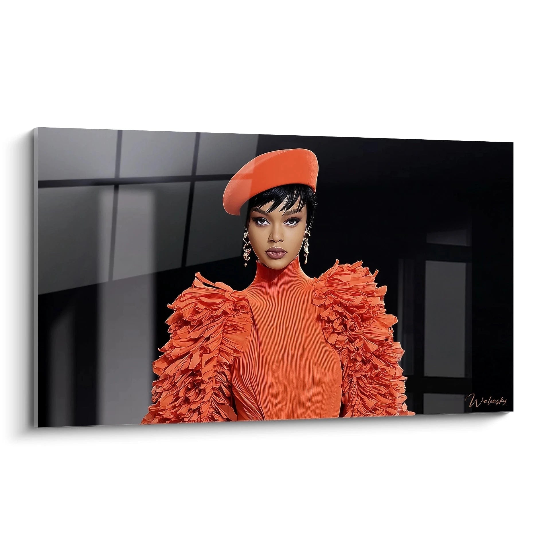
A high fashion red wall art radically transforms the atmosphere of a luxury space by bringing visual intensity comparable to the runways of great Parisian fashion houses. This powerful chromatic signature instantly evokes the boldness and refinement of haute couture creations where red traditionally embodies creative passion and artisanal excellence. Designed for demanding interiors, these monumental paintings feature sophisticated crimson ranges that dialogue with noble materials such as velvet, lacquer or precious woods.
Red as a Signature of Elegance in Exceptional Interiors
Integrating a high fashion red wall art into a reception space represents a strategic choice comparable to selecting an iconic evening gown. This powerful hue demands an environment worthy of its intensity, favoring high ceilings and generous spaces where its monumental presence can fully express itself. Interior architects exploit this chromatic dominance to create magnetic focal points in prestigious entrance halls, reception lounges or corporate representation areas.
Which red nuances should be prioritized for a luxury environment?
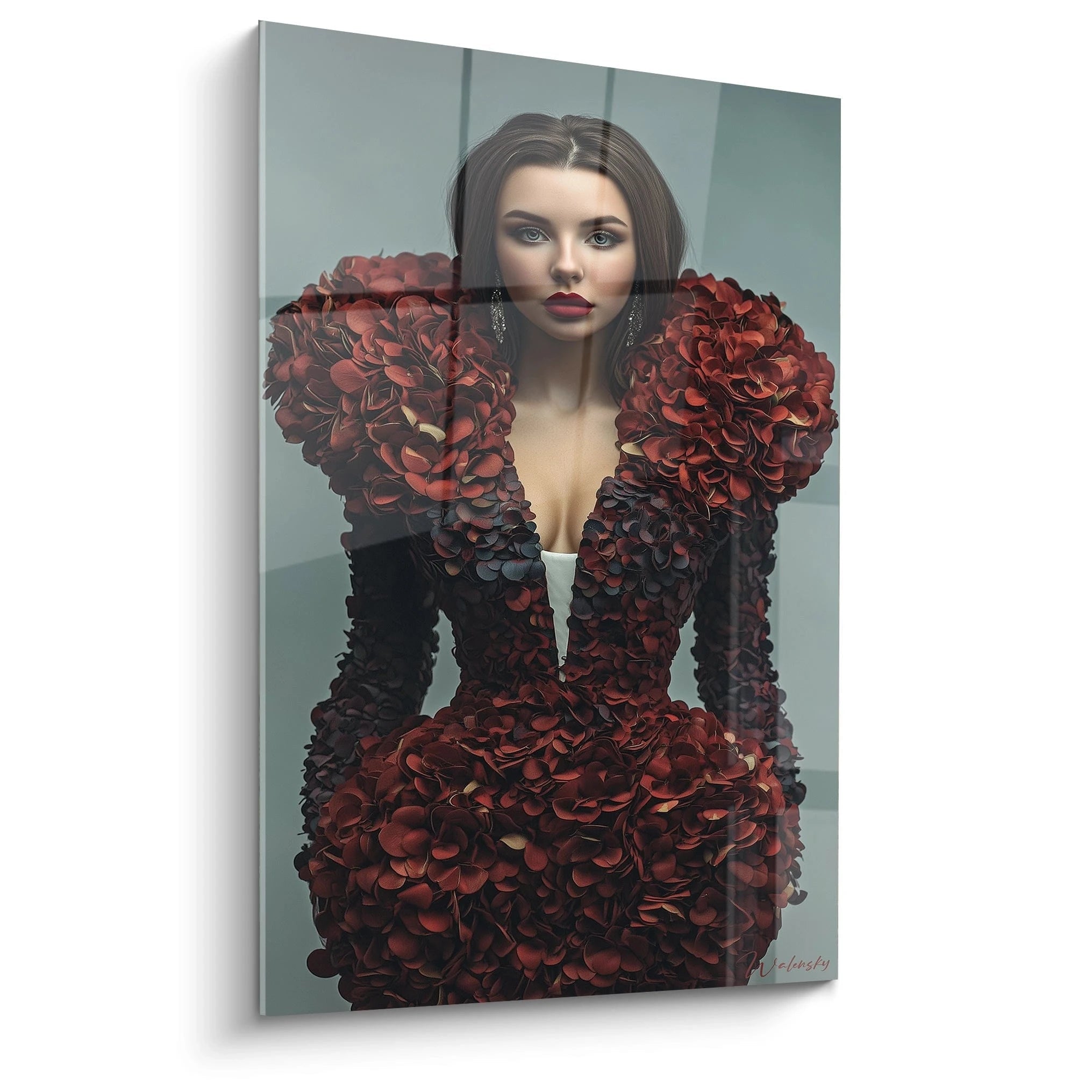
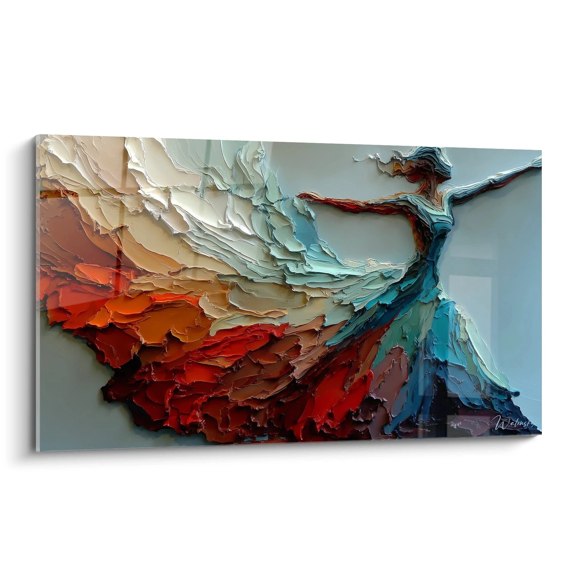
The most sought-after variations oscillate between deep burgundy red evoking theatrical velvets, luminous vermillion inspired by Asian lacquers, and intense carmine recalling historical pigments used by master painters. These chromatic variations allow the work to adapt to the desired ambiance: dark, quilted red for intimate libraries, vibrant lacquered red for minimalist contemporary spaces. Interaction with natural lighting transforms these nuances throughout the day, creating constantly renewed visual dynamics.
Association with noble materials and refined textures
A large-format high fashion red wall art naturally dialogues with veined marbles, waxed woodwork and precious metals. This chromatic synergy recalls the codes of couture workshops where sumptuous fabrics and impeccable finishes respond to one another. Professionals recommend accompanying these works with furniture featuring clean lines in neutral tones—pearl gray, off-white, anthracite—so the artwork retains its status as visual protagonist. Upholstery textiles can echo touches of red as counterpoint, creating a balanced chromatic choreography.
The psychological dimension of red in professional spaces
In prestigious corporate environments, using a monumental red painting transmits subliminal messages of dynamism, ambition and leadership. This decorative strategy is particularly observed in international law firms, luxury group headquarters or flagship boutiques where immediate visual impact builds brand identity. For those exploring less figurative compositions, a high fashion abstract wall art can offer a complementary approach while preserving this sought-after chromatic intensity.
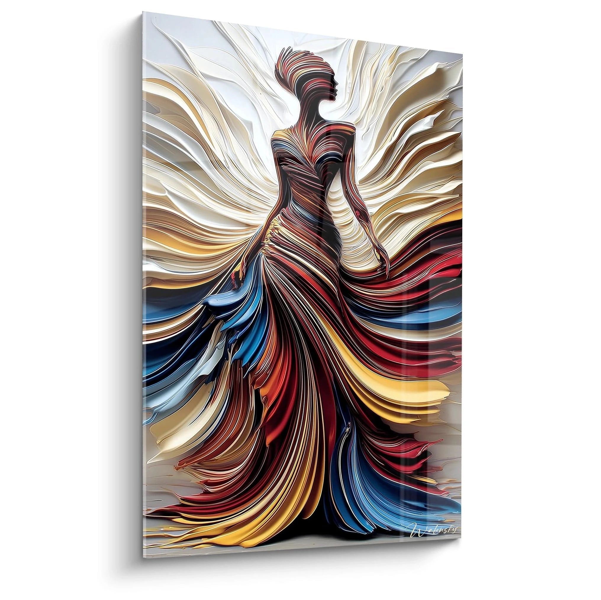
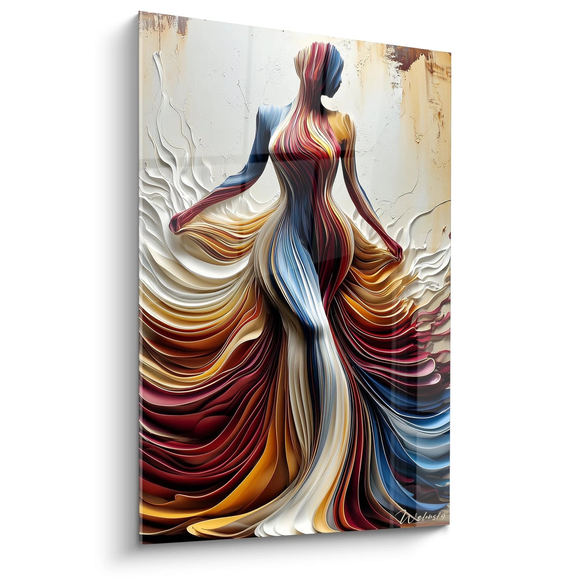
Chromatic Variations of Red in the Fashion Universe
From ruby to garnet: understanding undertones
An authentic high fashion red wall art rarely explores pure primary red, preferring the chromatic complexities found in exceptional textile collections. Ruby nuances incorporate reddish undertones that soften intensity, while garnet reds incorporate brown touches creating near three-dimensional depth. These subtle variations determine final harmony with the environment: cool reds with bluish nuances harmonize with refined Scandinavian interiors, while warm orangey reds warm spaces with gray dominance.
How does red interact with light architecture?
The perception of a large-format red painting evolves radically depending on the space's light exposure. Facing south-oriented bay windows, saturated red retains its intensity in daylight while developing unexpected light reflections. Conversely, in softly lit spaces like gourmet restaurants or luxury spas, deep red absorbs light to create an enveloping, intimate atmosphere. Professionals recommend installing accent lighting with neutral color temperature (3000-3500K) to preserve chromatic fidelity without altering subtle nuances.
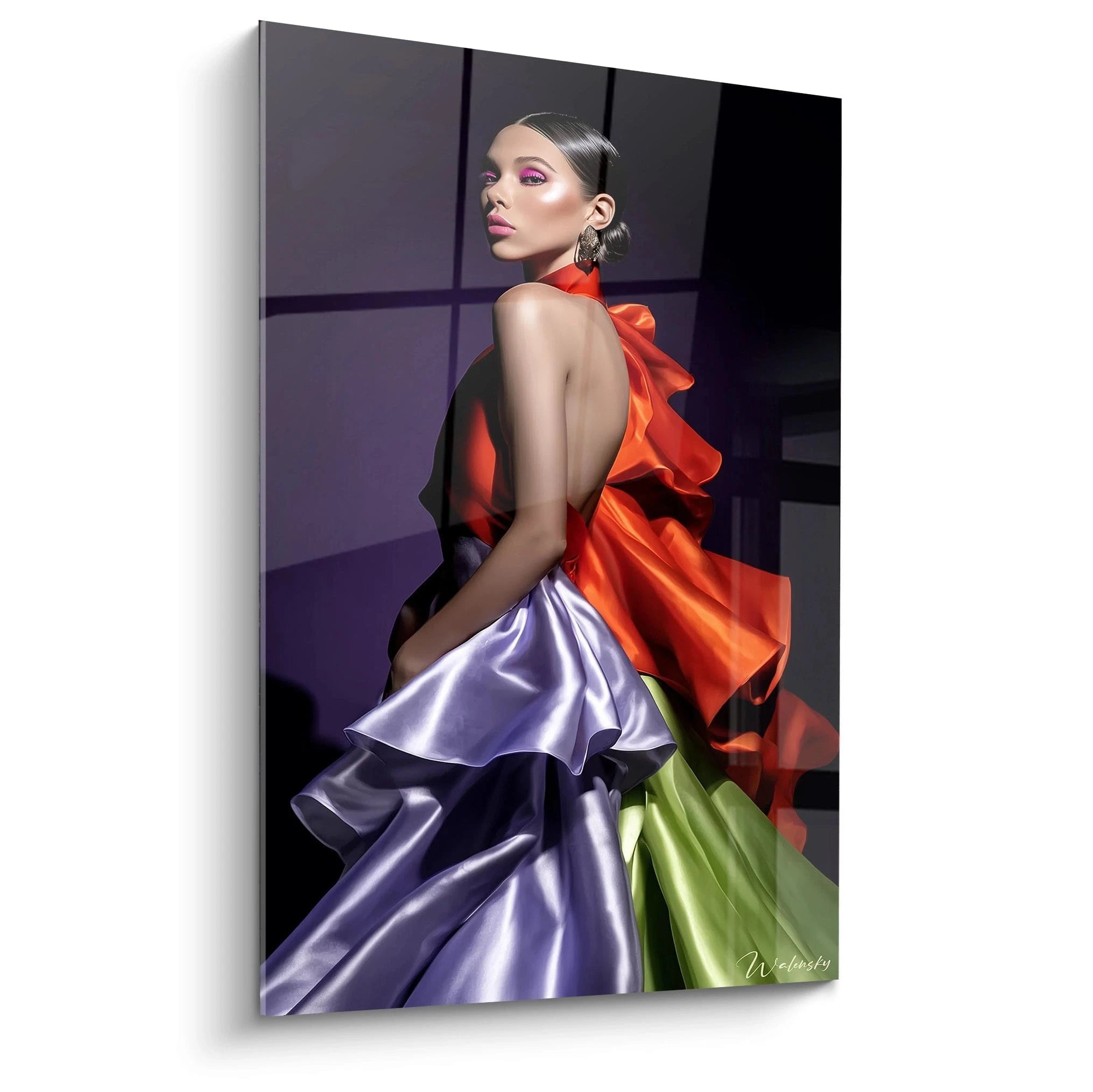
Bold chromatic combinations inspired by fashion runways
The haute couture universe teaches the art of unexpected chromatic associations that can be transposed into interior decoration. A fashion red painting enriches visually when it dialogues with:
- Gold or copper accents recalling metallic embroidery on gala gowns
- Emerald green in discrete touches, creating sophisticated complementary contrast
- Deep black that structures composition and reinforces red's impact
- Textured neutrals (natural linen, limestone) that calm chromatic intensity
Errors to avoid when integrating dominant red
The most frequent failure consists of multiplying red sources in the same space, creating fatiguing visual saturation. A monumental high fashion red wall art must reign supreme, accompanied by 80% neutral tones so its impact remains optimal. Also avoid association with different red hues (mixing an orangey red and raspberry red) which create chromatic dissonance. Finally, underestimating necessary scale constitutes a recurring error: these works demand generous formats to deploy their full theatricality.
Architectural Scenographies Around High Fashion Red
Installation in double-height and cathedral volumes
Spaces with double height offer ideal terrain for exceptional-scale high fashion red wall art. These vertical volumes accommodate compositions of 2 to 3 meters in height that establish direct dialogue with architecture. Installation on raw concrete creates striking contrast between red's organic warmth and the support's mineral coldness. Rehabilitated lofts, urban penthouses and contemporary architect villas particularly exploit this synergy where the work becomes space-structuring element rather than mere decoration.
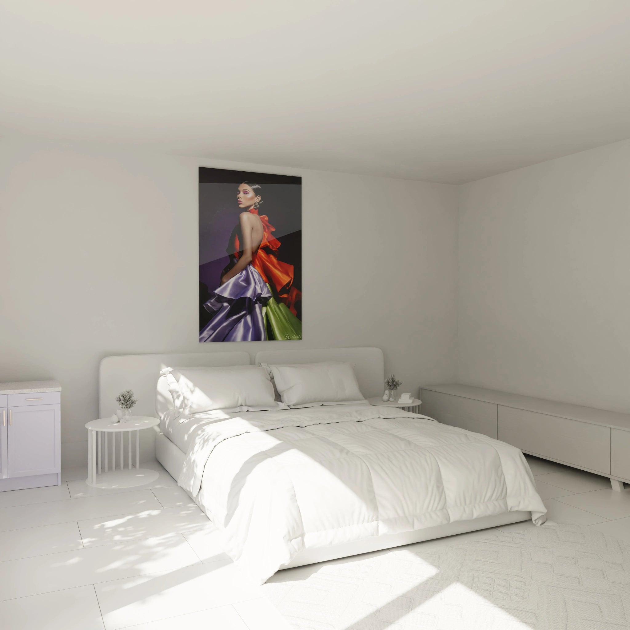
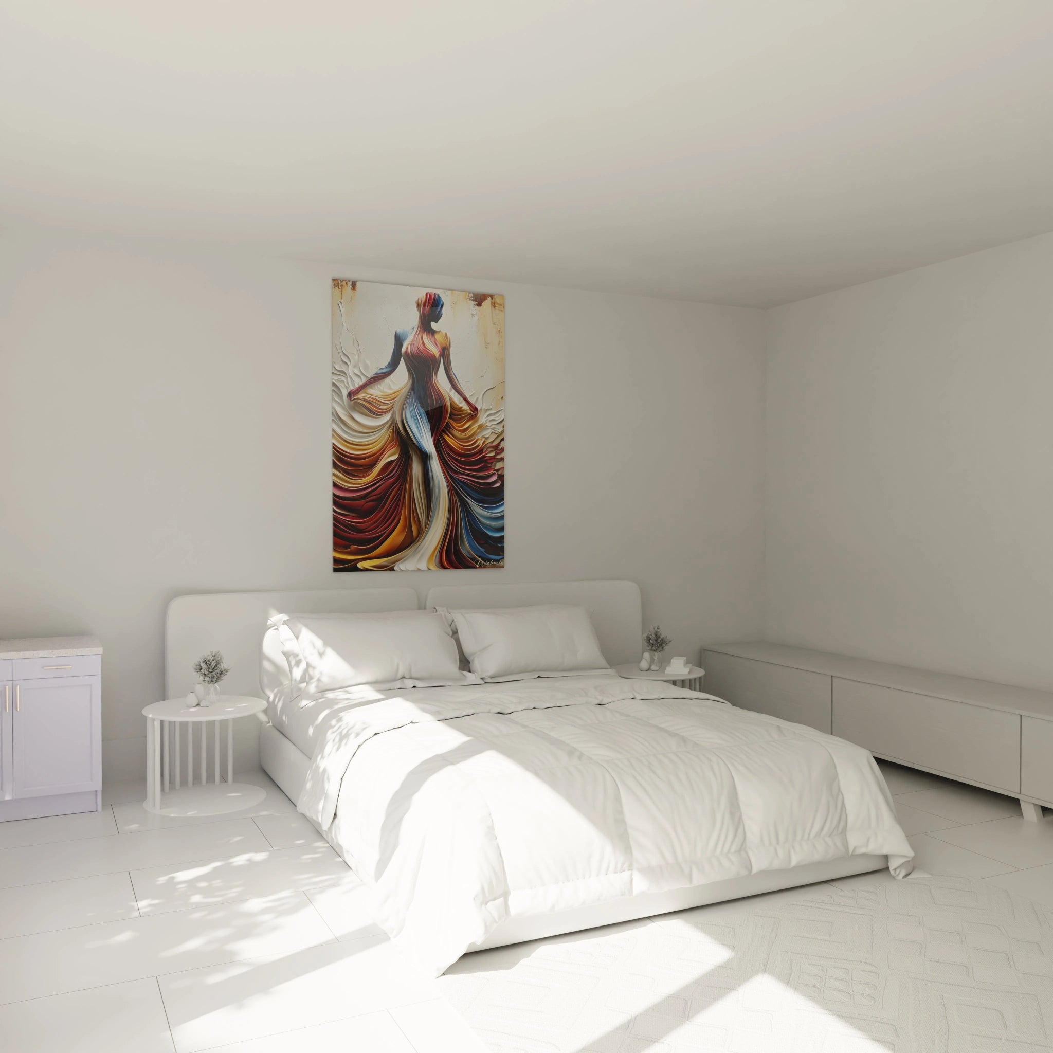
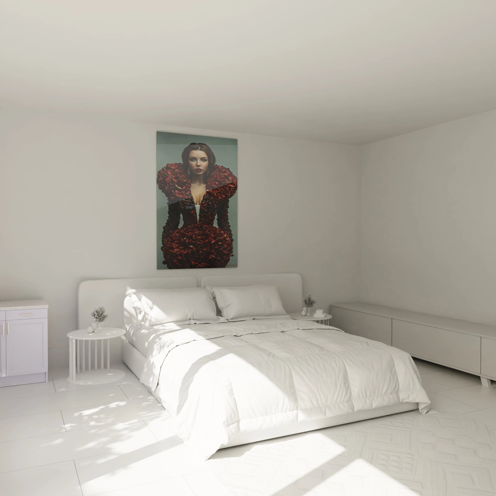
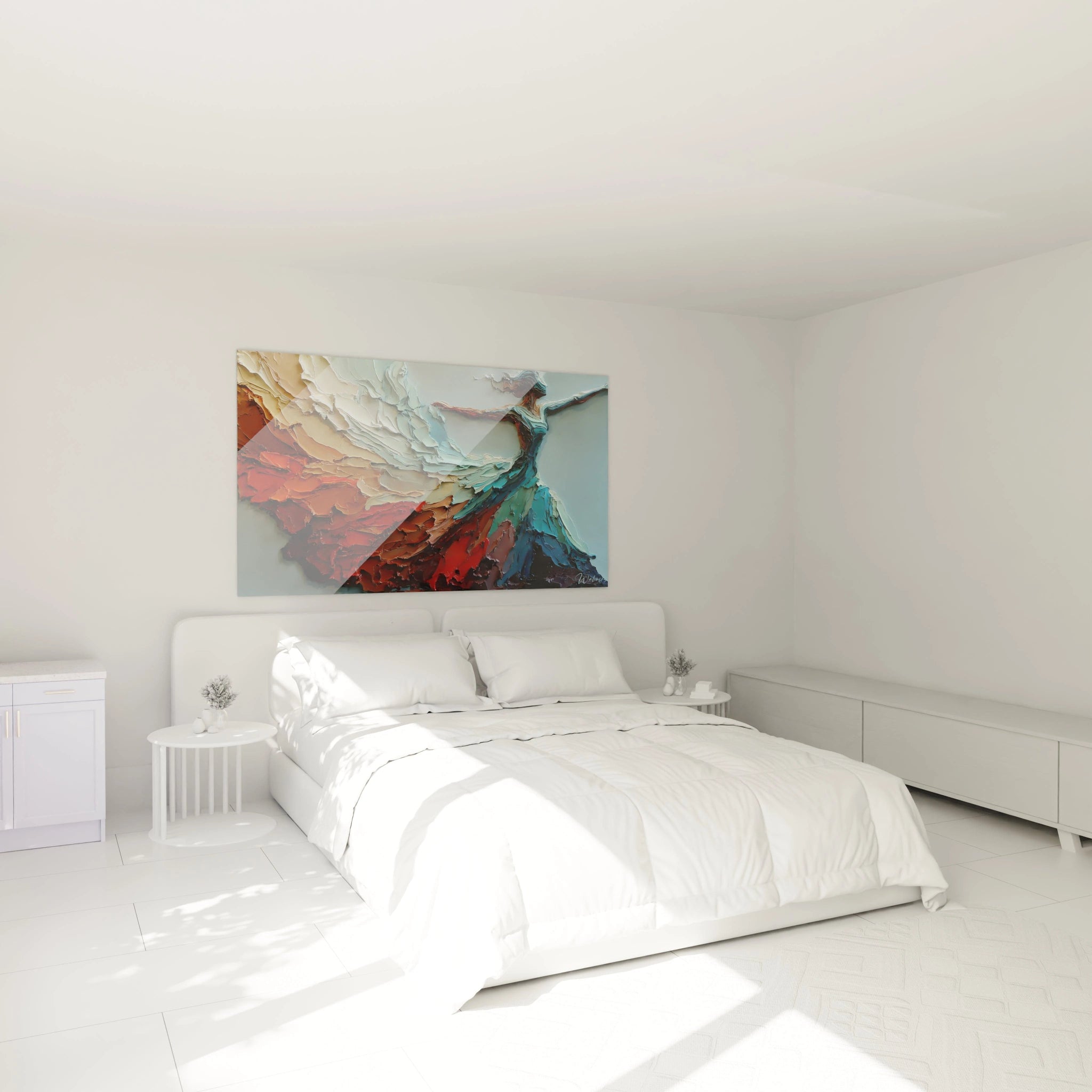
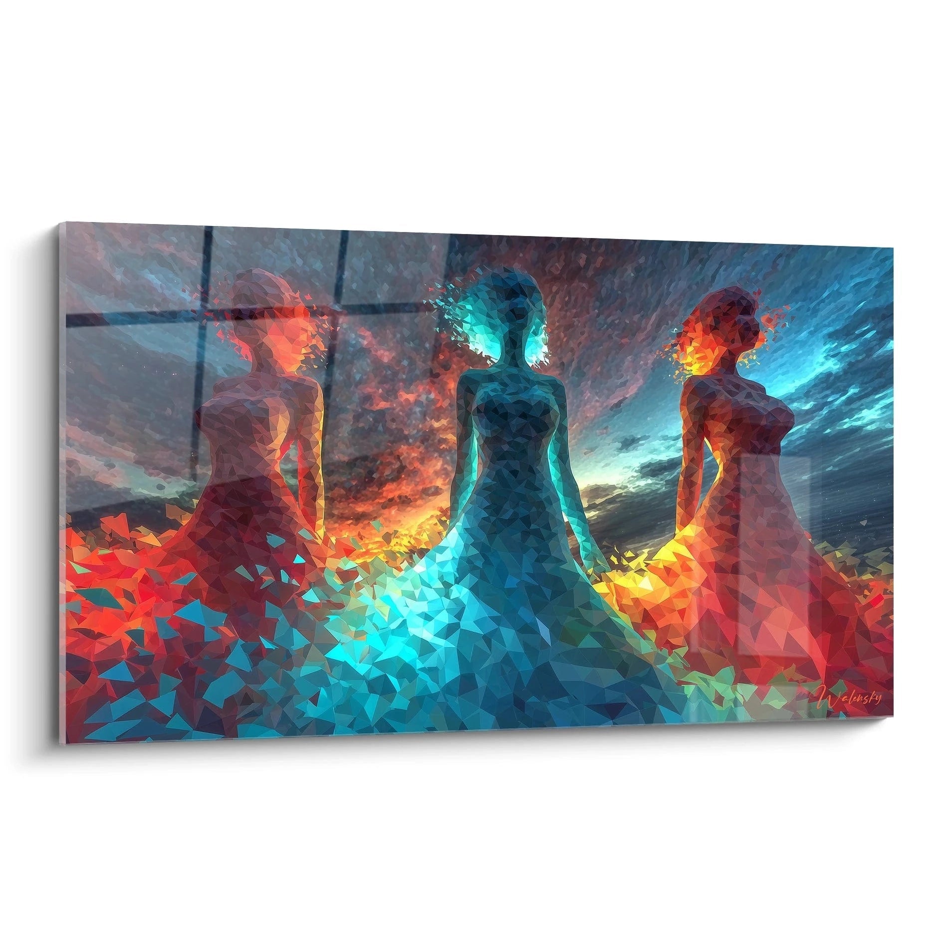
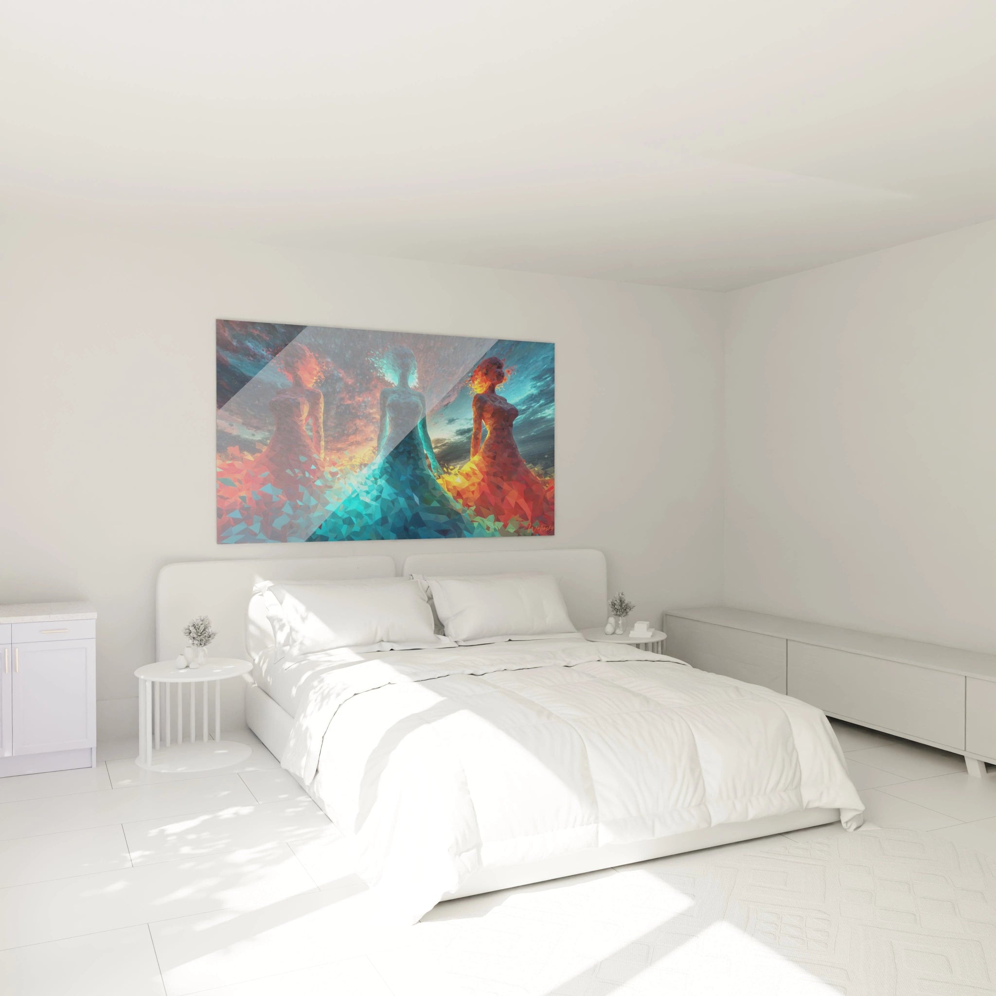
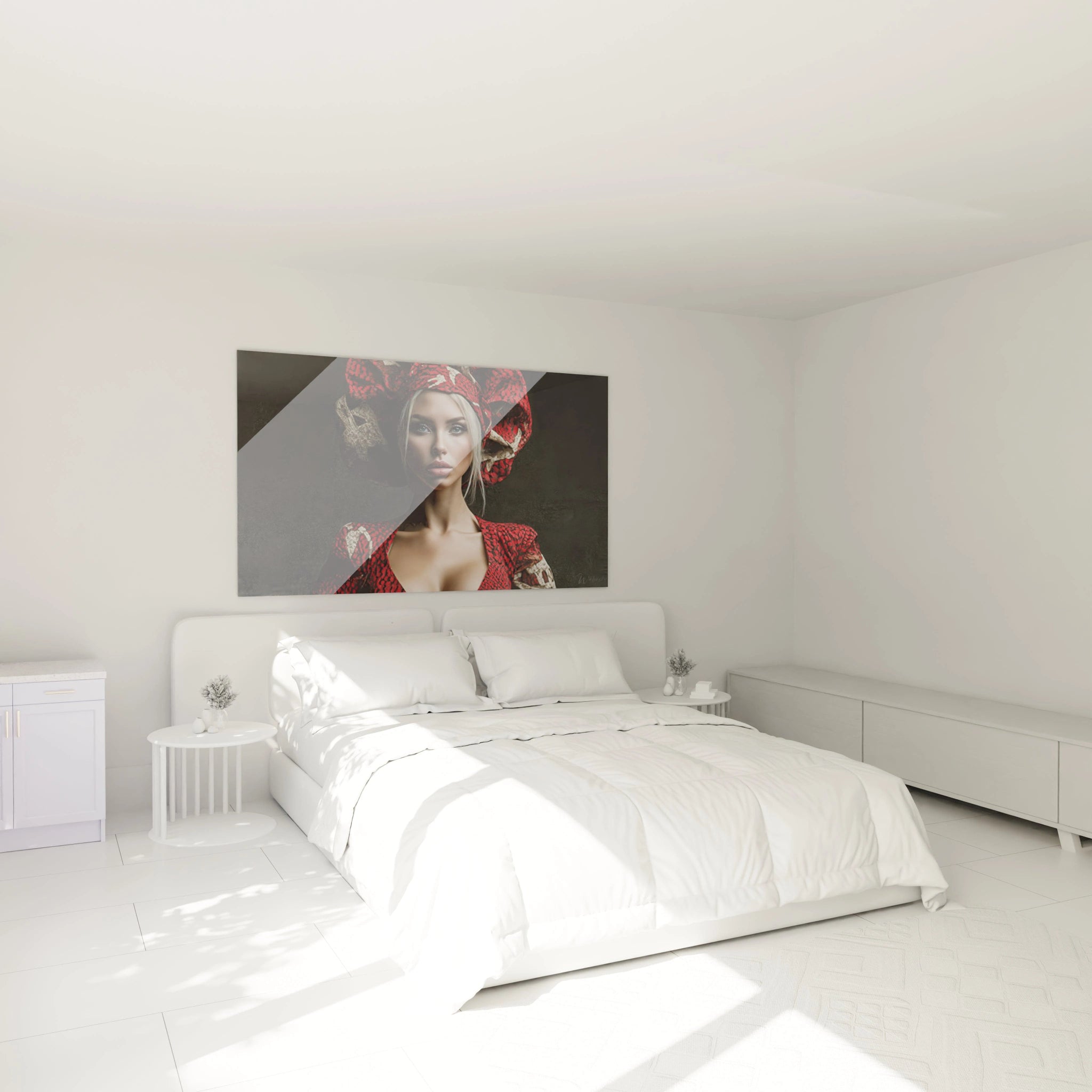
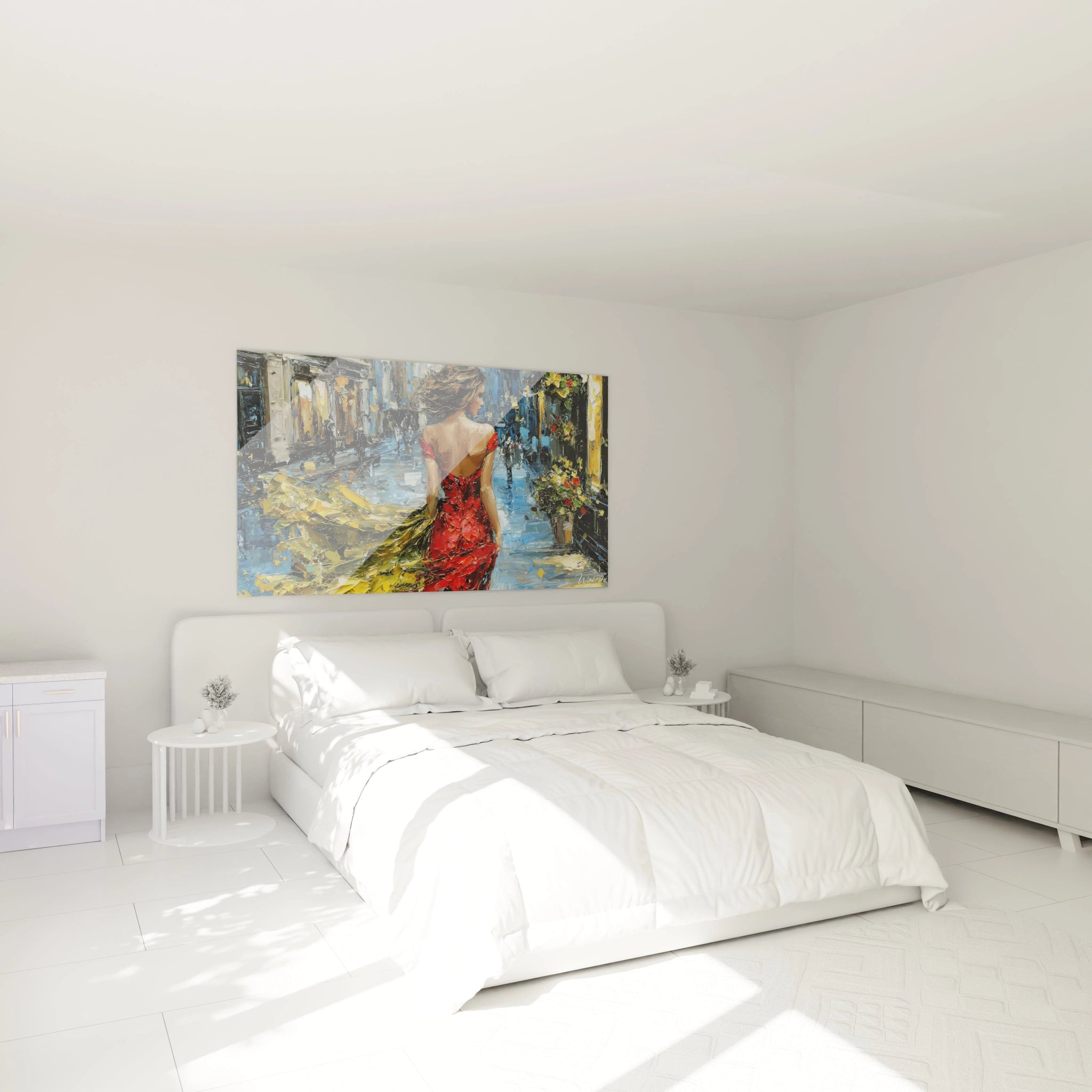
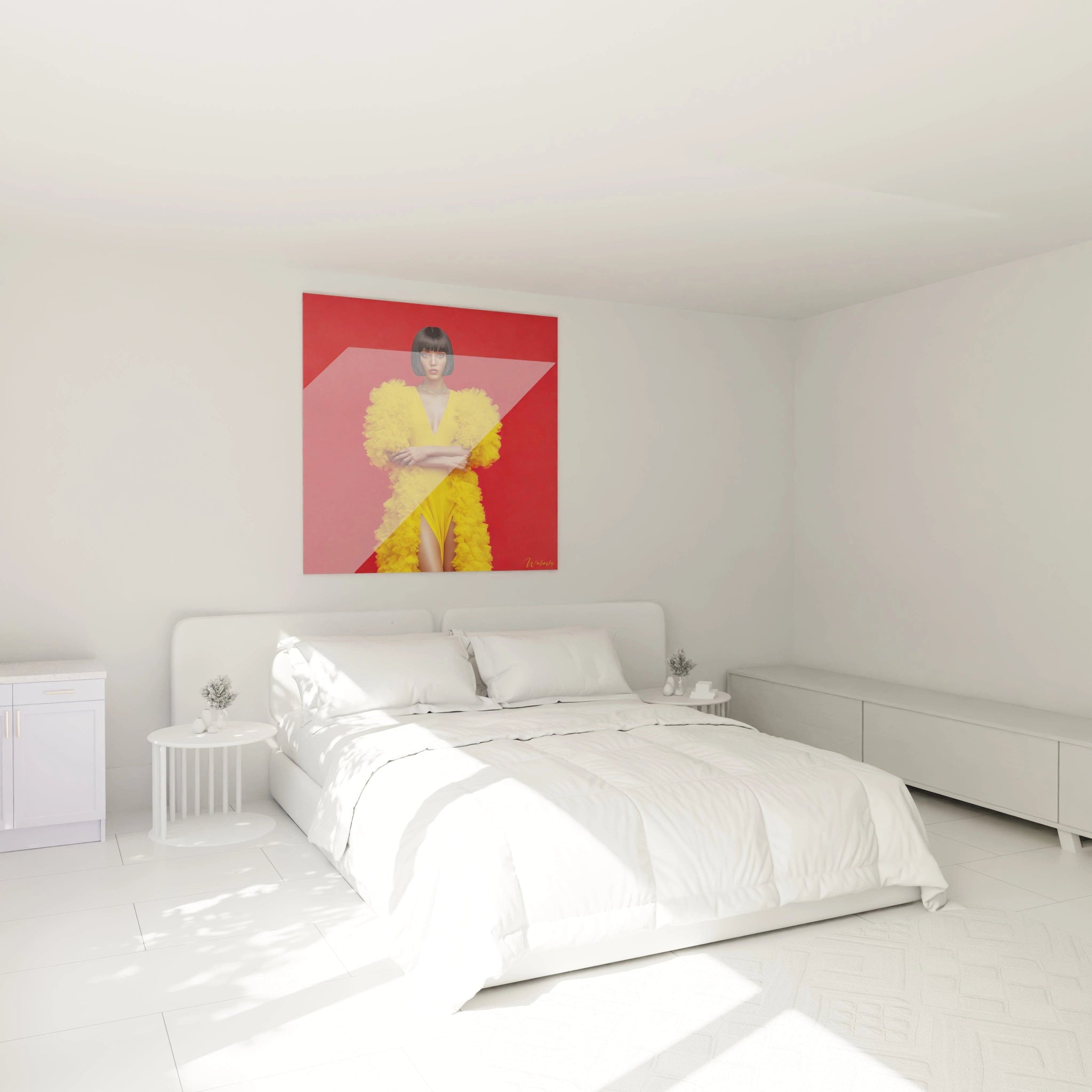
Can one install red wall art in a primary bedroom?
Contrary to common misconceptions, a high fashion red wall art finds its perfect place in an adult bedroom provided certain balances are respected. Prioritize deep reds with burgundy or plum tonalities rather than vibrant reds, creating a sensual atmosphere without excessive visual excitement. Strategic placement facing the bed, framed by sober wall architecture (walls painted taupe gray or mineral beige), transforms the work into a contemplative focal point. This approach draws inspiration from luxury suites where each element contributes to a sophisticated, calming ambiance.
Configurations for luxury commercial spaces
In high-end boutiques and showrooms, a monumental red painting functions as a visual manifesto of brand identity. Installation strategies differ according to objective:
- In background display creating theatrical setting for featured products
- In reception area as immediate aesthetic intention declaration
- As visual divider between different sales zones, structuring customer journey
- In VIP lounge to mark exclusive character of private space
Evolution of perception according to seasons
A fascinating phenomenon emerges with monumental red paintings: perception evolves with seasons and natural light. In winter, under grazing and bluish light, red develops mysterious depths and welcome warming presence. In summer, with intense luminosity, hidden nuances and compositional subtleties are revealed. This perpetual transformation justifies investment in a work that visually renews itself without human intervention, offering twelve different versions of the same acquisition.
Does high fashion red wall art suit a minimalist interior?
Absolutely, and it's even the most spectacular association. Architectural minimalism with its refined surfaces and rigorous lines creates the perfect setting for red painting to deploy full visual power without decorative competition. This combination recalls contemporary art gallery aesthetics where each work benefits from necessary space to breathe.
What viewing distance should be planned to appreciate large-format high fashion red wall art?
For painting exceeding 150 cm width, ideally plan viewing distance equivalent to 1.5 times its diagonal. This rule allows embracing composition as a whole while perceiving details and chromatic nuances. In constrained spaces, install the work in an angle offering perspective vision compensating for frontal viewing distance lack.
Does red harmonize with classical or contemporary decorative styles for high fashion red wall art?
Red transcends stylistic classifications through its historical universality. In classical interiors with moldings and antique flooring, red wall art brings balancing modern touch. Conversely, in contemporary industrial loft, it warms atmosphere and humanizes raw materials. This versatility explains why decorators use red as transition element between different aesthetic periods.