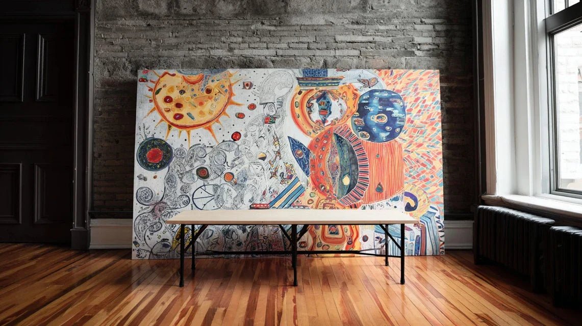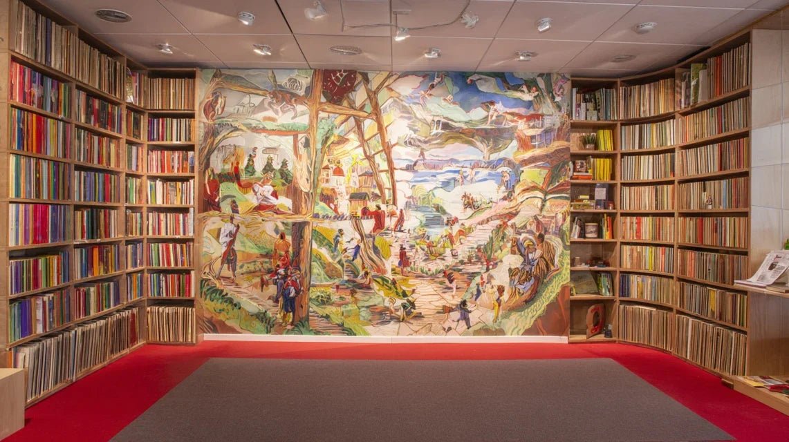
You're admiring your perfectly organized bookcase and this beautiful wall niche, but something's missing. The space feels cold, impersonal, as if it lacked that artistic touch that would transform this simple storage into a true decorative showcase.
You imagine an elegant painting that would enhance this space, create a captivating focal point, but anxiety grips you: what if the result was totally wrong? What if the painting clashed with your books, broke the harmony, or worse, gave your decor a cluttered and amateurish look?
You may have already tried hanging some frames at random, testing different arrangements, but the result disappointed you. Either it was too small and lost in the immensity of the shelf, or too imposing and overwhelmed your precious books.
This frustration is perfectly normal and you're not to blame. The problem comes from the fact that integrating artworks into functional spaces follows precise rules of proportions and harmony that no one has ever explained to you.
By the end of this article, you will master expert techniques to create a perfectly balanced bookcase-painting ensemble that will impress your guests and transform your space into a true personal gallery.
Why does your bookcase need a painting now?
A bookcase without an artistic element remains a simple storage furniture, however well organized it may be. It's like having a beautiful car without ever taking it on the road: it fulfills its function but never expresses its potential. Every day of delay, is a missed opportunity to transform your interior into a space that truly reflects you.
🏠 Customer testimonial: "Sarah, a Parisian interior architect, tells us: 'I lived with my 'bare' bookcase for two years. The day I integrated this gold abstract painting between my shelves, my guests started asking me who my decorator was. The effect was instant and spectacular.'"
💬 Conversation with a decor expert
The golden rule of modern bookcases: An unartistic reading space loses 60% of its decorative potential. Just as good lighting reveals the beauty of a jewel, a well-integrated painting reveals the unique character of your collection and transforms your bookcase into a true centerpiece within 15 days.
Let's discover what lies behind your hesitations
You recognize yourself in at least one of these situations: you circle around your bookcase imagining a thousand possibilities without ever taking action, you buy paintings that end up in a closet because "it doesn't finally work", or you secretly envy those magazine interiors where everything seems perfectly orchestrated.
What is really happening is that you feel the potential for transformation without having the technical keys to make it happen. It’s neither a lack of taste nor a lack of creativity: it's simply that no one has taught you the composition rules that decorators apply instinctively.
Imagine wanting to cook a gourmet dish without knowing the basic techniques: you have all the quality ingredients, the desire to succeed, but you are missing the precise instruction manual to assemble everything harmoniously.
The first hidden cause: the illusion of limited space
Contrary to what 90% of people think, a bookcase is not a "already occupied" space but a setting to compose. The difference? An occupied space suffers its elements, a setting enhances them mutually.
It's like the difference between a crowded parking lot (each car takes its place) and a jewelry store window (each jewel enhances the others). Your bookcase can become that showcase where books and paintings reveal themselves to each other.
This revelation changes everything in your approach: you no longer seek to "fit" a painting, but to create a dialogue between your literary and artistic works, transforming your relationship with this space and your daily enjoyment of living in it.
🔍 Instant test: Temporarily place a mirror or an empty frame against your bookcase. Observe how your eye structures the space differently and how your books suddenly seem "organized" around that focal point. That's exactly the effect a well-chosen painting will produce permanently.
The perfection trap
Many people think they have to find THE perfect painting on the first try, as if decorative harmony were an exact science with only one correct answer. In reality, successful integration relies on composition principles that allow for several harmonious solutions.
It's like floral art: there’s not just one way to arrange beautiful flowers, but there are rules of proportions, colors and balance that guarantee an elegant result. Once these rules are mastered, your decorative instinct can express itself with confidence.
This understanding frees your creativity and transforms the “search for the perfect painting” into a “joyful exploration of possibilities”, making the process as rewarding as the final result.
The invisible influence of lighting
Here’s what 95% of people don't know: a painting can be perfectly suited to your bookcase but completely fail due to inadequate lighting. It's the invisible factor that makes the difference between an amateur and a professional result.
You can see this by observing how your books change appearance depending on the time of day. Some titles that seem dull in the morning become vibrant late afternoon. A painting undergoes exactly the same variations.
This element transforms your bookcase into a living space that evolves with natural and artificial light, creating different atmospheres according to the time of day and multiplying your daily pleasure.
🔍 The 3 signals that your lighting sabotages your decor projects:
- Your books look dull even when neatly arranged: The light does not reveal the colors of the edges, a sign that your paintings would suffer the same fate and lose their visual impact.
- You avoid reading in this area in the evening: Insufficient lighting creates a cold atmosphere that would neutralize the warmth that a painting is supposed to bring to the space.
- Your existing decorative objects go unnoticed: If your current accessories don't stand out, it’s because the lighting does not enhance decorative elements and reduces the effect of your future painting.
What really makes the difference between a successful and failed placement is an understanding of visual proportions. Like a positive domino effect, respecting this rule automatically balances all other elements of your composition. You can identify it by observing whether your gaze “catches” naturally in three distinct points of your bookcase or whether it “slides” without finding clear structure.
The universal rule of successful spaces: Every harmonious space creates three balanced visual points of interest. Observe your bookcase: if your eye finds only one or two anchor points, the space appears unbalanced. You can check this by taking a photo and noting where your gaze naturally rests.
| ❌ Common belief | ✅ Expert reality | 💡 Why it works | 🎯 Immediate benefit |
|---|---|---|---|
| "You need a blank wall to hang a painting” | A bookcase structures and enhances a painting | Shelves create a natural frame that highlights the artworkYour painting becomes the focal point instead of getting lost on a bare wall||
| "The more expensive, the more professional it looks" | The accuracy of proportions is more important than price | Visual harmony depends on size ratios, not value | You create a "magazine decor" effect even with a tight budget |
| "Colors must match exactly" | Complementary colors create more dynamism | Controlled contrast gives depth and character | Your space gains personality and avoids monotony |
| "One painting is enough per bookcase" | The composition can integrate several works depending on the size | Several small paintings can create a more interesting rhythm | You multiply creative possibilities and visual impact |
The progressive method to transform your bookcase
Rest assured, you are not going to revolutionize your decor overnight. We will proceed like an experienced gardener: carefully prepare the ground, plant at the right time, and let beauty reveal itself naturally. The final result will give you that discreet pride of someone who masters their art.
Step 1: Reveal the hidden potential of your space
This first step is crucial because it transforms your gaze: you are going to go from "I don't know what to do" to "I see exactly the possibilities". It's like learning to read a musical score before playing: once the basics are acquired, the melody flows naturally. This step will give you that Now let's move on to concrete action: Photograph your library from all angles: Take 5 photos: one well-centered frontal view, and four diagonal views from the corners of the room. This multiplicity of viewpoints reveals how your library integrates into the overall space and what its visual strengths are. The camera objectifies your perception and reveals details that your accustomed eye no longer notices. ⏱️ Time: 10 minutes | ✅ Successful when: You clearly see on the photos the "empty" areas and the "full" areas, and you identify 2-3 potential locations for a painting | ⚠️ Attention: Avoid photos with backlighting that obscures details - turn your back to the main window. Measure key dimensions: Note the total height, width, and depth of each shelf. Also measure the most significant free spaces. These numbers will determine the ideal proportions of your future painting according to the rule of thirds. A work that is too small will get lost, too large it will overwhelm your books. ⏱️ Time: 15 minutes | ✅ Successful when: You have a simple diagram with all the main dimensions and you identify available spaces of at least 40x40cm | ⚠️ Attention: Shelves are not always perfectly straight - measure in several places to detect variations. Identify existing focal points: Observe where your eye naturally rests: colored objects, particularly harmonious rows of books, decorative elements already present. These points must be highlighted or balanced by your painting, never competed with. This is the basis of any successful composition. ⏱️ Time: 10 minutes | ✅ Successful when: You have identified 3-4 elements that "catch" the eye and understood their distribution logic | ⚠️ Attention: Do not confuse "what attracts the eye" with "what you like" - be objective about the real visual impact. 🎯 Validation of step 1: You should now look at your library with "new eyes" and clearly see 2-3 potential locations for a painting, with their approximate dimensions. If some areas still seem blurry, re-measure these specific areas - it's normal and even a good sign, it shows that you are developing your critical eye. Congratulations, you have just crossed the step that makes the difference between decorating randomly and composing consciously!
Now that you master your space, we move on to the creative level: choosing the artwork that will reveal the full potential of your library. This step is particularly rewarding because you will see your vision take shape concretely. The effect is often spectacular: the right proportions immediately create that impression of mastery you were looking for.
Calculate ideal proportions: Your painting should represent between 1/3 and 2/3 of the surface area it occupies. If your area is 90cm wide, your painting should measure between 30 and 60cm wide. This universal rule guarantees perfect visual balance. Create several templates within this range to visualize options concretely. ⏱️ Time: 20 minutes | ✅ Success when: You have 3-4 different templates and you immediately feel which one "sounds right" visually | ⚠️ Attention: A painting that is too small will create a "shy" effect, too large it will overwhelm your books - trust your first visual impression. Test the optimal location: Place your template at different heights and positions. The rule: the center of the painting should be at eye level (about 1m60 from the floor) or align with a strong line of your library (e.g., shelf edge). Observe how this changes the overall balance of your composition.
⏱️ Time: 15 minutes | ✅ Successful when: A position seems obvious and natural to you, and your bookcase suddenly feels "complete" | ⚠️ Attention: The perfect location in a photo isn't necessarily the right one in reality - test it from your usual spot in the room. Validate color harmony: Observe your bookcase and identify the 2-3 dominant colors (book sections, existing decorative objects). Your artwork should either pick up one of these colors or bring its complement to create contrast. This color consistency instantly unifies the entire composition. ⏱️ Time: 10 minutes | ✅ Successful when: You clearly visualize what color palette to look for in your artwork | ⚠️ Attention: Avoid trying to pick up too many different colors - a maximum of 2-3 colors to maintain sophistication. 🎯 Validation of step 2: You should have precisely identified the ideal dimensions (width and height to the nearest centimeter), the exact location, and the color palette you are looking for. If you're still hesitating between two options, that's perfect: take a photo of each configuration and let it sit for 24 hours. Your instinct will guide you to the right solution. This maturation step is part of the creative process.
This final step transforms a "correct" placement into a "masterful" composition. This is where the difference between someone who decorates and someone who composes a space becomes apparent. You will feel this particular satisfaction of the craftsman seeing their work reach perfection, and your guests will immediately notice this professional quality without knowing exactly why.
Create the perfect lighting: Install your accent lighting to reveal the artwork without creating shadows on the surrounding books. The ideal angle is 30° from the surface of the painting. Test different intensities: you are looking to reveal the colors, not to dazzle. This light should seem natural, as if it were part of the architecture. ⏱️ Time: 25 minutes | ✅ Success when: Your artwork "radiates" naturally and attracts attention without an artificial effect | ⚠️ Attention: Too much lighting creates a "spotlight" effect that isolates the painting instead of integrating it. Add connecting elements: Place a small object that echoes your artwork near the hanging area. This object should not compete with the work but create a "visual bridge" between it and the environment. Observe how this addition instantly unifies the composition and gives it a professional consistency. ⏱️ Time: 15 minutes | ✅ Success when: The object seems "natural" and reinforces the impression of overall harmony | ⚠️ Attention: The connecting object must remain discreet - if it attracts more attention than the painting, it is not well chosen or placed. Check final alignments: Use your level to ensure that the artwork aligns perfectly with the guidelines of your bookcase (edges of shelves, vertical posts). This geometric precision brings an immediate visual serenity and gives that impression of "justness" which characterizes expert compositions. ⏱️ Time: 10 minutes | ✅ Success when: All lines seem to "dialogue" harmoniously and create a soothing geometry | ⚠️ Attention: Even a minimal misalignment creates an unconscious tension - take the time for precision. 🎯 Final validation: Step back 3 meters and observe the whole. Your bookcase should now have a "presence" that it didn't have before, a sophistication that immediately impresses. If the effect seems spectacular compared to the starting point, congratulations: you have just completed an expert transformation. Take a final photo to immortalize this moment of success! The rule of natural progression: Each step should bring you a visible satisfaction before moving on to the next. If you do not feel any clear improvement at a stage, it is a signal to refine this phase before continuing. Patience in execution guarantees the excellence of the final result - better 3 days of mastered progress than one month of groping.🎯 Phase of systematic analysis
OUR RECOMMENDED PRODUCTS
Step 2: Select and position your masterpiece
🎨 Selection and placement tools
🎯 Progressive selection method
Step 3: Refine for a professional result
✨ Expert finishing tools
🎯 Expert finalization
You now master the solid basics that distinguish amateurs from connoisseurs. But there are still some expert subtleties that will transform your good result into an exceptional result, those details that make people ask you "who decorated your place?"
🎨 Pro tip - The reflection rule: Position a small mirror or shiny metallic object nearby your artwork to create subtle light games that visually multiply the presence of the work. This technique, used in high-end galleries, creates depth and dynamism that 99% of people can't explain but feel immediately. The effect is particularly striking with vibrant colored artworks.
🤔 "What if my artwork doesn’t ultimately harmonize with my books?"
"I'm afraid of making a mistake and that the final result clashes with my collection... How can I be sure before investing?"
This concern is perfectly legitimate and even shows that you have developed a true sense of aesthetics! That’s exactly why we worked with paper templates to avoid this risk. The beauty of this method is that it allows you to test without risk and refine your choice before making any purchase. Plus, remember that the most seductive libraries mix different styles and eras - this diversity creates the desired visual richness. Your intuition, guided by the rules of proportion that you now master, will be your best advice.
💡 Reassuring action: Photograph your library with the template in place and show this simulation to 2-3 trusted people. If their reaction is unanimously positive, you have your confirmation. This external validation reinforces confidence in your choice.
The pitfalls to absolutely avoid to protect your investment
Even with the best method in the world, some mistakes can compromise your final result. I'm going to reveal the 5 most frequent errors that I regularly see, so you can completely avoid them and keep the pleasure intact of your successful transformation.
- ⚠️ Neglecting the impact of humidity: Libraries are often in passageways where humidity varies. Choosing an artwork on unprotected paper or a canvas without varnish in these conditions is to risk seeing your investment degrade quickly. Always opt for artworks treated against moisture or resistant supports such as aluminum or plexi. This precaution avoids the disappointment of seeing your beautiful composition spoiled by avoidable technical problems. 🔨 Underestimating the weight and fixing: Even a lightweight artwork can tear your shelf if the fixing is not suitable. Many rely on small adhesive hooks for works over 30x40cm. Beyond this size, always use screwed fixings in dowels adapted to the material of your wall. A falling artwork damages not only the work but can also damage your precious books. 🎨 Choose only according to personal taste: Your favorite painting is not necessarily the one that will enhance your library. This very human error leads to unbalanced compositions where the artwork "clashes" with the environment instead of blending harmoniously. Keep in mind that you are creating a decorative ensemble: your work of heart may find a better place elsewhere in your interior.
- 💡 Ignore the evolution of natural light: A perfect painting in full daylight can completely change its appearance in the evening. Always test your choice at different times of the day and with artificial lighting on. This check avoids unpleasant surprises and guarantees that your composition remains attractive under all circumstances.
- 📐 Rush the measurement phase: The most expensive mistake! Many measure approximately "by eye" and end up with a painting too large or too small. A difference of 10cm can completely ruin the desired effect. Always take your measurements to the nearest centimeter and check them twice - it's 10 minutes of attention that avoids weeks of frustration.
🛡️ Your safety checklist before purchase: Check that your measurements are accurate to the nearest centimeter, that the fixing is suitable for the actual weight of the artwork, that the colors work with natural AND artificial lighting, and that the overall effect satisfies you from your usual position in the room. If any of these points leave you in doubt, take the time to clarify it - your instinct is alerting you for a good reason.
🎁 Special offer for readers
Because you took the time to inform yourself, enjoy 10% discount on your first order:
⏰ Valid 72h after reading • Applicable to all our products
Answers to frequently asked questions about integrating paintings
For a spectacular transformation, count between €80 and €300 depending on the size of your space. A quality 40x60cm painting generally costs between €60 and €200, plus €20 to €50 for additional lighting and fixing accessories. The investment may seem significant, but compared to the decorative impact and lifespan (over 10 years), it represents less than €3 per month of daily pleasure. Budget tip: Start with a smaller but quality painting rather than a large low-end painting - you can always expand your composition later.
The visual transformation is immediate upon installation, but your enjoyment will increase over 2-3 weeks as your eye gets used to this new harmony. It's like a new perfume: the effect is instant, but you discover its subtleties over time. The research and selection phase usually takes a weekend, installation an evening, and refinement a few adjustments in the following week. Patience and gradual progression guarantee a result that you will be proud of for a long time.
Excellent question! Small spaces even benefit more from this technique because each element has a greater visual impact. In a restricted space, a well-integrated painting can completely transform the impression of grandeur and sophistication. The rule: prioritize a medium-sized painting with colors that "open up" the space (light or cool tones) rather than several small works that would visually fragment the area. A 2m² space can easily accommodate a successful composition with a 30x40cm painting.
Both work perfectly, but according to different logics! An abstract painting creates a sophisticated contrast with the geometry of the books and brings a modern visual breath. A figurative painting (landscape, portrait, still life) dialogues with the narrative universe of your books and reinforces the intellectual atmosphere. The choice criterion: your abstract painting should have harmonious colors with your books, your figurative painting should have a style consistent with the spirit of your collection. In doubt, abstract is more versatile and timeless.
Yes, but with a strict rule: maximum 3 paintings to avoid the “exhibition wall” effect that kills harmony. The technique: create a visual rhythm by alternating sizes and locations (one large in the center, two smaller in echo), or align 3 works of the same format for a modern gallery effect. Ensure color consistency between the artworks and respect regular spacing. This approach is perfect for large libraries over 3 meters wide.
Your transformed library: the satisfaction of a space that resembles you
In a few weeks, you will contemplate your library with the discreet pride of someone who has created something beautiful and personal. Your guests will immediately notice this new sophistication, this harmony that transforms a simple storage into a true centerpiece of your decoration. Your reading space has become a privileged showcase where every moment spent will be more enjoyable.
But this transformation goes far beyond aesthetics: you will have developed an expert eye for spaces, a capacity to see the hidden potential of your interior. This new skill will serve you for all your future decor projects and give you the quiet confidence of someone who masters their environment. Your relationship with your interior will never be the same.
The best part of it all? You now know that creating a harmonious space is neither a question of budget nor innate talent, but of method and patience. Your first concrete step: take out your measuring tape and take those first measurements that will launch your transformation. In one hour, you will already have a clear vision of the possibilities available to you.
🌟 Your new decor adventure begins now: Every great decorator started by carefully observing a space and imagining what it could become. You now have the keys to succeed in this transformation - all that remains is to take action and let your creativity express itself within a controlled framework. Your future dream library awaits you!