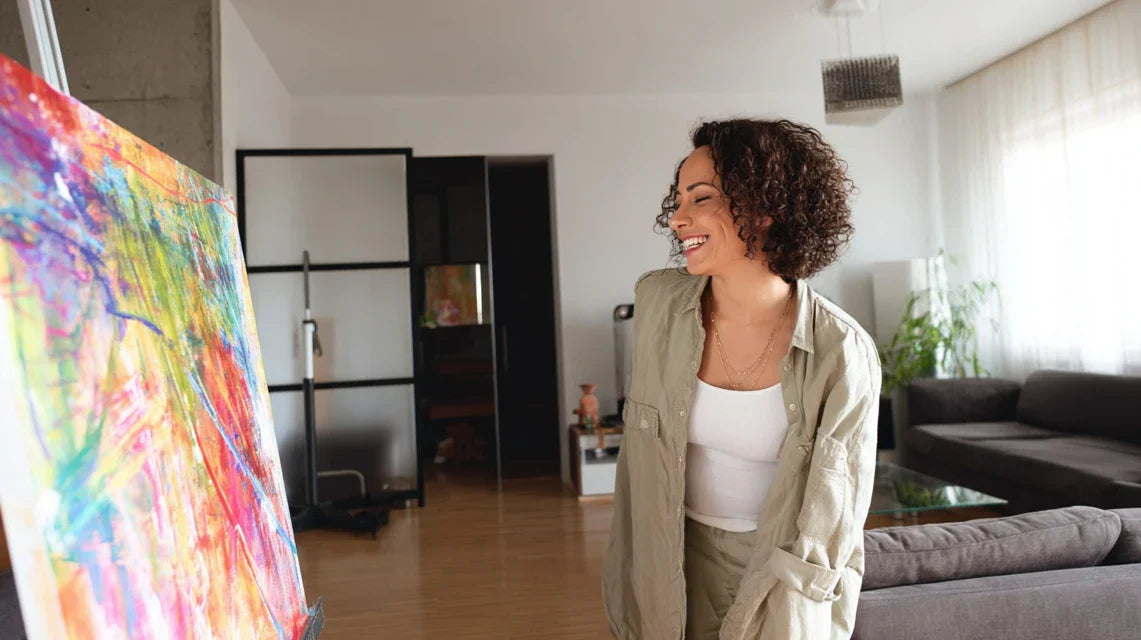
This feeling of “failure” gnaws at you. You turn around, change the height, move the furniture... But nothing works. This artwork that you loved so much in the store now seems out of place, like a stylish guest in inappropriate attire for the occasion.
You’ve probably tried to follow classic advice: “choose according to your taste” or “put it where you like.” But these approaches ignore a fundamental truth about interior decoration.
It's not your fault if you feel this frustration. Most decor tips forget the essential: each room has its own personality and specific needs, and the shape of your artwork must dialogue with that unique identity.
By the end of this article, you will know exactly which shape of artwork to choose for each room in your home, and above all why some shapes create instant magic while others fall flat.
Why the shape of your artwork can transform the soul of a room?
Each room tells a story, and the format of your artwork writes its most memorable chapters. Ignoring this harmony is like wearing hiking shoes with a tuxedo. The opportunity you risk missing? Creating that “decor magazine” effect that your guests notice instantly, without being able to explain why your interior fascinates them so much.
🏠 Revelatory testimonial: Sarah, a Parisian interior architect, says: "I saw a client completely transform the ambiance of her living room simply by replacing three small square paintings with a single panoramic canvas. The effect? Her 2.40m ceiling suddenly seemed cathedralesque, and the space seemed to have doubled in volume."
💬 Conversation with a decor expert
The golden rule of proportions: The shape of your artwork should amplify the natural function of the room, like an acoustic mirror amplifies a voice. By respecting this harmony, you create an environment where each element reveals itself mutually, and the result is felt within the first 24 hours.
What’s Really Behind Your Hesitations
You hesitate in front of your blank wall, catalog in hand. You imagine three different paintings in the same spot, but you can't visualize the final result. You feel lost between Pinterest advice, suggestions from those around you, and your personal instinct.
This indecision reveals a truth that few decor enthusiasts suspect: your brain is intuitively seeking harmony, but you’ve never been given the keys to consciously recognize it. It's not a lack of taste on your part; you simply haven't been taught the secret language of shapes and spaces.
Imagine an orchestra conductor who knows the music but ignores the sheet music: he feels what sounds right, but can’t reproduce that magic at will. That’s exactly your current situation.
The First Hidden Cause: The Illusion of the “Universal Crush”
Contrary to what you've been told, a perfect painting in a showroom can become disappointing at home, not because of its quality, but because the proportions of your room tell a different story. The reality? Sales spaces are designed to showcase each piece individually, not to reproduce the harmony of your interior.
It’s like choosing a dress on a store mannequin: it can be sublime in the shop and less flattering on your figure, not because it's less beautiful, but because your proportions require a different cut.
This revelation changes everything about your approach: instead of searching for THE perfect painting, you’re going to learn how to identify THE perfect format for each space in your home. The result? Each purchase becomes a guaranteed success rather than a risky bet.
🔍 Instant test: Look at the wall where you want to hang your painting. Stretch out your arms to draw a rectangle in the air: if your movements naturally draw a horizontal format, your eye craves a panoramic shape. If it's vertical, your room calls for a portrait format. Trust that first reflex!
Many mechanically apply the rule
You may have noticed this trend of repeating the same canvas format throughout the house, believing it creates decorative consistency. Yet, each room has its own breath: your expansive living room calls for generous formats, while your reading nook demands the intimacy of a more compact size.
Do you recognize these signals in your interior? A living room that lacks presence despite beautiful furniture, a bedroom that doesn't really soothe you, a hallway that seems endless... These symptoms often reveal poor artistic proportions.
The impact? Your home loses its personality and becomes bland, like a delicious dish served on an unsuitable plate. Each room needs its own "visual language" to reveal its unique beauty.
3 signs that your canvas format is not right:
- You subconsciously avoid this room: Your body senses the broken harmony and pushes you towards more balanced spaces
- Your guests never notice your artwork: An unsuitable format makes the work "invisible" even if it is magnificent
- You feel like "filling in" around the canvas: When the shape doesn't fit, you compensate by adding other decorative elements
The trigger factor: the natural energy of your room
Each space exudes a dominant energy - dynamic, soothing, intimate or majestic - and this energy naturally dictates the ideal format of your canvas. It's like a domino effect: choosing the right format amplifies this positive energy, which spreads throughout the room and influences your daily well-being. To identify it, observe how you naturally move around in that space: quickly (dynamic energy = horizontal formats), slowly (contemplative energy = vertical formats), or stopping often (intimate energy = square formats).
The universal rule of energies: Respect the natural energy of your room rather than contradicting it. This works because your subconscious instantly recognizes the harmony. To check, enter the room with your eyes closed and open them: your first feeling indicates the dominant energy.
| ❌ Common belief | ✅ Reality | 💡 Explanation | 🎯 Practical benefit |
|---|---|---|---|
| The bigger it is, the more impressive it is | The ideal proportion reveals the space | A suitable format can make a small room appear larger than an overly imposing format in a large space | Visual optimization of every square meter |
| You have to match all the canvases in the house | Each room has its own needs | Overall harmony comes from style consistency, not format uniformity | Unique personality for each space |
| Standard formats are safer | Unusual proportions create character | An unexpected format attracts the eye and becomes a memorable focal point | Distinctive decoration that leaves a lasting impression |
| Only color matters for the atmosphere | The shape influences emotion as much as color | Our brains subconsciously associate shapes with emotions: horizontal = serenity, vertical = dynamism | Precise control of the atmosphere of each room |
The 3 Energies Method: Choose the Perfect Format with Peace of Mind
Choosing the right format becomes instinctive once you understand the language of energies. Like learning to ride a bike, it seems complicated at first, then becomes a natural reflex. This method follows the logic of your feelings: first identify the energy of the room, then choose the shape that amplifies it, and finally refine the proportions. The result? A perfect harmony that is felt instantly.
🎯 Overview of progression: We will first learn to "read" the natural energy of your room (like diagnosing its temperament), then identify the format that reveals it best (choosing the right staging), and finally refine the details for a professional result (expert finishes). Each step builds on the previous one to create this decorative magic that makes all the difference.
Step 1: Decoding Your Space's Energy
Understanding your room is like getting to know its personality before choosing an outfit for it. This foundation avoids future missteps. Once you have mastered this step, you will feel the deep satisfaction of "seeing clearly" in your space, like when you finally find the right key for a stubborn lock.
What You Need for This Analysis
- A notebook and pencil: To note your observations so you don't forget them. Choose a small notebook that you can hold in one hand, as you will be moving around the room. Avoid your phone: the screen will distract you from your authentic feelings.
- A measuring tape: Not to measure everything obsessively, but to confirm your intuitions about proportions. Choose one with clearly legible numbers, as you will take a few key measurements that will influence your future choices.
- A moment of calm: 15 minutes without distractions, ideally in the late afternoon when natural light best reveals the volumes of your room. This quality of light allows you to perceive the nuances of atmosphere that you do not notice in artificial lighting.
Now, let's move on to concrete practice:
The Art of Feeling Your Room's Energy
The first impression test: Leave the room, close your eyes, breathe calmly, then enter and open your eyes. Immediately note the first sensation: do you feel calmed, energized, or intimately connected to the space? This instinctive reaction reveals the dominant energy that your artwork format must respect.
⏱️ Time: 2 minutes | ✅ Successful when: You clearly feel a dominant emotion | ⚠️ Attention: Do not try to analyze intellectually, rely only on your first physical emotion
Observing traffic flows: Naturally walk around your room following your daily habits. Note whether your movements are fluid and fast (dynamic energy), slow and contemplative (soothing energy), or if you often stop to savor the moment (intimate energy). These patterns reveal the natural rhythm of the space.
⏱️ Time: 3 minutes | ✅ Successful when: You identify a dominant movement pattern | ⚠️ Attention: Walk as usual, without forcing a particular gait
Recording the dominant proportions: Observe whether your gaze is naturally drawn to horizontal lines (windows, low furniture, perspective) or vertical lines (ceiling height, bookshelves, doors). This observation reveals which format orientation will naturally harmonize with existing architecture.
⏱️ Time: 3 minutes | ✅ Successful when: One direction (horizontal/vertical) clearly dominates | ⚠️ Attention: Don't count the elements, feel what spontaneously attracts your eye
✅ Validation of step 1: You should be able to summarize the energy of your room in one word (soothing, dynamic, intimate) and identify the dominant direction (horizontal or vertical). If it's blurry, repeat the first impression test at a different time of day. Congratulations: you have just decoded the secret language of your space!
OUR RECOMMENDED PRODUCTS
Step 2: Selecting the revealing format
Now that you know the energy of your room, you are going to choose the shape that magnifies it. This step is more rewarding because you begin to visualize the concrete result. The snowball effect begins here: the right format reveals the hidden beauty of your space, which in turn inspires your other decor choices.
Your selection tools
- Newspaper or cardboard: To create templates with the correct proportions and test them on your wall. Choose a material that you can temporarily tape without damaging the paint. This concrete visualization is better than all mobile apps because it respects the real scale.
- Repositionable adhesive tape: Painter's tape, which leaves no traces. You will outline different formats on your wall to compare their visual effects. This simple but remarkably effective method instantly reveals which format "dialogues" best with your space.
- Your smartphone: Only for photographing the different tests and comparing them objectively. The camera lens sometimes reveals imbalances that our eye, too accustomed to the space, no longer perceives.
The Revealing Template Technique
Create your test templates: Cut out three rectangles from your cardboard: a horizontal format (60x40cm), a square (50x50cm), and a vertical (40x60cm). These standard proportions give you a reliable basis for comparison. Test them one by one on your main wall, taking a photo each time from your usual point of view in the room.
⏱️ Time: 10 minutes | ✅ Success when: A format creates an immediate "visual evidence" | ⚠️ Attention: Place the templates at eye level (150-160cm from the floor) for a realistic rendering
The energy harmony test: For each format tested, redo your usual walk around the room. The right format amplifies the energy you identified in step 1: you feel more relaxed with a horizontal format in a relaxation room, more energized with a vertical one in an activity space. Trust this emotional resonance.
⏱️ Time: 5 minutes per format | ✅ Success when: A format clearly amplifies your well-being in the space | ⚠️ Attention: Test at different times to confirm your feelings
🎯 Validation of step 2: You have identified THE format that "clicks": the one that instantly reveals the beauty of your room and amplifies your well-being. If you are still hesitating between two formats, it is normal: step 3 will refine your choice. You now master the art of making form and space dialogue!
Step 3: Fine-tune expert proportions
This last step takes you from amateur to connoisseur. You will adjust the precise proportions to create this "signature" effect that interior design professionals immediately notice. The final result? A space that tells your personal story while respecting the codes of visual harmony, this rare combination that creates memorable interiors.
Finishing tools
- Golden ratio ruler: Simple mobile app or calculator with the 1:1.618 rule. This natural proportion, found in nature and classical art, guides your final adjustments for a particularly harmonious and restful result for the eye.
- Frame samples: A few small pieces of molding in different thicknesses (thin, medium, thick). The thickness of the frame influences the visual impact of the painting: a thin frame lightens the whole, a thick frame affirms the presence of the work.
- Additional lighting: A desk lamp or mobile spotlight to test the effect of different lighting on your future painting. Light reveals or hides color nuances and modifies the perception of proportions.
The art of perfect proportions
Adjusting the golden ratio: Starting from your winning format from step 2, adjust a dimension according to the golden rule. If your width is 60cm, the ideal height will be 60÷1.618=37cm. This proportion creates a natural harmony that the eye perceives subconsciously as "perfect". Test this new proportion with your template.
⏱️ Time: 5 minutes | ✅ Success when: The new proportion seems "more correct" than the old one | ⚠️ Attention: The golden rule guides but does not replace your personal feeling
Testing balance with the environment: Observe your final format in relation to other elements of the room: it should neither overwhelm the furniture nor be forgotten. A good format creates a balanced visual conversation where each element finds its natural place. Temporarily move a piece of furniture if necessary to validate overall harmony.
⏱️ Time: 8 minutes | ✅ Success when: Everything seems in its natural place, without forcing | ⚠️ Attention: Avoid over-analyzing: harmony is felt more than it is calculated
🏆 Final validation: Your final format creates that magical feeling where you can no longer imagine anything else in this place. The room seems to have found its perfect balance. If your loved ones spontaneously notice an improvement in the atmosphere, then you succeeded: congratulations, you now master the art of proportions!