You know what? After managing a dozen Airbnbs and spending hours analyzing my occupancy rates, I realized one essential thing: neutral colors are your best ally to seduce 90% of travelers. No risk with a fuchsia pink that divides, just this timeless elegance that makes you say « wow » as soon as you walk in.
Why bet on neutrals rather than bright colors?
Honestly, at first, I was tempted by a flashy yellow in the kitchen, to « liven things up ». Big mistake! Neutral colors are not synonymous with boredom, quite the contrary. They create a soothing backdrop that allows your guests to instantly project themselves into the space.
Think about it: your visitors come from different backgrounds, with varied tastes. Beige, off-white, taupe gray or natural linen universally appeal. It's like wearing raw denim: it suits everyone. And above all, these shades photograph beautifully, which boosts your bookings. I increased my requests by 35% simply by repainting my living room in a sophisticated greige!
Neutrals also allow you to absorb decoration mistakes. A cushion that clashes less, personal items from guests that blend better into the decor... It's the assurance of harmony that survives rotations of travelers.
The five neutral shades that are a hit in short-term rentals
After testing (and sometimes failing!), here is my infallible selection:
Cream white : forget pure white too clinical. Off-white with warm undertones creates a cocooning atmosphere without appearing yellowish. Perfect for bedrooms where you are looking for serenity.
Greige : this magical fusion between gray and beige is THE flagship color of premium Airbnbs. It adapts to changing lights and goes well with absolutely everything. I put it in my living room and the compliments pour in!
Natural linen : this shade reminiscent of textile fibers brings a natural warmth. Ideal for spaces where you want a nature-chic atmosphere.
Anthracite gray : in touches, on a wall or in a bathroom, it brings contemporary sophistication. Be sure to balance it with lighter tones.
Rosy sand : my little secret gem! This slightly rosy neutral (very light, mind you!) softens spaces without falling into bubblegum pink. Women love it, and men don't even notice it as « pink ».
The 60-30-10 rule applied to neutrals
Well, let's be honest: all in beige, it can turn into a depressing total beige. The solution? Apply the golden rule of interior designers!
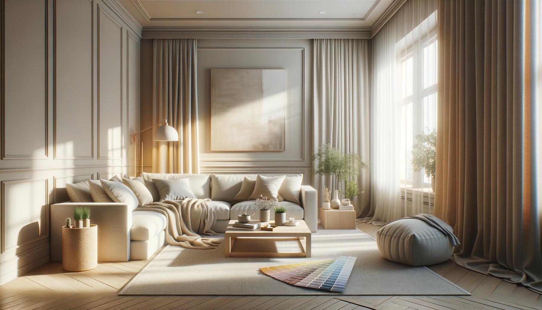
60% of your dominant neutral color (your walls, often), 30% of a complementary neutral shade (sofa, curtains, large rug), and 10% of more marked accents. These 10% can remain neutral but darker, or dare to use a soft color like blue-gray or sage green.
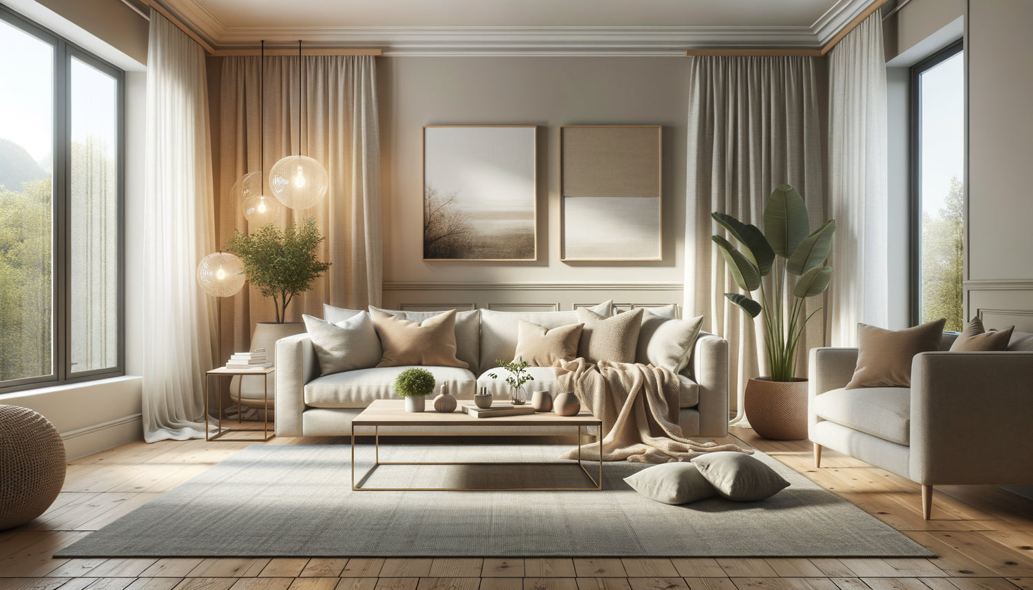
In my Parisian Airbnb, I have: 60% greige walls, 30% natural linen textile on the sofa and curtains, and 10% terracotta cushions and black decorative objects. The result? A warm harmony that appeals to all types of travelers.
This formula prevents the “blank page syndrome” where everything blends into a monotonous relief. Your online photos will have punch, and your guests will feel in a stylish cocoon rather than in a hospital room!
Combining textures and materials to avoid blandness
Here's my secret for neutrals to vibrate: play with materials! An all-beige interior but with ribbed velvet, crumpled linen, a Berber rug, raw wood, and rattan... it changes EVERYTHING.
Textures create shadows and reliefs that bring colors to life. A linen cushion doesn't render the same way as a velvet cushion, even in the same cream shade. Multiply tactile surfaces: knit, matte ceramic, aged wood, brushed metal...
I particularly like mixing three materials per room. For example, in the bedroom: cotton sheets, chunky knit throw, and a rattan headboard. All neutrals, but so visually rich!
Don't forget natural elements: dried branches in a vase, pebbles, wicker baskets... They bring that organic touch which instantly warms up a neutral palette.
What lighting to sublimate your neutrals?
We don't talk about it enough, but lighting makes or breaks a neutral palette. I made the mistake of choosing a beautiful gray in store that turned blue-violet at home with my Nordic light. Disaster!
Rule number one: test your colors with the natural lighting of your accommodation. Buy samples, paint large squares on different walls, and observe them at different times of the day.
For artificial lighting, prioritize warm white (2700-3000K) bulbs that enhance warm neutrals without yellowing them. Cold spotlights kill the warmth of a neutral interior and give it a sad appearance.
Multiply light sources: table lamps, LED string lights, wall sconces... Varied lighting creates comfort zones and highlights your color choices. In my Lyon studio, I installed three independent lighting circuits: guaranteed atmosphere!
The touches of personality that make the difference
Okay, let's be honest: your Airbnb shouldn't look like all the others. Neutrals are your base, but it's in the details that you create your identity.
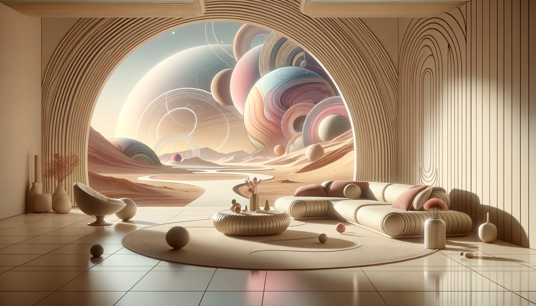
I love incorporating wall art that brings that sophisticated touch without overwhelming. Space-inspired paintings, for example, create a fascinating focal point while staying within tones that perfectly complement neutrals. Discover our selection of cosmos and space paintings which bring this poetic and mysterious dimension: cosmic hues (midnight blue, silver gray, golden touches) harmonize wonderfully with neutral palettes.
Also consider small objects that tell a story: a vintage coffee maker, well-chosen books, a generous green plant... These elements humanize the space without compromising its universality.
Tableware also deserves your attention. I've invested in artisanal ceramics in earth and sand tones. It photographs beautifully and adds that 'like at home, but better' touch.
Mistakes to absolutely avoid with neutrals
Let’s talk about the pitfalls I’ve fallen into (so you can avoid them!):
Betting everything on pure white: it's cold, it looks like a hospital, and it doesn't age well. Stains are visible, any imperfection is immediately apparent. Opt for off-whites.
Neglecting undertones: a beige with yellow undertones + a gray with blue undertones = guaranteed disaster. Stay consistent in your undertones (warm together, cold together).
Forgetting black: even in a neutral interior, you need dark anchor points. Black frames, anthracite door handles... they structure the space.
Buying everything from the same store: you'll have a catalog effect. Mix sources to create a real personality.
Neglecting maintenance: light neutrals require impeccable cleanliness. Invest in washable fabrics and wipeable paints.
Last mistake: believing that neutral = cheap. Quality materials make all the difference. Real linen is worth a thousand times more than cheap beige polyester.
Choosing a neutral palette for your Airbnb is choosing commercial intelligence without sacrificing style. It's creating a reassuring setting where everyone can project themselves, while letting your personal touch shine through in the details.
Remember: neutrals are not an easy option, it’s sophistication. They require reflection on undertones, work on textures, and attention to light. But once mastered, they become your best asset for bookings that explode and five-star reviews.
So, ready to transform your rental? Start small: one wall, one textile, one decorative element... and watch the magic happen. Your next guests will thank you in their comments!