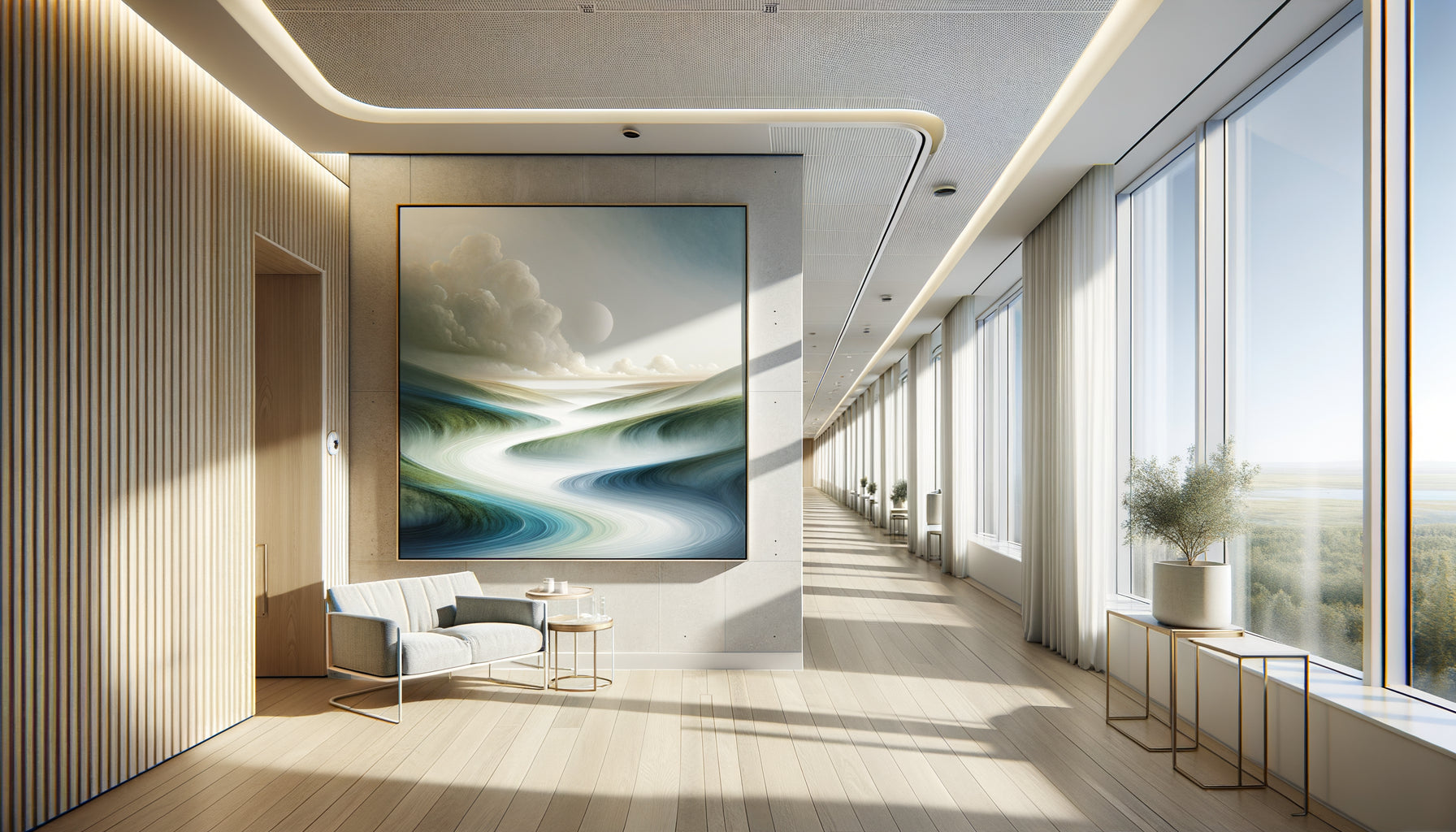
In the waiting room of a pediatric clinic in Zurich, I recently observed a disturbing scene: a child anxious, frozen in front of sterile white walls, then his face gradually calming as he contemplated a painting with soothing blue-green tones. This instant transformation reminded me of a fundamental truth that we, designers of therapeutic spaces, know intimately: colors heal as much as medicine.
Here's what Goethe’s color theory brings to medical spaces: an emotional understanding of hues that reduces patient anxiety, a visual harmony that promotes healing, and a universal chromatic language that transforms places of care into havens of serenity. After fifteen years advising healthcare facilities on their artistic design, I have seen that poorly mastered color choices create oppressive environments where patients feel more ill than safe.
The frustration is real: how to choose the right artwork for a medical office when every color seems to carry a contradictory message? Does red stimulate or attack? Does blue calm or sadden? Yet, the solution has existed since 1810, masterfully formulated by Johann Wolfgang von Goethe in his Treatise on Color. Unlike Newton who saw colors as purely physical phenomena, Goethe explored their psychological and emotional dimension, thus creating the foundation of all contemporary artistic choices in care spaces. I promise you that by understanding his principles, you will transform any medical environment into a therapeutic space.
When science meets emotion: Goethe versus Newton
Johann Wolfgang von Goethe was not just a romantic poet. In 1810, he published his Farbenlehre, a revolutionary treatise that dared to contradict Isaac Newton. Where Newton decomposed white light into a colored spectrum with his prism, Goethe was interested in human perception of colors and their emotional impact. For him, colors did not exist independently of the observer: they were born from the interaction between light and darkness, between the eye and the world.
This phenomenological approach radically changes our way of designing medical spaces. In my practice, I have applied Goethe’s color theory in more than sixty healthcare facilities across Europe. A striking example: a cardiology clinic in Brussels had wallpapered its walls with bright red, thinking to infuse energy. Catastrophic result: elevated blood pressure in waiting patients, increased nervousness. Goethe had anticipated this phenomenon two centuries ago: red belongs to the warm and active colors, stimulating the sympathetic nervous system.
The emotional color wheel
Goethe developed a color circle based on six fundamental colors: yellow, orange, red, violet, blue, green. But unlike contemporary circles, his integrated emotional qualities. Yellow evoked joy and warmth, blue-green serenity and calm. This emotional mapping remains today the foundation of artistic choices in medical spaces. Pediatric services naturally adopt soft yellows, palliative care units favor soothing blues, and waiting rooms opt for regenerating greens.
Colors that heal: concrete applications in a medical setting
During a project for an oncology center in Lyon, we meticulously applied the principles of Goethe's color theory. In chemotherapy rooms, we installed works dominated by deep blues and aquatic greens. Goethe described blue as a color that attracts the spirit to infinity, creating a sensation of expansion and freedom. For patients confined for hours to infusions, this impression of psychic space proves therapeutic.
Nurses reported a noticeable decrease in pre-treatment anxiety. One patient confided in me: These paintings give me the feeling of breathing, while physically I am exhausted. This reaction perfectly illustrates Goethe's brilliant intuition: colors act directly on our emotional state, regardless of our conscious will. It is precisely this involuntary quality that makes color choices so crucial in medical environments where patients are already psychologically vulnerable.
The triangle of complementary colors
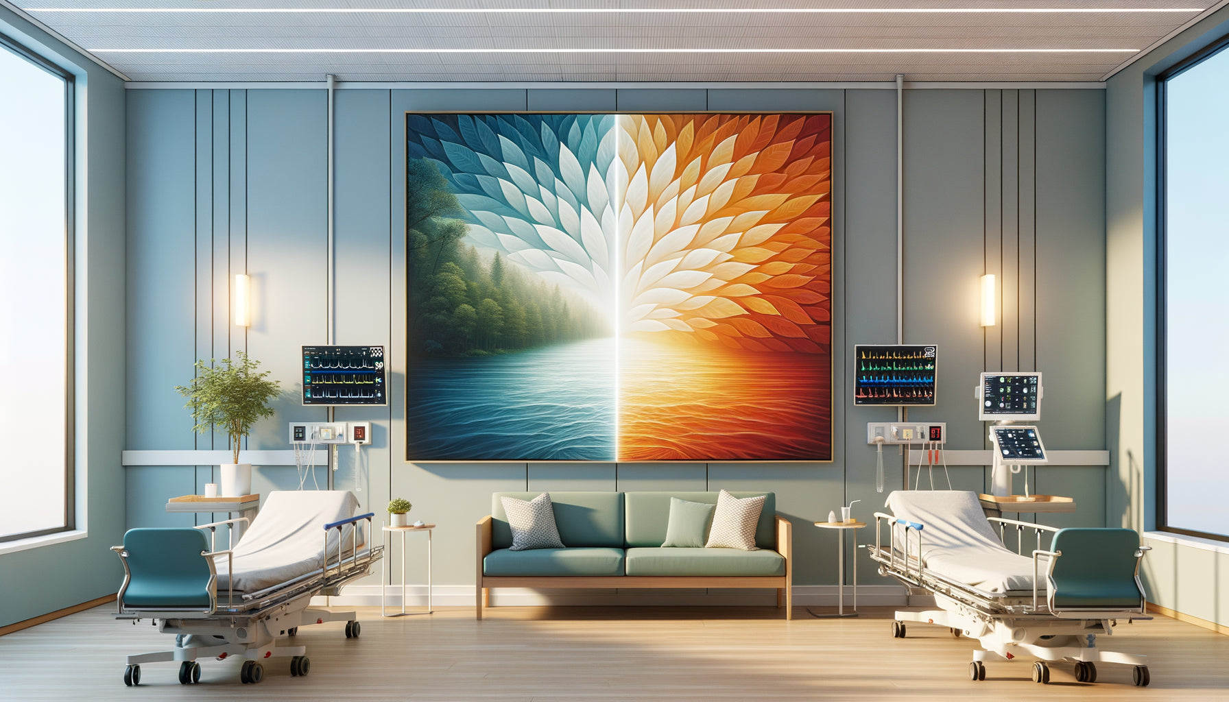
Goethe also theorized the harmony of complementary colors: those that, when placed side by side, create a perfect visual balance. Yellow and violet, red and green, blue and orange. In a dermatology department in Geneva, we installed a series of abstract paintings playing on the blue-orange duo. Goethe asserted that this combination satisfied the human eye by offering it chromatic totality. Patients spontaneously expressed a feeling of visual completeness, as if the space finally breathed correctly.
This approach contrasts sharply with traditional monochrome white environments. Medical white, although symbolizing cleanliness, creates according to Goethe's color theory an emotionally anxious void. The absence of chromatic stimulation deprives the brain of essential information for its balance, unconsciously generating malaise. Hence the importance of integrating works of art with thoughtful palettes in these spaces.

Beyond soothing blue: Nuancing chromatic clichés
We often hear that blue is calming and red is irritating. This simplification, although inspired by Goethe, betrays the subtlety of his thinking. In my practice, I have discovered that intensity and saturation count as much as the hue itself. A saturated cobalt blue can create tension comparable to red, while a powdery red, almost pink, infuses a comforting softness.
For a maternity service in Lausanne, we dared artworks with soft orange-reds, evoking the warmth of the maternal bond. Goethe described orange-red as the highest energy of color, but softened by a touch of white, it becomes a visual embrace. Young mothers reported a powerful feeling of comfort, as if the walls were kindly enveloping them. This experience confirms that Goethe's color theory does not offer recipes, but a framework for emotional exploration.
The importance of cultural context
Goethe himself recognized that the perception of colors varies according to cultures. When working with a multicultural medical center in Brussels, I had to adapt my artistic choices. While white symbolizes purity in the West, it evokes mourning in some Asian cultures. Green, calming for Europeans, can recall negative connotations elsewhere. This cultural sensitivity greatly enriches the contemporary application of Goethe's theory, making it more universal by paradoxically adapting it locally.
Natural light: The forgotten element of chromatic theory
An often overlooked aspect of Goethe's color theory concerns his obsession with natural light. For him, colors were born from the dance between light and shadow. In medical spaces, this dimension is crucial. A painting with deep blues placed in a waiting room without windows creates an oppressive heaviness. The same painting, bathed in natural light, breathes and soothes.
I oversaw the renovation of a dental clinic in Antwerp where we completely reorganized the artwork placement based on the orientation of natural light. Paintings with bright yellows migrated to the north walls, compensating for the cold light. Works with fresh greens found their place on the south side, tempering solar heat. Patients immediately perceived an inexplicable spatial coherence, but evident emotionally. Goethe would have applauded this holistic approach where color, light and space dialogue.

Why medical spaces need this ancestral wisdom
In our hyperconnected and stressful era, medical spaces represent potential sanctuaries where healing begins with visual soothing. Goethe's theory offers a universal language to create these therapeutic havens. Unlike fleeting design trends, its principles cross the centuries because they rely on fundamental human psychological constants.
A hospital director recently confided in me that since integrating works selected according to Goethe’s chromatic principles, prescriptions for pre-operative anxiolytics had decreased by 18%. This figure, although requiring broader studies, suggests that the visual environment physiologically influences our internal states. Goethe sensed this truth: colors do not only decorate our lives, they shape them.
Transform your medical space into a therapeutic haven
Discover our exclusive collection of wall art for medical offices that integrates the timeless principles of color theory to naturally soothe your patients.
Create your own therapeutic palette
Imagine yourself tomorrow, entering your freshly transformed office. Patients look up from their phones, captivated by a chromatic composition that resonates with their deep emotions. You don't need to explain why the atmosphere has changed: their bodies understand it instinctively. This is the magic of Goethean theory applied with intention.
Start by observing the natural light in your space. Note how it changes with the hours, the seasons. Then, according to the principles of Goethe's color theory, choose artworks that dialogue with this light. For a north-facing space, favor soft yellows and oranges. For a south orientation, dare to use refreshing blues and greens. Your patients will feel this harmony without necessarily being able to name it, and it is precisely this unconscious resonance that transforms a place of care into a healing space.
Frequently Asked Questions about Goethe's Color Theory in Medical Settings
Is Goethe's color theory scientifically validated for medical spaces?
Excellent question that deserves a nuanced answer. Goethe's color theory was not scientific in the contemporary sense, but rather phenomenological: it described the subjective experience of colors. However, modern research in environmental psychology largely confirms his intuitions. Studies show that blues reduce blood pressure, greens promote post-operative recovery, and reds stimulate cognitive activity. Goethe was right to assert that colors influence our physiology, even if the neuroscientific mechanisms were not yet elucidated at his time. In my practice, I see daily that spaces designed according to his principles generate exceptionally positive patient feedback, which constitutes a powerful empirical validation.
Which colors should absolutely be favored in a general practitioner's office?
Contrary to popular belief, there is no universal palette, and that is precisely what Goethe's color theory teaches us: each space has its own luminous and functional identity. For a general practice welcoming all types of patients, I generally recommend a base of regenerating greens and soothing blues, nuanced according to the orientation. Green, an intermediate color in Goethe's circle, satisfies the eye without overstimulating or understimulating it. Add touches of soft yellow to warm up the atmosphere, especially in waiting areas where patients may feel apprehension. Avoid bright reds and saturated oranges in treatment areas, but don't hesitate to integrate them subtly into administrative spaces where energy is welcome. The essential thing is to create a coherent chromatic progression that emotionally guides the patient from the anxiety-provoking entrance to the reassuring consultation room.
Can Goethe's theory be combined with contemporary artworks?
Absolutely, and that’s even the best approach! <strong>Goethe's color theory</strong> isn't a stylistic straitjacket but an emotional framework. I have successfully integrated abstract photographs, contemporary paintings, and even digital installations into medical spaces, always guided by Goethean principles. The important thing is not the artistic style but <strong>chromatic intention</strong>. A minimalist photograph of a seascape can convey Goethe's calming blue as effectively as a 19th-century romantic painting. A geometric abstraction in emerald greens respects its principles as faithfully as a naturalistic landscape. What matters is the emotional quality of color, not its representation. Contemporary patients also appreciate that medical spaces reflect a current aesthetic while preserving this timeless wisdom of chromatic harmonies. It is this alliance between traditional theory and contemporary expression that creates the most powerful therapeutic environments.