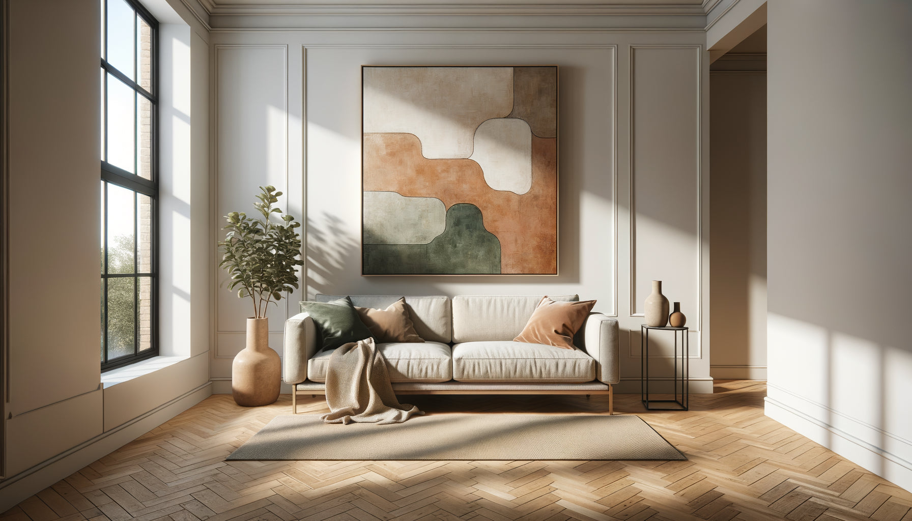
That morning, as I opened the door to my new apartment bathed in Nordic light, I hung my favorite orange-toned painting. The result? A strangely stifling, almost aggressive atmosphere. This experience taught me a fundamental lesson: the chromatic temperature of a work must dialogue with the orientation of your space, not contradict it.
Here's what a painting with a warm or cool palette, well chosen brings: a natural luminous balance that transforms your apartment, a visual harmony that amplifies or tempers the existing light, and an atmosphere perfectly suited to your daily life. Too often, we choose a work for its intrinsic beauty, without considering this subtle alchemy between colors and solar exposure. We then find ourselves with spaces that seem constantly « out of sync », without understanding why that magnificent painting in a gallery seems dull at home, or why that soothing canvas creates an inexplicable tension.
Rest assured: understanding this dynamic requires no expertise in chromotherapy. It is enough to know a few simple principles about how natural light interacts with pigments. I will guide you through this discovery which has radically transformed the way I dress the walls of my clients and my own interior.
Light reveals or betrays: understanding the impact of orientation
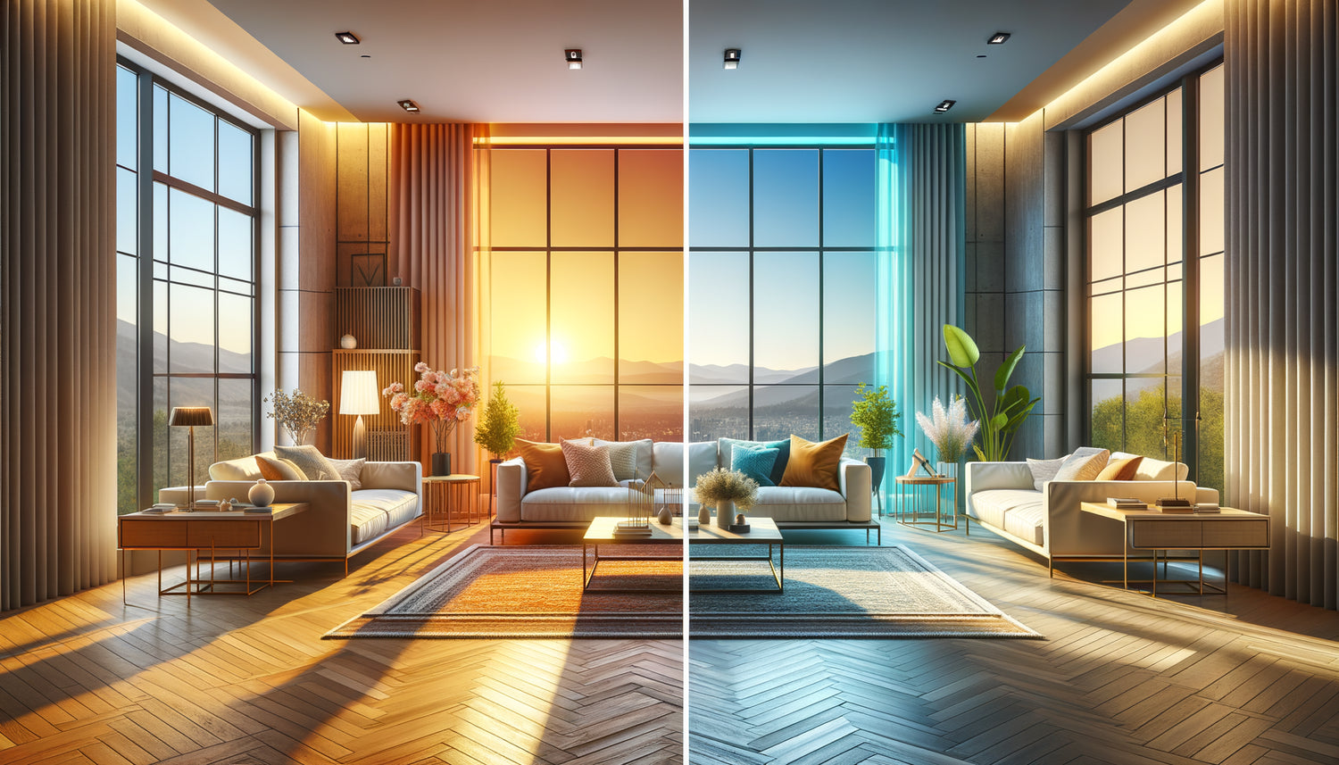
Each orientation possesses its unique luminous signature, its own character that profoundly influences our perception of colors. An apartment facing north receives a constant but cold light, almost bluish, which remains stable throughout the day. This diffused luminosity naturally creates a cool atmosphere, sometimes perceived as austere.
Conversely, an exposure to the south floods the space with warm and generous light for most of the day. Direct rays make colors vibrate, creating marked contrasts and a naturally energizing atmosphere. The east offers you this golden morning light, invigorating but ephemeral, while the west captures the evening lights, that intense warmth at the end of the day.
I observed in my own west-facing living room how a painting with cool tones – deep blues and turquoise greens – seemed to literally fade under the orange rays of the evening. The cold pigments absorbed this warm light instead of reflecting it, creating a « black hole » effect on the wall. Choosing a painting with a warm or cool palette without considering this dimension is ignoring the main lighting designer in your interior: the sun itself.
Cool palette for warm exposure: the rule of harmonious counterpoint
When your apartment benefits from a southern or western exposure, you already have an abundance of natural warm light. A painting with a cool palette then becomes your ally to temper this intensity and create a soothing balance.
Deep blues, emerald greens, muted purples, or silvery grays will delicately absorb excess light heat without fighting it. Imagine a seaside landscape with cerulean hues on a sunny wall: the warm southern light will reveal the subtleties of these blues, give them depth, create changing reflections throughout the day.
In a south-facing Parisian loft that I recently decorated, we installed an abstract composition dominated by turquoise and indigo. The transformation was spectacular: the space, previously almost too bright and aggressive midday, gained sophistication. The cool palette artwork created a visual oasis, a resting point for the eye in this sea of golden light.
Which cool shades to prioritize depending on light intensity?
For a very bright south exposure, dare to use saturated blues, deep forest greens, rich purples. These powerful hues can perfectly handle confrontation with intense direct sunlight. For a more moderate west exposure, prefer softened cool palettes: blue-gray, sage green, pale lavender. These softer shades will harmonize with the declining evening light, creating crepuscular atmospheres of rare elegance.

Warm palette for cold exposure: infuse missing energy
Conversely, an apartment facing north or a morning east often suffers from a lack of light warmth. This is where an artwork with a warm palette truly becomes magical, compensating for this natural coolness with its own chromatic energy.
Earth reds, burnt oranges, golden yellows, deep ochres will literally visually warm your space. These colors do not directly receive the warm light of the sun; they must therefore generate it themselves. An abstract sunset, a flamboyant autumnal landscape, a composition in copper tones: all sources of artificial heat that transform the atmosphere.
In my north-facing bedroom, I installed a large format dominated by terracotta and saffron hues. The contrast with the natural bluish light creates a fascinating visual tension, almost vibrational. The artwork seems to possess its own light source, radiate from within. This subtle optical illusion warms the space psychologically much more effectively than an electric heater.
The art of balance: avoiding overcompensation
However, be careful not to fall into the trap of overcompensation. A painting with a warm palette that is too aggressive in a north-facing room can create an unpleasant artificial effect. Opt for earthy reds rather than bright primary reds, spiced oranges rather than neon oranges. Sophistication lies in nuance: a painting with warm tones but mature, patinated, slightly desaturated will bring the desired warmth without visual violence.
Intermediate exposures: playing with changing light
East and west orientations present a particular challenge: the light changes dramatically throughout the day. An east-facing room receives that magnificent golden morning light, then shifts to a more neutral or even cool luminosity in the afternoon. A west-facing room experiences the opposite phenomenon.
For these dynamic exposures, you have two possible strategies. The first: choose a painting with a warm or cold palette depending on when you mainly use the room. A bedroom facing east, mostly used in the morning? Opt for cool tones that temper the golden light of dawn. A west-facing living room used in the evening? Warm tones will enhance spectacular sunsets.
The second strategy, more daring: select a work with mixed temperatures, which subtly integrates warm and cold areas. These chameleon paintings reveal different facets depending on the time of day, creating a changing spectacle on your walls. I installed an abstract canvas blending deep blues and golden touches in a dining room facing east: magical at sunrise, soothing in the afternoon.

Beyond theory: the importance of in situ testing
However precise these rules may be, nothing replaces direct observation in your own space. The presence of trees in front of the windows, the color of your walls, the ceiling height, the urban or natural environment: all variables that subtly alter the quality of light.
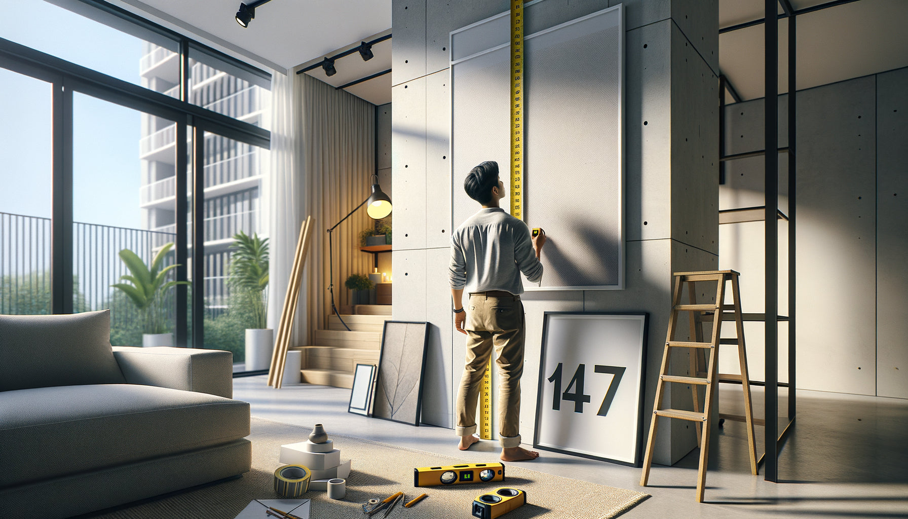
My advice? Before investing in an important piece, use the "temporary painting" technique. Print a reproduction of the artwork you are considering in large format (even approximate), hang it temporarily and observe it at different times of the day. How does it dialogue with the morning, midday, evening light? Does it reveal itself or fade away? Does it create the desired atmosphere?
This empirical approach has saved me from many disappointments. A painting with a cool palette that I loved in a gallery seemed dull in my north-facing entrance. Conversely, a canvas with warm tones that I found almost excessive turned out to be perfect in the same space, transforming a dark hallway into a welcoming passage.
The crucial role of size and placement
The dimension of the painting also influences its thermal impact. A large format with warm tones has a much more powerful visual warming effect than a small canvas, even with identical colors. For a north-facing apartment that really needs warmth, don't hesitate to invest in a beautiful piece.
Placement is just as important. A painting with a cool palette placed facing a south-facing window will directly receive warm light, creating fascinating effects of brilliance and depth. Conversely, on a perpendicular wall, the same work will reveal different nuances, more subtle. Experiment with locations before permanently drilling holes in your walls.
When to break the rules: intuition at the service of originality
Paradoxically, after explaining these principles to you, I must confide this to you: the most beautiful decorative accidents sometimes arise from a conscious transgression of these rules. I have seen paintings with vibrant warm palettes transform south-facing apartments into jubilant celebrations of light, creating an assumed intensity, almost Mediterranean.
Likewise, some north-facing spaces gain mystery and sophistication with cool palettes that amplify their introspective character rather than fighting it. This approach requires courage and a clear vision of the desired atmosphere. If you like cool, Nordic, minimalist atmospheres, why artificially warm up your north-facing space? Embrace its nature and magnify it.
The key lies in intention. Consciously choosing to reinforce rather than temper a luminous characteristic is a legitimate aesthetic choice. What doesn't work is the unconscious choice, by default, without consideration for these dynamics. Knowing the rules allows you to break them intelligently, not to suffer from them through ignorance.
Ready to transform the light in your apartment into a decorative asset?
Discover our exclusive collection of paintings for Apartment that harmoniously dialogue with each orientation, creating the perfect atmosphere for your living space.
The art of living with light, not against it
Ultimately, choosing a painting with a warm or cool palette according to the orientation of your apartment is accepting to collaborate with the architecture, with the course of the sun, with the seasons that subtly change the quality of light. It's understanding that your wall isn't a neutral surface, but a changing screen that reveals works differently depending on the time and day.
This approach transforms the act of hanging a painting into a true choreography between natural light and color. Your south-facing apartment soothes under blue waves. Your north bedroom is illuminated by permanent sunsets. Your living room becomes a theater of morning metamorphoses.
Start simply: identifying precisely the orientation of each room, observe the quality of light at different times, then let this knowledge guide your choices. You will discover that a painting well-matched to its luminous environment seems to inhabit the space with a natural evidence, as if it had always been destined for that specific wall, in that particular light. It is this kind of magic that I wish you to create at home.
Frequently Asked Questions
Can we mix warm and cool paintings in the same room?
Absolutely, and it's even often desirable to create visual dynamism! Maintaining a clear hierarchy is important: a dominant painting (the largest or best placed) that respects the orientation rule, complemented by secondary pieces that can play the counterpoint. In a south-facing living room, you can for example install a large cool artwork as a focal point, then add some more subtle warm touches to avoid monotony. This approach creates visual conversations between artworks, creative tensions that enrich the space. Think of your wall as a global composition rather than a succession of isolated elements.
How to determine if a painting is really warm or cool?
The question is excellent because some works are ambiguous! Photograph the painting with your smartphone and convert the image to black and white: this technique reveals the dominant temperature by eliminating the distraction of colors. A predominantly light rendering in black and white probably contains more yellows, reds, oranges (warm), while a dark rendering indicates blues, greens, violets (cold). You can also use the « first impact » method: what thermal sensation does the artwork provoke at first glance, before analysis? This immediate intuition is often correct. Finally, observe the shadows and neutral areas: in a warm painting, even the grays tend towards beige or ochre; in a cold painting, they lean towards blue-gray or taupe.
What to do if my apartment has an unfavorable orientation for the painting I love?
Genuine affection for a work always deserves consideration! <strong>Several solutions are available to create a harmonious compromise</strong>. First, explore all your walls: sometimes, a wall perpendicular to the window receives a more neutral light that better accepts deviations from the rule. Then, consider passageways (hallway, entrance) where orientation is less important as you do not stay there. You can also modulate artificial lighting: well-oriented spotlights with bulbs of appropriate temperature (warm or cool) partially compensate for natural orientation. Finally, accept that the work reveals different facets depending on the seasons: your warm painting in a south-facing apartment will be magnificent in winter when the light fades, creating a natural rotation of atmospheres throughout the year.