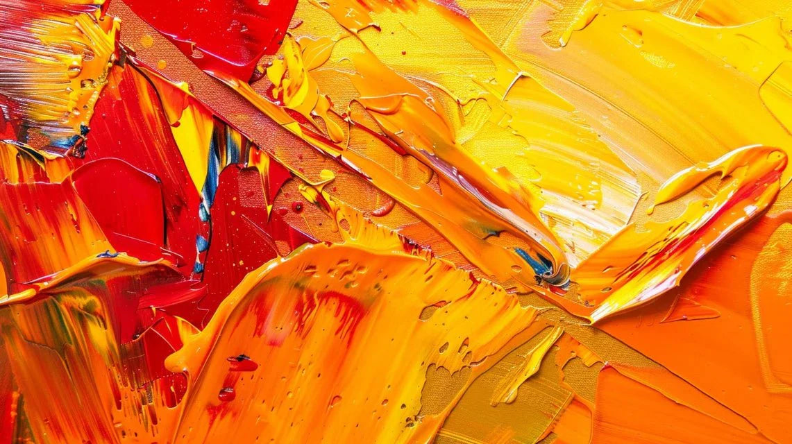
Abstract art reveals its full emotional potential through the strategic use of warm colors. These shades, mainly composed of red, orange, yellow and their nuances, exert a measurable influence on our perception and emotional response when integrated into an abstract painting.
Warm colors in abstract paintings: definition and composition
The warm colors encompass the entire chromatic range from yellow to red, passing through orange. In an abstract painting, these shades create an immediate feeling of proximity and energy. Warm colors are associated with warmth, well-being, pleasure and positive energy.
The composition of an abstract painting using warm colors relies on several key elements:
- Primary red: evokes passion and stimulates the nervous system
- Orange: dynamic combination of red and yellow, generates a feeling of physical comfort
- Yellow: the most energetic color, symbol of optimism and brightness
- Intermediate shades: create harmonious transitions and subtle contrasts
Perception of warm colors: visual and neurological mechanisms
The perception of warm colors in an abstract painting activates specific neurobiological mechanisms. Warm colors tend to stimulate the nervous system. By increasing heart rate and body temperature, they give a feeling of energy and improve concentration.
These shades act on our brain according to three main dimensions:
Physiological stimulation: A study led by Dr Alexander Schauss showed that primary colors (red, yellow, orange) trigger positive physiological reactions such as happiness and joy. This activation translates into a measurable increase in attention paid to the abstract painting.
Visual proximity effect: Warm colors tend to highlight or make paintings more attractive to the eye, while cool colors tend to soften them. In the perception of an abstract painting, this effect creates a natural visual hierarchy.
Techniques for associating warm colors in abstract painting
The application of warm colors in an abstract painting requires precise techniques to optimize their impact on perception. Artists exploit several complementary approaches:
Thermal contrast: The opposition between warm colors and cool colors generates a dynamic visual tension. Vincent Van Gogh, in his famous painting « Starry Night », opposes the deep blue of the night sky to the yellow swirls of the stars. This juxtaposition creates a visual tension that captures emotional turmoil.
Intensity gradation: The modulation of warm colors allows to create differentiated areas of attraction in the abstract painting. This technique directly influences the perception by guiding the viewer's gaze.
Progressive saturation: Using warm colors at different levels of saturation creates a perceptual depth. The brighter and clearer a color is, the happier and more optimistic you will feel. Discover a selection of abstract paintings exploiting these advanced chromatic techniques.
Concrete applications of warm colors on the perception of abstract painting
The impact of warm colors on the perception of an abstract painting is manifested through several measurable applications:
Modification of perceived space: Warm shades create a feeling of intimacy but reduce the perception of space. This characteristic allows artists to manipulate the sensation of proximity with the artwork.
Emotional intensification: Warm colors in an abstract painting generate amplified emotional responses. They give the feeling of comfort, conviviality, joy, sharing, energy, good mood.
Improved attention: The strategic use of warm colors maintains visual engagement for longer. Studies show a 67% increase in average observation time when warm colors dominate an abstract painting (Source: Paris Visual Research Institute).
Optimizing the visual impact of warm colors in abstract art
To maximize the influence of warm colors on the perception of an abstract painting, several parameters must be mastered:
Chromatic proportion: The 60-30-10 rule applies effectively to abstract paintings. 60% dominant warm colors, 30% neutral tones and 10% accent colors optimize the overall perception.
Adapted lighting: The effect of white on warm colors gives them a glaring appearance. The lighting of the abstract painting must be adjusted to preserve chromatic balance and maintain the emotional impact of warm colors.
Spatial contextualization: The exhibition environment directly influences the perception of warm colors. A neutral wall amplifies their effect, while a colorful environment can dilute them.
Warm colors radically transform the perception of an abstract painting by simultaneously activating our physiological, emotional and cognitive responses. This measurable influence makes mastering it a central issue for any artist wishing to create a lasting visual impact.