Mistakes to Avoid When Decorating Your Living Room Walls with Paintings
Decorating your living room wall with paintings can transform your living space, but it is essential to avoid some common mistakes to achieve a harmonious and aesthetically pleasing result. In this article, we will guide you through the most common mistakes to avoid when integrating living room decoration paintings , so that your wall becomes a real asset in your interior design.
1. Choosing inappropriately sized tables
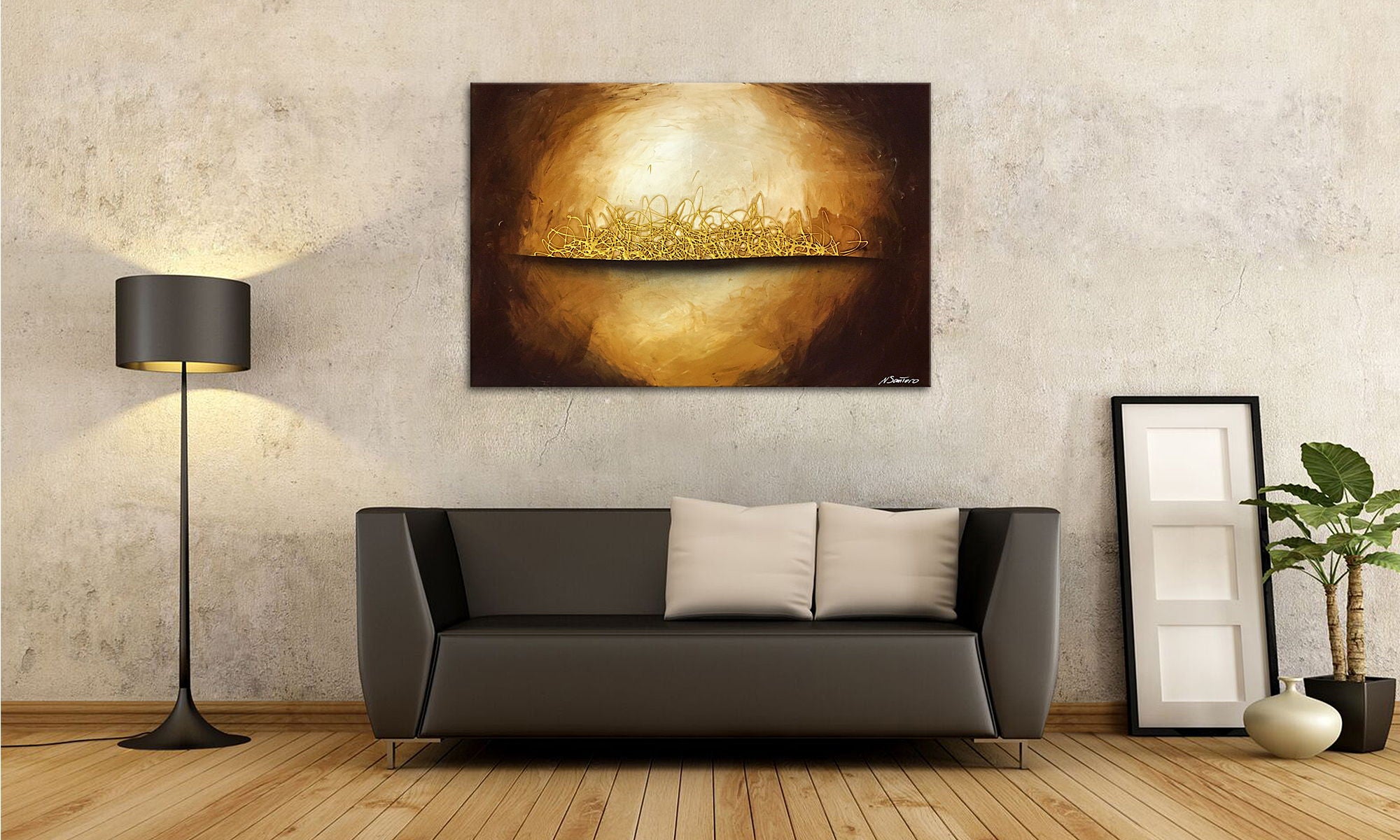
One of the most common mistakes is selecting canvas prints that are the wrong size for the available wall space. A canvas print that is too small on a large wall can look lost and insignificant, while one that is too large can overpower the space. It is crucial to consider the dimensions of your wall before choosing a canvas print. A good guideline is that the canvas print should take up about two-thirds to three-quarters of the width of the piece of furniture underneath, such as a sofa or sideboard.
2. Neglecting color harmony
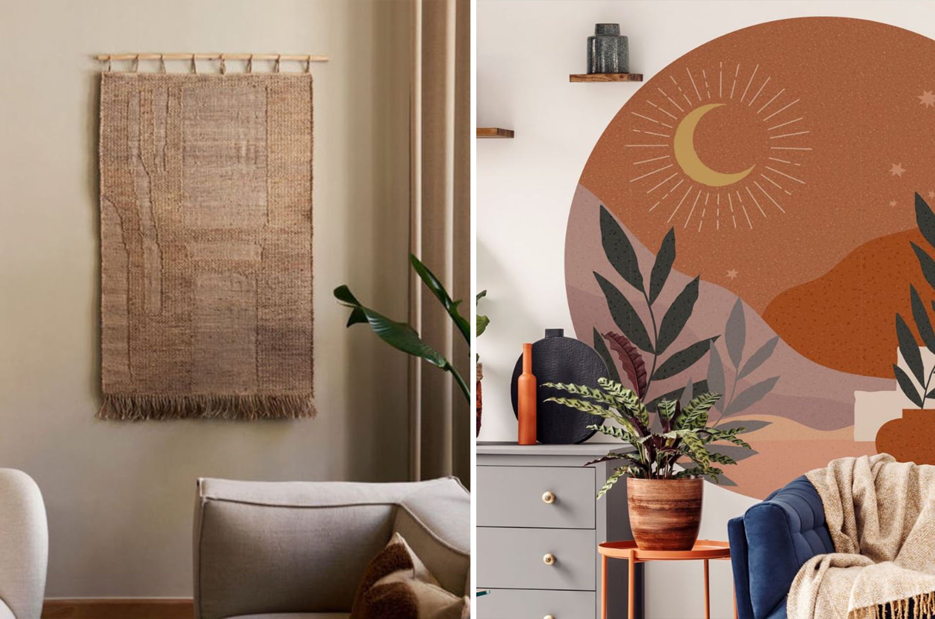
The colors of your painting should harmonize with the color palette of your living room. A common mistake is to choose paintings whose colors do not blend well with the rest of the decoration. This can create a visual imbalance and give an impression of chaos. To avoid this, opt for paintings whose hues complement or contrast harmoniously with the colors of your walls, furniture and accessories. For example, if your living room is decorated in neutral tones, a painting with bright colors can bring dynamism without breaking the overall harmony.
3. Hanging pictures at the wrong height
Hanging a living room decoration painting at an inappropriate height is a common mistake. If the painting is too high, it can seem disconnected from the rest of the decoration, while if it is too low, it can make the space seem disproportionate. The general rule is to place the center of the painting at eye level, about 150 cm from the floor. However, if the painting is hung above a piece of furniture, such as a sofa or a fireplace, it should be positioned so that it is balanced with this element, generally at a distance of 15 to 20 cm above.
4. Overloading the walls with too many pictures
It can be tempting to fill a wall with lots of art, but this can quickly lead to visual overload. A wall that is too busy can make the space feel cluttered and difficult to appreciate. To avoid this mistake, limit the number of paintings on a single wall, and make sure they are well spaced. If you have multiple paintings to hang, consider creating a well-organized gallery wall where each piece has enough space to "breathe." Use paper templates to plan the layout before drilling holes to ensure the paintings are arranged properly.
5. Forgetting the importance of lighting
Lighting plays a crucial role in enhancing your paintings. A common mistake is to overlook lighting, which can cause a work to go unnoticed or create distracting reflections. To avoid this, make sure your paintings are well lit, either with directional lighting or ambient lighting that does not create reflections. Using spotlights or specific fixtures for art lighting can help accentuate the details and colors of the painting, reinforcing its visual impact.
6. Ignoring visual balance
For a successful layout, it is important to consider the visual balance of the entire room. Hanging a decorative wall painting without considering the other decorative elements can create a feeling of imbalance. Make sure the painting is in harmony with the other objects in the room, such as furniture, lighting and textiles. If you have several paintings, think about arranging them in a way that creates a balanced composition, where each element contributes to the overall harmony.


Leave a comment
This site is protected by hCaptcha and the hCaptcha Privacy Policy and Terms of Service apply.