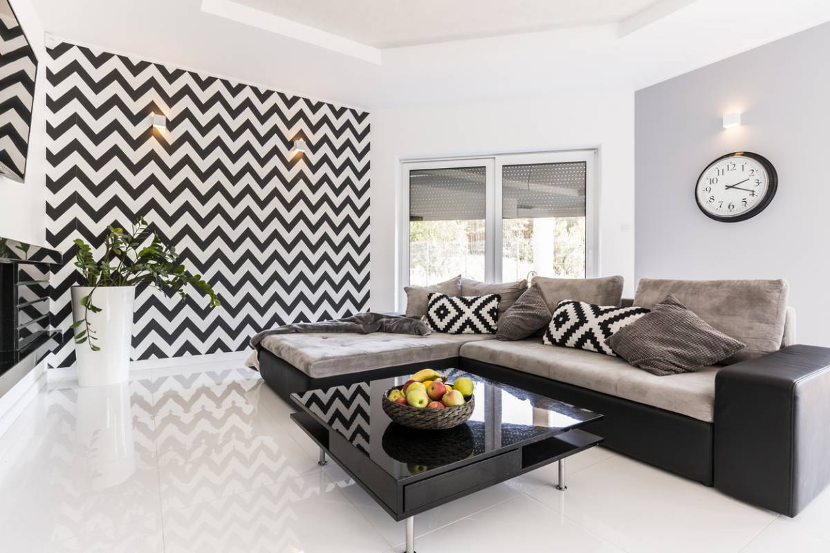
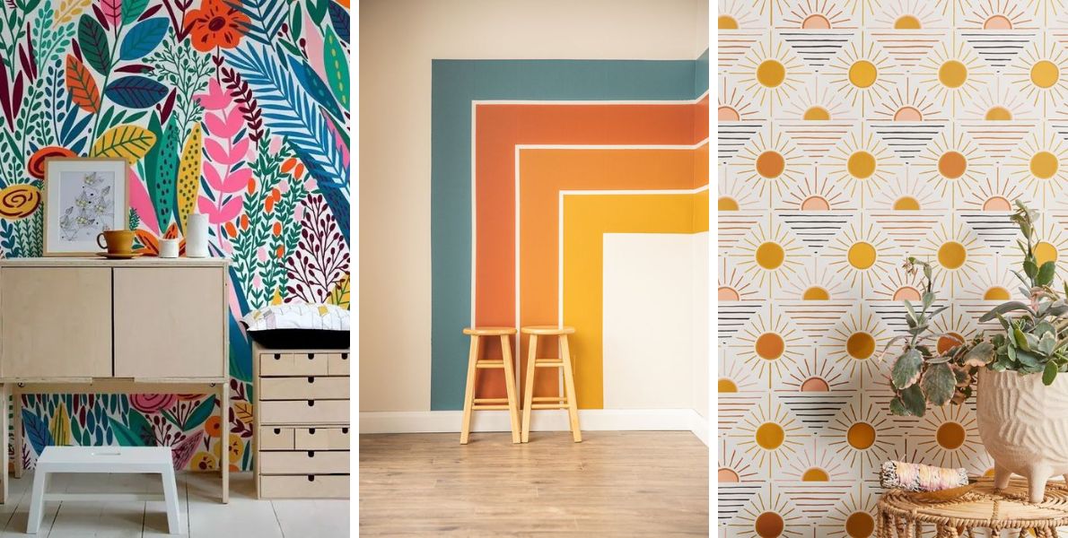
An original wall decoration can transform any space into a unique work of art. However, it is easy to fall into certain traps that compromise the harmony and elegance of your interior. In this article, we present the most common mistakes to avoid to ensure a successful and stylish wall decoration.
Failure to respect the proportions of the room
One of the most common mistakes in wall decoration is not taking into account the proportions of the room. A painting or work that is too small on a large wall can seem lost, while a piece that is too imposing can visually crush the space. It is essential to choose works that are proportionate to the size of the wall and the general layout of the room to maintain a visual balance.
Tip: Before installing your wall decor, measure the available space and try different templates to see which size would work best.
Ignore color palette
A common mistake is choosing wall decor that doesn't complement the room's color palette. The colors in your artwork should complement the colors in your interior, whether by creating a stylish contrast or reinforcing an existing harmony. Choosing hues that clash with the rest of the room can create an unpleasant visual dissonance.
Tip: Consider incorporating elements of color from your wall decor into other accessories in the room, such as cushions, rugs or curtains.
Hanging at the wrong height
The positioning of your wall art is crucial to its impact. Hanging a painting too high or too low can unbalance the space. As a general rule, artwork should be hung at eye level for maximum impact.
Tip: If you're creating a gallery wall with multiple pieces, line them up by centering each one at the same height to maintain visual consistency.
Multiplying wall decoration styles without coherence
Mixing multiple art styles together without thinking about how they work together can make the whole look messy. While variety is great, it's important to keep a common thread in your choice of artwork, whether that's through similar colors, themes, or styles that complement each other.
Tip: Choose a cohesive theme or color palette and make sure each piece fits together harmoniously.
Forget about lighting
Lighting is often overlooked in wall decor , but it plays a vital role. Poor lighting can make your artwork invisible or create unflattering shadows. Conversely, well-designed lighting highlights the details and colors of your wall pieces.
Tip: Use directional spotlights or wall lights to directly illuminate your artwork and avoid glare.


Leave a comment
This site is protected by hCaptcha and the hCaptcha Privacy Policy and Terms of Service apply.