


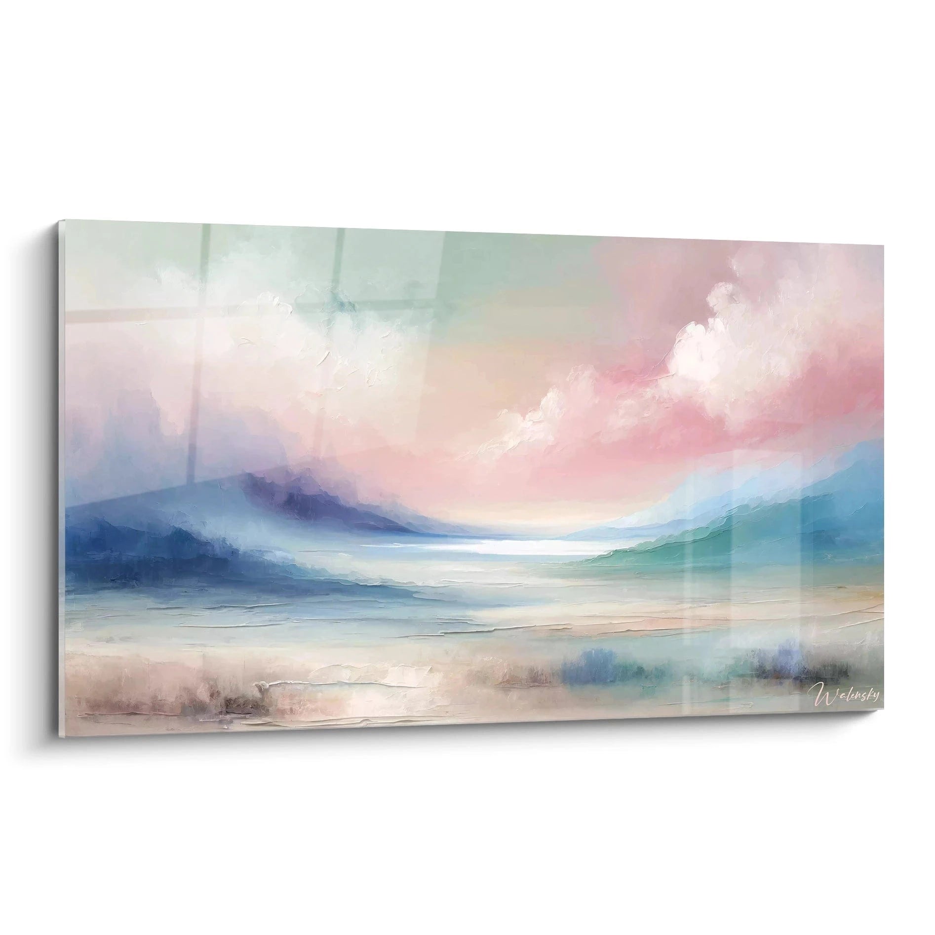

Abstract multicolored spiral painting: boost the creativity of your office
8 λεπτά ανάγνωσης · από τη Walensky
ΠΙΝΑΚΑΣ ΑΦΗΡΗΜΕΝΕΣ ΣΠΕΙΡΕΣ
9:14 a.m., Tuesday. The creative team is gathered around the table for the quarterly brainstorming session, and the wall facing the main workstation is white. Still white. Since the space was set up, no one has had time to think about it — yet this wall watches everyone work, day after day, without ever giving anything back.
An abstract multicolored spiral painting is not merely a matter of taste for this kind of space. It is a visual tool that plays with the way the brain processes movement and color — and which, placed in the right spot, literally changes the energy of a workspace.
The direct answerAn abstract multicolored spiral painting boosts creativity in the office through two combined mechanisms: the circular movement of the spiral captures and holds visual attention without tiring it, while vivid colors activate the cognitive alertness associated with energy and openness of mind. Placed facing the workstation or in a brainstorming room, it acts as a visual trigger that breaks the monotony of the gaze and renews attention.- The spiral form follows a continuous circular movement that catches the eye without ever tiring it, unlike rigid or overly busy patterns.
- Warm colors (orange, yellow, red) energize, while cool palettes (blue, turquoise) soothe reflection — the choice depends on how the room is used.
- Facing the workstation or in a creativity room, the painting becomes an active visual resting point, not just wall decoration.
Why the multicolored spiral stimulates creativity in the office
The spiral is not a motif chosen at random by kinetic abstract artists. It is one of the forms most studied in visual psychology: it guides the eye in a fluid movement, with no sharp angles and no break. The gaze follows, turns, returns — a bit like a visual breath.
Facing a screen for eight hours a day, the eye and brain need these micro-pauses. A hypnotic spiral hung in the peripheral field of vision offers exactly this kind of break: a few seconds of visual relaxation which, accumulated, help you return fresher to a complex file.
A creative wall should not just be beautiful. It should make you want to lift your head.
The psychology of color reinforces this effect. Vivid tones — pink, yellow, turquoise, orange — are associated with states of alertness and mental openness, the opposite of the lethargy that overly neutral interiors can induce. In a design agency or creative studio, this is not a detail: it is a decision that shapes the everyday working atmosphere.
A work overloaded with fine detail can, on the contrary, tire the eye over time. The abstract spirals that work best in the office play on broad shapes and fluid gradients, not on an accumulation of small motifs.
The colors that energize a creative space
Not all multicolored palettes tell the same visual story. The choice of hues determines whether the painting will electrify a brainstorming room or simply brighten it without unsettling it.
Warm versus cool palettes in a multicolored spiral
A spiral dominated by red, orange and yellow pushes toward energy, positive urgency, the desire to act — perfect for a creativity room where ideas must be generated quickly. Conversely, a spiral with a blue-turquoise dominance installs a softer tension, conducive to long concentration and strategic reflection.
The painting Rainbow Vortex illustrates the first approach well: a chromatic explosion of yellow and multiple colors designed to inject rhythm into a space that lacks it.
Contrast and vibrancy: finding balance without tiring the eye
The classic pitfall is believing that "the more vivid, the better." Wrong. An overly saturated painting, hung facing a screen, can create visual fatigue after several hours of work.
The ideal: a work where the colors vibrate without fighting each other, with a dominant hue that structures the whole. The painting Cosmic Vortex, for example, plays on a deep blue that anchors the composition while letting the other tones swirl around it.

Αγαπημένη επιλογή
Multicolored spiral painting - Vibrant vortex - abstract spiral edition
Από 213,90 €
Ανακαλύψτε αυτόν τον πίνακαWhere to place a multicolored spiral painting to maximize inspiration
The location changes the entire effect of the painting. Facing the main workstation, the spiral becomes a natural point of fixation during reflection breaks — those moments when you lift your eyes from the screen without really knowing what to look at.
- Facing the individual desk : at eye level in a seated position, to catch the gaze during micro-pauses.
- Brainstorming room : on the main wall, visible to all participants seated around the table.
- Agency reception wall : in large format, to set the creative tone from the moment one enters the premises. For this kind of use, a large-format contemporary abstract spiral painting is the most striking choice.
For a reception wall or meeting room, a panoramic format often makes a better impression than an isolated square: the eye follows the width and the movement effect extends. The Chromatic Harmony format, available up to 255x85 cm, illustrates this panoramic potential well.
— Nuestra selección


Pairing the multicolored spiral with other creative office universes
A successful creative wall does not necessarily rely on a single artwork. These abstract spiral paintings also make excellent gifts for modern decor. Many agencies combine visual registers that respond to each other without copying one another.
A multicolored spiral can very well converse with a geometric painting in vivid colors, whose structured lines balance the more organic movement of the spiral. On a wider wall, one can also introduce a note of escape with a travel painting to give the office a wanderlust breath, to break the rigidity of work with a touch of elsewhere.
To combine several paintings without creating visual chaos, keep a single dominant color family across the works. Two or three recurring hues are enough to hold the ensemble together, even if the subjects differ.
Those who prefer to stay within a single artistic vein will find what they need in a collection of contemporary multicolored paintings, designed precisely for this kind of coherent creative wall.
— Ανακαλύψτε επίσης


Our favorite multicolored and gold spirals for the office
Here is a selection designed specifically for a creative workspace — agency, studio or home office that needs a bit of visual electricity.
The Vibrant Vortex relies on a pink-blue contrast that captures the eye without aggressing it, ideal for a wall facing the workstation. Color Explosion, with its golden touch, brings a more artistic, almost gallery-like dimension for a reception wall. Finally, Vortex of Life plays on a blue-multicolored gradient that works as well in a meeting room as in an open space.
For narrower spaces, the collection of colorful abstract paintings offers varied formats that suit an office corridor as well as a main wall. And if your company favors shared spaces, the coworking painting collection is worth a look.

Στο ίδιο πνεύμα
Πολύχρωμος σπειροειδής πίνακας - Χρωματική έκρηξη - αφηρημένη έκδοση σπείρα
Από 213,90 €
Ανακαλύψτε αυτόν τον πίνακα →Συχνές ερωτήσεις
Which colors should you choose for a creative office painting?
To stimulate energy and idea generation, favor warm palettes (orange, yellow, red). For a space of long concentration, a blue-turquoise dominance installs a more measured reflection without making the room sleepy.
Can an abstract painting really stimulate creativity?
It does not act like a magic wand, but the visual movement of a spiral and the alertness associated with vivid colors create an environment favorable to active breaks, those moments when the brain relaxes and then bounces back on an idea.
Which spiral painting format for a professional office?
Facing an individual workstation, an L format (120x70 cm) is more than sufficient. For a meeting room or reception wall, aim rather for a panoramic or 3XL format, keeping in mind that a wall artwork ideally occupies 60 to 75% of the width of the wall or furniture piece it hangs above.
How to combine several abstract paintings in one space?
Keep a common color scheme across the works, even if the motifs differ — a multicolored spiral and a geometric painting in similar tones coexist very well on the same creative wall.
Συμπέρασμα
The white wall facing the workstation is never neutral: it silently weighs on the energy of the day. An abstract multicolored spiral painting is not there to look pretty between two meetings — it is a choice that directly affects how a team looks, breathes and bounces back on its ideas.
Before ordering the next batch of coffee to get through the 3 p.m. meeting, perhaps first think about this wall that has been waiting far too long. A detour through our collection of multicolored spiral paintings could well change the game.
Εξερευνήστε τις συλλογές μας


