


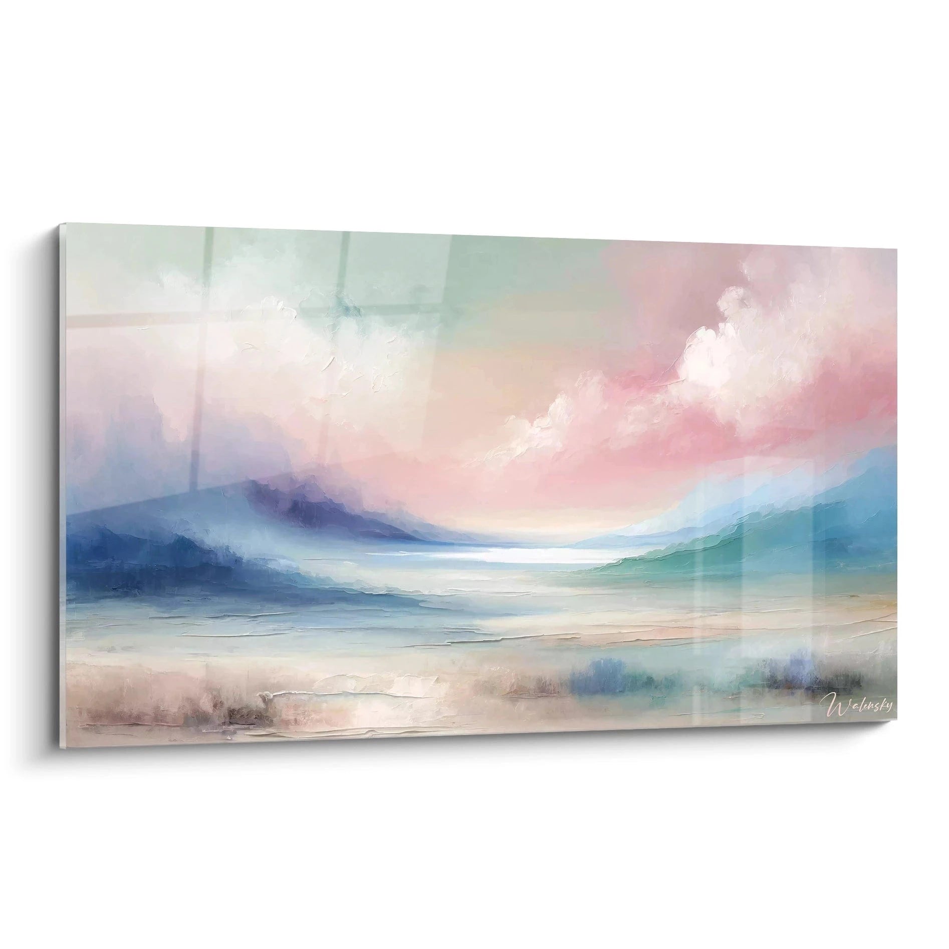

Abstract painting in gold and black: the luxury signature of a professional office
9 λεπτά ανάγνωσης · από Walensky
ΑΦΗΡΗΜΕΝΟΙ ΠΙΝΑΚΕΣ
An executive office that says nothing about its occupant is a missed opportunity. Grey furniture, a screen still glowing, a plastic plant in the corner: this setting could belong to anyone. Then there is the other room, where a wall behind the armchair catches the light with a golden vein running through the black like a fault line, and suddenly you know who runs the place.
The gold and black pairing is not a passing trend. It is a visual code that luxury brands have used for decades, and it has gradually established itself in the most demanding professional spaces. An abstract gold and black painting in a professional office is never a mere decorative choice: it is a statement.
- Black embodies authority and stability, gold signals success: together they form the visual vocabulary of "quiet luxury".
- The format is chosen according to the width of the wall or desk: the artwork should cover 60 to 75% of the width of the main piece of furniture.
- An acrylic glass support intensifies the effect of gold and light in a room with controlled lighting; Alu Dibond is the better choice facing a window.
Why the gold and black pairing dominates executive offices
Black never shouts. That is precisely why it works in business: it absorbs, it structures, it gives weight to everything it touches. In colour psychology applied to management, black is associated with rigour, self-control and a form of restraint that impresses without showing off.
Gold plays a completely different role. Historically associated with wealth, success and excellence — think of trophies, medals and the gilded ornaments of palaces — it injects a spark of ambition into the gravity of black. On its own, gold can look garish. Set against black, it becomes precise, almost surgical.
Black imposes silence, gold adds a spark of success: together, they speak without a word.
Αυτή η συμμαχία βρίσκεται στην καρδιά του κινήματος του quiet luxury : μια πολυτέλεια που δεν επιδεικνύεται με λογότυπα ούτε με παγιέτες, αλλά αναγνωρίζεται στην ποιότητα των υλικών και στην ακρίβεια των επιλογών. Ένα γραφείο διακοσμημένο με αυτό το πνεύμα δεν χρειάζεται να πει περισσότερα. Η σύγχρονη αφηρημένη τέχνη ταιριάζει ιδιαίτερα, καθώς αποφεύγει κάθε υπερβολικά φλύαρη εικονογράφηση και παραμένει φορτισμένη με νόημα.
Criteria for choosing your abstract gold and black painting
Choosing this type of artwork for a professional space follows different rules from those of a living room. Here the issue is not only aesthetic: it is a question of consistency with the image the place projects to clients, employees and partners.
Format and proportion according to the size of the office
A painting that is too small on a large executive wall looks like a forgotten detail. The rule to remember: the artwork should occupy 60 to 75% of the width of the furniture or wall it dresses.
For a standard executive office, an L format from 120x70 cm remains the credible minimum. In a larger meeting room, do not hesitate to aim for a 3XL or 4XL: a modest artwork gets lost in a large volume and loses all its authority. This principle of panoramic abstract painting applies in any large space that needs unifying.
Texture and light effect: paint, resin, relief
The visual result changes radically depending on the support. Acrylic glass offers a glossy surface that makes the gilding shimmer and slightly reflects the ambient light — ideal in a room with controlled lighting, where reflections work in the artwork's favour rather than against it.Alu Dibond, by contrast, offers a matte, non-reflective surface that softens the gold slightly but holds its own facing a window or in full natural light, where glass would create distracting reflections.
Before choosing the support, look at where the light falls in the room at the hour when you receive the most visitors. An office facing full south deserves Alu Dibond; an office with subdued lighting will bring out the best in acrylic glass.
Some compositions play with relief effects that imitate applied gold leaf without actually being gold leaf: high-definition digital printing recreates nuances of sheen that evoke handwork, with a consistency of tone impossible to achieve with an ageing traditional gilding.

Αγαπημένη επιλογή
Πίνακας Peau de Métal - Έκδοση Υφής Αφηρημένος
Από 273,90 €
Ανακαλύψτε αυτόν τον πίνακαΠού και πώς να τον τοποθετήσετε για μέγιστο αποτέλεσμα;
The location matters as much as the artwork itself. A gold and black painting poorly placed loses much of its impact, however magnificent it is.
Wall behind the desk facing visitors
This is the prime location for an executive. Positioned behind the armchair, the painting becomes the backdrop to every photo, every video call, every negotiation. The visitor seated across the desk has the artwork in their field of vision throughout the exchange — it sets the tone of the meeting before the first sentence is spoken.
Αίθουσα συσκέψεων και χώρος υποδοχής
In a meeting room, the effect changes in nature: the artwork must make a collective impression rather than an individual one. A large panoramic or square format works particularly well on the main wall, the one everyone looks at on entering. In a reception hall, the same principle applies, with an added advantage: it is often the client's first visual contact with the company's identity. The logic of minimalist abstract paintings for an entrance also aligns with that of professional reception spaces.
These uses largely overlap with those found in a selection of paintings for professionals, designed precisely for this type of space. a selection of paintings for professionals
— Nuestra selección


Pairing the gold and black painting with furniture and lighting
A magnificent painting on the wrong furniture backdrop loses all its force. The harmony between the artwork and its surroundings plays out on three levels: materials, surfaces, light.
Dark wood — smoked oak, walnut, wenge — creates a warm base that dialogues naturally with the gold without ever competing with it. Leather, whether black or cognac, adds a tactile texture that anchors luxury in something physical, not merely visual. Brushed metal, on the other hand, should stay discreet: too present, it competes with the reflections of the artwork.
- Dark wood (desk, bookcase): reinforces the warmth and stability of the black.
- Leather (armchair, reception sofa): adds a texture that physically anchors the prestige.
- Matte metal (light fittings, handles): use sparingly, so as not to rival the gilding of the artwork.
On the lighting side, indirect lighting — recessed spotlights, wall lights aimed at the ceiling, a warm-toned architect's lamp — enhances gold far better than a frontal central ceiling light. Raking light, coming from the side at the end of the day, reveals the nuances of sheen in a way that flat lighting never can.
— Ανακαλύψτε επίσης


2026-2027 trends: from gold minimalism to organic textures
Style is evolving, and the most forward-thinking offices are gradually moving away from highly smooth geometric gold towards more fluid, organic compositions. Liquid flows, mineral veins reminiscent of marble, bursts of light evoking a cosmic explosion: these motifs are gradually replacing straight lines and overly architectural forms.
This shift reflects a search for naturalness in luxury — as if gold had stopped wanting to look like a trophy and moved closer to a natural, almost geological phenomenon. A composition such as Radial golden explosion painting on a dark background illustrates this turn well: it retains all the power of black and gold, but in a movement that evokes a stellar birth rather than a fixed symbol of power.

For offices seeking a more distinctive identity, some artworks play on the abstract human figure — a face suggested rather than depicted, inviting contemplation without drawing attention away from the workspace. This is an interesting direction for a consulting firm or creative agency that wants to avoid the generic abstract painting. the collection of black and gold abstract paintings

Στο ίδιο πνεύμα
Πίνακας Βόρτεξ Ντοράντο – Έκδοση Αφηρημένη
Από 273,90 €
Ανακαλύψτε αυτόν τον πίνακα →Συχνές ερωτήσεις
What colour painting for an executive office?
Black and gold remain the combination most associated with authority and success in corporate design codes. A deep navy or dark burgundy can complement this palette without betraying it.
How does gold influence the perception of a professional space?
Gold has historically signalled success and excellence. Used with precision on a black background, it creates an impression of controlled prestige rather than ostentation, which matches the spirit of quiet luxury precisely.
Which painting format to choose for a large corporate office?
For a large wall, aim for a format covering 60 to 75% of its width: a 3XL (160x160 cm) or 4XL (180x180 cm) depending on square compositions, or a 3XL (200x112 cm) for panoramic formats.
Does black and gold suit every office style?
It adapts to contemporary, industrial or revisited classic interiors. It is less suitable in a very Scandinavian or pastel office, where the contrast would be too harsh against the light, soft atmosphere already in place.
Choosing an abstract gold and black painting for a professional office means accepting that decoration is never neutral. Every material, every reflection, every proportion says something about the person who occupies the room. That wall which seemed empty for months may only have been waiting for one thing: an artwork capable of carrying, without a word, the message you could not otherwise formulate. To compose this symbol of success, the collection of paintings for coworking and professional spaces remains the safest starting point. collection of paintings for coworking and professional spaces If mythological inspiration appeals to you more, the article on the black and gold Pegasus painting explores another variation of this same visual language, while the article on black and white calligraphy offers a more spare approach to prestige through gesture. And for the full range of pieces embodying this signature, the collection of abstract paintings for professional offices remains the reference to browse.
Εξερευνήστε τις συλλογές μας


